Mr. Crispy is more than a fast-food restaurant specializing in fried chicken in Volta Redonda. Inspired by the rich tradition of Louisiana Creole/Cajun cuisine, each dish is carefully seasoned with an artisanal blend of salt, paprika, garlic, onion, cayenne pepper, and thyme, resulting in a unique and unmistakable flavor.
Our goal within this project is to elevate the gastronomic experience to the next level, and to that end, we developed a visual identity that reflects the brand’s passion for Creole/Cajun cuisine.
The challenge:
Within this project, our challenge was not just to reformulate a fast food brand, but rather to build a brand that incorporated a distinct personality, which was in tune with the authenticity of the cuisine presented by the establishment.
The solution:
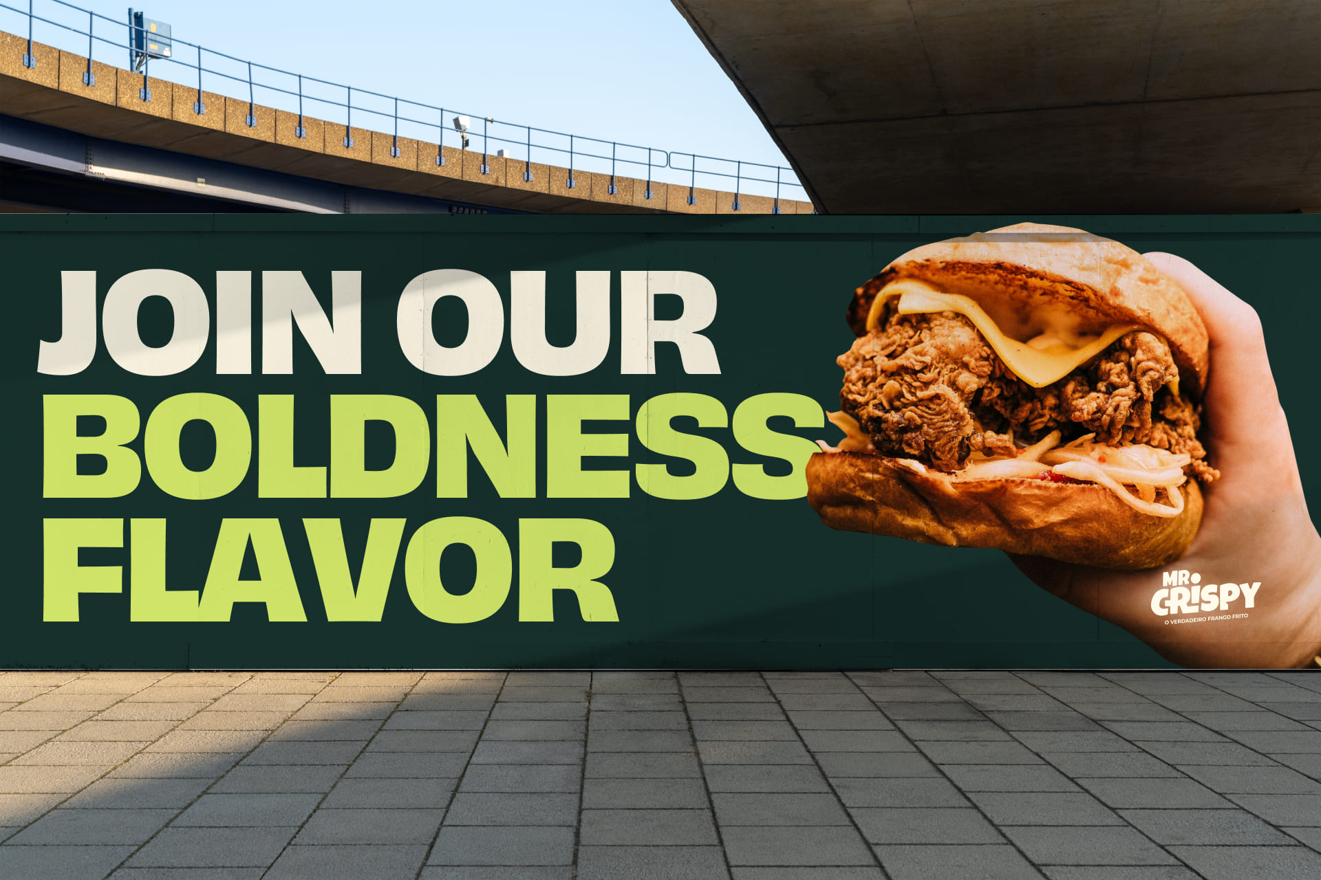
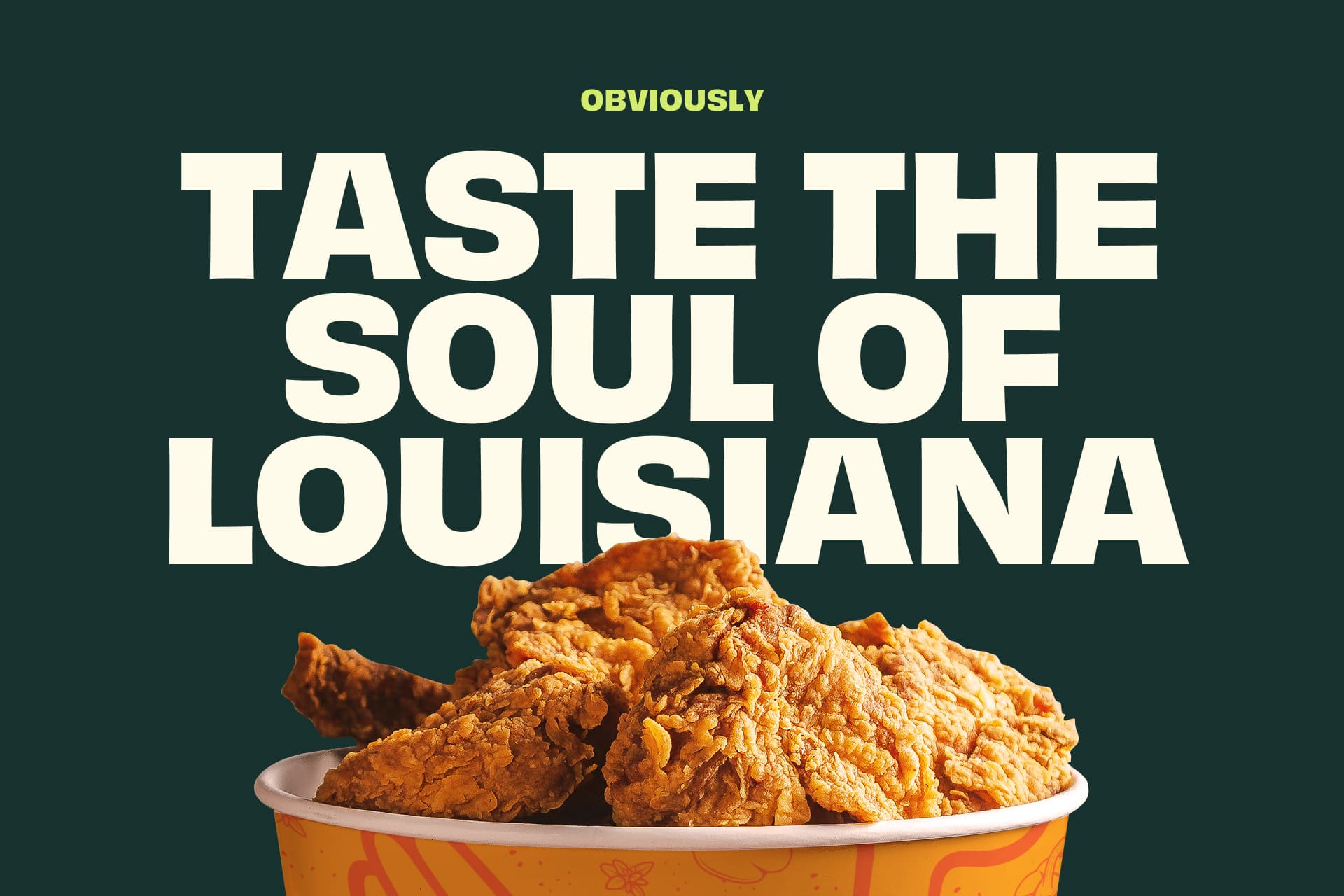
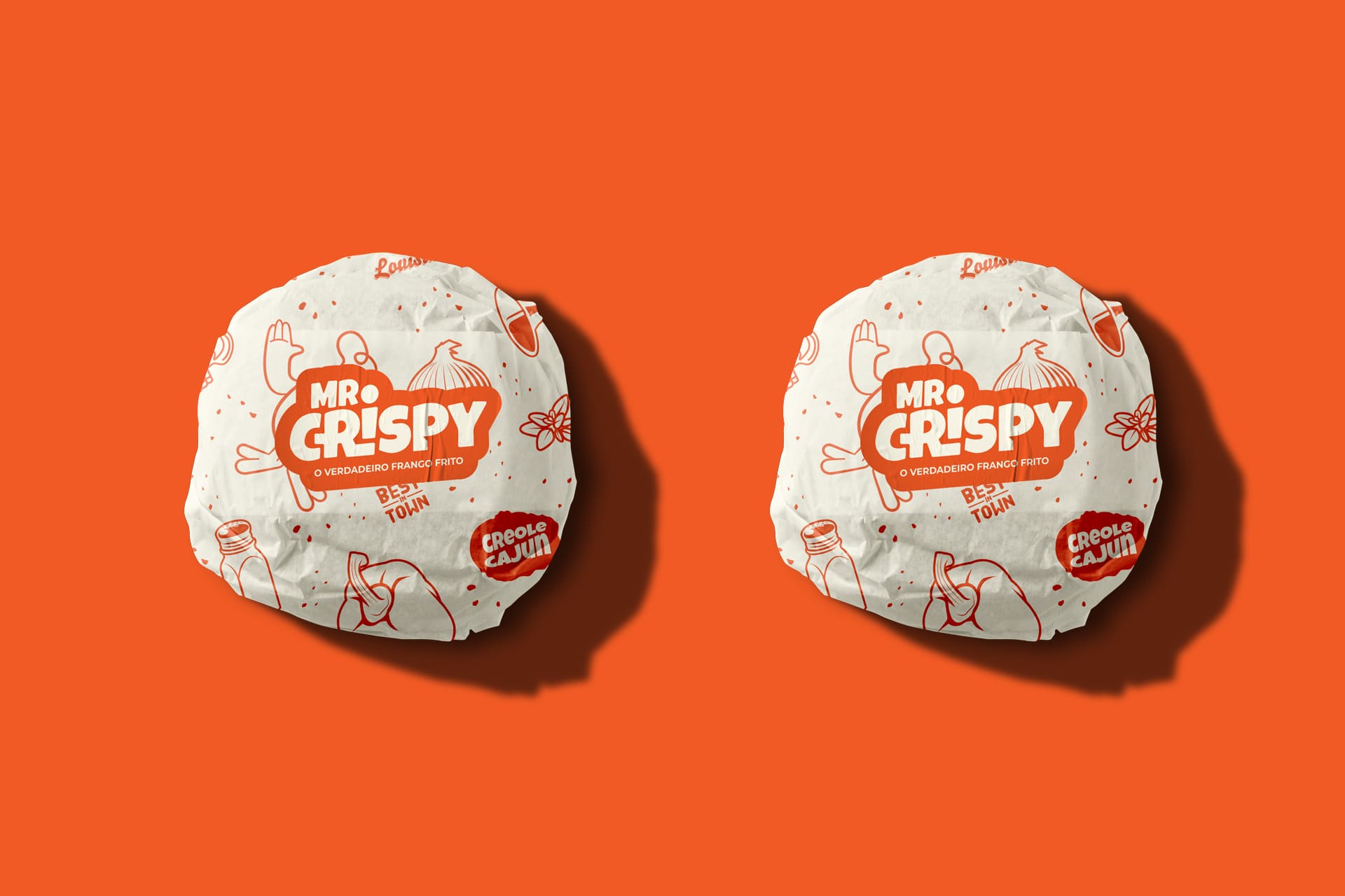
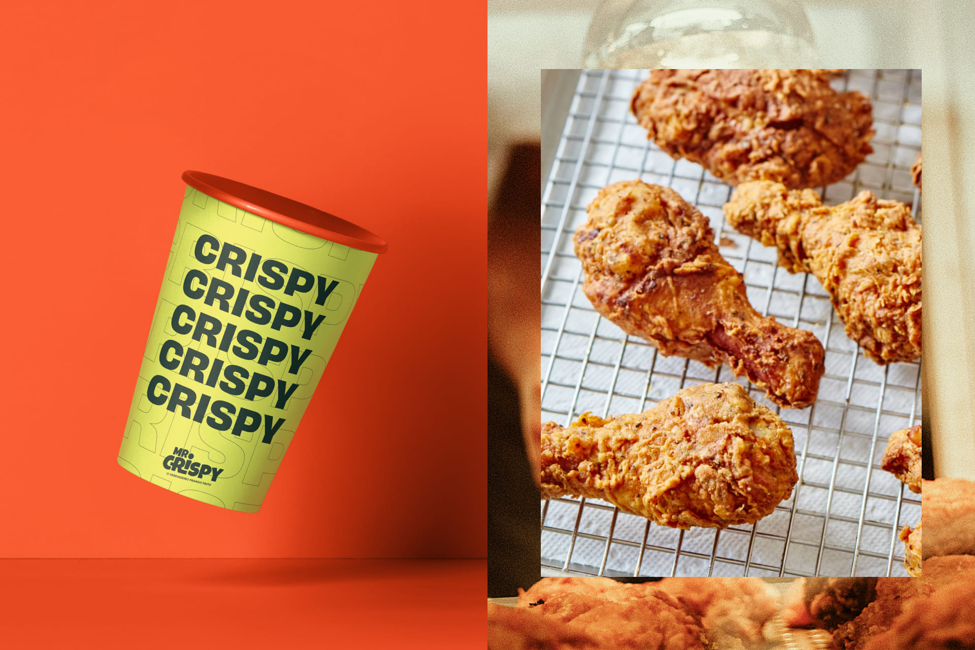
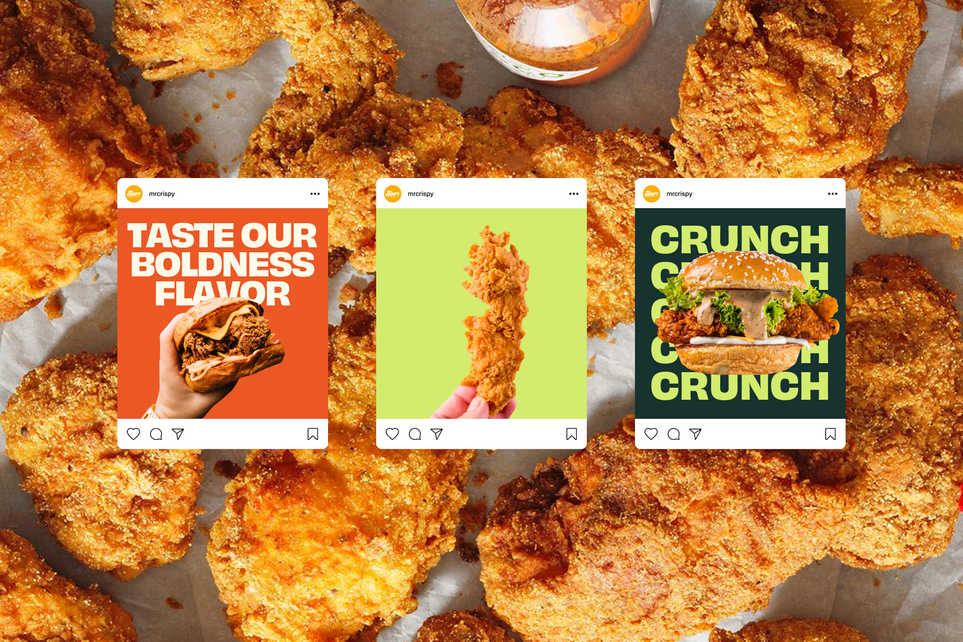
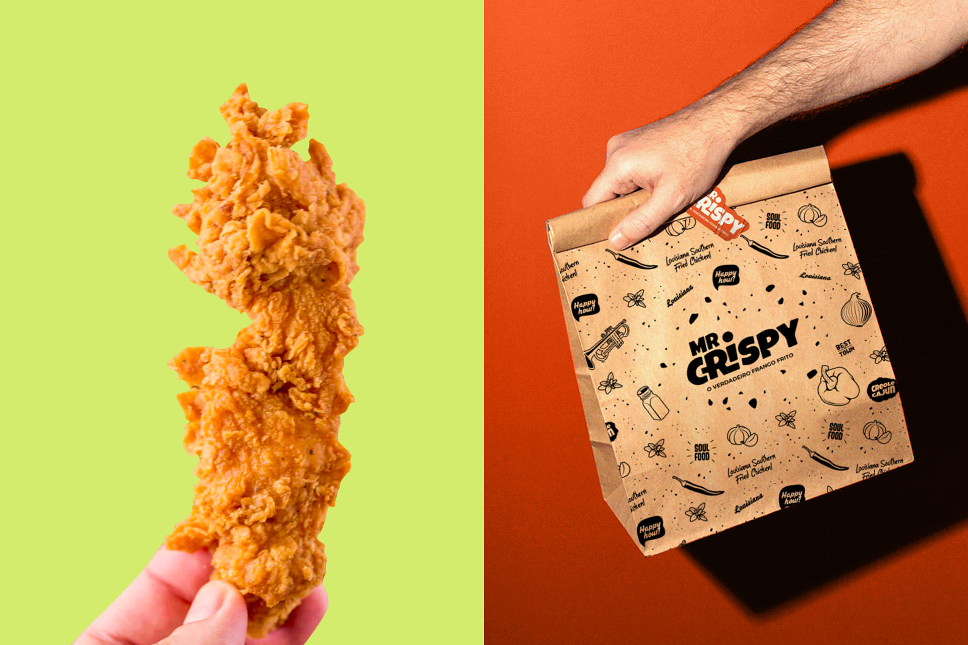
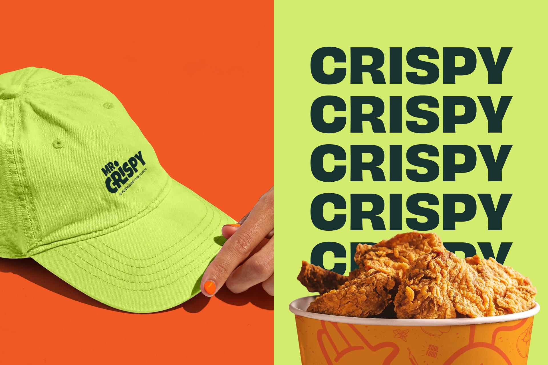
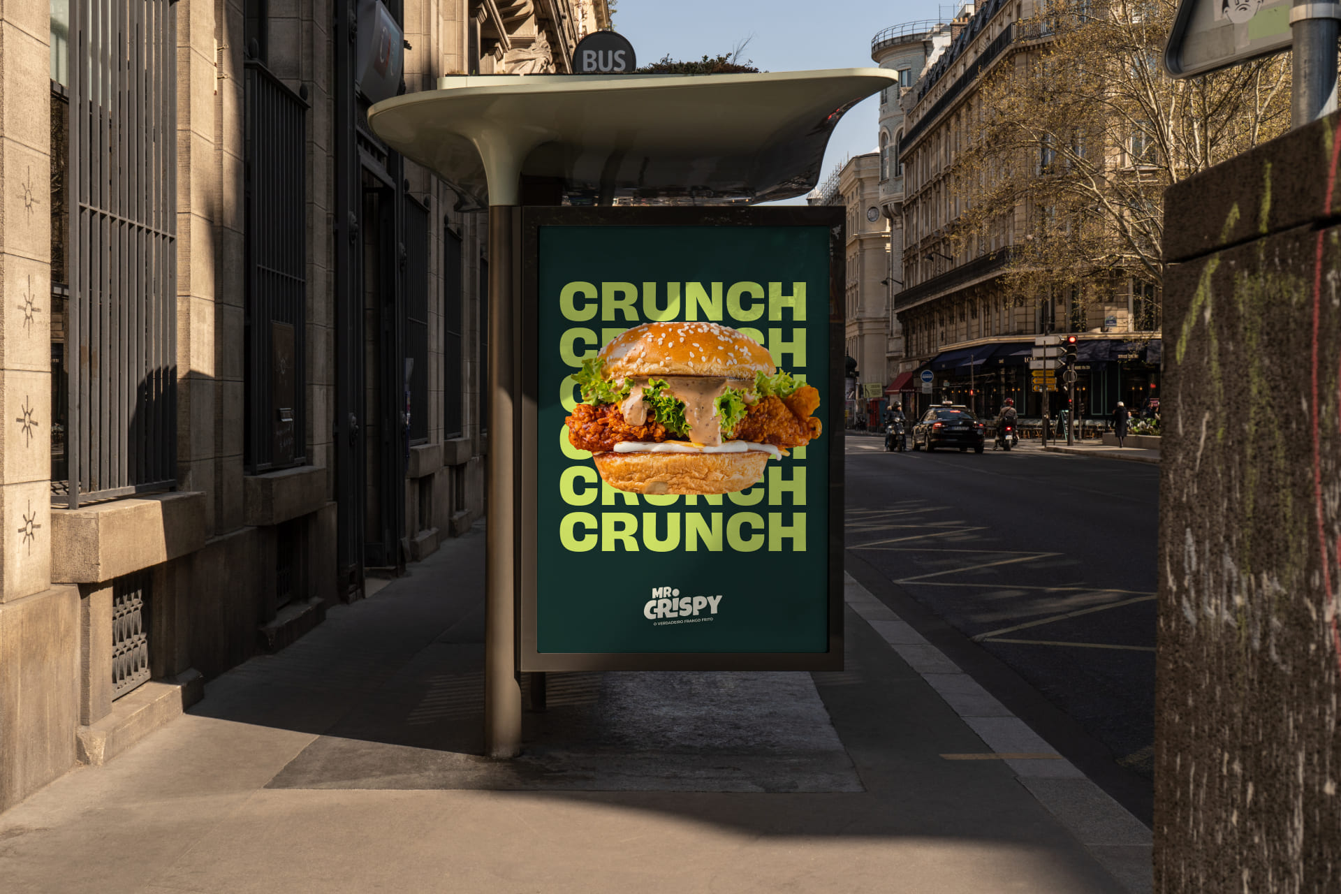
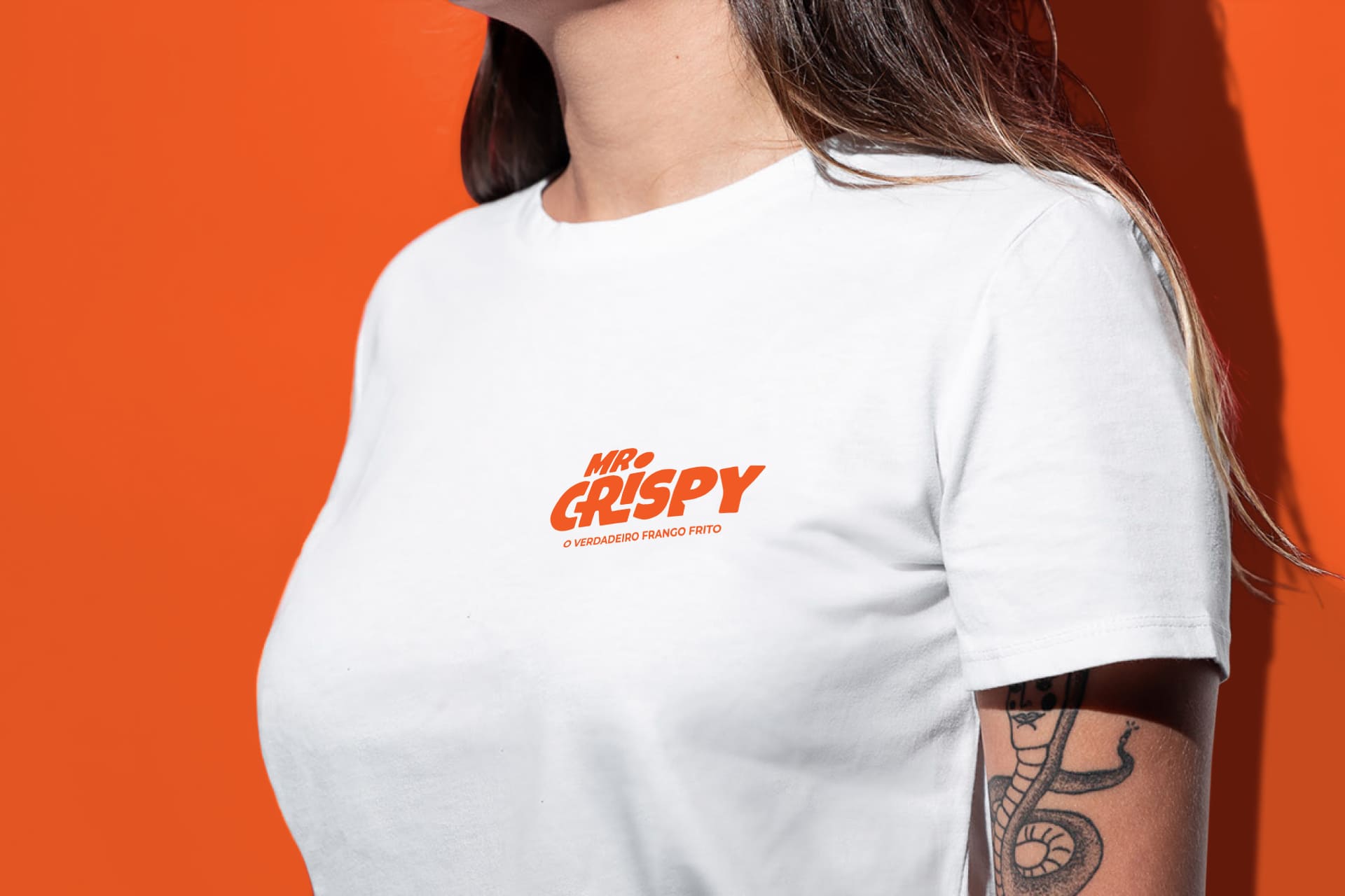
Inspired by the rich Creole-Cajun culture, we built an identity full of flavor and energy. Vibrant colors and striking typography were chosen to attract the public in a positive way. The visual elements reinforce our identity and extend to packaging and all of our brand’s touchpoints, making the Mr. Crispy experience unique and memorable. Its mascot was developed for the brand with the aim of making it more affectionate and fun for the public. Following the concept of authenticity that permeates the project, the mascot presents a stylized design with simple, yet modern features, seeking to escape the classic representation widely used in the segment. Its shape is inspired by the thigh of a chicken wing.
CREDIT
- Agency/Creative: Lazr Design
- Article Title: Mr. Crispy Visual Identity and Packaging Design
- Organisation/Entity: Agency
- Project Type: Identity
- Project Status: Published
- Agency/Creative Country: Brazil
- Agency/Creative City: Rio de Janeiro
- Market Region: South America
- Project Deliverables: Brand Identity
- Industry: Food/Beverage
- Keywords: brand identity, burger, Fast food, fried chicken, hamburger, junk food, packing, restaurant
-
Credits:
Creative Director: Caio Rossatto de Araújo


