


Having clinched their first league crown in 29 years, Bath Rugby, one of English rugby’s most iconic clubs, has lifted the lid on a refreshed brand identity aiming to reignite the sport’s raw intensity and reconnect with the city’s proud heritage.
English rugby clubs have become unremarkably similar. Similar imagery, similar language, similar social media posts, kit launches and season ticket campaigns. Teams are stuck in a distinctly ordinary and conventional formula. One that’s gone unchanged for years and risks losing the raw intensity and unique edge that once set the sport apart.
If you want to grow, stand out to a younger, more diverse audience, or capture the minds of those that’ve never engaged with the sport before that’s never going to cut it.
Bath Rugby’s brand refresh, led by creative agency Mr B & Friends, comes at a pivotal moment.
With a fresh, stable backroom setup, a progressive new head coach, and a squad full of power and panache, the club has soared to new heights in the 2024/25 season winning the English Premiership, Premiership Cup and Challenge Cup.
But their brand had become dated, no longer reflecting the high standards and ambition emerging on the pitch.
The club recognised the opportunity to build on their on-field success and present Bath Rugby as something truly unique and exciting to a fresh generation of fans.
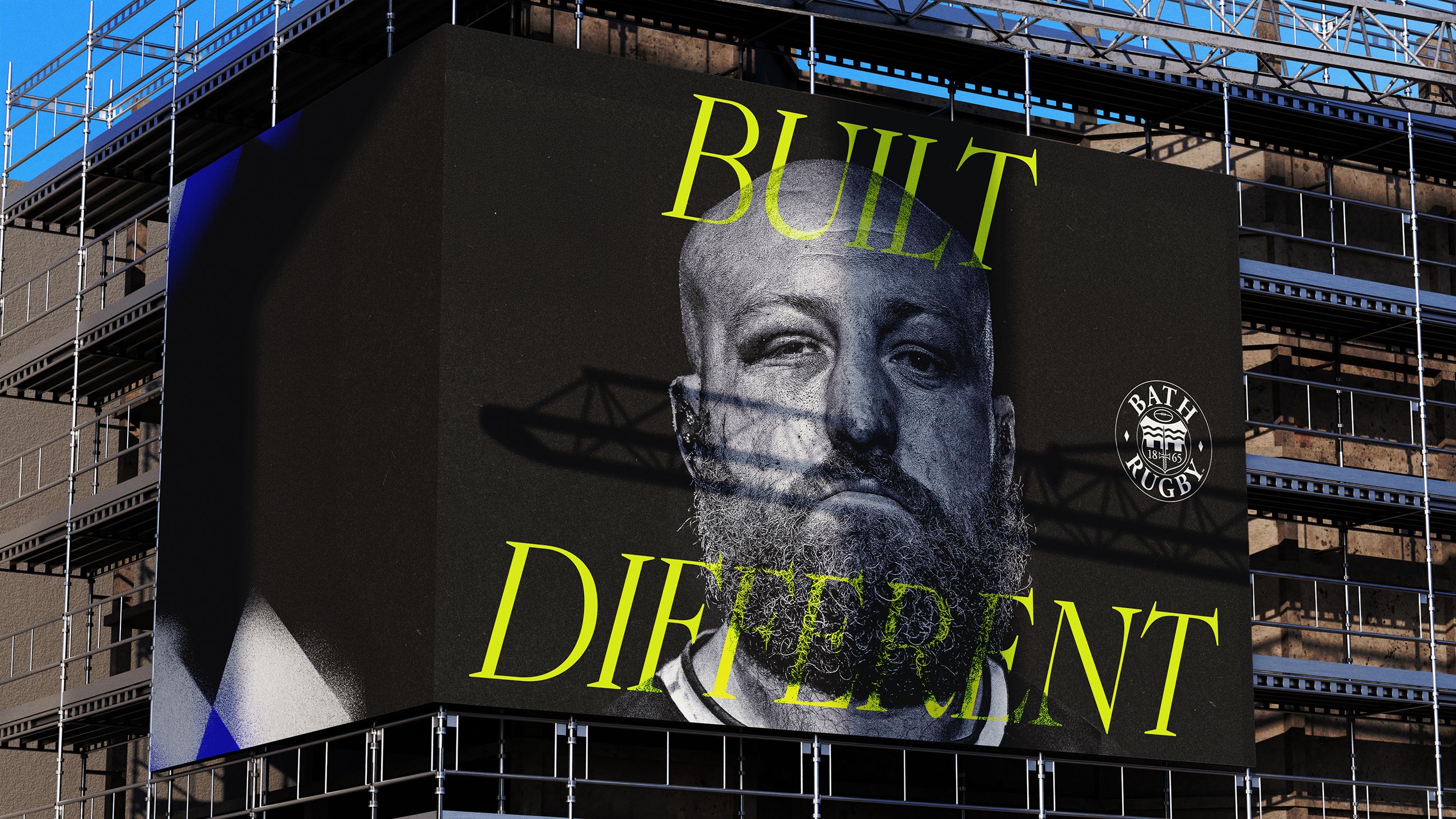
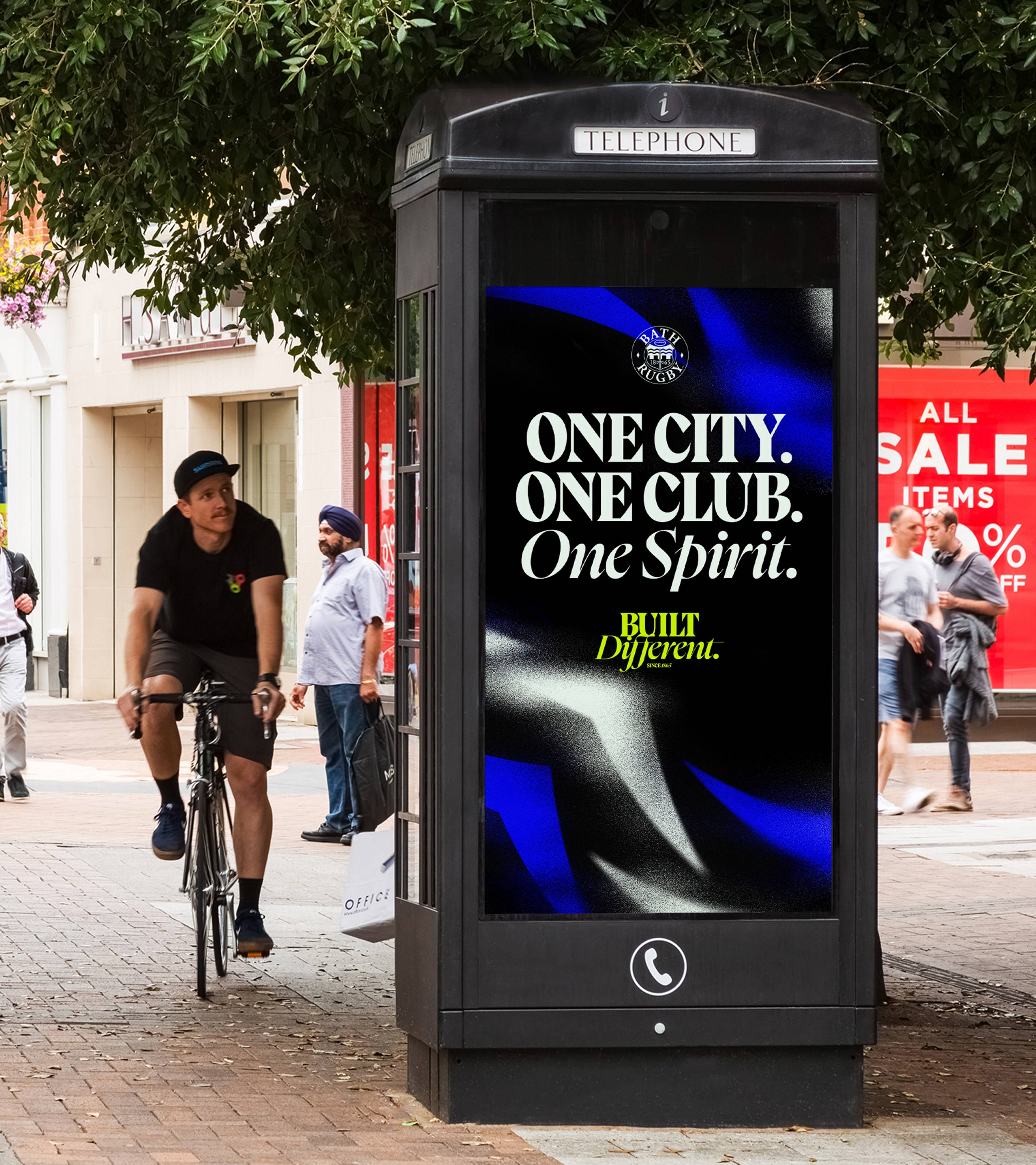
Bold, modern and unafraid to go against the grain, this new Bath Rugby understands following the rest of the pack will get you nowhere. This new Bath Rugby is ready to make people sit up and take notice. This new Bath Rugby is Built Different.
The idea? Unleashing the Spectacle of Modern-day Gladiators.
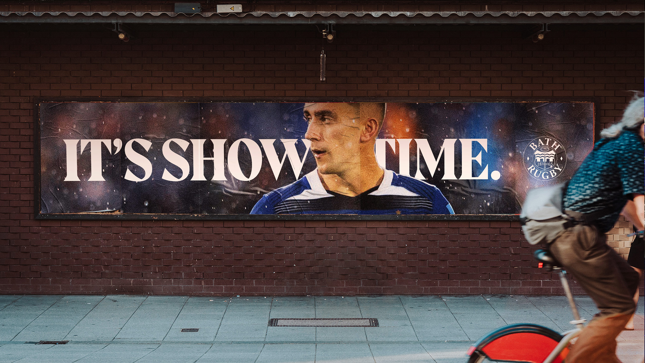
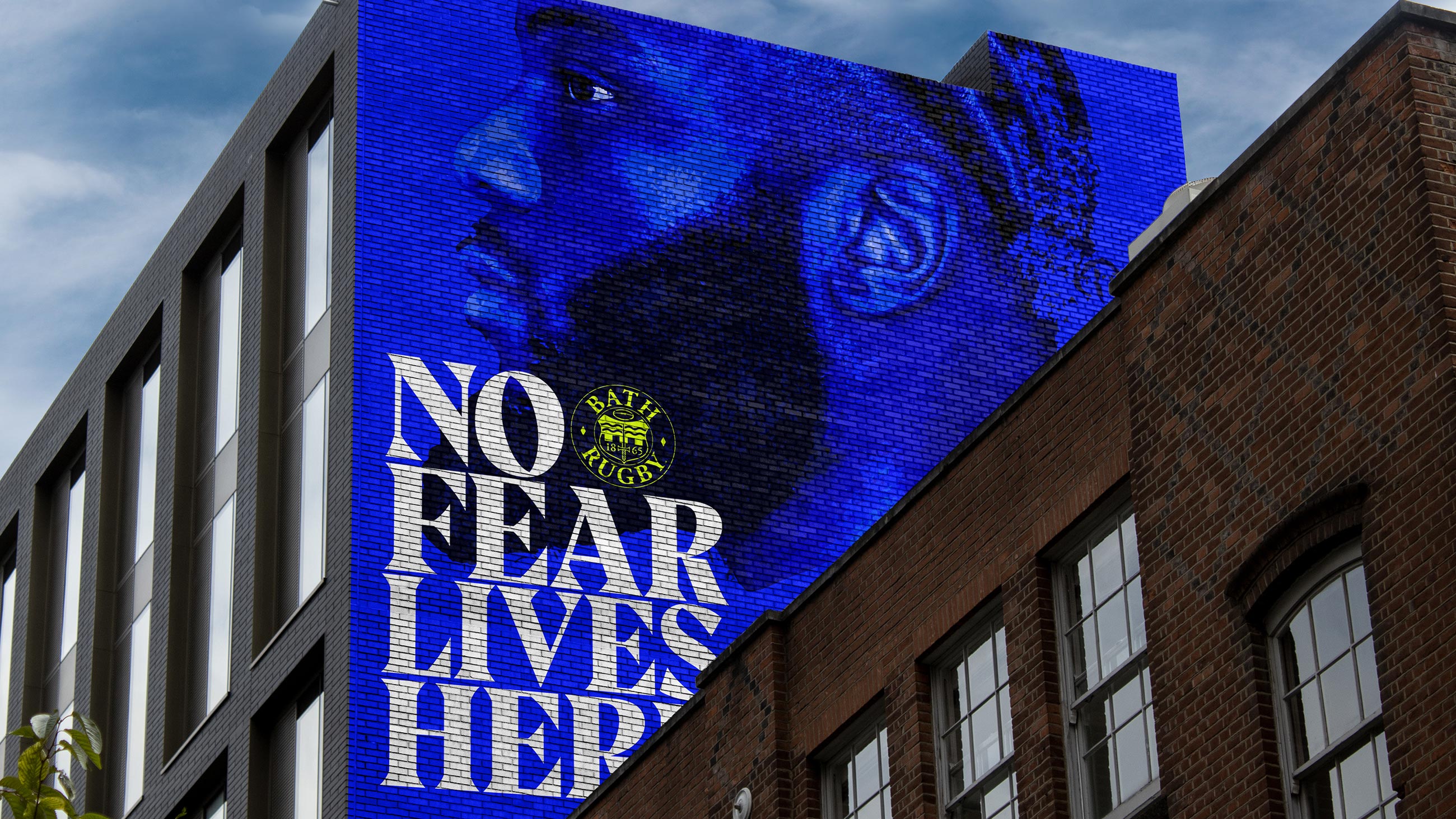
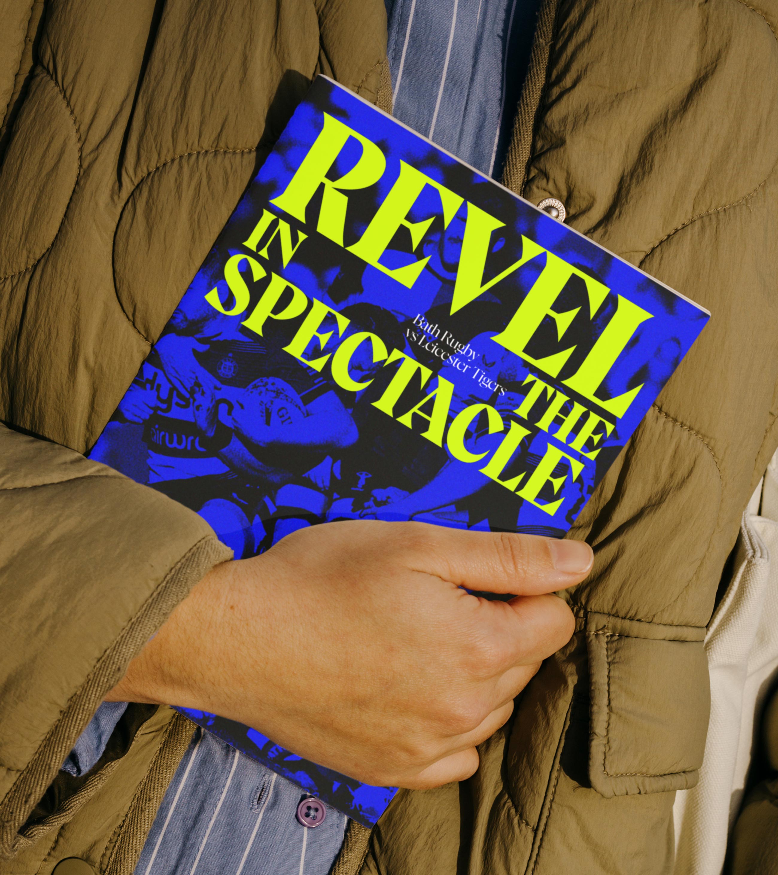
Bath Rugby’s new identity celebrates their standing as the iconic rugby club with Gladiatorial Spirit coursing through its veins oozing everything the sport is and should be: an intense heart-pounding display of ferocity, grit and artistry.
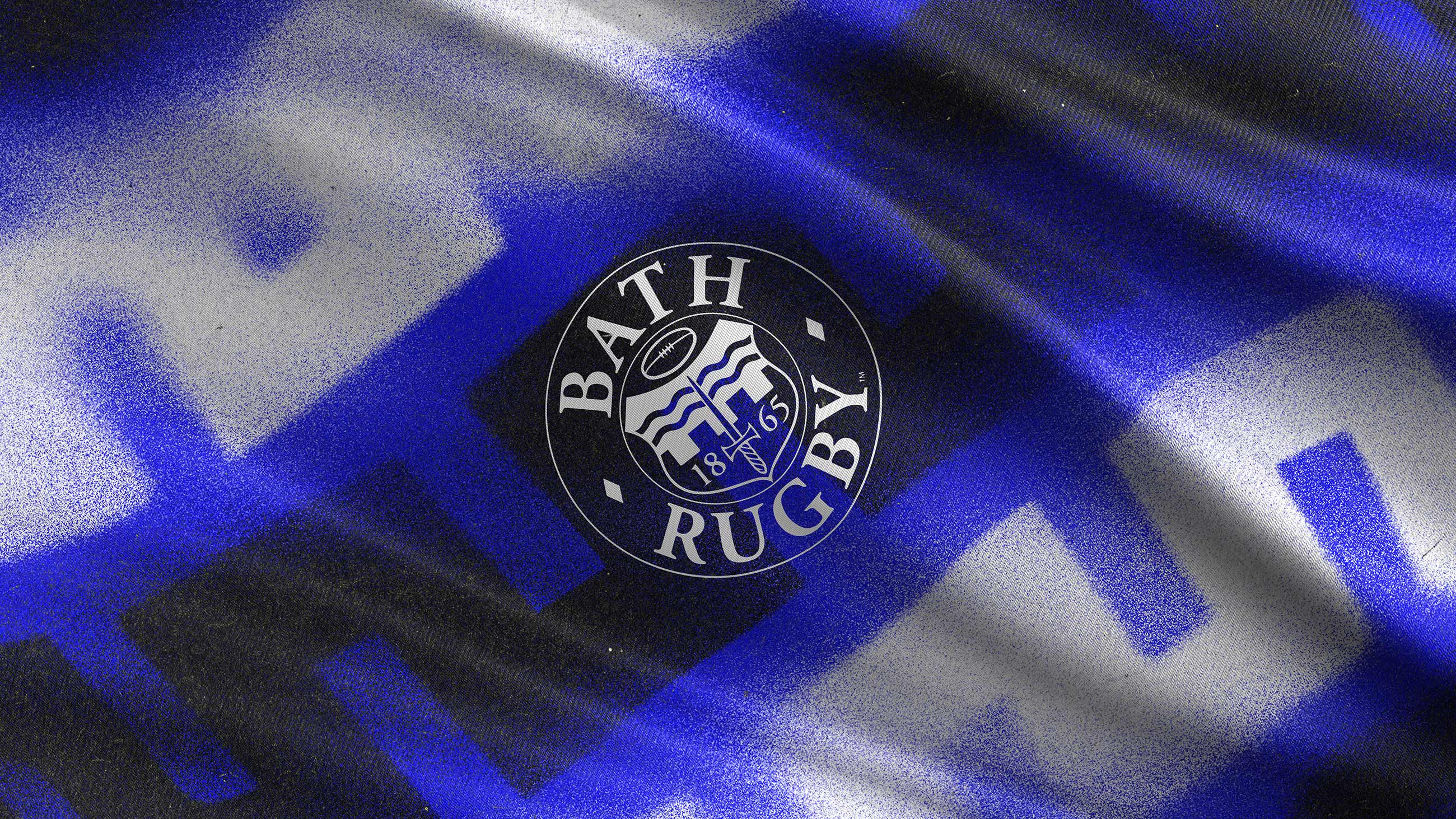
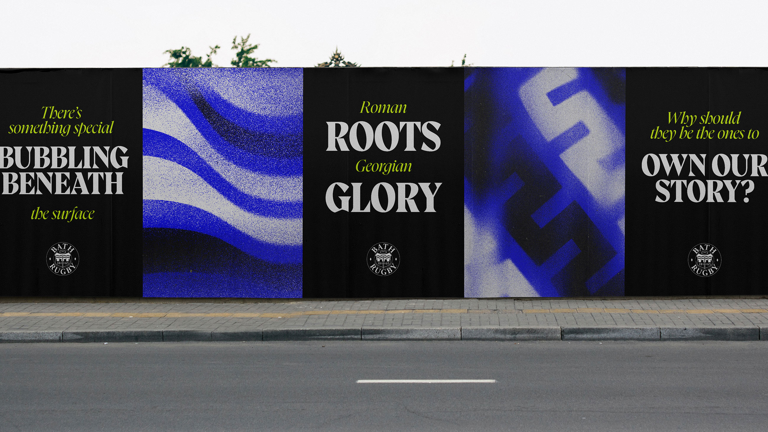
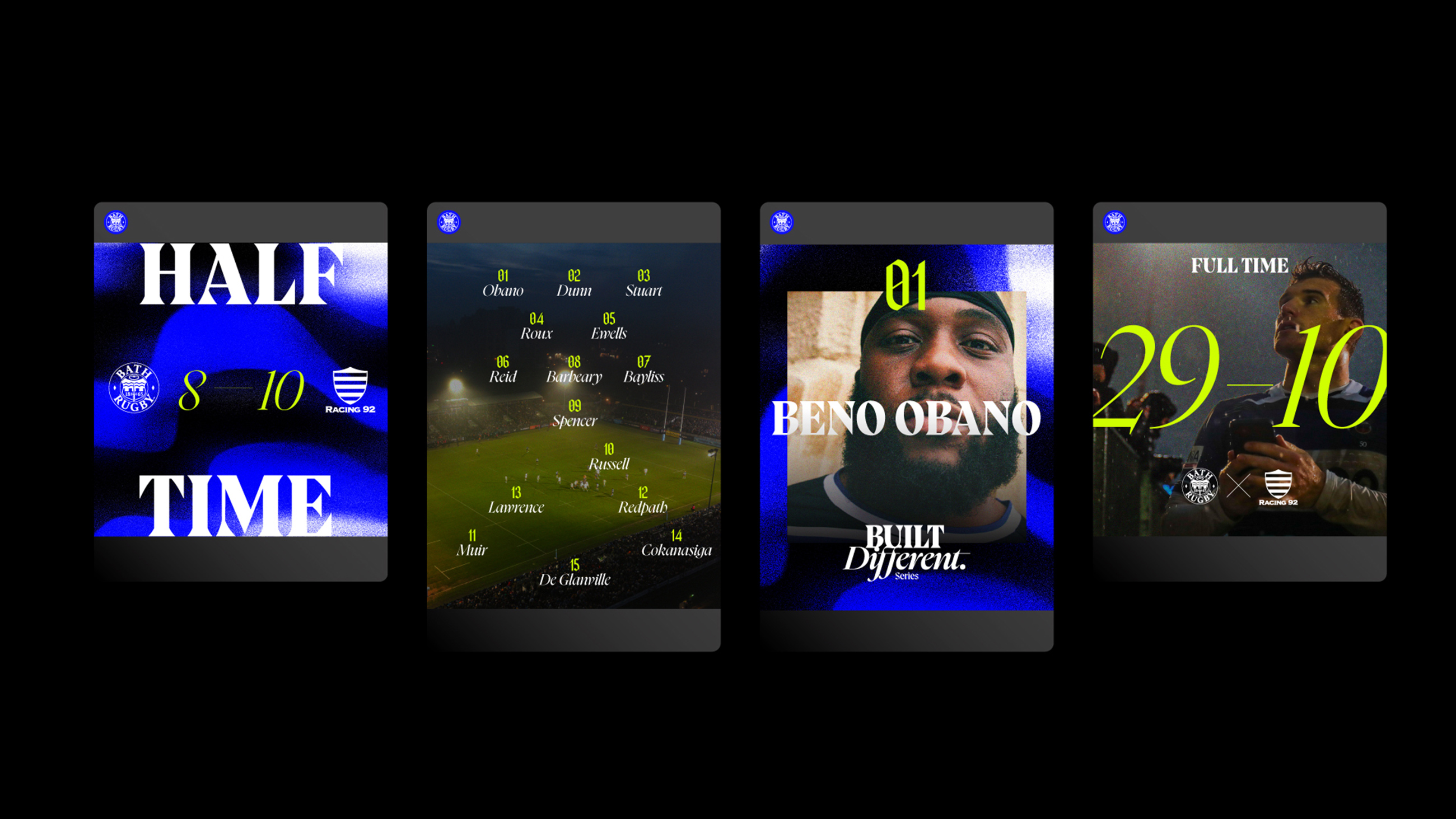
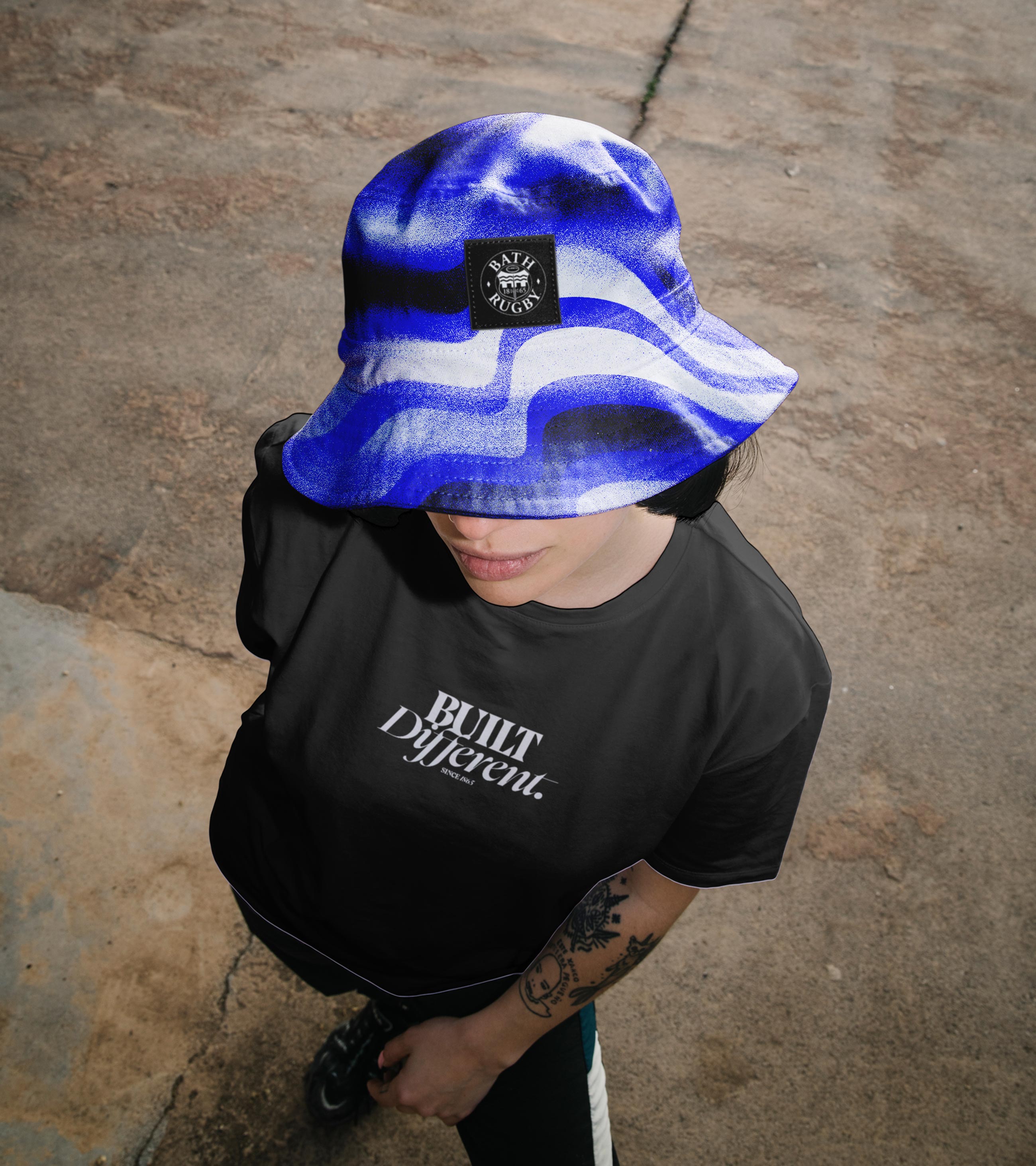
The design system pairs contemporary heraldry with tribal illustration, and confident, expressive typography. Contrasting type styles from heavy and impenetrable to fast and fluid imitate the duality of the club’s rich Roman and Georgian history, as well as the team’s jaw-dropping playing style.
Iconic blue, black and white colours of old have a renewed confidence, placed alongside an expressive splash of the colour bolt for added energy. Each brought to life by motion principles that mimic gameplay and echo the visceral.
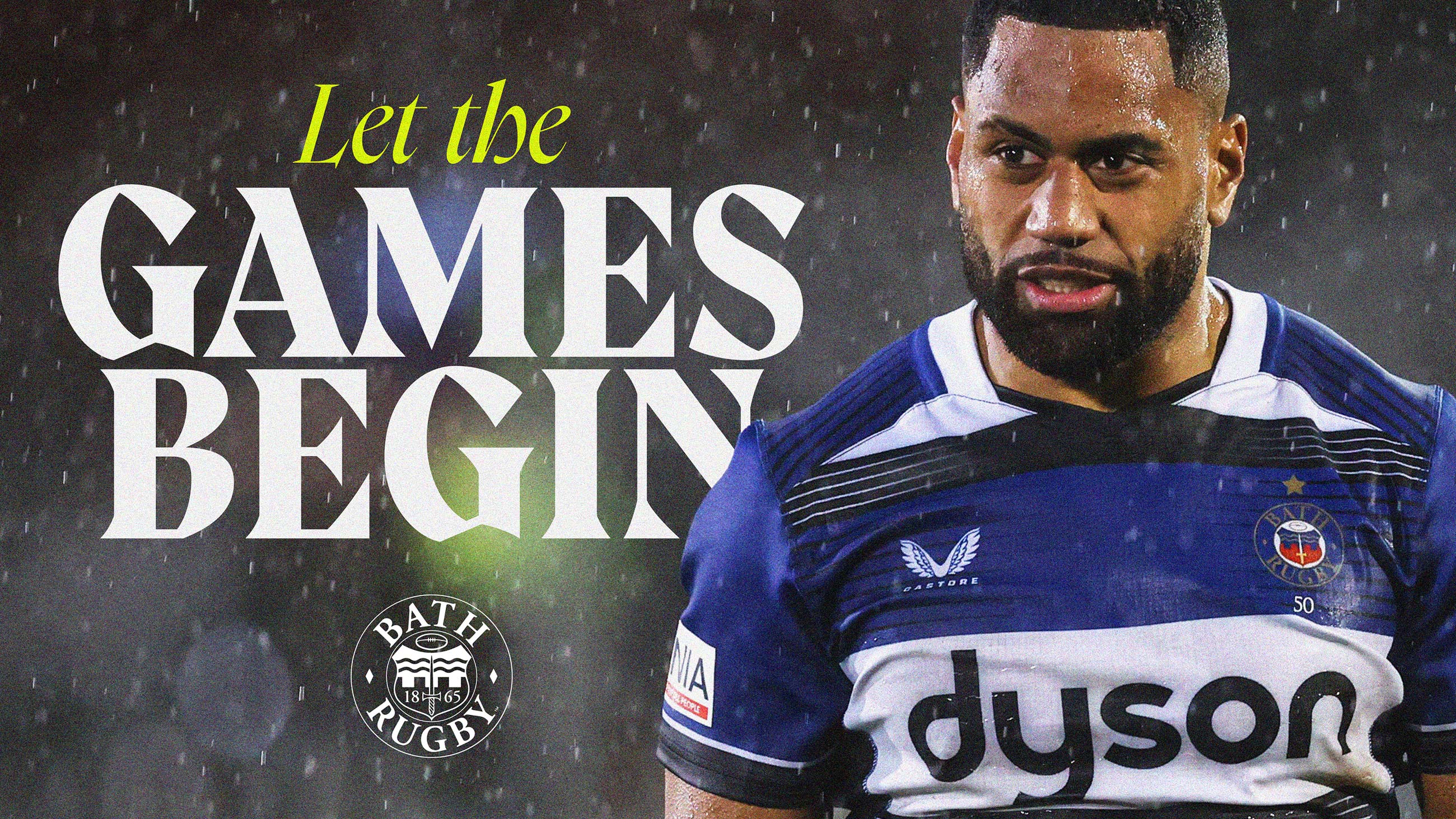
The club’s tone of voice has also undergone a dramatic shift: from traditional and functional rugby formalities to an emotionally charged, attention-commanding presence – worthy of being dragged into battle or hung from the corridors of the Colosseum. Art direction of photography leans into every aspect of the visceral, capturing not just bone-crunching action, but the attitude and atmosphere that surrounds it.
Nathan Crosby, Creative Director at Mr B & Friends, says “Bath Rugby has always been the beating heart of the city, but this was about making people feel it again. Rugby at its best is theatre. This identity dials that up, not just for the fans who’ve always been there, but for the next generation who want something louder, fresher and more alive.”
Tarquin McDonald, Bath Rugby CEO, says “Mr B & Friends have created an identity befitting of our renewed success on the field, providing us with a bold new platform from which to excite, engage and grow our fanbase and attract the next generation.”
CREDIT
- Agency/Creative: Mr B & Friends
- Article Title: Mr B & Friends Reignites the Intensity of the Game in Bath Rugby’s Gallant New Identity
- Organisation/Entity: Agency
- Project Type: Identity
- Project Status: Published
- Agency/Creative Country: United Kingdom
- Agency/Creative City: Bristol
- Market Region: Europe
- Project Deliverables: Brand Design, Brand Identity, Brand Redesign, Brand Strategy, Brand Tone of Voice, Copywriting, Identity System, Motion Graphics, Rebranding, Tone of Voice
- Industry: Entertainment
- Keywords: Rugby branding
-
Credits:
Executive Strategy Director: Adam Partridge
Creative Director: Nathan Crosby
Senior Designer: Kieran Hawes
Senior Creative Copywriter: Dave Warfield
Animation Lead: Louise Lepic
Motion Graphic Designer: Ian Clarke
Artwork & Technical Manager: Neil Lenihan
Group Account Director: Joe Baptiste


