


The most elegant Rosé Wine in the Douro Valley
The image of Quinta da Cuca’s Rosé Wine is the result of a graphic project in which every detail was carefully considered, from the choice of bottle to the design elements that define the packaging of this wine: the labels applied to the bottle and the packaging of a single unit.
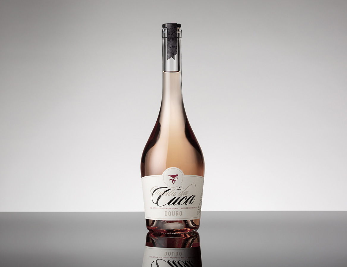
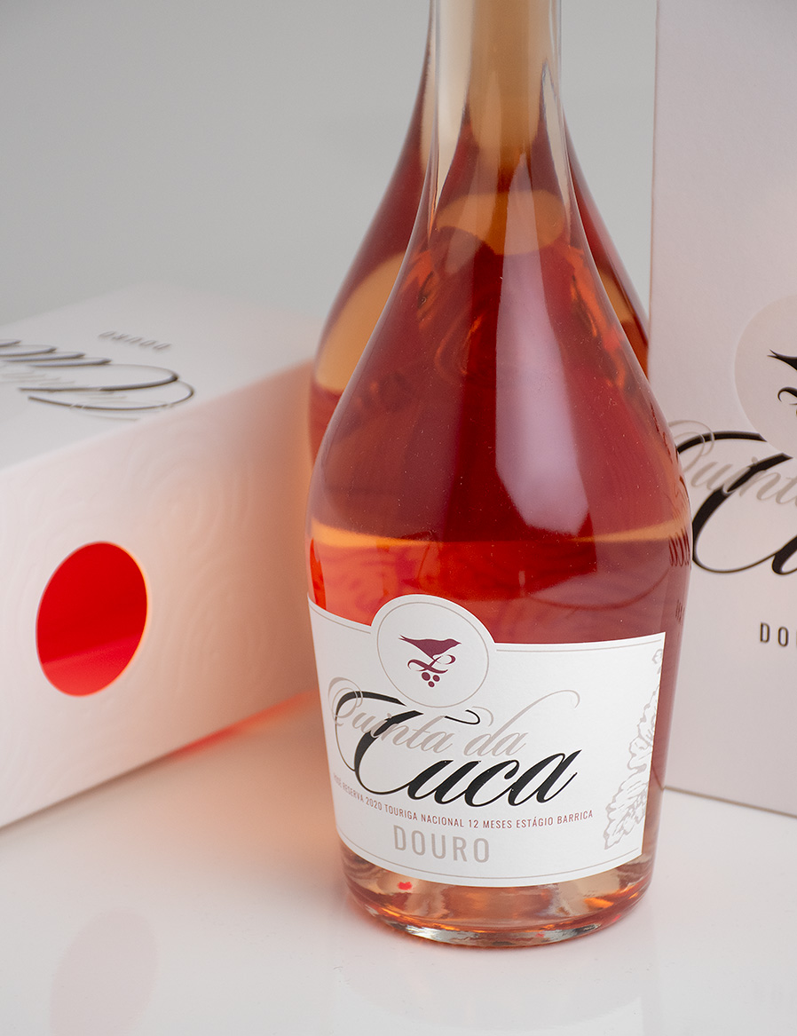
The Pompadour Wine bottle produced by Saverglass was carefully selected by the client; its distinctive shape and design were the starting point for the entire conception of the project. Characterised by a rounded, sculptural silhouette, this bottle is topped by a high neck that allows the use of a personalised glass cap, adding a unique detail to the presentation.
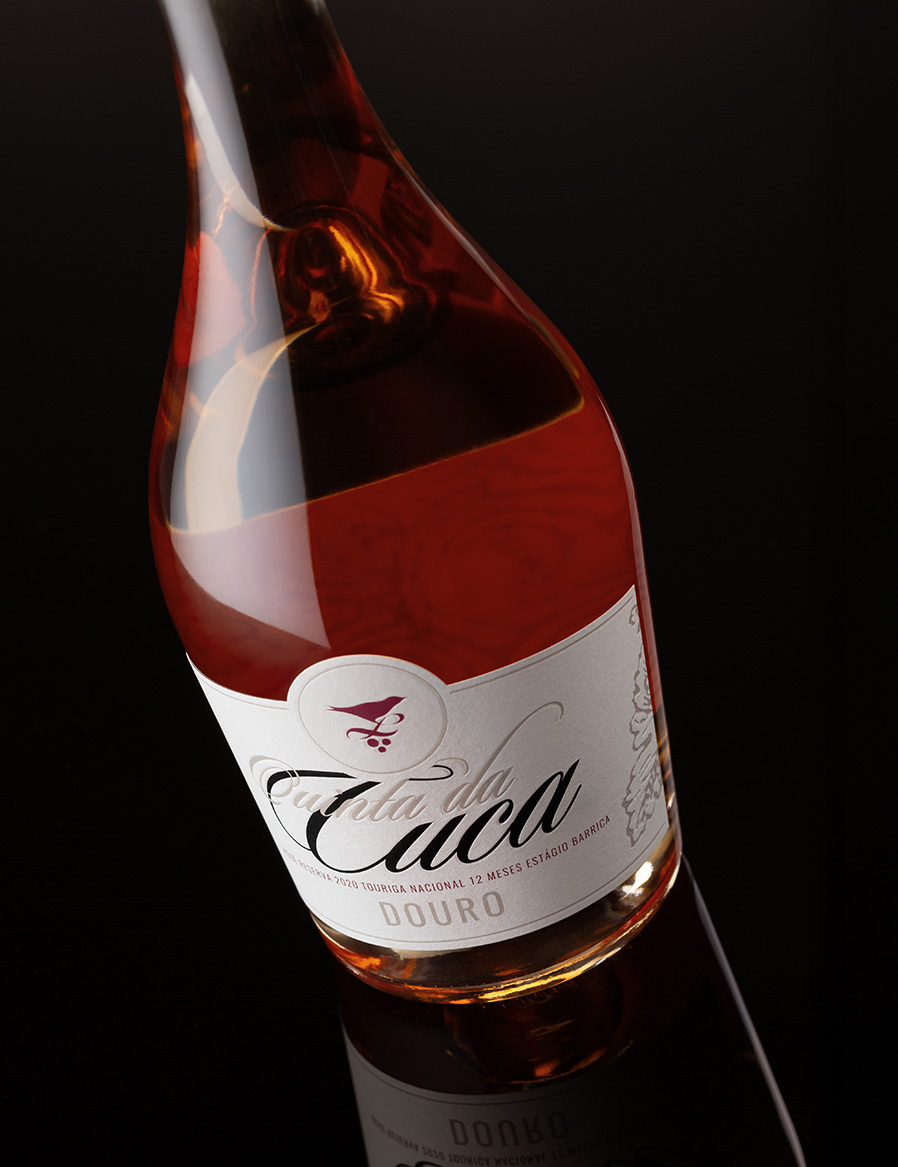
The creative approach adopted in the design of the label and back label enhances the transparency and colour of the wine through the printing on the back of each of the labels. The cut-outs on the labels not only reinforce and accompany the shape of the rounded bottle, but also emphasise the brand symbol, which takes the form of a distinctive seal at the top of the label.
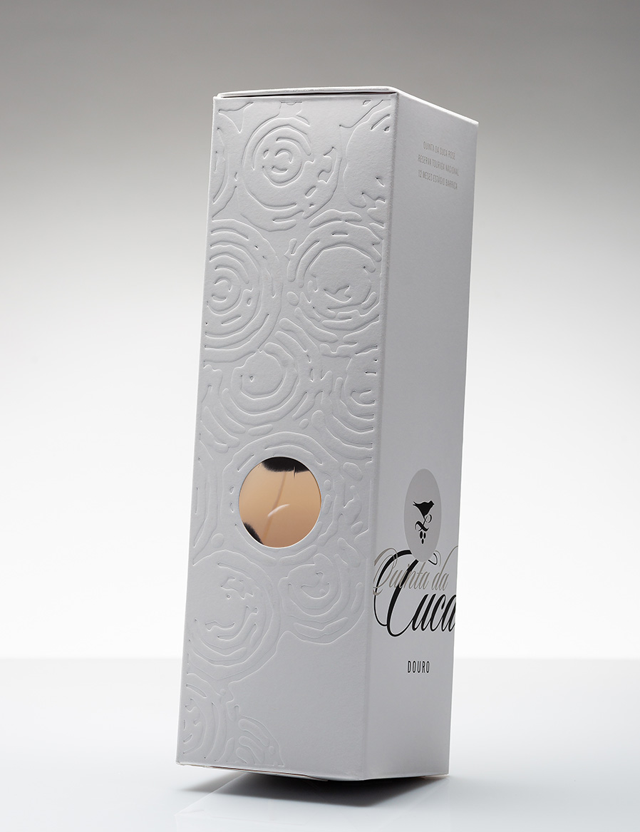
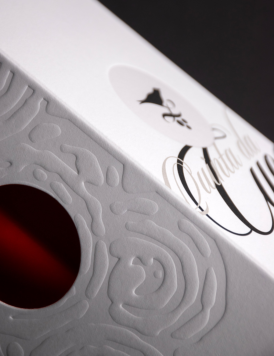
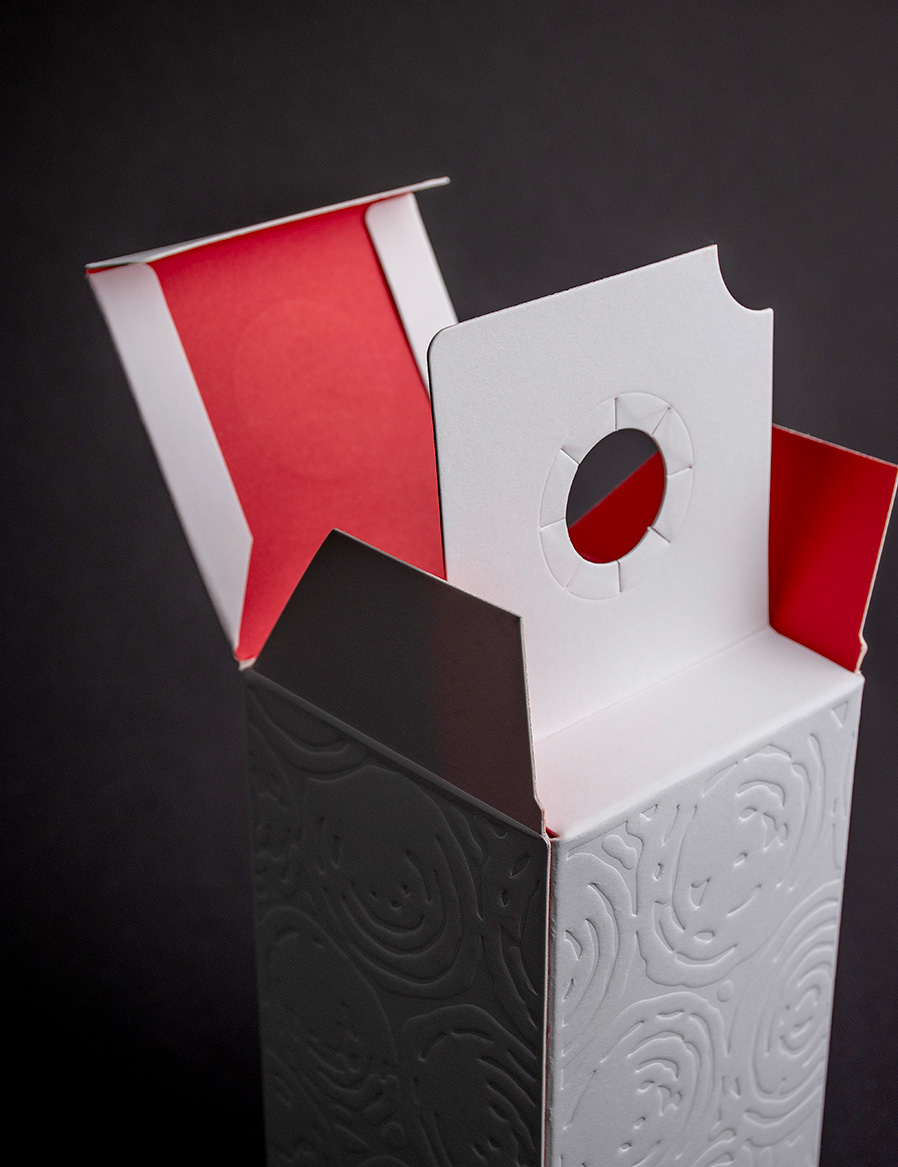
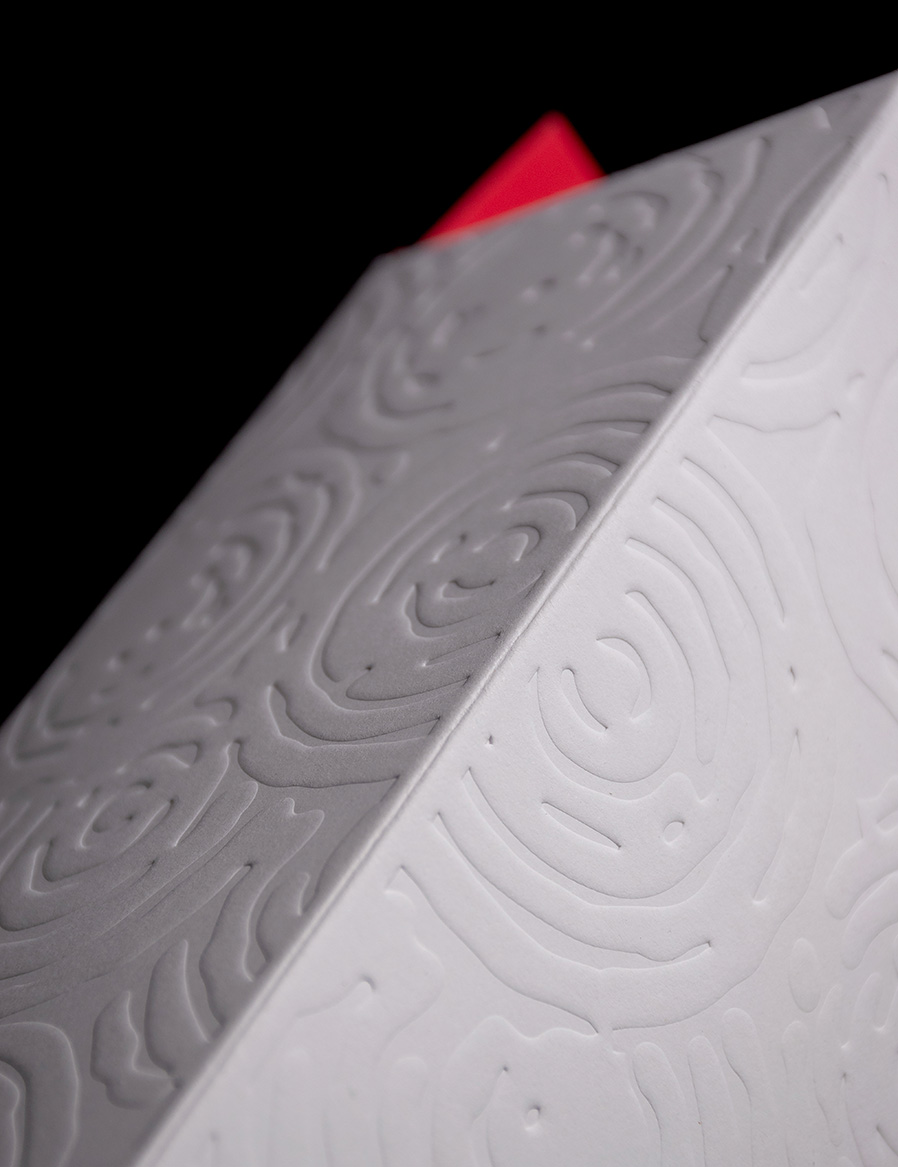
Thinking about and designing a package for this bottle was obviously aimed at packaging it, but at the same time enhancing the product by getting the most out of the graphic codes and the paper. The paper selected was Fedrigoni® Arena White Smooth white and smooth in the 580g version, which allowed the use of a range of graphic finishes, including low relief, reserved gloss UV varnish and the excellent result of the Pantone 1797 U offset printing on the inside of the packaging.
From a creative point of view, the combination of the low relief (illustration of a detail of a bunch of grapes) used on the sides and the circular openings that allow the colour of the wine to be seen make for a special product with a clear positioning for this rosé wine.
The typeface – Sloop Script by @richardlipton / Lipton Letter Design – used for the ‘Quinta da Cuca®’ brand was chosen for its lightness and organic design, contributing to the elegance of the whole.
The typeface – Sloop Script by @richardlipton / Lipton Letter Design – used for the ‘Quinta da Cuca®’ brand was chosen for its lightness and organic design, contributing to the elegance of the whole.
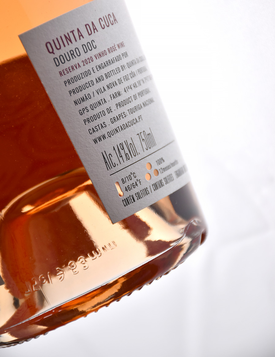
Quality and sustainability were taken into account when choosing the paper used for the label and back label. Fasson Watermark 120 Plus FSC Mix U paper, made from FSC® certified paper, was selected for its unique characteristics. This white, uncoated paper, made up of wood-free fibres and synthetic fibres, allows the application of a hot stamping that creates a distinctive watermark effect, without the need for aluminium foil. This, together with the braille varnish, reinforces the simplicity and elegance of this wine’s image, making it truly special.
CREDIT
- Agency/Creative: MPFXDESIGN
- Article Title: MPFXDESIGN Aligns Material, Shape and Story in the Packaging Design for Quinta da Cuca Rosé
- Organisation/Entity: Agency
- Project Type: Packaging
- Project Status: Published
- Agency/Creative Country: Portugal
- Agency/Creative City: Porto
- Market Region: Europe
- Project Deliverables: Art Direction, Branding, Design, Label Design, Packaging Design
- Format: Bottle
- Industry: Food/Beverage
- Keywords: label design Rose Wine Douro Portugal
-
Credits:
Art Director / Designer: Miguel Pinto Félix
photography: João Pinto Félix
photography: Paulo Serra


