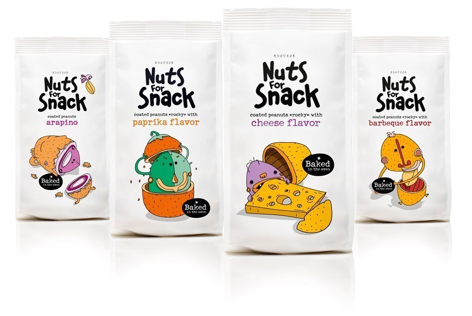
The briefing (in brief): “We need a new identity for our nut products, which have been in the Greek market for years. We want to place them in a more fun and easy-to-eat context this time including foreign markets also”. The target audience: Greek and foreign markets.
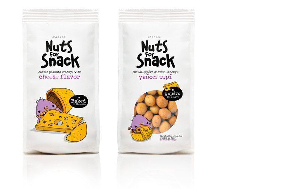
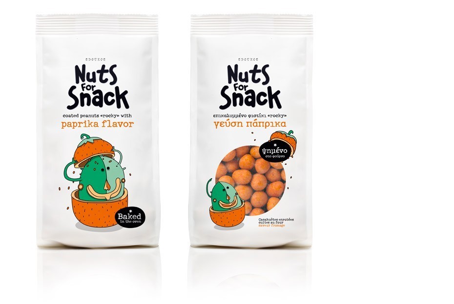
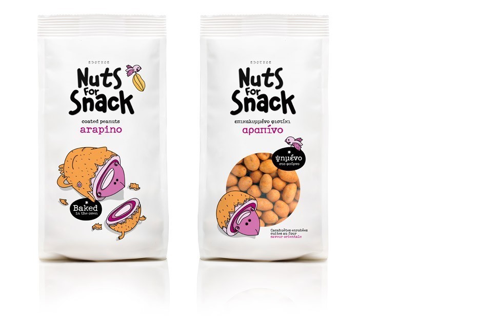
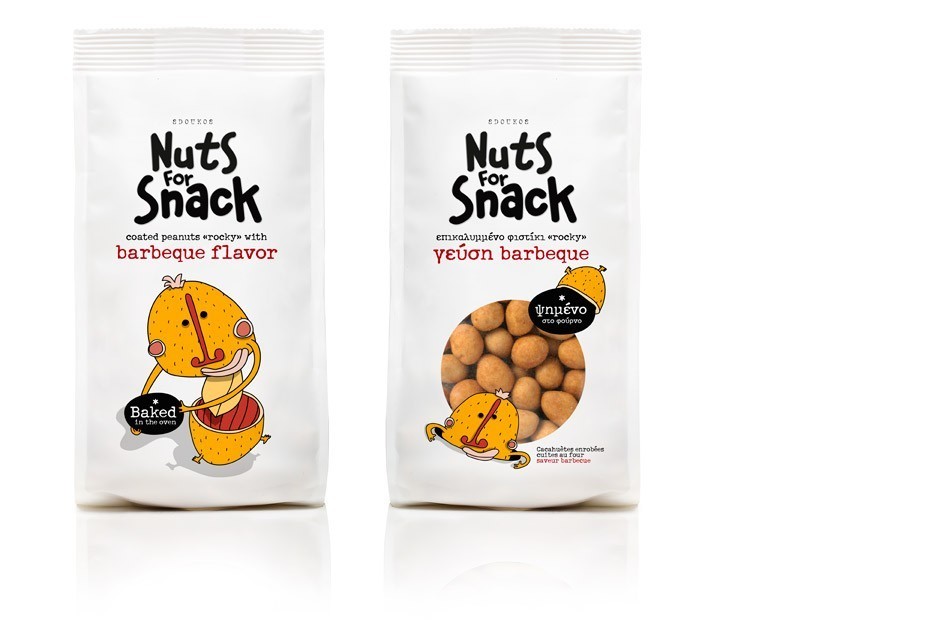
The design: Nuts can be a lot of fun and also have high nutritional value especially when oven-baked as in this case. We decided to opt for a consumer – friendly, casual looking yet careful approach, to combine both attributes in the best possible way. We developed the “Nuts for Snack” product name which plays on the double meaning of the word “nuts”; To “go crazy” over a type of food so as to make it a daily small nibble ritual – a snack must – and the actual meaning. We worked on the packaging design with an emphasis on illustration. We assigned this project to a collaborator who has worked with urban graffiti and fanzine illustration leading us to decide on several cartoon-like characters. Both cute and awkward, in funky, nut-related color schemes, these characters are assigned to the different product flavors and ultimately ‘communicate’ in a globally recognized urban jargon.
CREDIT
- Agency/Creative: Mousegraphics, Athens
- Article Title: Mousegraphics – Nuts for Snacks
- Project Type: Packaging
- Substrate: Plastic


