


Urban. Funky. Cool. Modern. Edgy. That’s what they wanted. ALDI China approached us to create a name, brand and packaging for a new Western Ready Meal range, to be sold in their Shanghai stores. The range, all about convenience, is targeted at young Chinese professionals who live a fast-paced life and are always on-the-go. They are more experimental than their seniors and go against traditional norms when it comes to food.
These meals are easy; they can be eaten straight from the pack. Created for people that have important and busy lives, that need something quick and convenient. The consumer can eat whatever they want, whenever they want, wherever they want. From this concept came the brand name Urban Eaters.
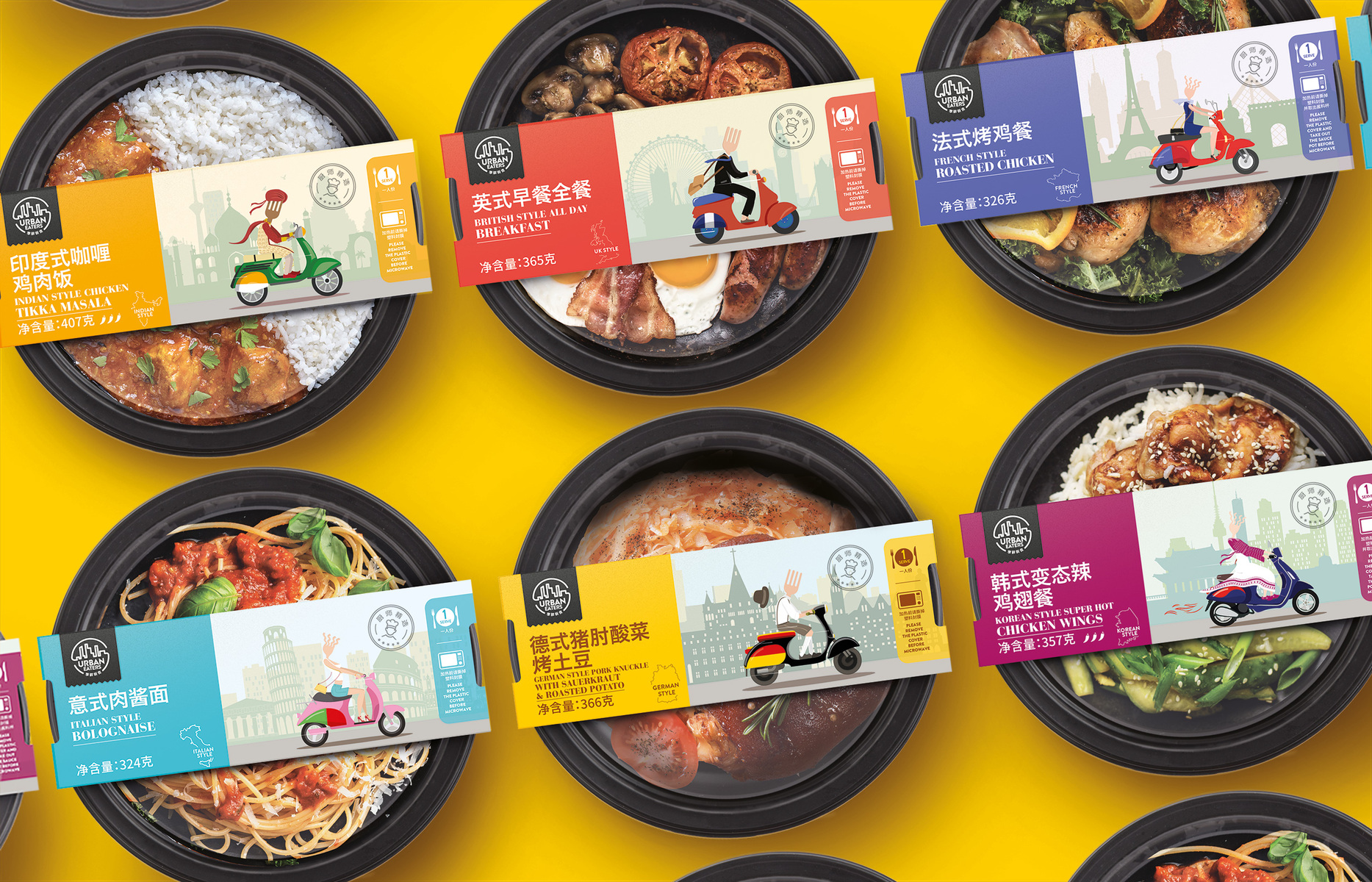
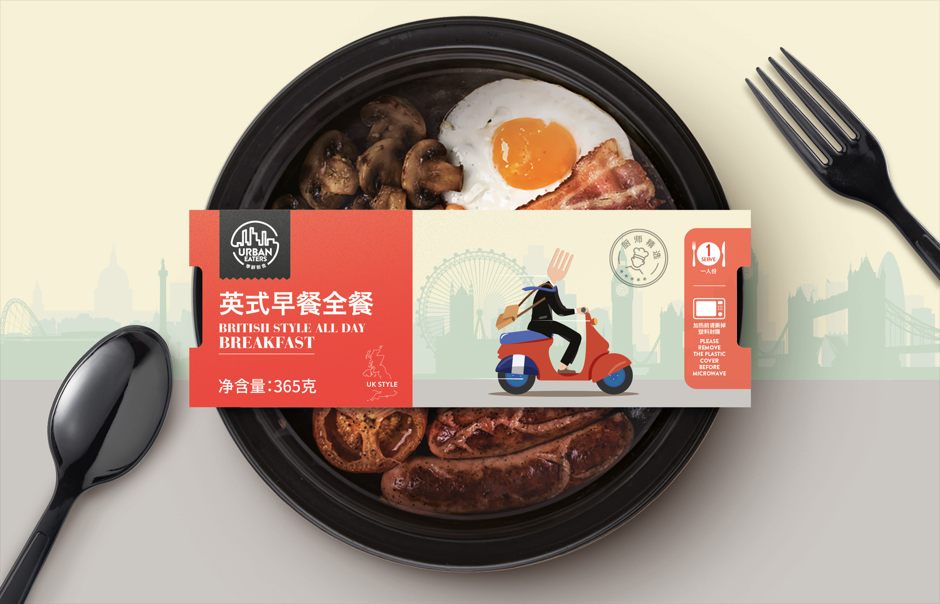
The logo Mark is sleek and minimalistic. It gives that modern feel that is key in this brand. Its simplicity reflects the convenience of the meals. The cityscape supports the Urban Eater brand name.
Introducing the raising A-listers, ‘Fork Man’ and ‘Fork Woman’. A fork is a universal symbol for food and eating. It reflects the western food and also shows a cultural change in China’s younger generation, who are more likely to use a fork over the traditional chopsticks as it is more convenient.
To reflect the origin of each meal our creative team incorporated famous western backdrops, tailored typography and dressed the fork characters according to their countries stereotypical dress. We have all seen those famous shots of hundreds of scooters at busy Chinese junctions, they are a cultural cornerstone, with millions in Shanghai alone. The moped simultaneously represented the on-the-go Chinese audience as well as the country of each meal by using their flag colour schemes. The graphics are fun, quirky, entertaining, and consumers look forward to seeing the next one.
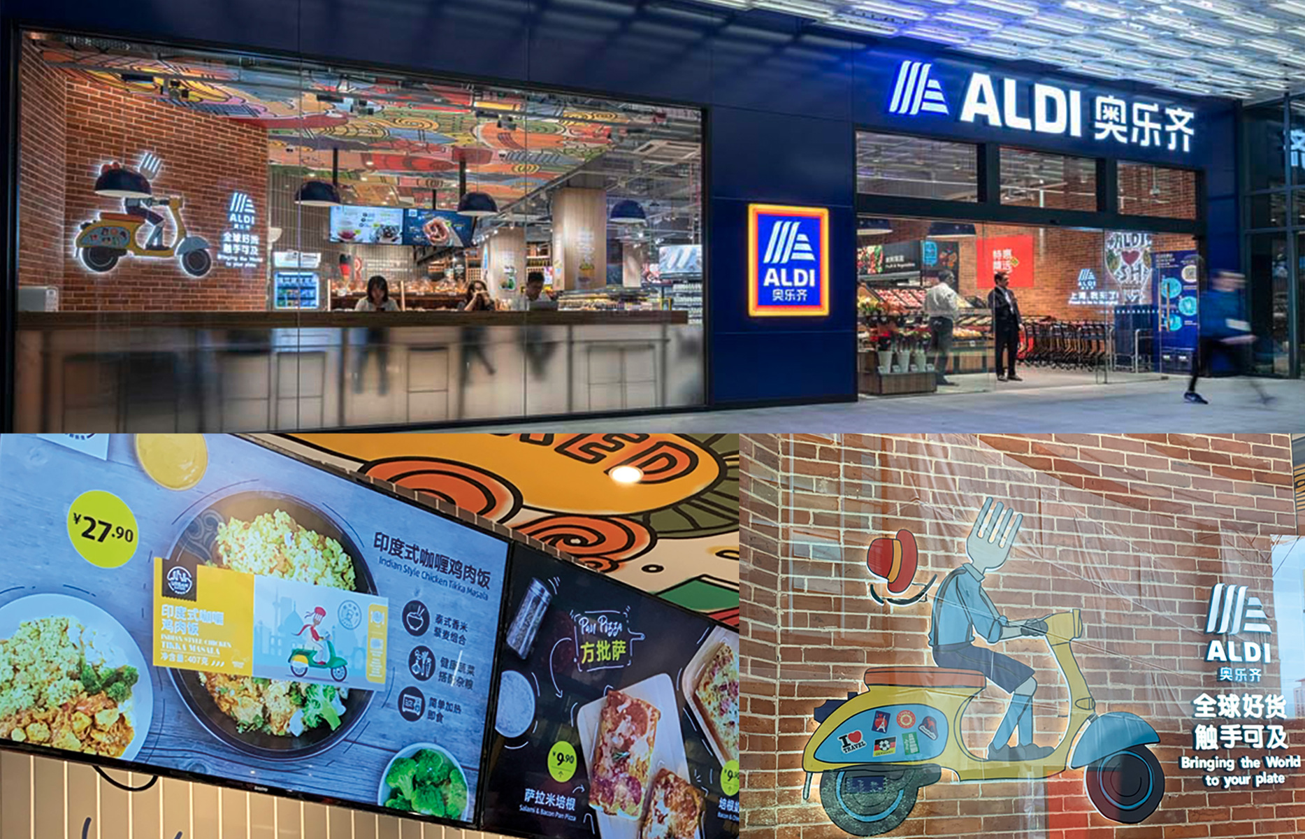
The brand creation and pack success can be measured by the brand’s success. Urban Eaters was so popular the range increased month on month, it has now more than quadrupled in size since first hitting the shelves. They loved Fork Man so much he now takes pride of place as a wall light in store… SUPER Urban. Funky. Cool. Modern. Edgy.

CREDIT
- Agency/Creative: Motor Brand Design
- Article Title: Motor Brand Design – Urban Eaters – Fork Man
- Project Type: Packaging
- Project Status: Published
- Agency/Creative Country: Australia
- Keywords: WBDS Agency Design Awards 2019/20


