Muk Haircare has and continues to be, a leading market leader in the global marketspace for haircare, styling and styling tools since its launch in 2006. Prioritising innovation and high-performance across their product range, they deliver to both professional hairdressers and consumers.
After over a decade on the shelves, we felt it was time to refresh Muk’s identity and design, elevating it to a premium-tier hair styling and care product range. The existing ‘Female Styling’ product range required revitalisation to maintain their strong market position, as well as elevate their presence in the market amongst premium competitors. Our vision for the rejuvenation of Muk was to reposition the brand as an exclusive salon.
We wanted to give the consumer the exclusive salon experience in the comfort of their own home as well as sitting pride of place in salons around the world.
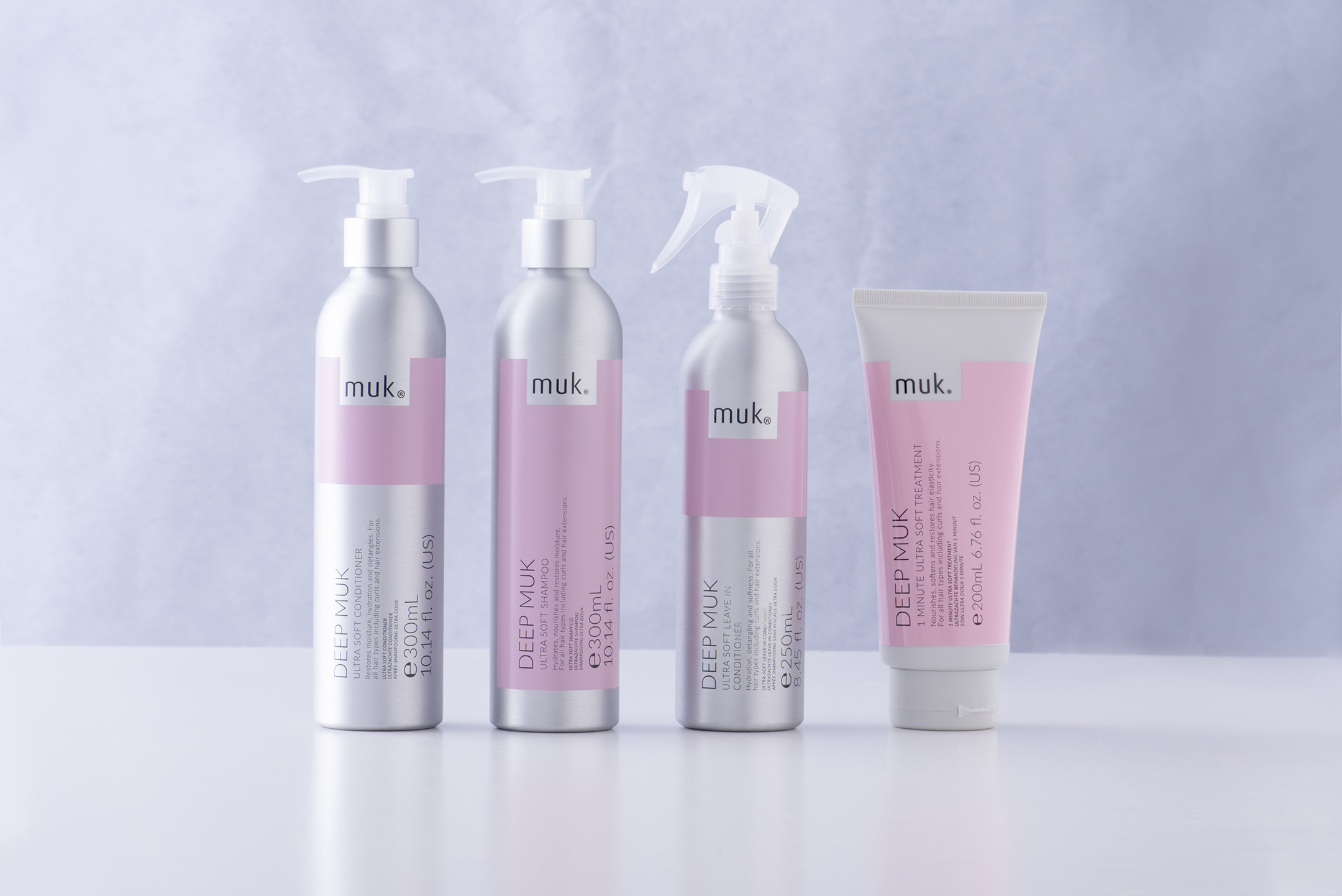
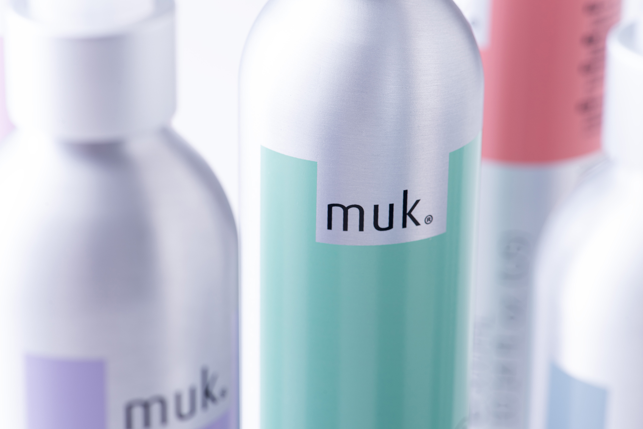
Inspiration was drawn from the minimal sophistication of deluxe cosmetic products, where packaging is stripped to the bare bones to allow for the primary focus to be on the quality of the product ingredients and benefits. This was carried across to the strategy behind the redesign, harmonising empty space to allow the brand to speak for itself.
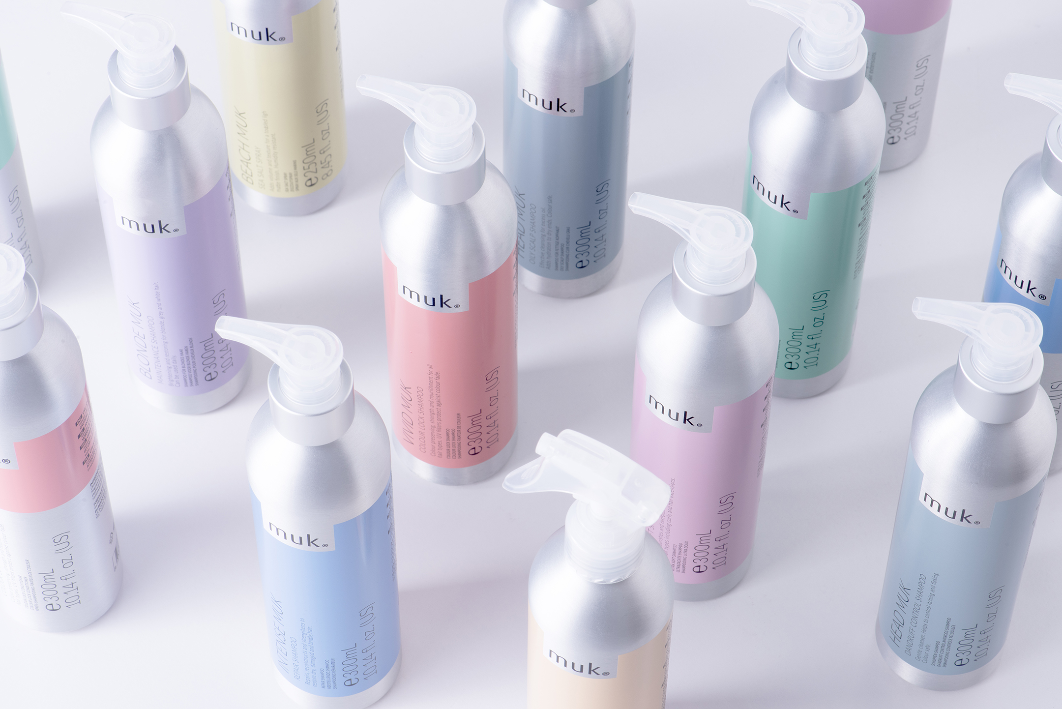
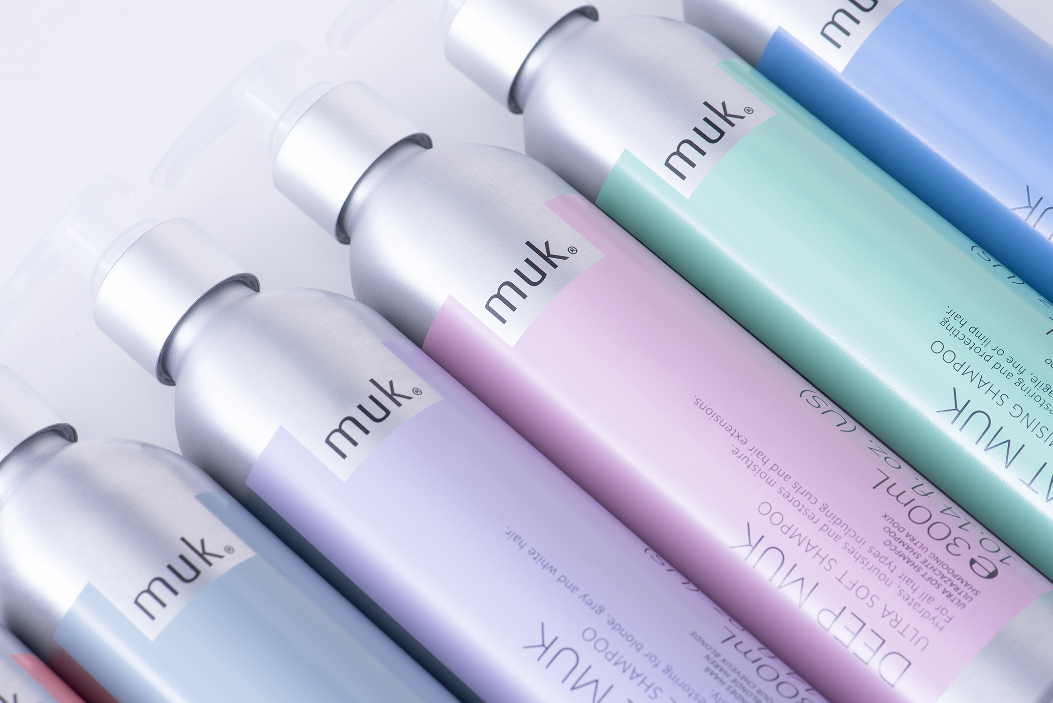
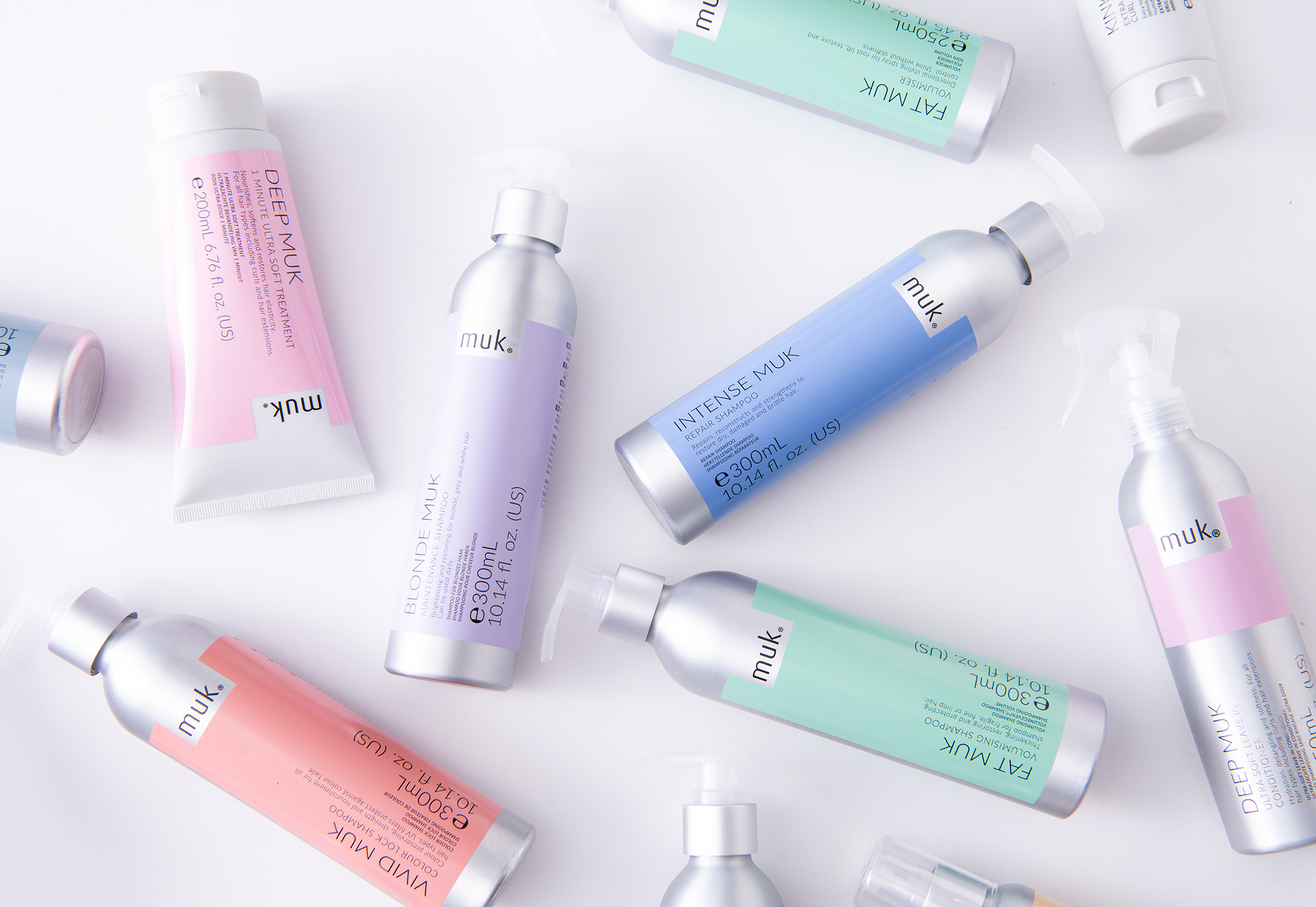
Across the ‘Female Styling’ product range, typography is positioned on a vertical plane to allow for the important information to read cleanly. Since each product is designed for different hair types and uses, some require more textual elements than others. The vertical orientation allows for consistency across the range.
The colour palette adds another layer of sophistication through the soft yet muted pastel tones, contrasting against a cool grey aluminium bottle. In addition, the tactile matte finish of the products further pushes the range towards the premium sphere of the female haircare market.
Not only have Muk been overjoyed with the rejuvenation of their products, but their customers have been even more excited to use them.
CREDIT
- Agency/Creative: Motor Brand Design
- Article Title: Motor Brand Design Refreshes Muk Haircare with Minimalist Packaging for a Premium Appeal
- Organisation/Entity: Agency
- Project Status: Published
- Agency/Creative Country: Australia
- Agency/Creative City: St Kilda
- Project Deliverables: Brand Rejuvenation, Brand Strategy, Packaging Design, Packaging Guidelines
- Industry: Beauty/Cosmetics
- Keywords: WBDS Agency Design Awards 2024/25 , Haircare, Premium, Hair Styling, Hair Health, Beauty
- Keywords: WBDS Agency Design Awards 2024/25 Haircare, Premium, Hair Styling, Hair Health, Beauty
-
Credits:
Executive Creative Director: Warren Spence
Creative Director: Barnaby Magart
Designer: Kesong Yang
Production Artist: Richard Martin
Creative Services Manager: Wre


