


RAW Crinkles — Wavy, Bold, and Full of Flavor
When RAW, Egypt’s first kettle-cooked healthy chips brand, decided to expand its portfolio, they wanted something that would bring new energy to their shelves — a sub-line that felt playful yet premium, and stood out while staying true to the brand’s roots.
That’s how RAW Crinkles was born — a new line of crinkle-cut chips designed for a generation that craves both flavor and authenticity.
The Creative Challenge
RAW already had a strong identity built around its natural, small-batch, kettle-cooked craftsmanship. But as the snack category in Egypt became increasingly competitive, the brand needed to reimagine its visual language for the Crinkles line to stand out with confidence while still feeling connected to the core brand.
The challenge was to create a packaging system that visually communicated fun, texture, and variety, yet carried the same premium, crafted feel that defines RAW.
Design Concept
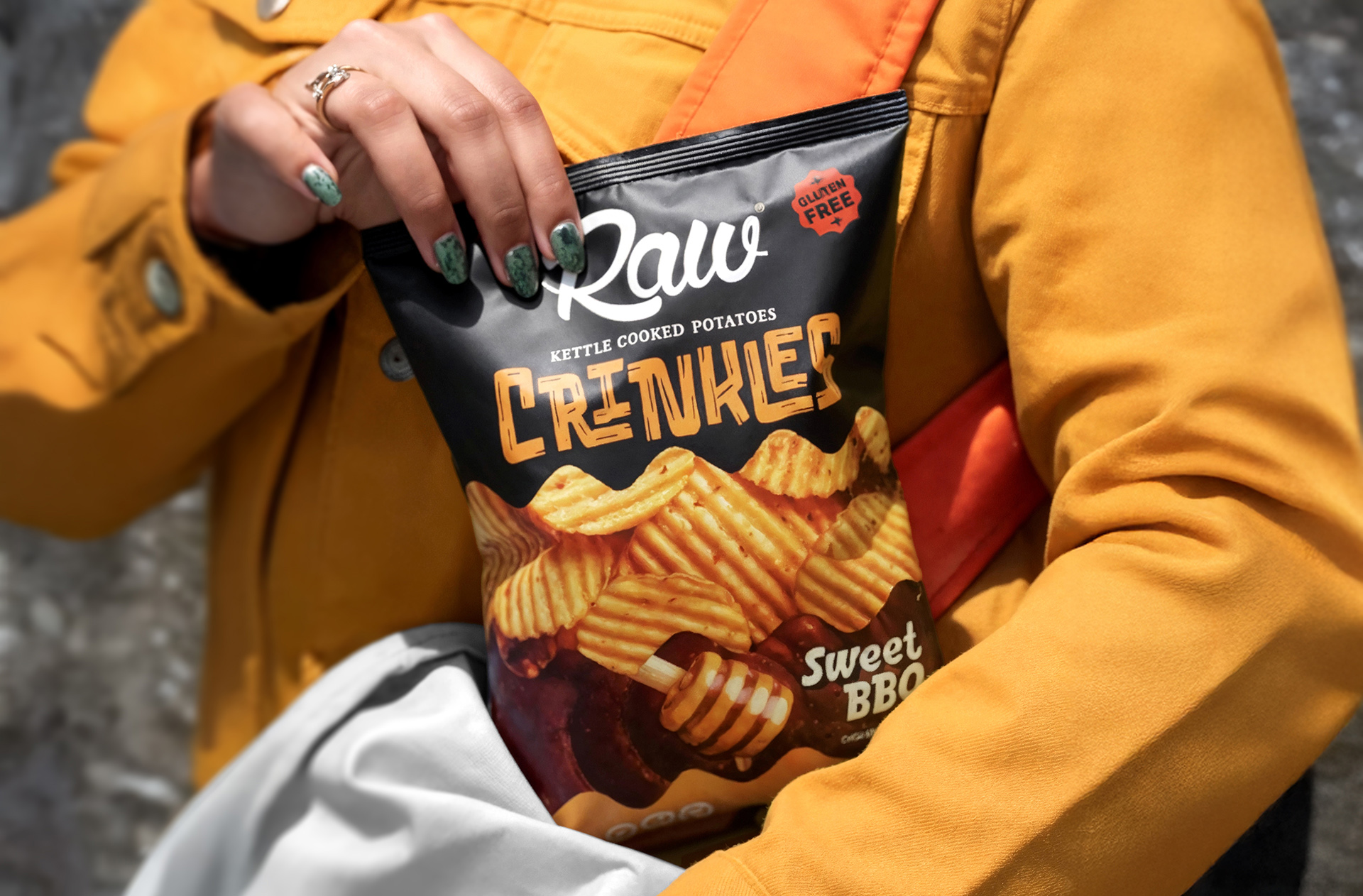
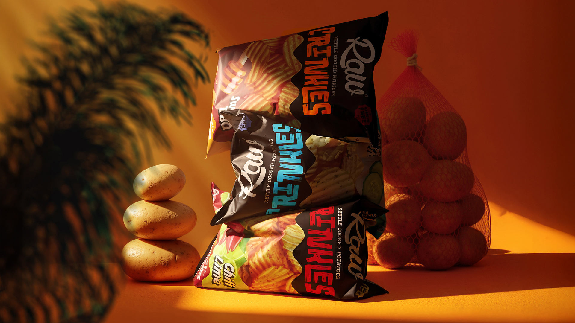
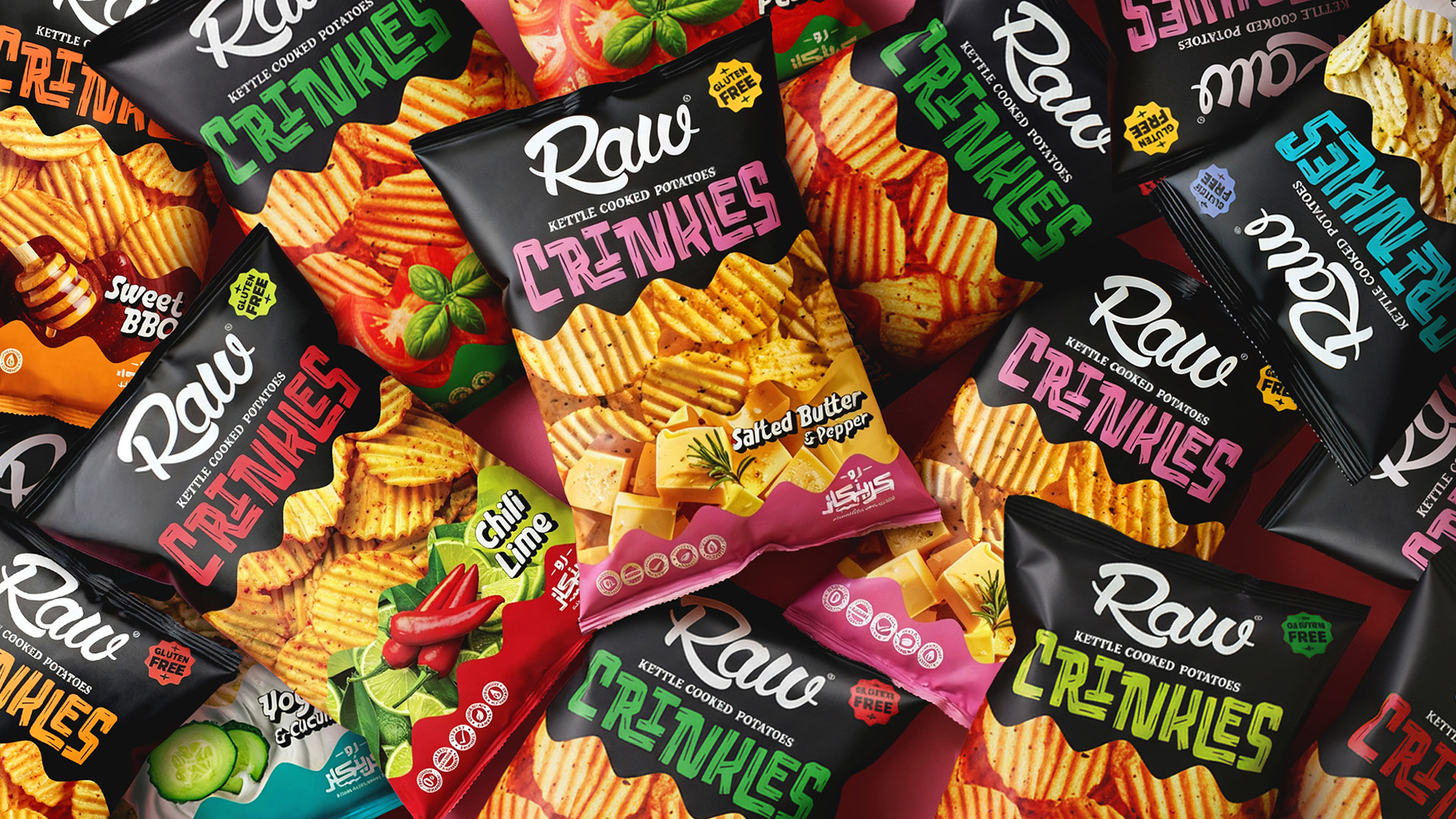
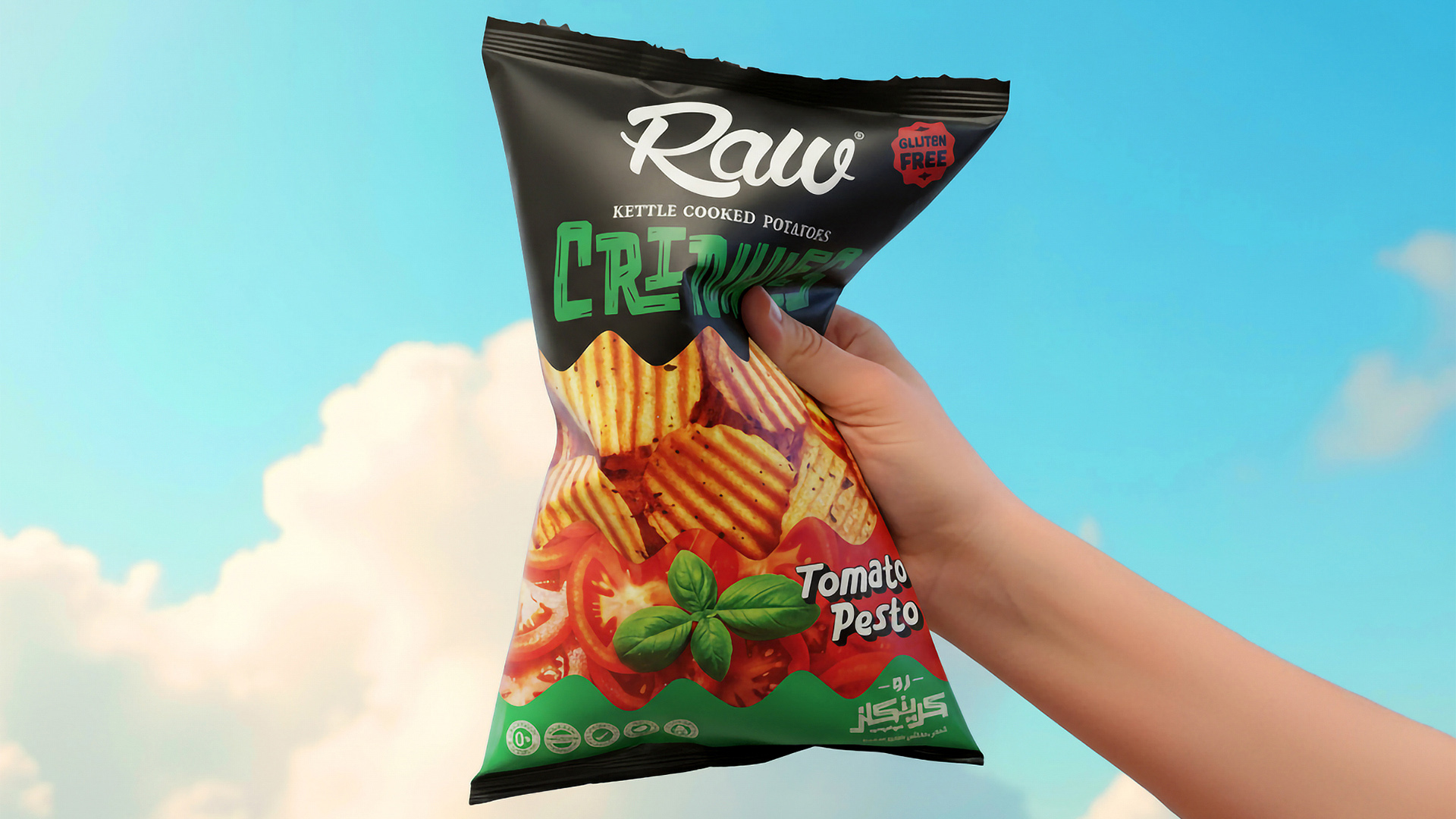
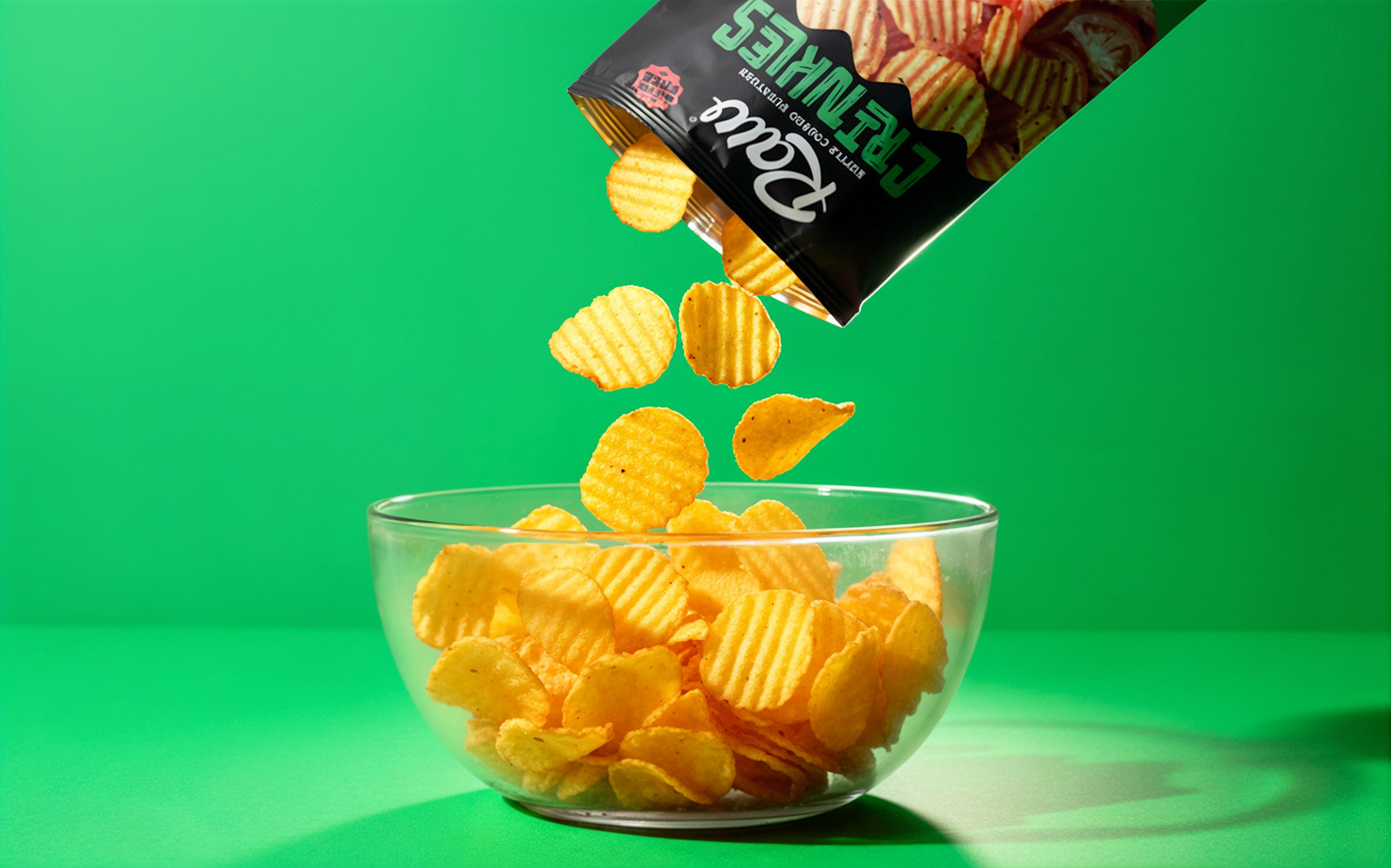
The creative idea was inspired by the crinkled wave texture of the chips themselves — that satisfying ripple that makes every bite a little more fun. This became the foundation of the design system: a flowing, wavy visual motif that moves across each pack, giving the packaging its rhythm, movement, and energy.
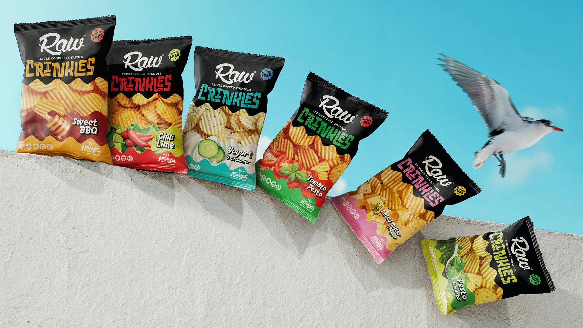
Each flavor is expressed through a bold and vibrant color palette, creating a strong shelf impact and flavor differentiation while maintaining a cohesive look across the line. The Crinkles wordmark was custom-designed to feel dynamic and handcrafted, complementing the parent RAW logo while giving the sub-line its own personality.
Typography and layout were kept clean and minimal, ensuring that the waves and colors take center stage — balancing playfulness with polish.
Flavor System
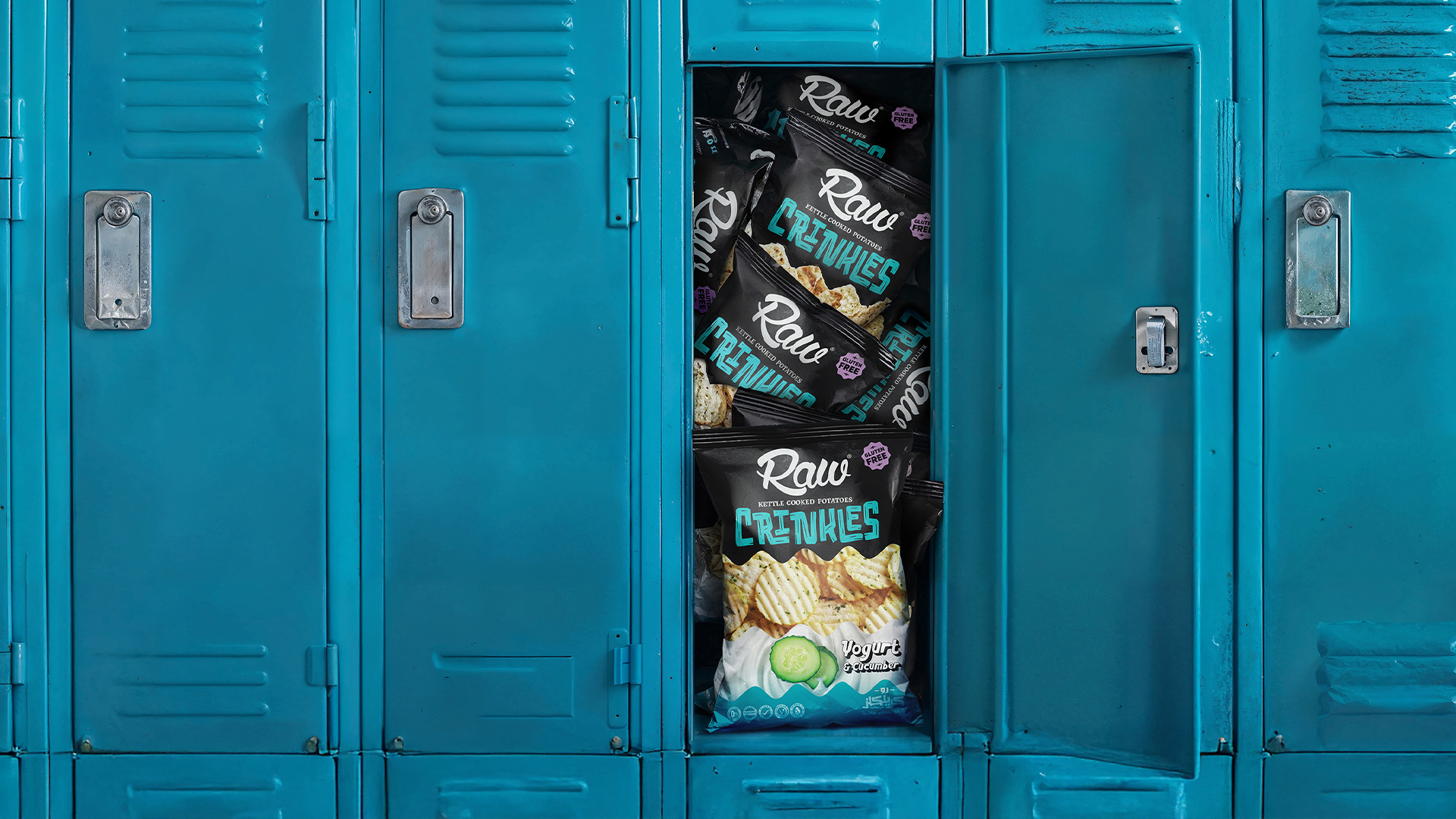
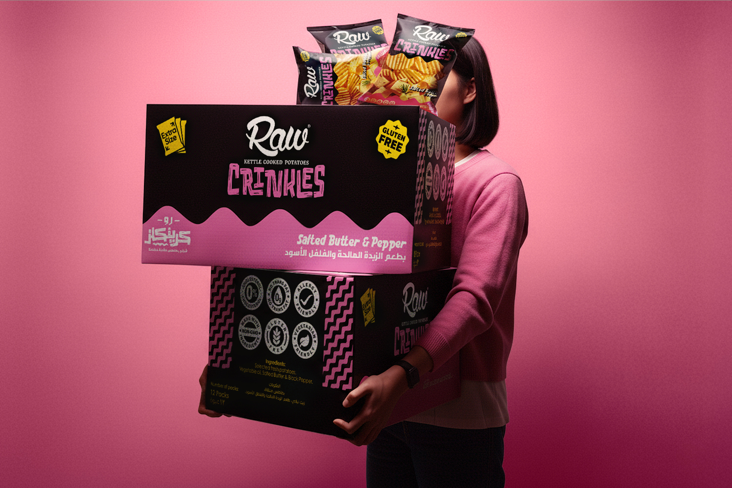
The launch lineup includes six distinctive flavors: Sweet BBQ, Chili Lime, Yogurt & Cucumber, Tomato Pesto, Salted Butter & Pepper, and Pesto & Herbs.
Each SKU is designed to reflect its flavor through both color and tone, creating a visual storytelling experience that instantly communicates taste and texture.
Result
The final design system captures everything RAW stands for — authenticity, creativity, and flavor — while infusing it with a modern, youthful energy. The wavy design not only mirrors the crinkled chips inside but also symbolizes movement, excitement, and the joy of discovery that comes with trying something new.
RAW Crinkles stands as a vibrant evolution of the brand — crafted, bold, and unapologetically flavorful.
CREDIT
- Agency/Creative: Mostafa Abdelmawla Ali
- Article Title: Mostafa Abdelmawla Ali Shapes RAW Crinkles Into a Contemporary Snack Line Driven by Color, Rhythm, and Flavor
- Organisation/Entity: Freelance
- Project Type: Packaging
- Project Status: Published
- Agency/Creative Country: Egypt
- Agency/Creative City: Cairo
- Market Region: Middle East
- Project Deliverables: Brand Design, Logo Design, Packaging Design
- Format: Bag, Pouch
- Industry: Food/Beverage
- Keywords: Chips, Packaging, Label Design, Crinkles, Colorful, kettle Cooked, Potatoes, Black, Crinkle-cut, Snacks
-
Credits:
Creative Director: Mostafa Abdelmawla Ali


