
Another great year of packaging and brand design from the commercially outstanding to the conceptually inspiring and brilliant. Delivered by the global players or up and coming talented students from around the world, we are already bracing ourselves to see what 2016 will bring.
This year we decided to highlight individuals, agencies and design works for this feature the World Packaging Design Agencies 2015. We have narrowed this selection down to 15 pieces of work that we feel deserve an honorary mention.
We would like to take this opportunity to say a big thank you to all the contributors, advertisers, editors and of course you the readers. Wishing you all a prosperous year ahead, best wishes from the World Packaging Design Society.
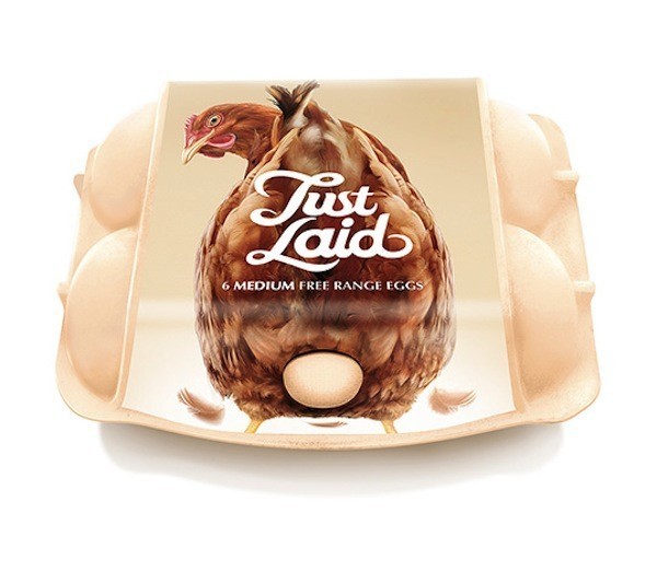
1. Springetts – Just Laid
If this doesn’t put a smile on your face then no packaging will. The cheeky playful nature, the name of the product and three variants of hen facial expressions makes this altogether unique. We think this big idea and creative execution is just genius!
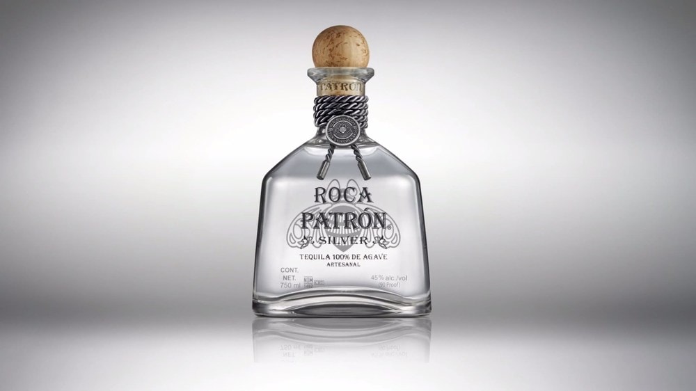
2. Pearlfisher – Roca Patrón
The balance of modernity and craft artisan cues elevates this product to superiority in a relevant and effortless way. The difference between good design and great design is surely the word effortless.
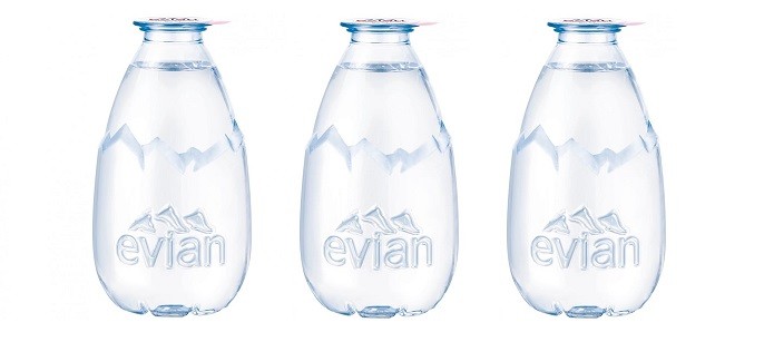
3. Grand Angle Design – La Goutte d’evian
A great interpretation of the Evian brand and clear understanding of desirability, viability and feasibility the secret ingredients for innovation.
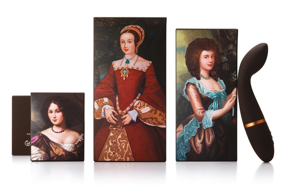
4. Williams Murray Hamm – Coco De Mer
The imaginative and explorative nature of erotica depicted through packaging and imagery of peep-holes, glory holes and seductive suggestions – who would of thought it could be so tasteful and intelligent.
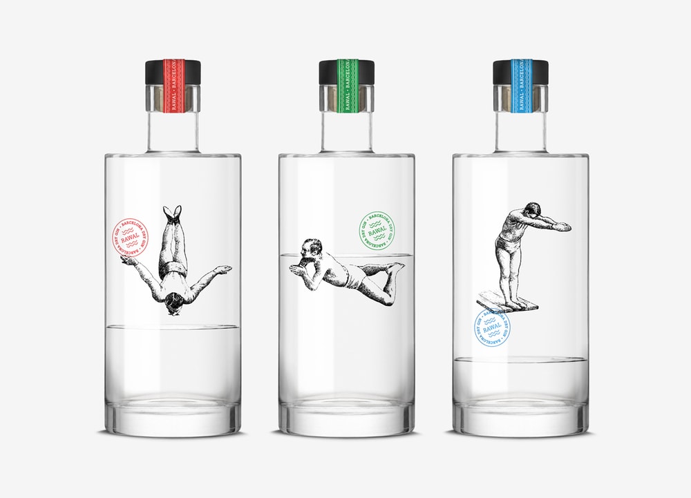
5. Dorian – Gin Rawal
A great packaging idea that provides a secondary visual interaction while the product is being consumed which is enabled by three timeless character illustrations of swimmers. Simply beautiful!
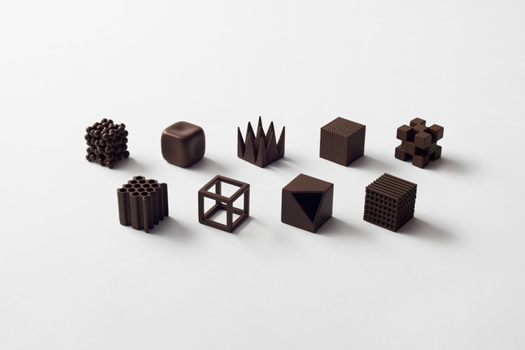
6. Nendo – Chocolatexture
No point having great packaging if you don’t have a great product idea. These intriguing and fascinating Chocolatexture products are directly named afther Japanese expressions used to describe their texture. Here the hero is the product experience that is simple framed by the packaging.
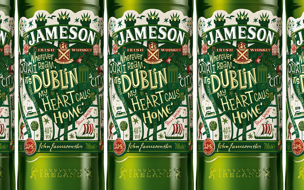
7. Steve Simpson, Design Bridge – Jameson Limited Edition Bottle
The hand lettered quotes and illustrations has a non conformist and Irish free spirited nature about it that challenges the category. It embraces and encapsulates everything that is the city of Dublin. Like St.Patricks Day the label is loud, proud and somewhat unmissable – great collaboration work.
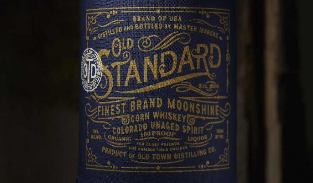
8. Chad Michael Studio – Old Standard Moonshine
Hand printed, stitched, and numbered for the local folk says it all – honest and soulful! The creative use of fabric and the print process is the real hero and essence of the product. Beautiful!
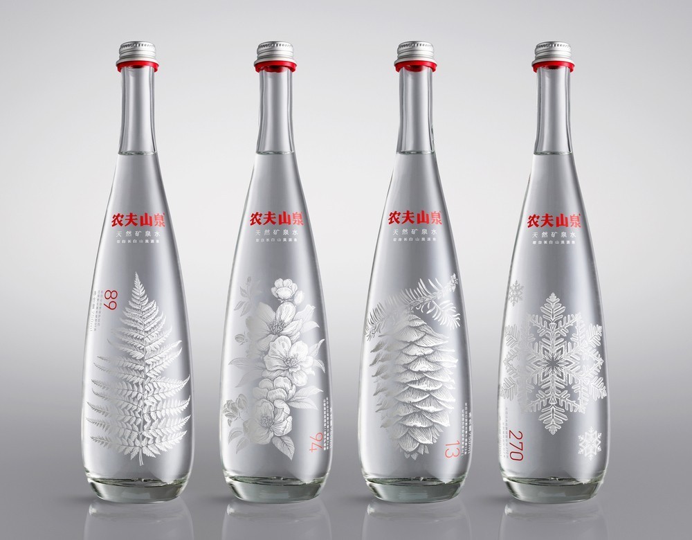
9. Horse – Nongfu Spring Mineral Water
The Nongfu Spring Mineral Water packaging is one that you remember seeing for the first time because of it’s powerful pressence, yet it also has a delicate side to it. This has been created using strong illustrations that have been elegantly placed giving space for information above and vertically below. Captivating!
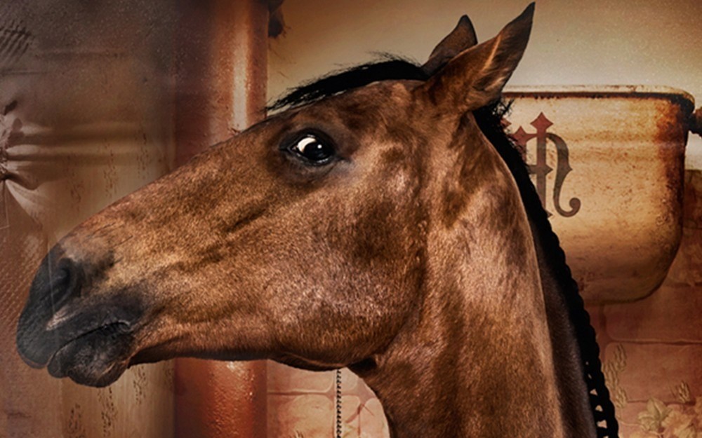
10. Proud Design – Give A Shit Horse Manure
Playful copy and pure silliness but who wouldn’t want to see these products at their local garden centre down the road. A concept hoping to be pushed forward if their is enough interest – it gets our shovel vote!
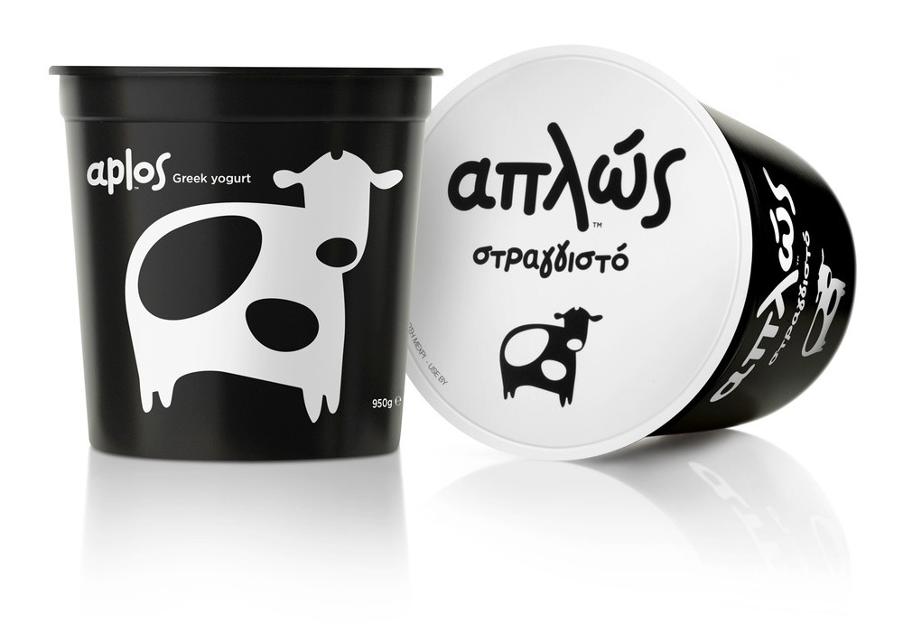
11. Mousegraphics – Aplos
Challenging a category through simplicity,
cost effectiveness and great design.
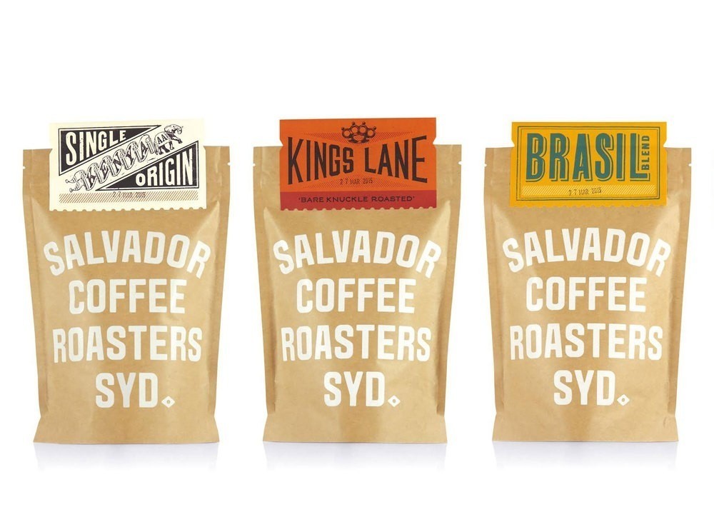
12. Co Partnership – Salvador Coffee
The strong brand presence and the versatility of this product range is pretty impressive. So strong is the branding the simplicity, flexibility and cost effectiveness of the packaging system is easily over looked – when it should be a applauded.
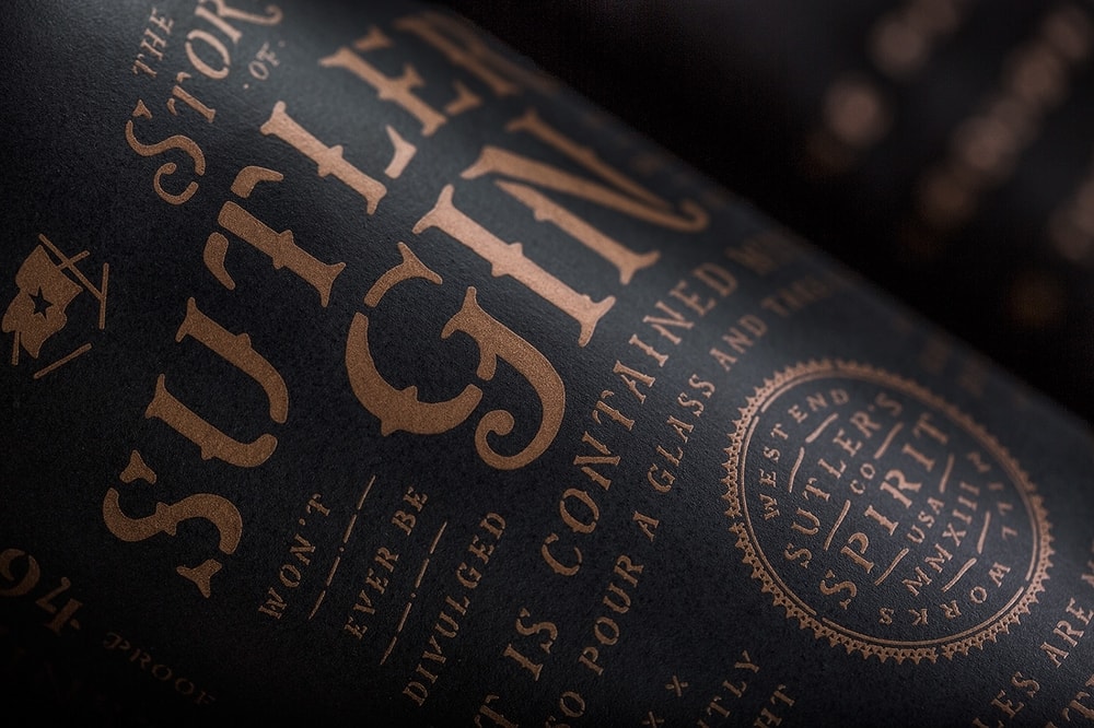
13. Device Creative Collaborative – Sutler’s Spirit Co.
One of the most complete projects of 2015, the attention to detail is overwhelming. Device Creative Collaborative have gone out of their way to capture emotional intensity through ceramic textures and contrasting metallic screen-printed tones – modern with a twist of old school.
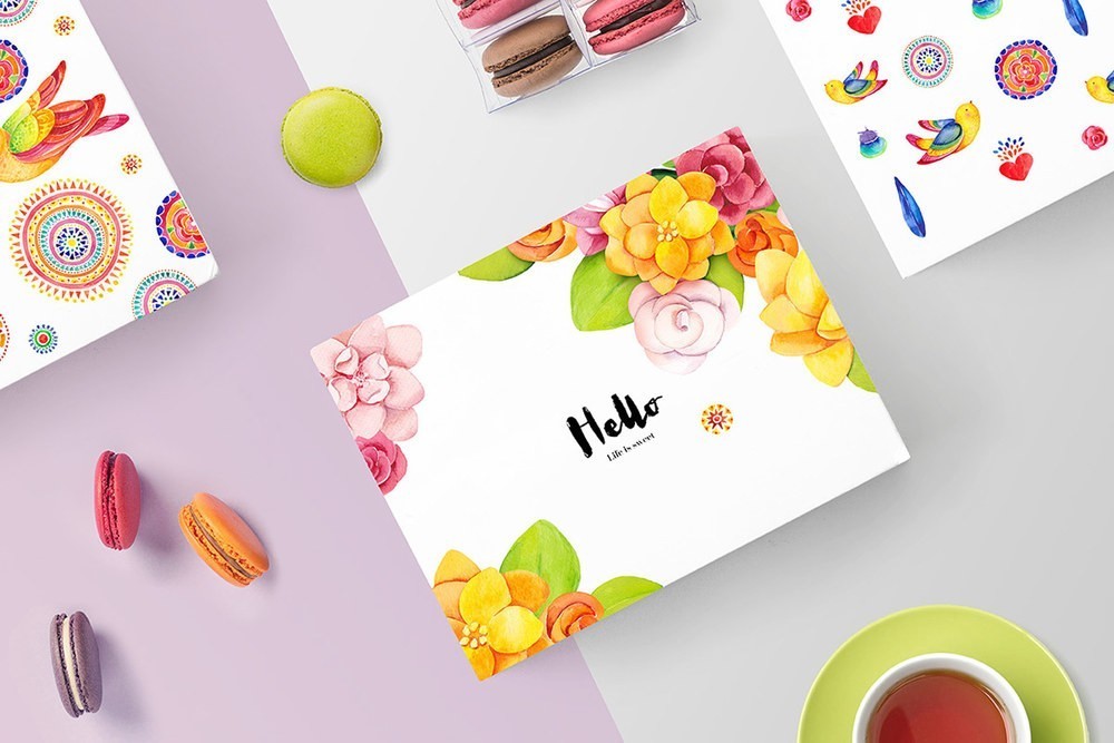
14. Sonice Design – “Life is sweet” Macarons
Although just a concept it’s hard to remember seeing such a vibrant and moving illustration that can put you in a good mood simply by having the pleasure of seeing it. Totally memorised through the honesty of colour.
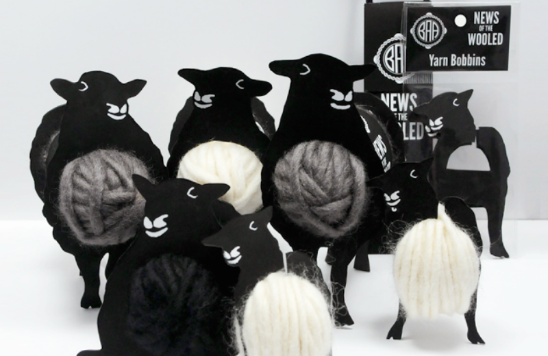
15. Gwyn Lewis – News Of The Wooled
What a wonderful idea that has captured a lot of attention and for good reason too. It’s a great example of how to add value where packaging can play an important role in merchandising the product.
Agencies
World Packaging Design Agencies 2017
World Packaging Design Agencies 2016
World Packaging Design Agencies 2015
Students
World Packaging Design Student 2017
World Packaging Design Student 2016

CREDIT
- Article Title: World Packaging Design Agencies 2015
- Project Type: Packaging
FEEDBACK
Relevance: Solution/idea in relation to brand, product or service
Implementation: Attention, detailing and finishing of final solution
Presentation: Text, visualisation and quality of the presentation


