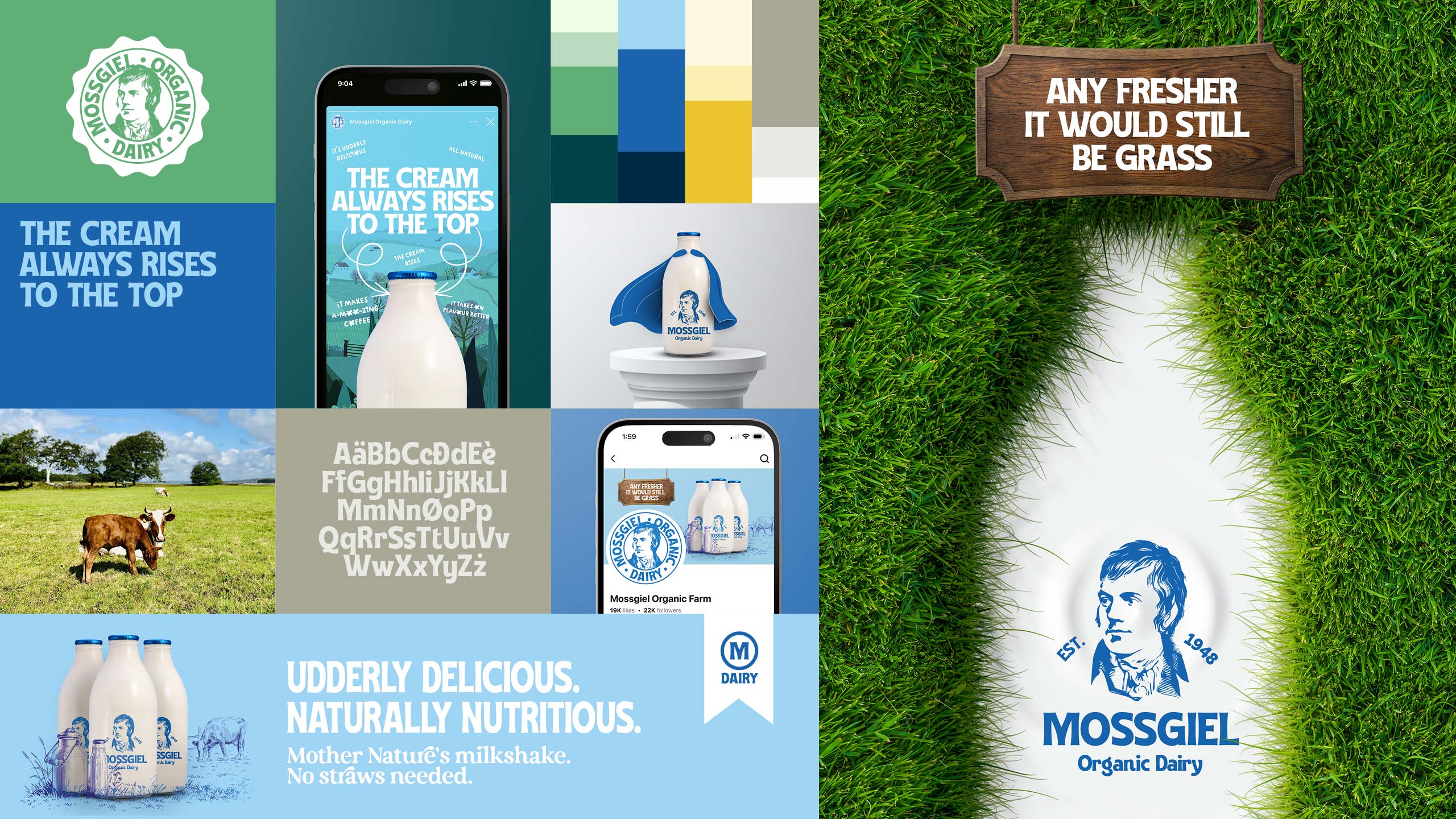
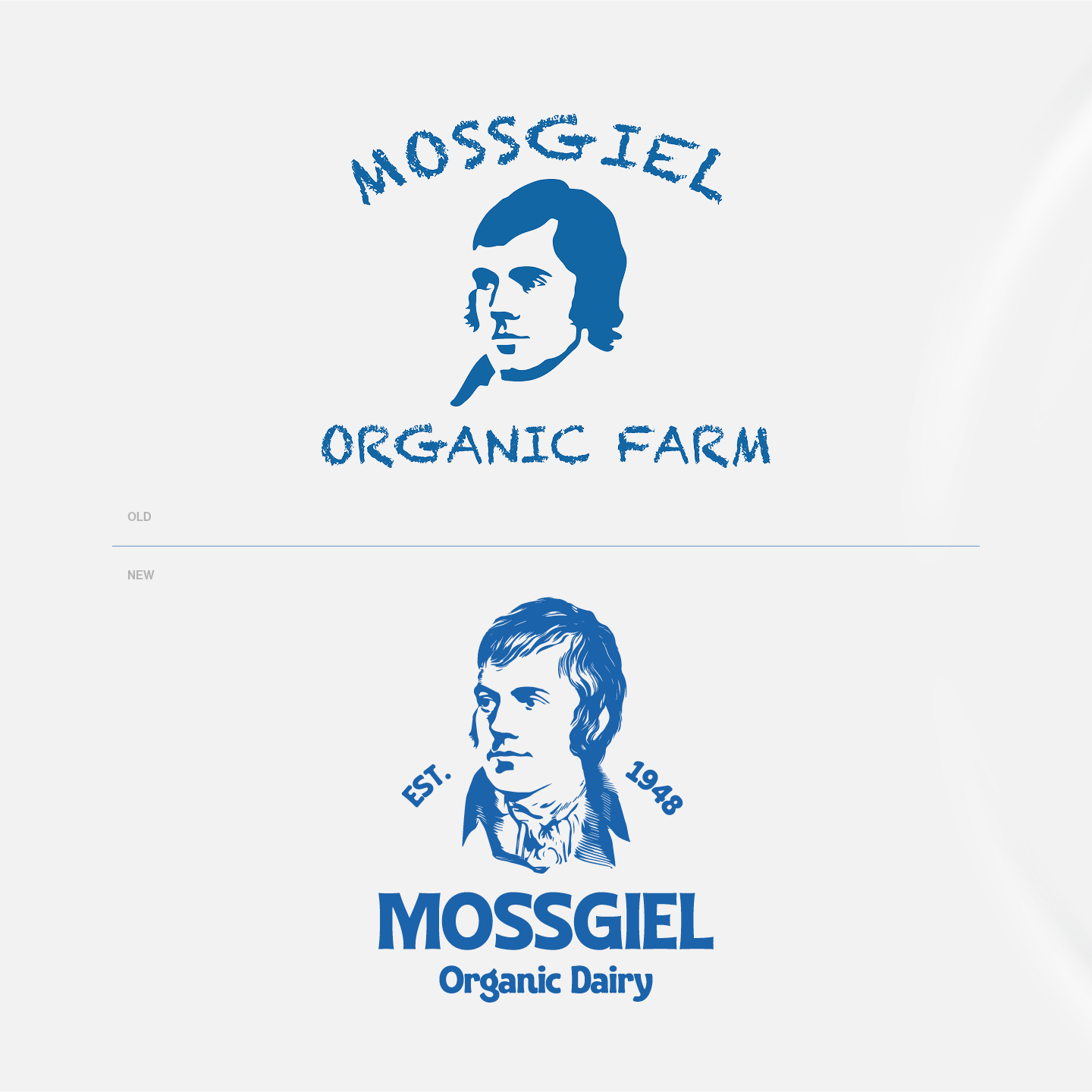
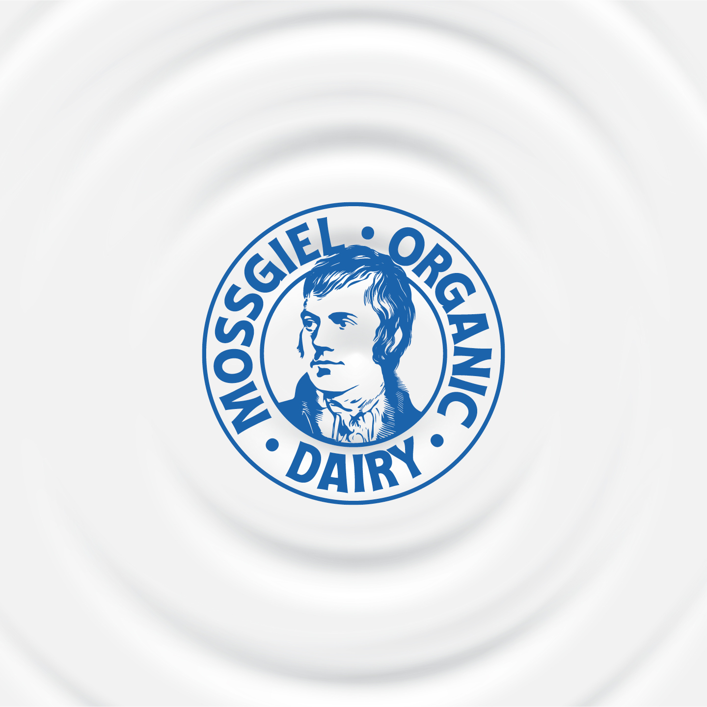
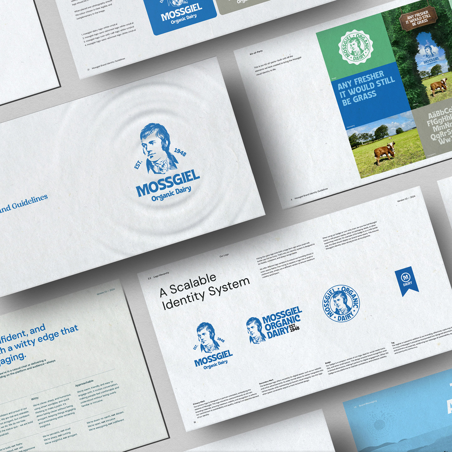
Our refresh of Mossgiel Dairy focused on breathing new life into the brand while staying true to its rich heritage. At the heart of this update was the iconic image of Robert Burns, which we completely redrew to be more polished and instantly recognizable. This modernized illustration maintains the brand’s historical connection while ensuring it resonates with today’s audience.
Typography played a crucial role in our refresh. The original design featured a chalk-style font that, while charming, presented legibility challenges. We replaced it with a robust, bold typeface that strikes the perfect balance – it’s clearly readable while retaining a handmade, artisanal appeal that reflects the craft and care Mossgiel puts into their dairy products.
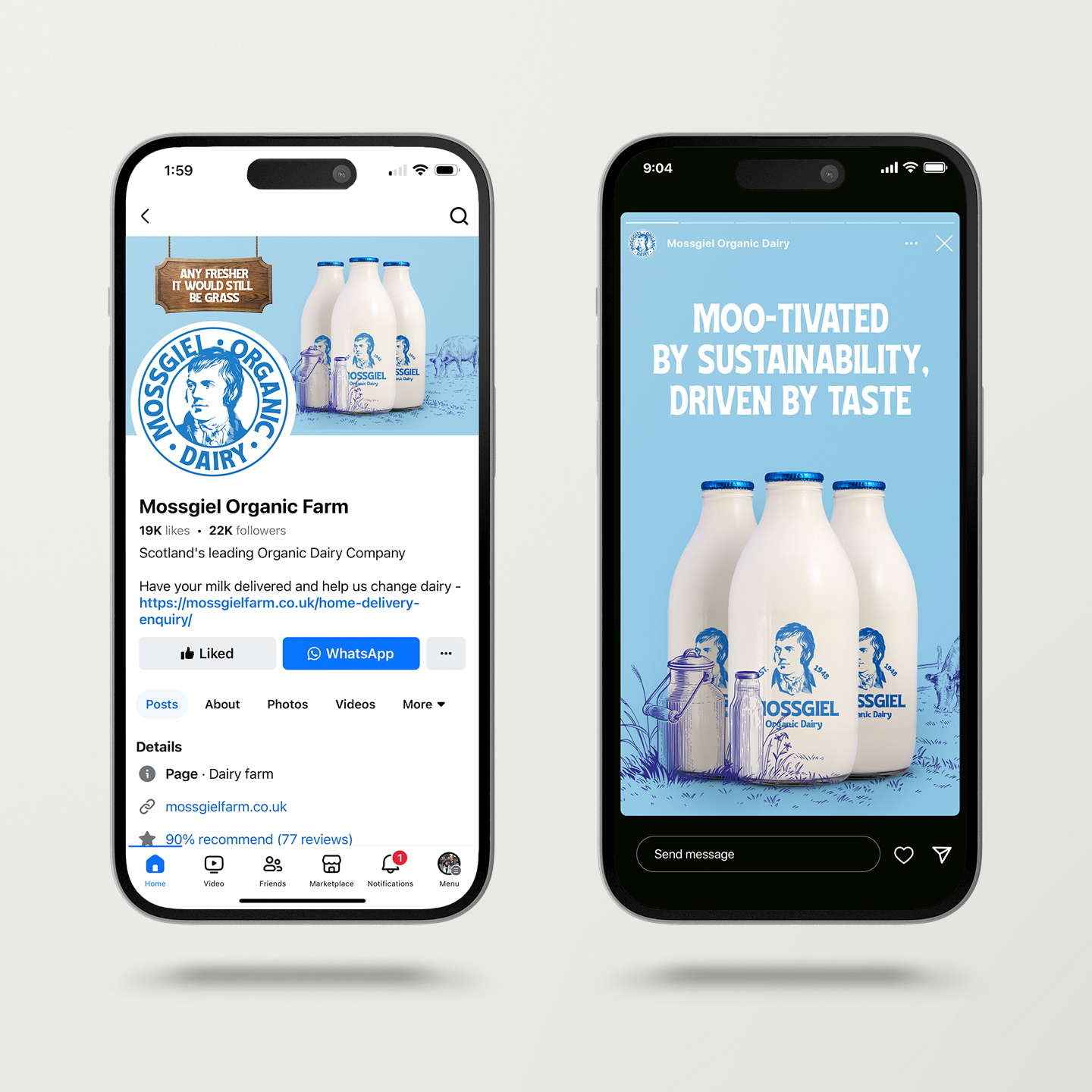
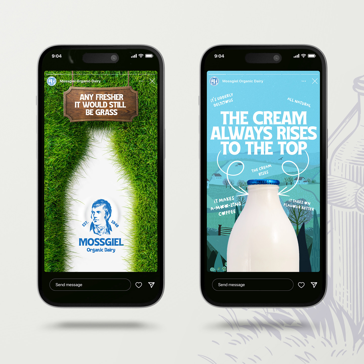
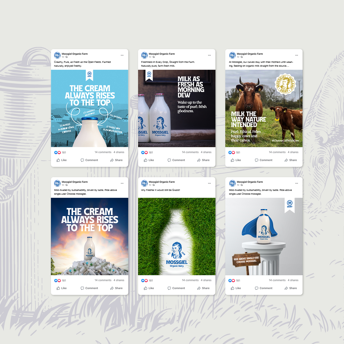
We injected personality into the brand through playful, dairy-themed messaging. Our new tagline, “The cream always rises to the top,” cleverly references both the authentic cream-top milk bottles and the premium quality of Mossgiel’s products. We’ve woven in delightful wordplay throughout the brand communications, such as using “udderly” instead of “utterly,” creating a fun, approachable tone that never forgets its dairy roots.
The imagery style evolved to tell a richer story. We’ve created a dynamic visual approach that combines authentic photographs of the dairy’s cows with playful, hand-drawn illustrations. These illustrations are thoughtfully interwoven with the photography, adding charm and personality to the brand while creating a distinctive and ownable visual style. This combination effectively showcases the real farm experience while adding a layer of warmth and approachability to the brand.
Through this refresh, we’ve successfully crafted an identity that feels both traditional and contemporary, premium yet approachable, and above all, authentic with a playful twist. The updated Mossgiel Dairy brand preserves its cherished heritage while stepping confidently into the modern era, improving functionality and adding personality without losing sight of its roots in Scottish dairy farming tradition.
CREDIT
- Agency/Creative: Mick McCabe Design
- Article Title: Mossgiel Dairy Rebrand by Mick McCabe Design
- Organisation/Entity: Freelance
- Project Type: Identity
- Project Status: Published
- Agency/Creative Country: United Kingdom
- Agency/Creative City: Kilmarnock
- Market Region: Europe
- Project Deliverables: Advertising, Brand Creation, Brand Guidelines, Brand Identity, Brand Redesign, Copywriting
- Industry: Food/Beverage
- Keywords: Rebrand, Dairy, Milk, Logo, Sustainability, Graphic Design, Social, Messaging
-
Credits:
Designer: Michael McCabe


