Omdesign – Aguardente Mosca
José Maria da Fonseca, a Portuguese wine producer with almost 2 centuries of history, relaunched, in 2018, the Aguardente Mosca (brandy), an old icon in Portugal, which returns to the market 30 years later.
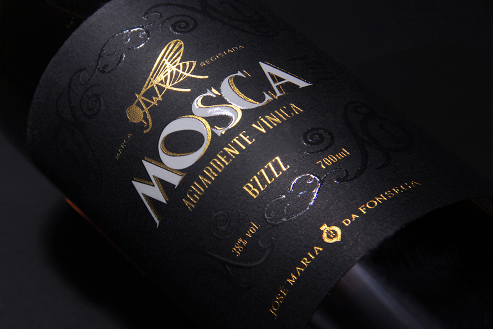
Mosca rebranding was signed by the hands of Omdesign that took care to preserve all the tradition of the emblematic José Maria da Fonseca, consolidating their know-how in the production of fortified wines.
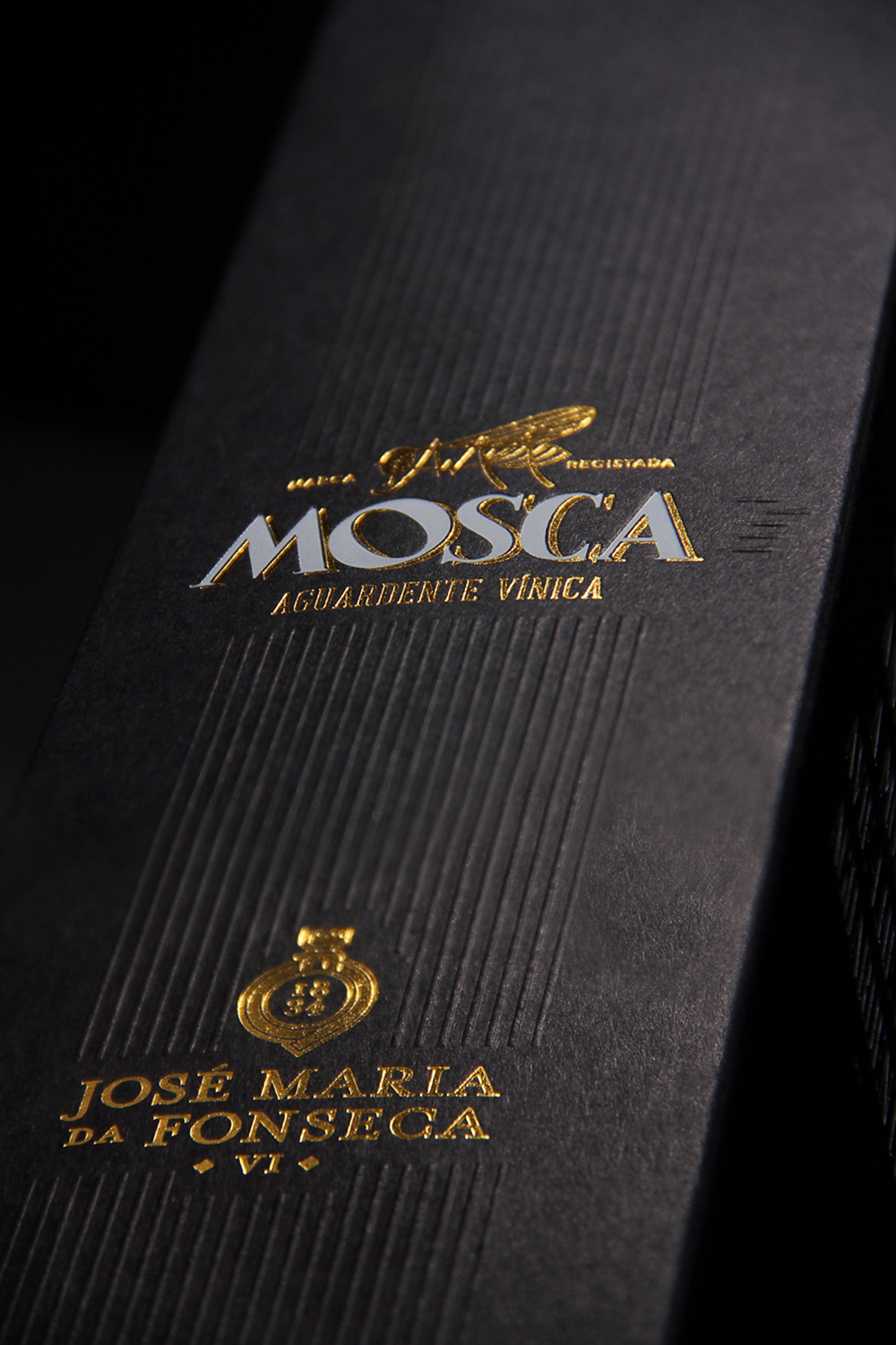
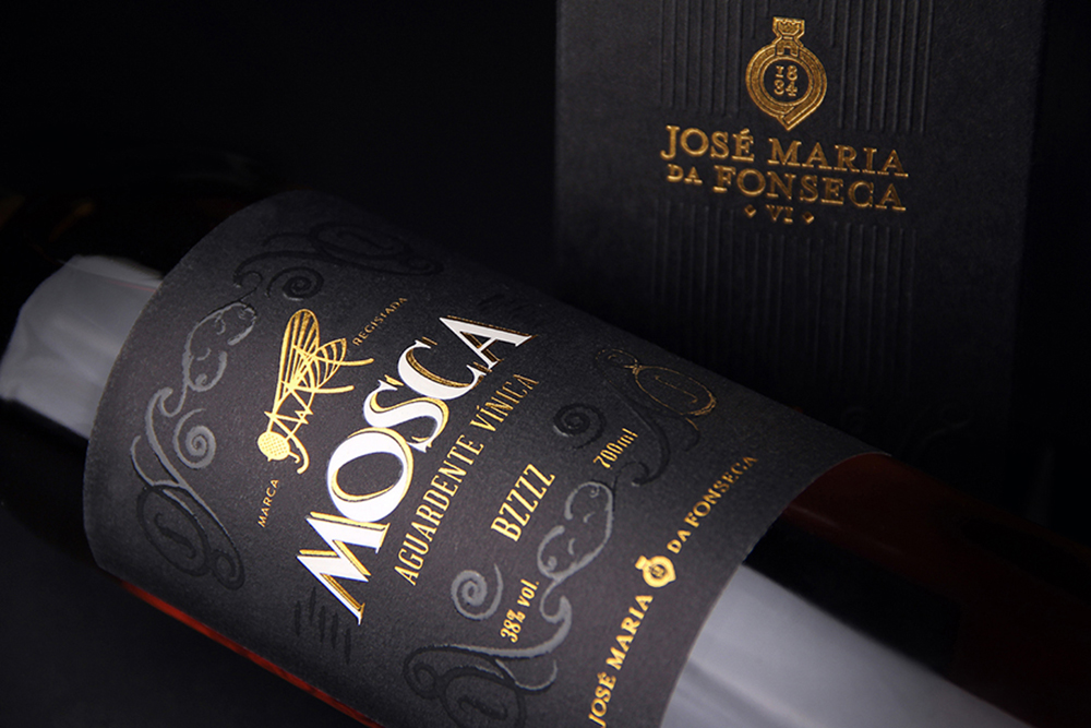
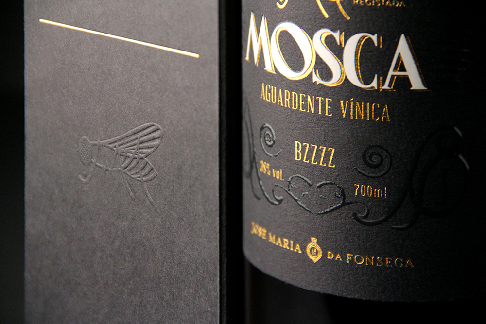
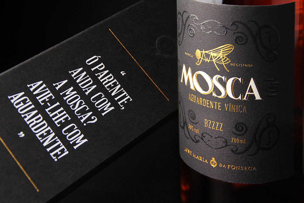
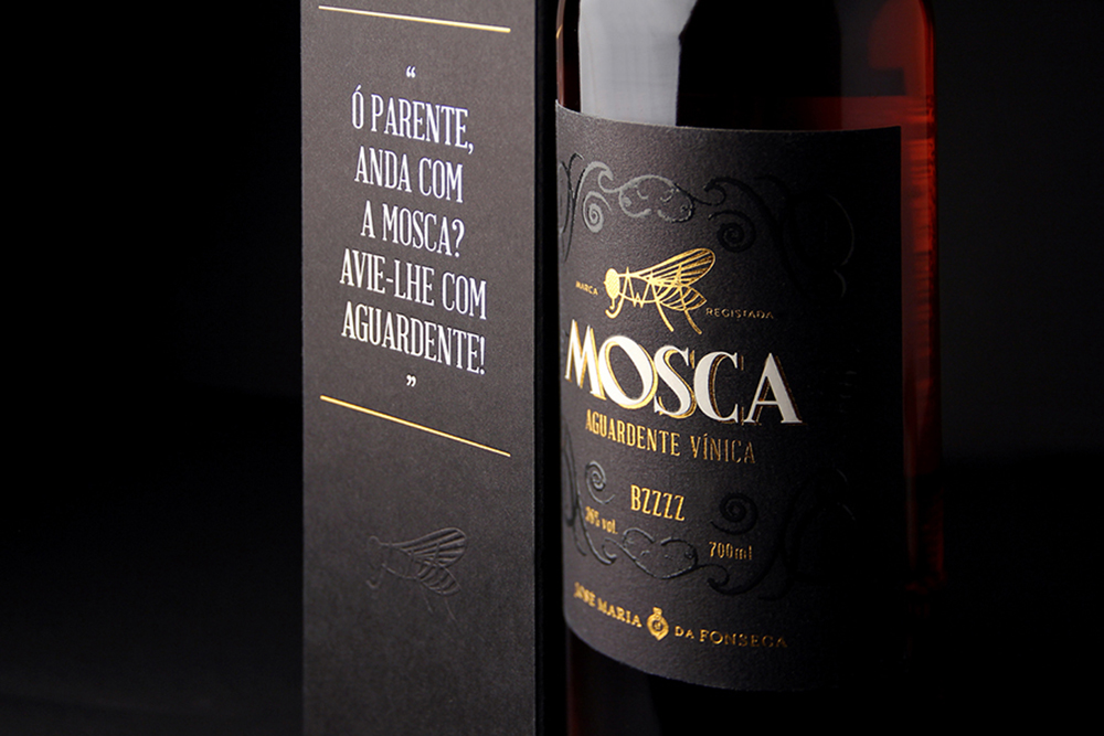
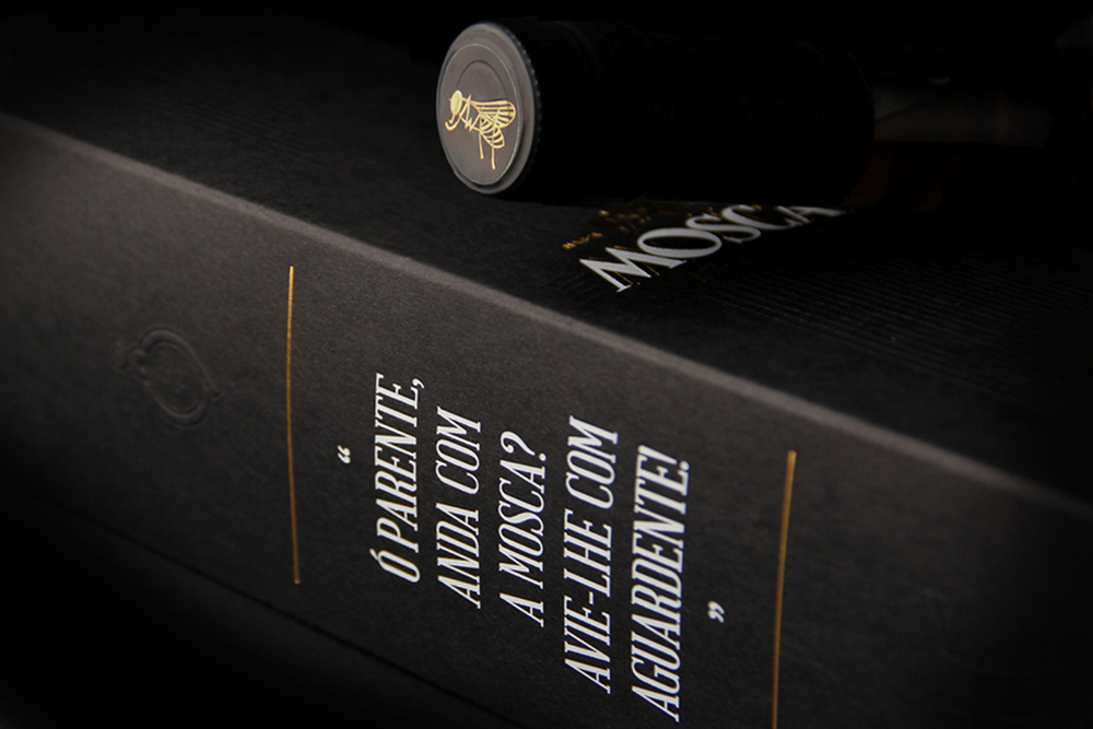
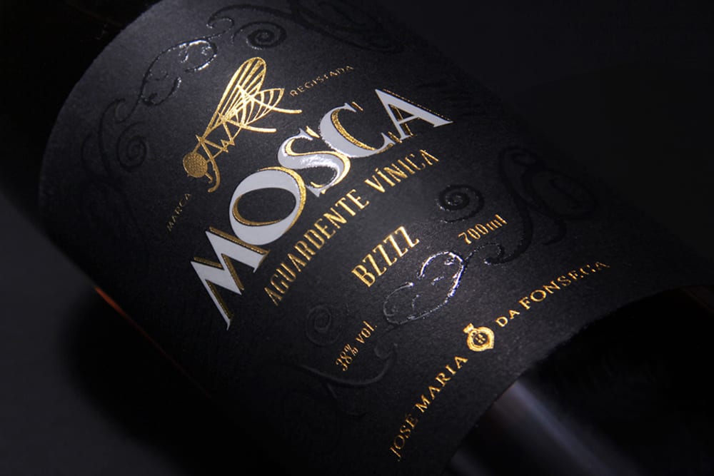
To the creative agency, the challenge was to totally renew Mosca’s image, giving the modernity this relaunch demanded. The labelling and packaging were updated and rejuvenated, combining the chromatic universe with distinctive finishes as high relief, varnishes and stampings, that make the Mosca, simultaneously, a classic and trendy drink.
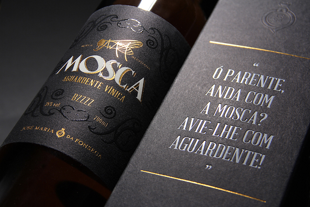
The fly (“mosca” in Portuguese) symbol acquired major prominence on the label and packaging, with the contrast of gold on the black background, and the onomatopoeia “BZZZZ” reinforced the new positioning the brand wants to adopt from now on, becoming closer to their target and of a younger public. The new packaging is also a call to action to consumers throughout the Portuguese expression (“Ó parente, anda com a mosca? Avie-lhe com aguardente!”) that invites them to taste Mosca.