Family (and friends) helps to radically revitalise brand identity for Mornflake Mighty Oats. Mighty in name and nature.
Building 21st century relevance for the only UK company with 15 generations’ worth of knowledge, who continue to pioneer ‘positive energy for people and planet’ in equal measure.
Morning Foods is one of Britain’s oldest family businesses, having been milling oats since 1675. For generations the company, through feast, famine, war and peace, has been making core staples like porridge oats, oat bran and oatmeal under the Mornflake brand, created back in the 1940’s.
There’s huge and proven health benefits of combining oats into our diets; lowering cholesterol, maintaining a healthy heart that provides a great source of fibre and positive energy for our bodies.
Mornflake approached Family (and friends) to review their packaging range to ensure the brand looked both premium and relevant, especially in the minds of younger consumers.
But how do you go about adding real value to commodity goods?
It soon became clear that the brand’s positioning and image needed a deep review – not only to avoid being seen simply as a heritage brand, but importantly, to elevate and communicate the company’s genuine commitment to pioneering ethical and environmental goals.
The Cheshire based company has a mission to be the most ecological oats producer in the UK, if not the world, using its own wind turbine and solar power, and by definition, can claim to be carbon neutral millers.
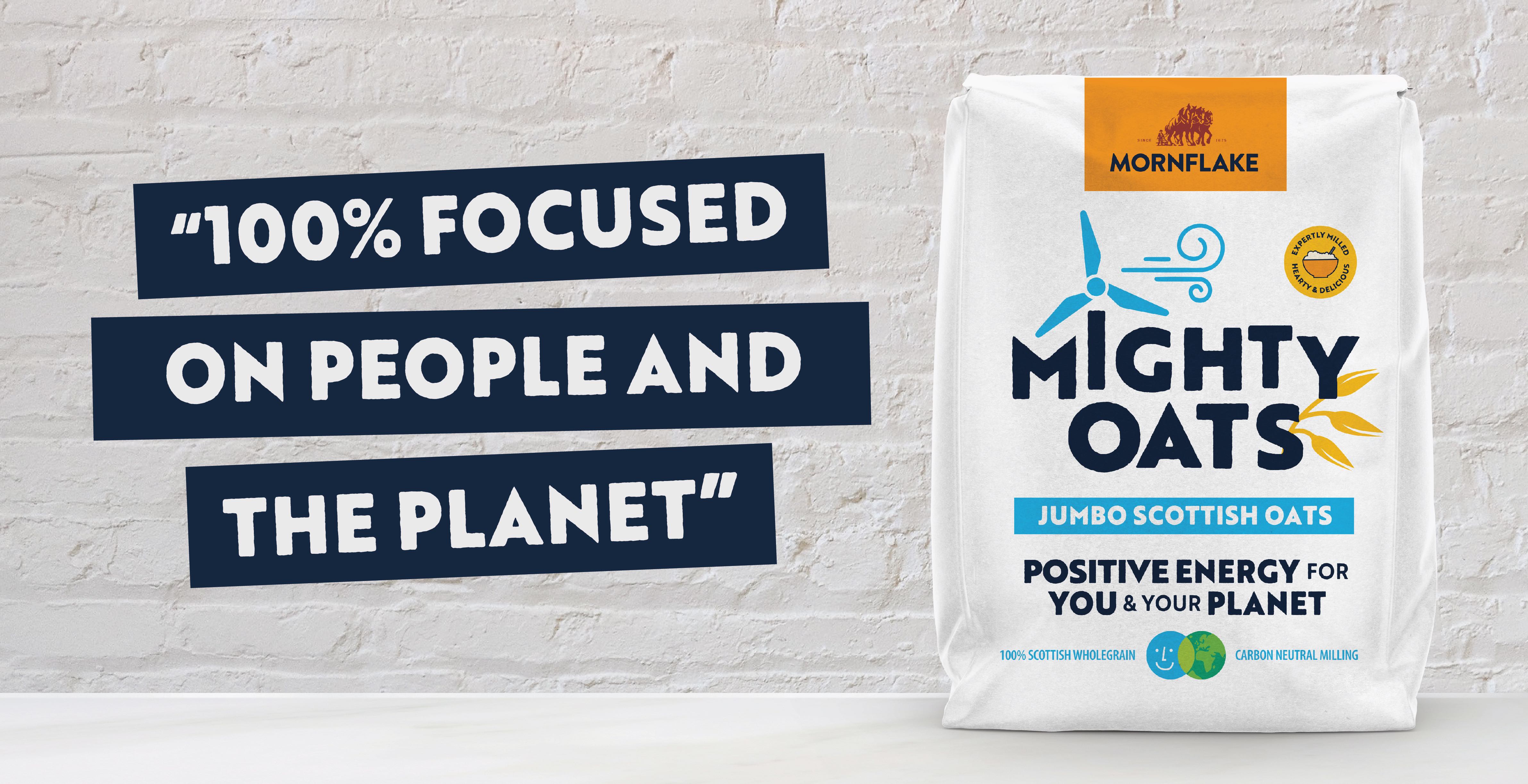
And being a family business, there’s also a genuine passion to be a good employer and a positive force for kind to nature farming practices and local, low food miles production. It’s a company that’s 100% focused on people and the planet, with 0% greenwash.
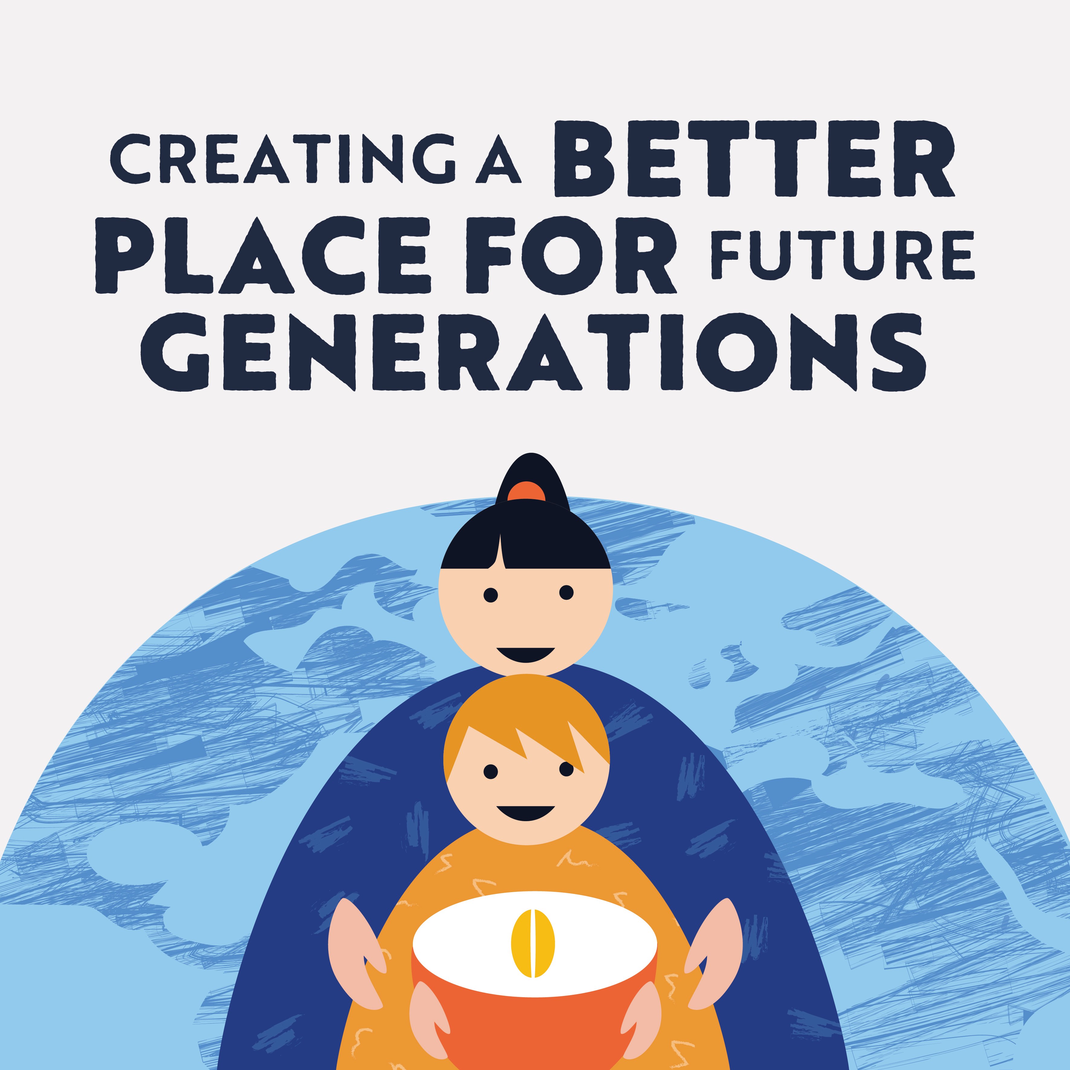
So a new proposition was born based around the idea of being A FORCE FOR NATURE “To make only healthy and positive energy for people and the planet for generations to come”.
A brand building Challenge
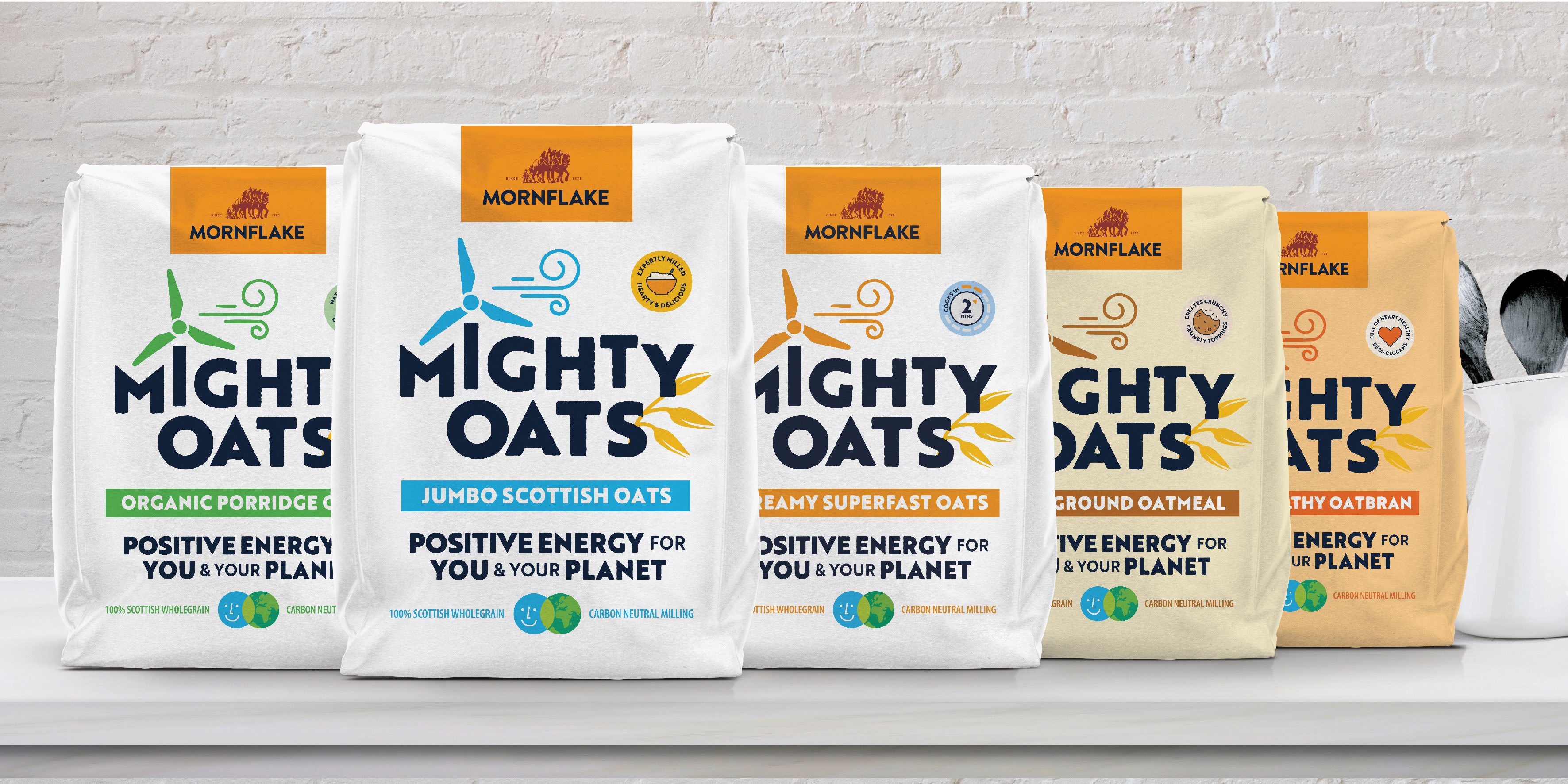
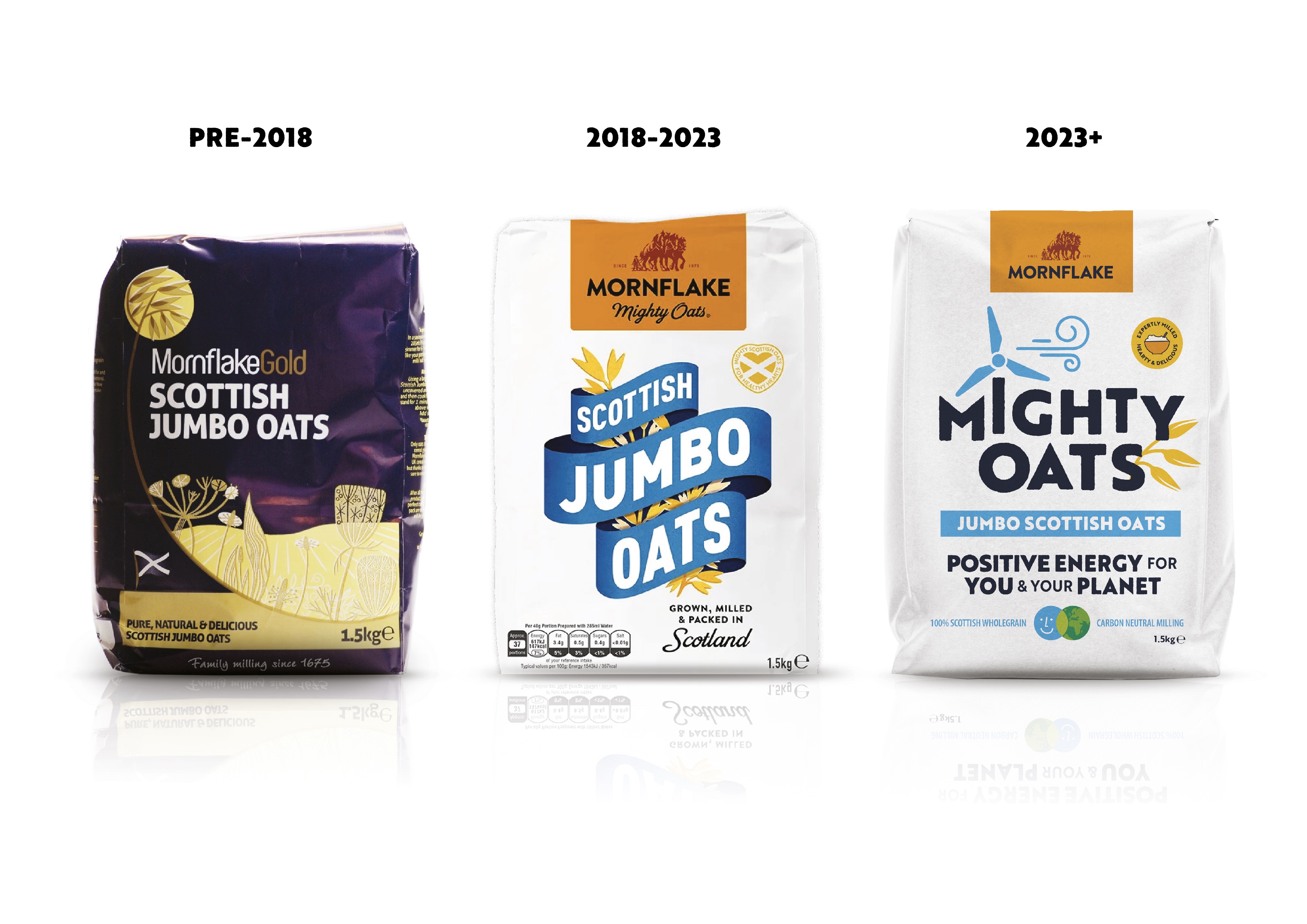
Translating this new proposition into Shelf Happy® packaging would require something of a polarity change – a switch from Victorian style banners and horse drawn ploughs, to a modern farming and milling image, whilst not throwing away important brand codes in the doing.
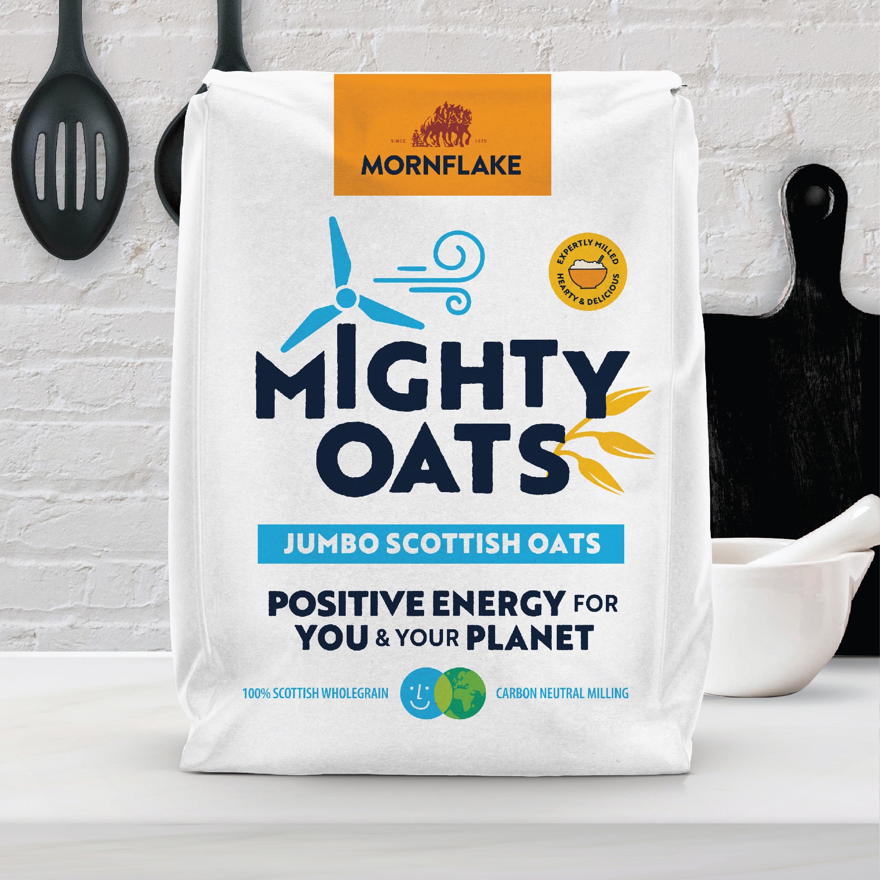
From April 2023, Mornflake’s range of delicious oat products will now be known as ‘Mighty Oats’.
Once a simple brand sign-off, Mighty Oats has been elevated to the role of brand – symbolising that this 350 year old family business is committed to truly sustainable farming and milling practices for the future.
Combined with manifesto-like messaging and poster style graphics supporting the story 360 on pack and through social media and other marketing, the new image brings to life the brand’s positive, warm and socially focused personality.
“The radically revitalized branding aims to create some genuinely exciting category disruption; maximizing both stopping power and appraisal at retail. Gone is the old, traditional image of the porridge oats category as the brand ushers in the future, presenting at point of purchase the proposition as a truly sustaining and sustainable superfood for generations to come.” DJ Johnston – Strategy lead at family (and friends).
“It was a fantastic experience to work with the Family & Friends team. They really got under the skin of what we’ve stood for as a business for almost 350 years and brought the Mornflake Mighty Oats message to life in a succinct and considered way. One that we believe will deliver genuine stand out in the hot cereal category.” Iain Lavelle – Head of Marketing – Morning Foods
The new look will be seen across retailers on May 15th with the full consumer launch.
CREDIT
- Agency/Creative: Family (and friends)
- Article Title: Mornflake Mighty Oats. Mighty In Name And In Nature
- Organisation/Entity: Agency
- Project Type: Packaging
- Project Status: Published
- Agency/Creative Country: United Kingdom
- Agency/Creative City: London
- Market Region: Europe
- Project Deliverables: Brand Redesign, Brand Rejuvenation, Packaging Design
- Format: Bag
- Substrate: Pulp Paper
- Industry: Food/Beverage
- Keywords: #forcefornature #cleanenergy #positiveenergy #solarpowered #mornflake #oats #breakfast #sustainablefarming #familybusiness #futurefood #healthyandhappybrands #brandrefresh #carbonneutral
-
Credits:
Creative Director: Alex Durbridge
Strategy Lead: DJ Johnston
Designer: Matthew Pumfrett
Designer: Lori Townsend
Designer: Jo Proudlove


