ICC, The comeback of a pioneer.
“If we had to create a great online community it would be a mixture between the Cheers bar, an art museum where it is possible to watch quality chess, and the Boy Scouts, who teach values in a friendly way.”
Marty Grund, President of the Internet Chess Club.
A complete revamp of the brand identity of the first-ever Internet chess server had to convey this community sense also with a business focus in scholastic chess and learning features to lure in new publics. Back in the day, players logged in via telnet and the board displayed as ASCII text, but the new ICC had to be all about people and chess and less about nostalgia.
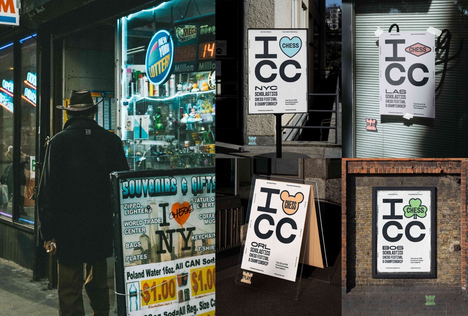
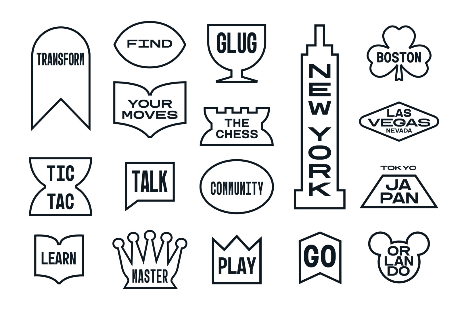
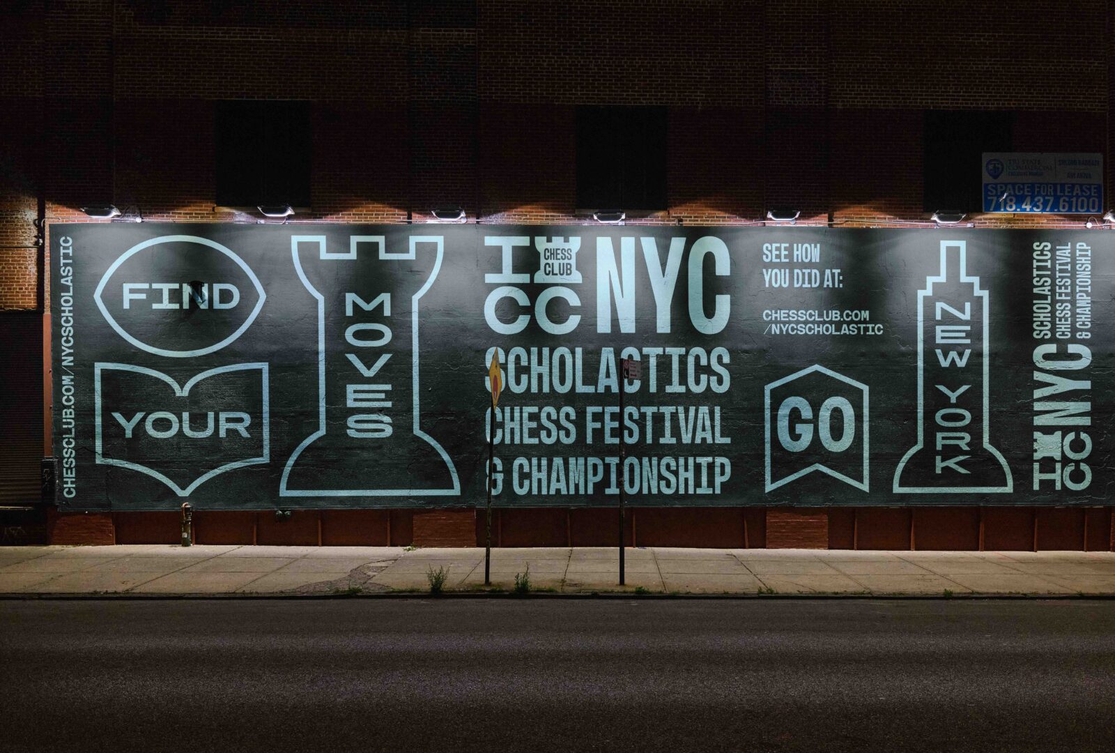
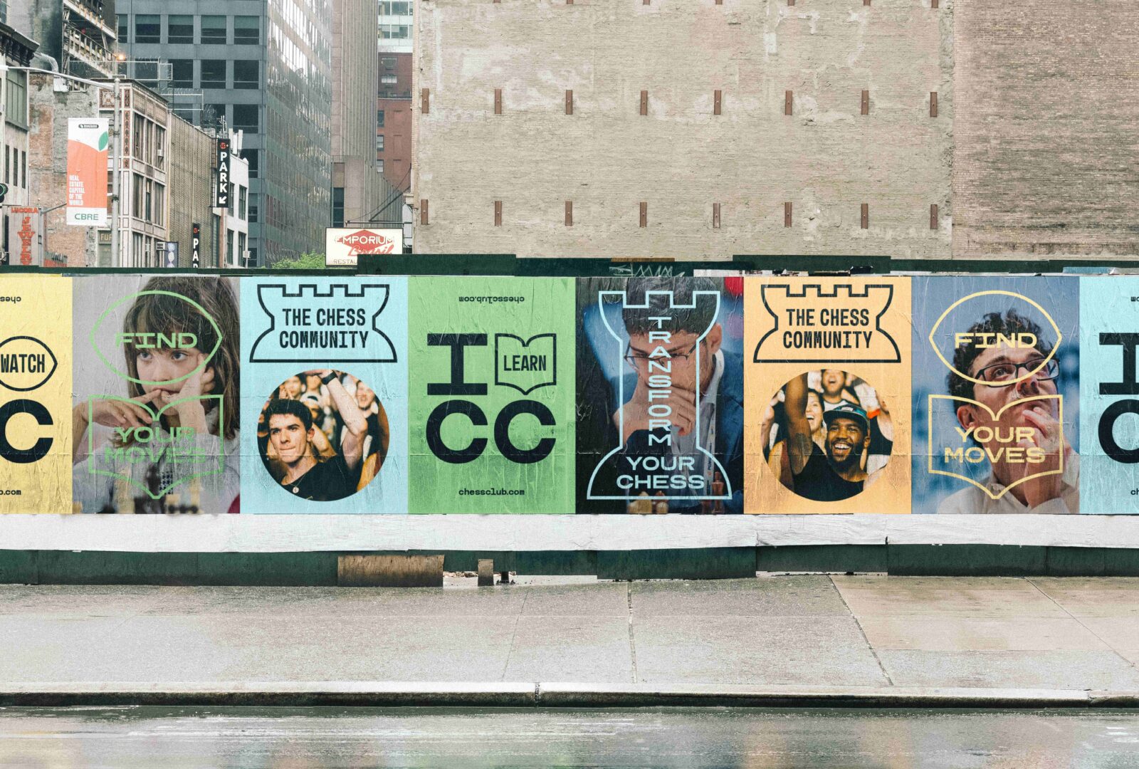
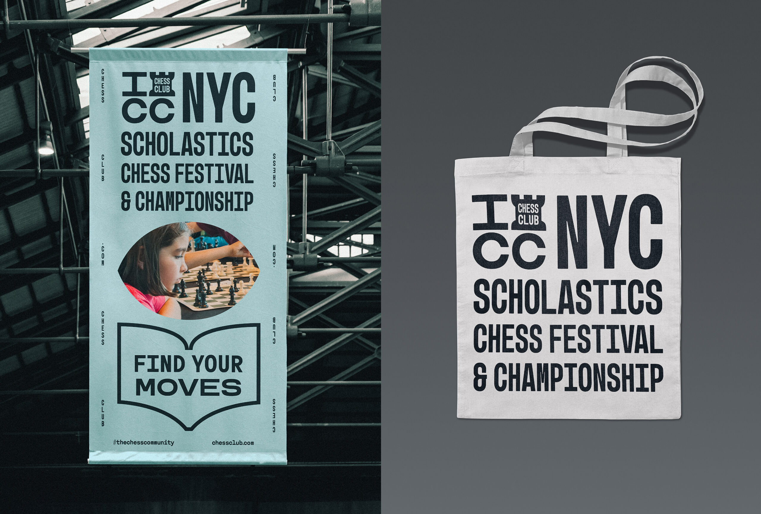
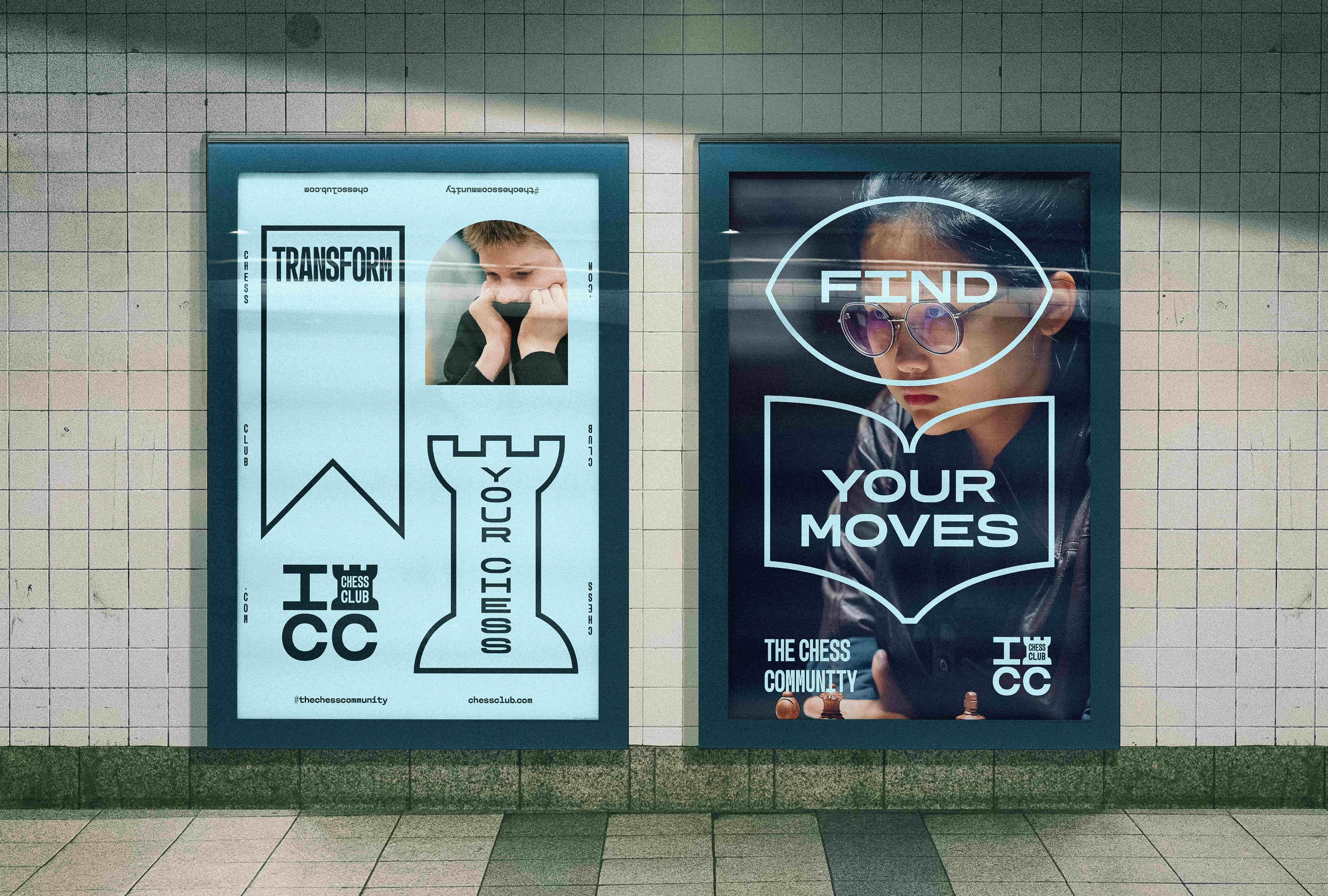
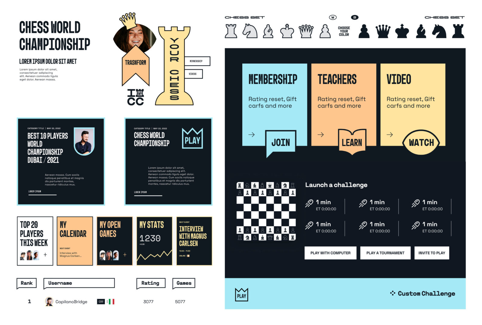
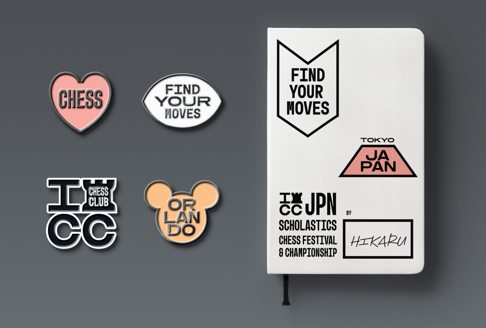
So we embraced this open spirit through a vibrant and warm graphic language designed to be community-friendly, especially conceived for kids and appealing to educated parents who may sign them up for chess classes we created a challenging environment that avoided competitive vibes. The geometric and simple shapes of the graphic language are loosely inspired by Boy Scout badges, signaling achievements and showing progress in the UI while also reflecting ICC’s people-centric personality.
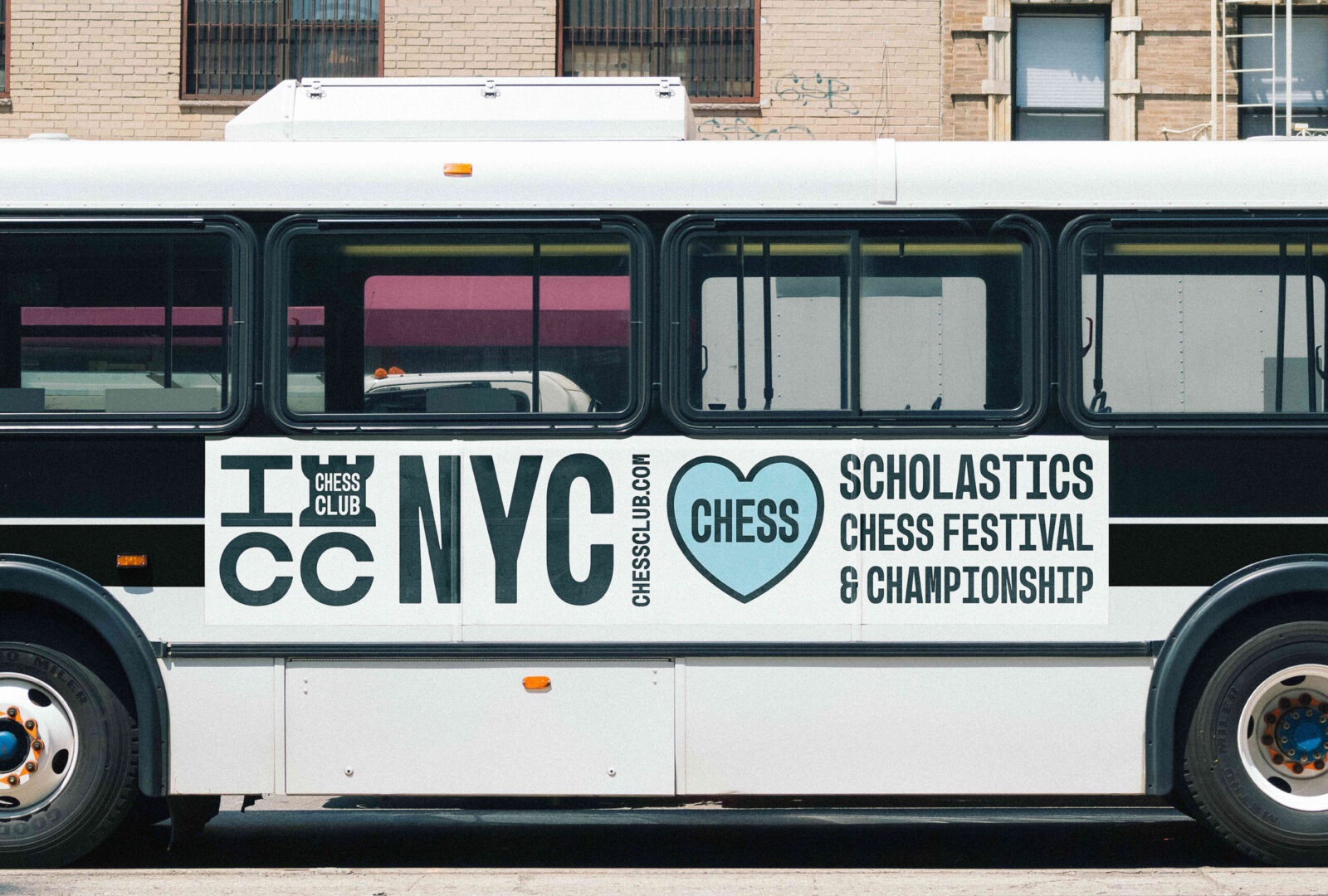
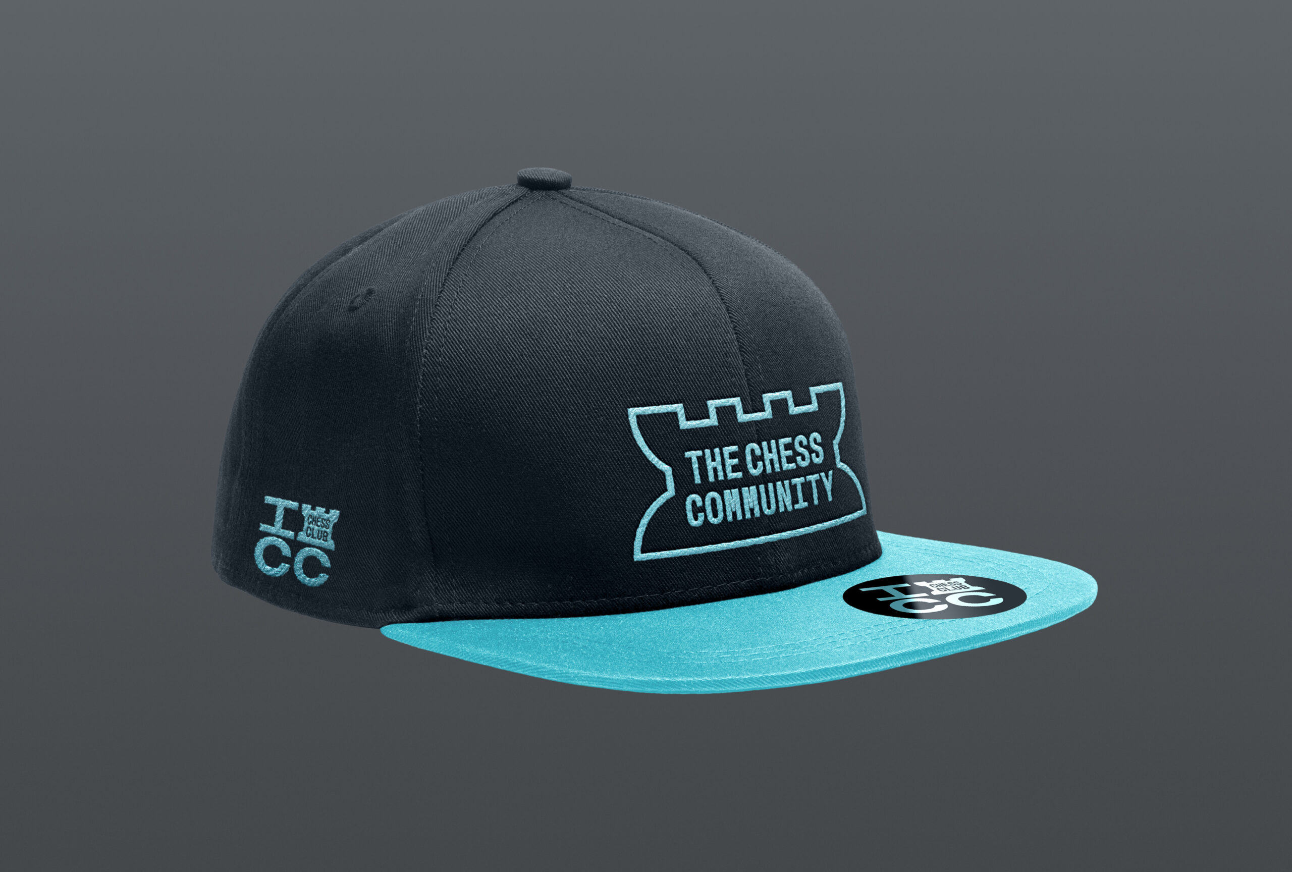
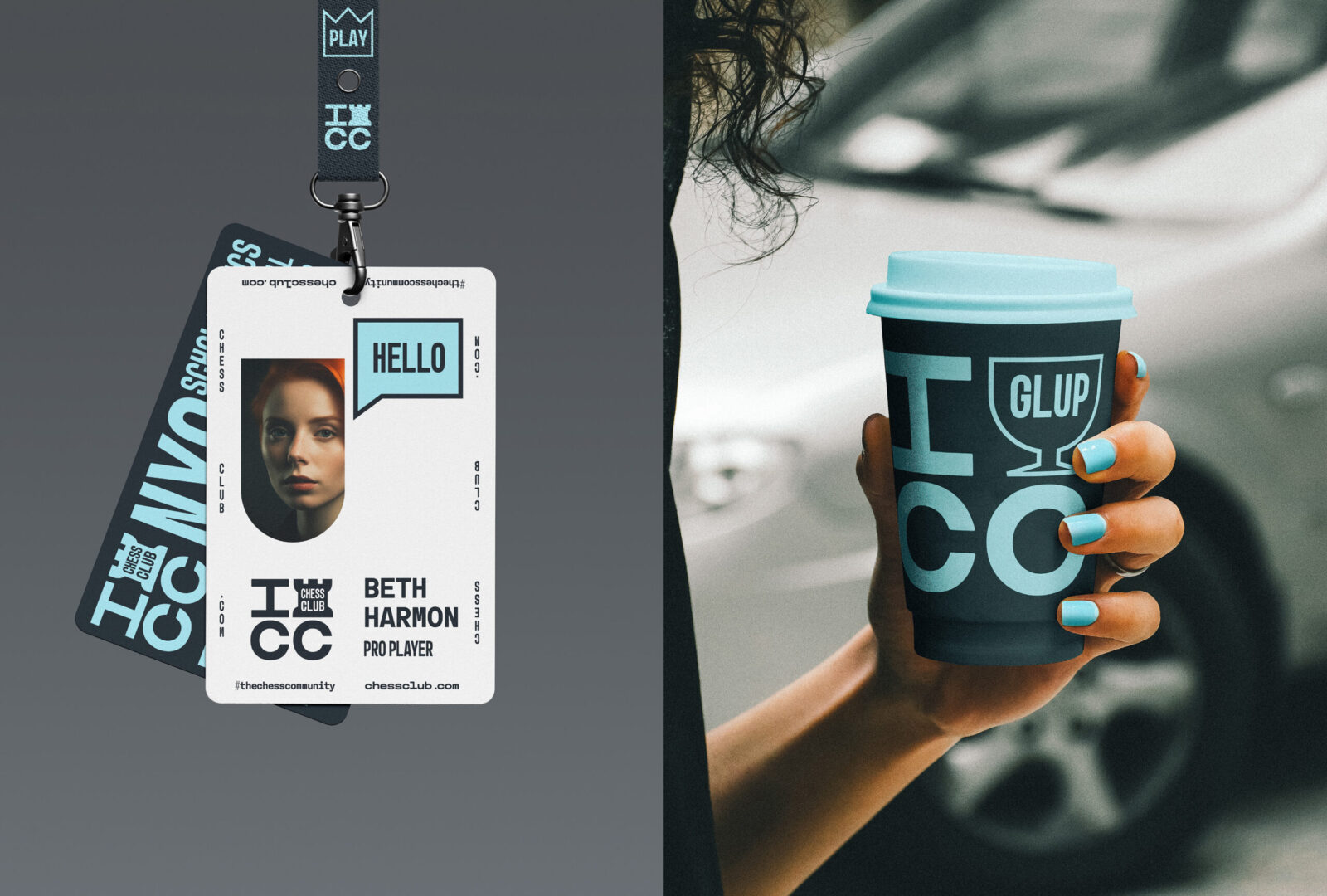
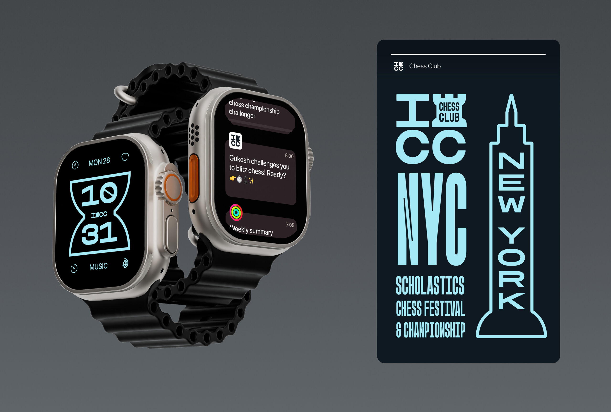
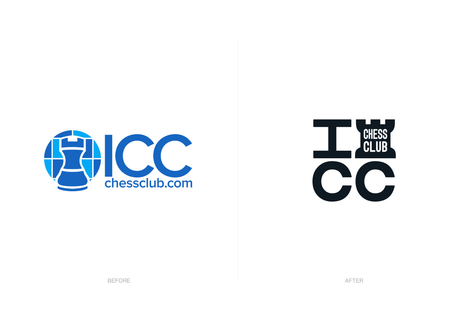
The rook has been part of the brand’s legacy, symbolizing endurance, straight-forwardness and reliability. These attributes are highly valued in tournament organization (fair play, IT trustworthiness) and scholastic chess (safety, protection). Applied as a solid block, it creates impact and coherence, working well across different sizes and formats, both digital and physical for in-person tournaments. The main brand becomes more sober, allowing sub-brands to express themselves according different needs.
We considered a variety of colors a useful mechanism to highlight the different brand experiences within the new ICC ecosystem. While colors work together harmoniously, a broad palette benefits each vertical, enhancing the overall experience, especially in scholastic chess (as achievements or badges) or in media (as categories).
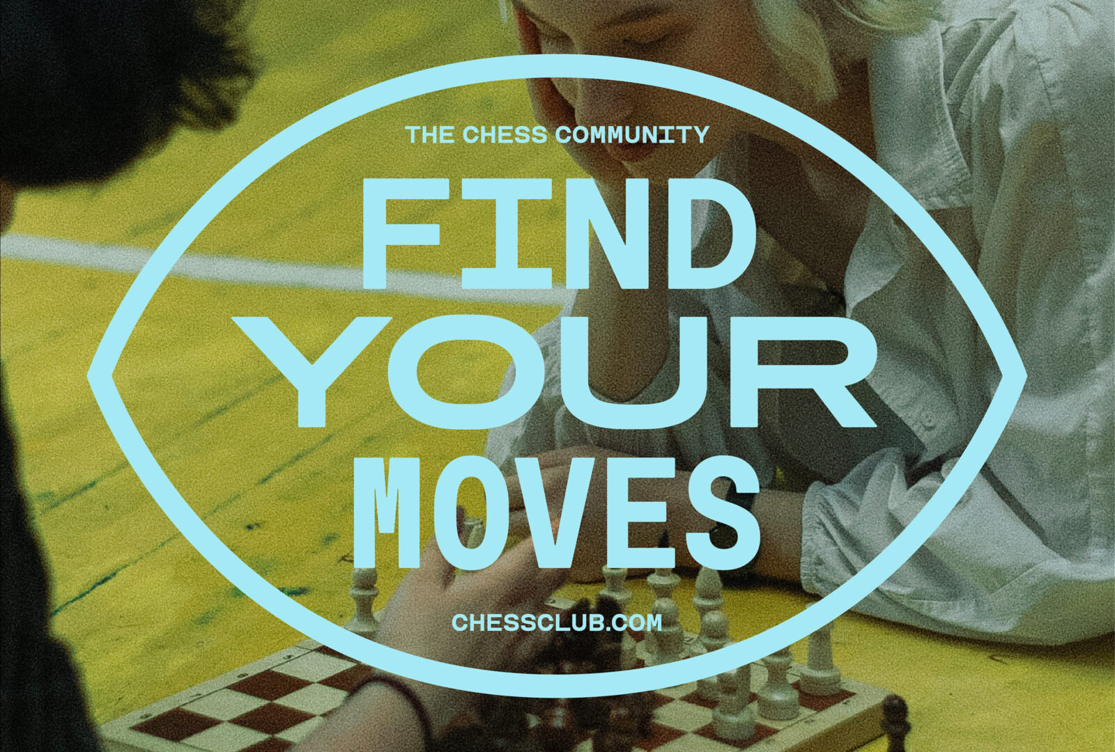
The typograpical choice was rooted in text consoles as an old school way to play chess online. In a time when graphical interfaces where not common at all and computers had limited capabilities text was entered on a grid where every square had the same width. In light of this, a monospaced font was a clear nod to this pioneer and humanist and a way to bring in stability and readability, contributing to the reliability of the rook in the symbol. However, we went one step further by tapping into a monospaced variable font that dubbed for diverse needs and interfaces.
The overall goal was to bring back that utopical spirit ICC had at he beginings where everything was possible on an Internet under construction with no stablished brands or businesses. Under the new identity and focus, ICC is the place to learn, to hang out, to celebrate a love for chess. An agora for masters. The IRL path. The chess community.
CREDIT
- Agency/Creative: Morillas Brand Design
- Article Title: Morillas Transforms Internet Chess Club with a People-Centric Brand Strategy
- Organisation/Entity: Agency
- Project Status: Published
- Agency/Creative Country: Spain
- Agency/Creative City: Barcelona
- Market Region: International
- Project Deliverables: 2D Design, Architecture, Art Direction, Brand Design, Branding, Graphic Design, Logo Design, Rebranding, Web Design
- Industry: Entertainment
- Keywords: WBDS Agency Design Awards 2024/25 brandidentity, community, chess, urban, digital, restyling, responsive, NYC, typography, monospace, badge
- Keywords: WBDS Agency Design Awards 2024/25 brandidentity, community, chess, urban, digital, restyling, responsive, NYC, typography, monospace, badge


