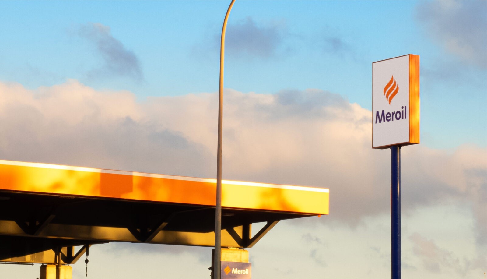
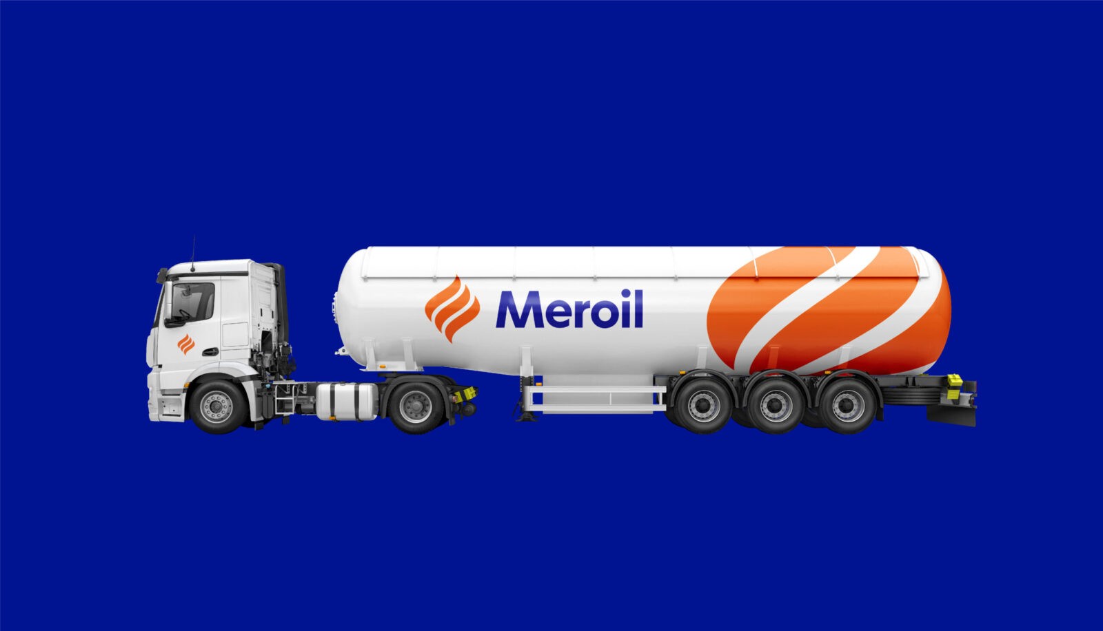
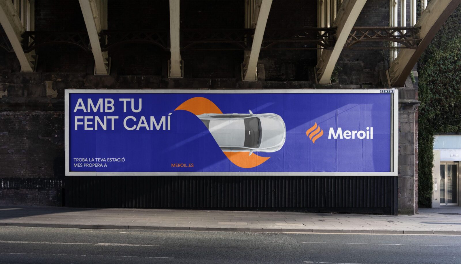
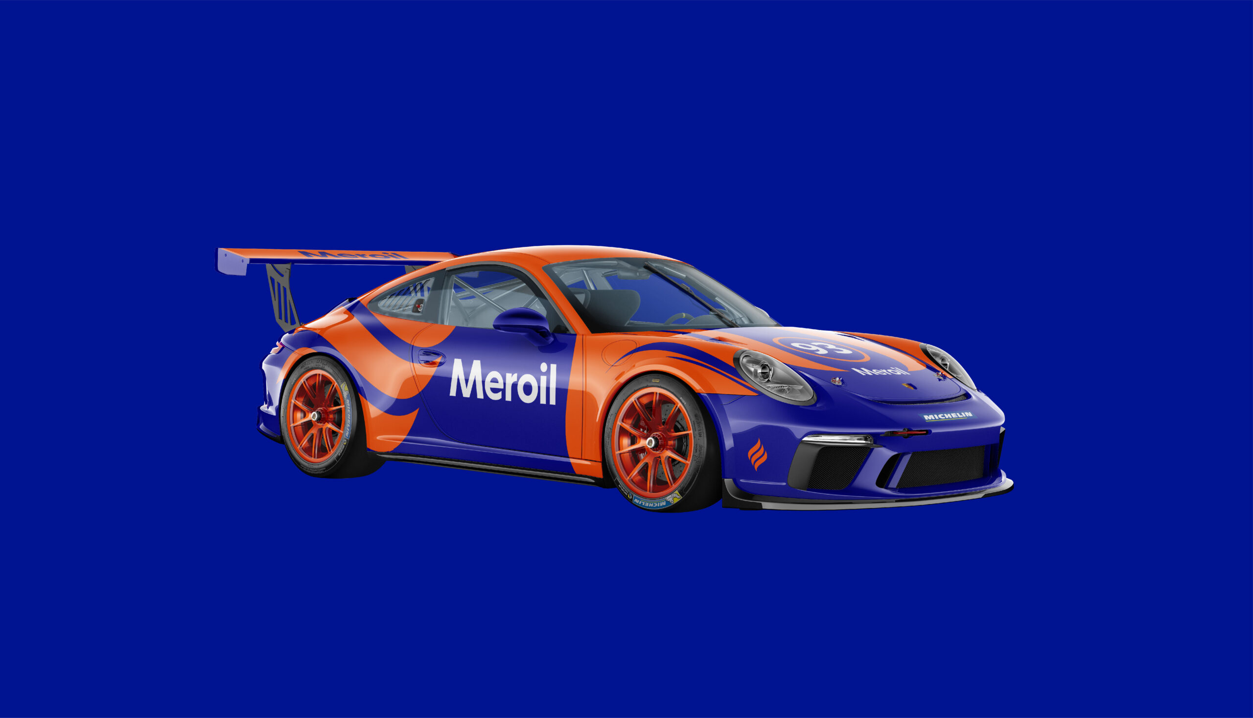
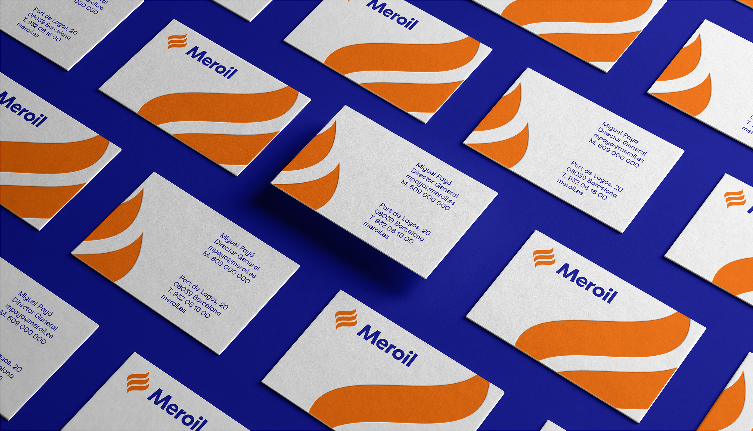
Introducing Meroil’s simplified and updated brand identity – dynamic and adaptable, always staying true to its essence and consistent across all brand touchpoints. Featuring a modern look and feel that propels Meroil forward and deepens the connection to its audience.
We embarked on a bold mission to redefine Meroil’s image, bringing it into the present and making it more approachable and accessible, in order to help it reconnect with the needs of a contemporary audience and market.
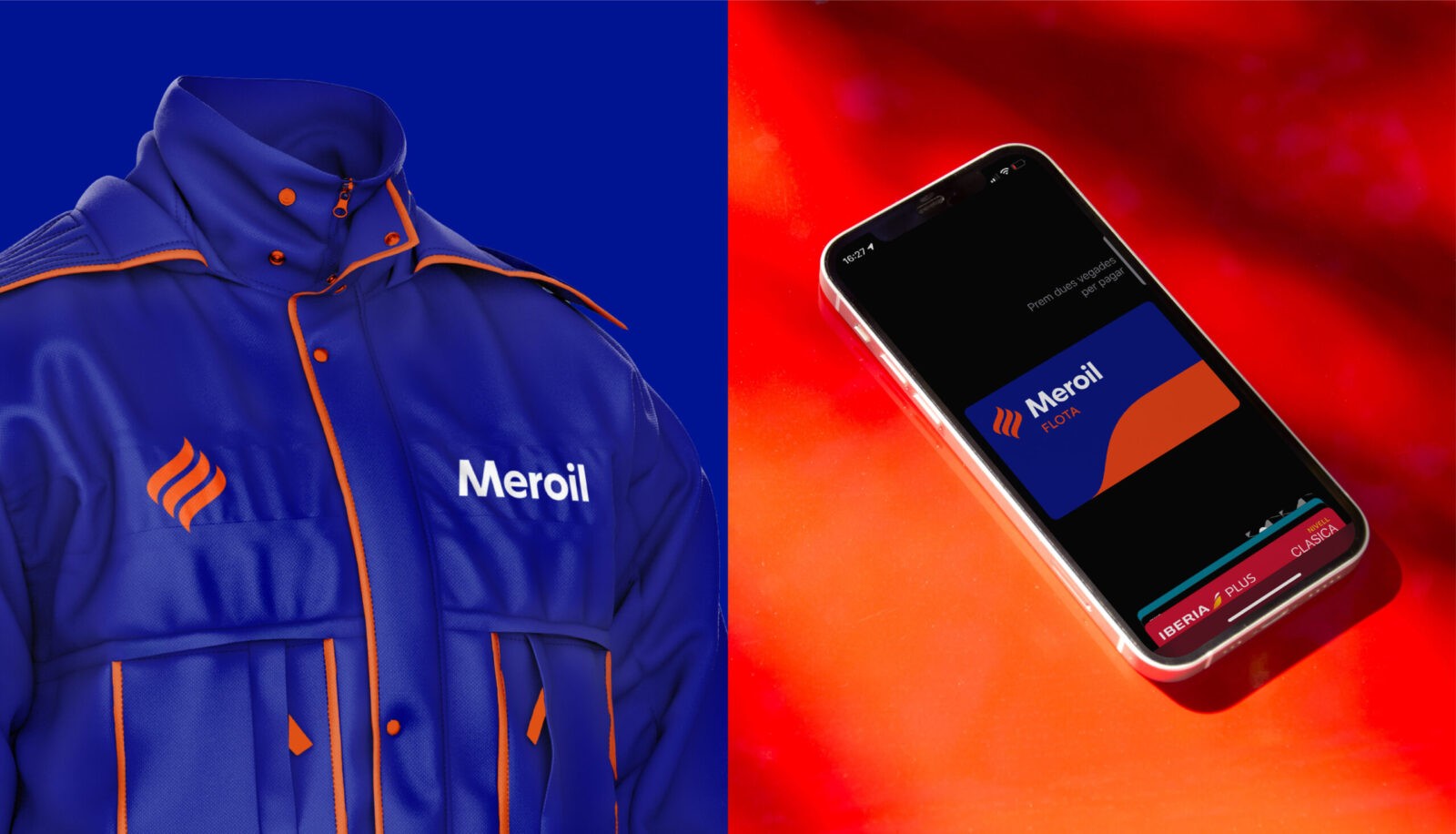
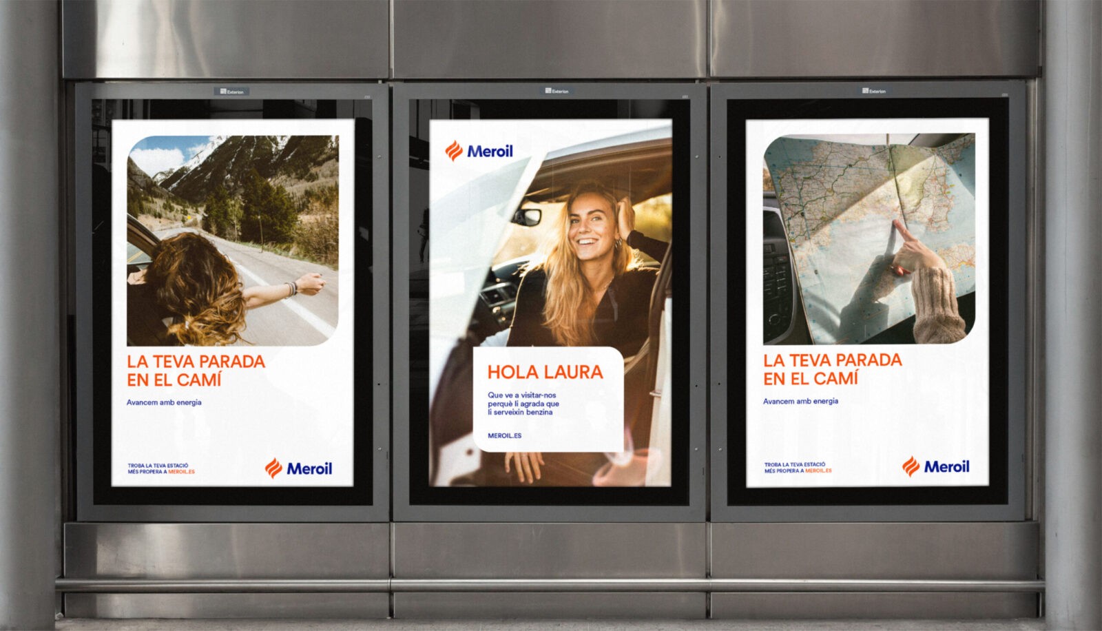
This update has the clear objective of reflecting a simple, modern, and approachable aesthetic, maintaining Meroil’s automotive essence, and ensuring a consistent brand experience across all touchpoints.
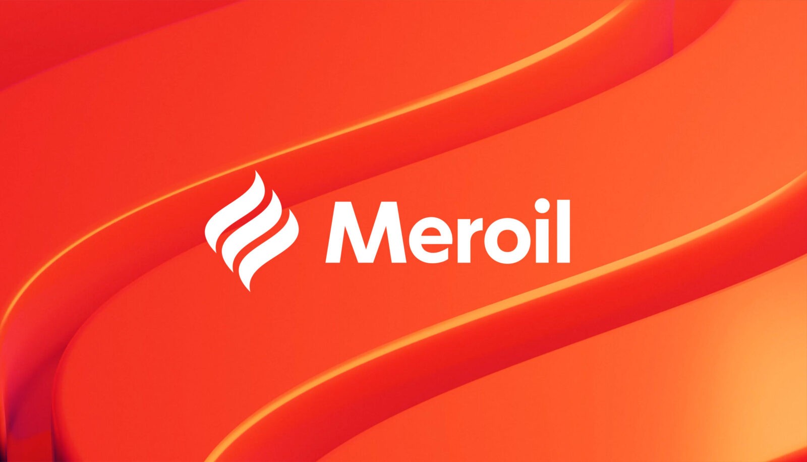
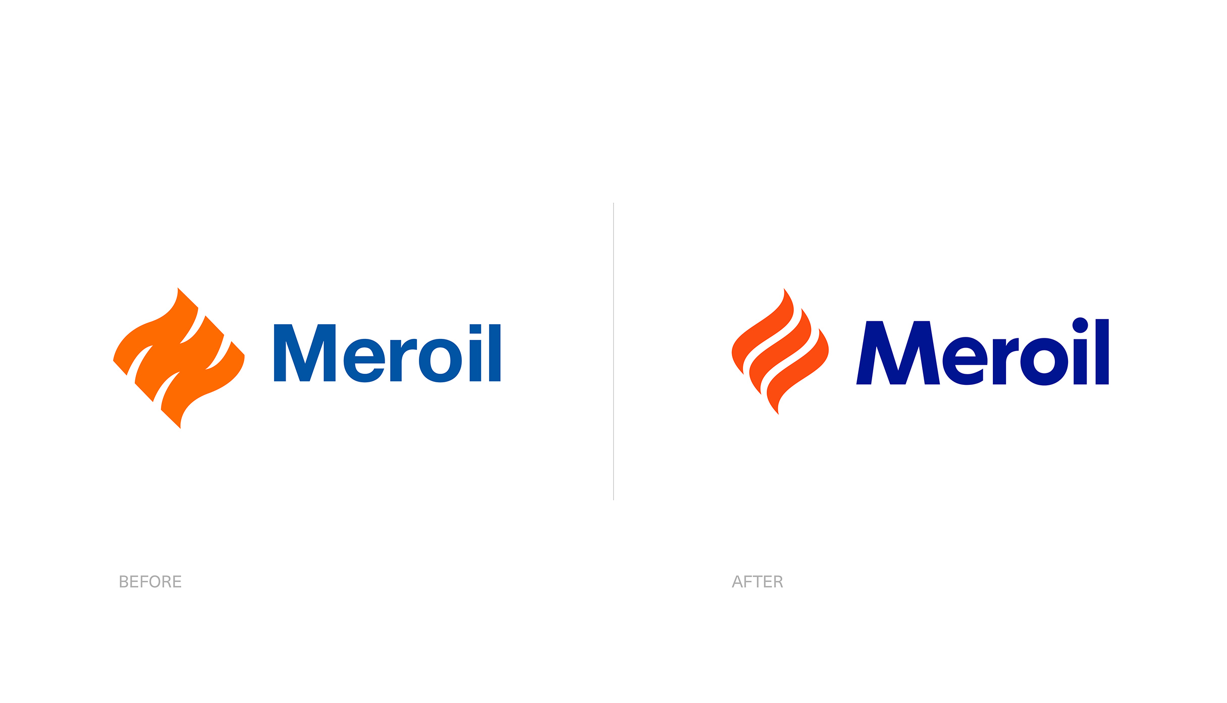
Our journey began with a comprehensive review of the brand’s old visual identity, aiming to identify potential areas for improvement. We focused on infusing the brand with a fresh energy, showcasing a sleeker and more contemporary aesthetic reflected in the new logo. This involved adjusting all the individual elements composing it, using a circular typeface as a foundation to help us convey Meroil’s simple and accessible character. Our goal was to develop a flexible brand image that could adapt seamlessly and maintain consistency across all brand touchpoints.
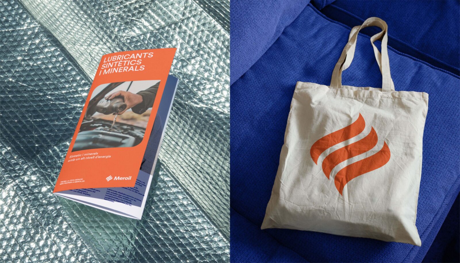
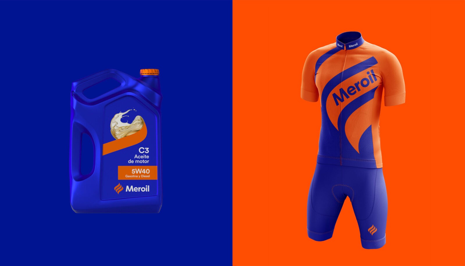
This culminated in a revitalised visual identity for Meroil, boasting a simpler, more contemporary and approachable look and feel. We transformed the symbol into a sinuous, undulating flame, symbolising Meroil’s connection to the petroleum industry. Furthermore, the logo now incorporates a friendly and versatile font, which enhances its timeless appeal.
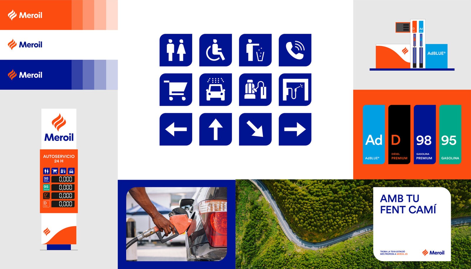
These characteristics extend to all other brand assets, such as image containers and a new custom pictogram system developed from these same sinuous shapes. We also richened the colour palette with new hues inspired by different varieties of fuel that help us boost the brand’s versatility.
With its updated visual identity, Meroil is better positioned to engage with its audience and adapt to evolving market dynamics.
CREDIT
- Agency/Creative: Morillas Brand Design
- Article Title: Morillas Refreshes Meroil’s Brand Identity to Connect with Modern Audiences
- Organisation/Entity: Agency
- Project Status: Published
- Agency/Creative Country: Spain
- Agency/Creative City: Barcelona
- Market Region: Spain
- Project Deliverables: Brand Redesign, Logo Design
- Industry: Energy
- Keywords: WBDS Agency Design Awards 2024/25
- Keywords: WBDS Agency Design Awards 2024/25


