Cinco Jotas is a renowned Spanish gastronomic icon with over a century of heritage, celebrated for its exquisite 100% Iberian acorn-fed ham. As a symbol of culinary excellence, Cinco Jotas embodies the artistry and tradition of Spain. Each piece of ham represents a masterwork, meticulously crafted by artisans dedicated to preserving this unique legacy. Following a strategic repositioning in 2019, Cinco Jotas has elevated its brand to meet luxury standards, positioning itself as a true masterpiece of Spanish gastronomy.
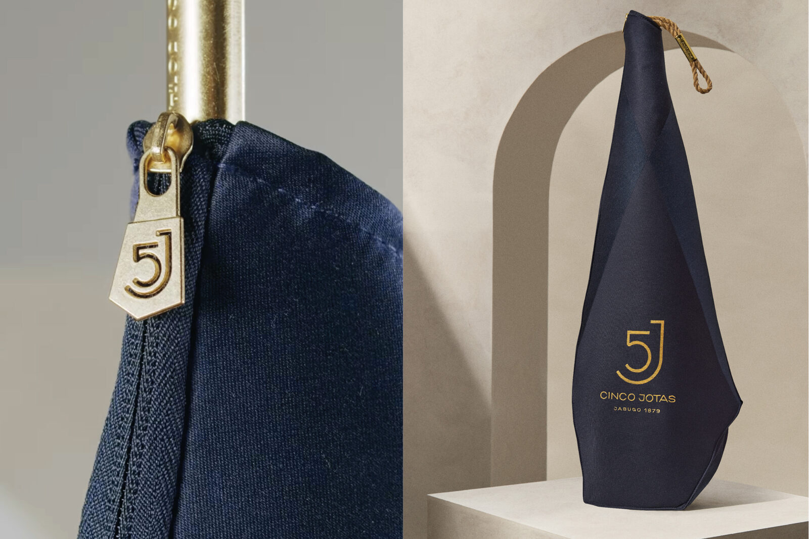
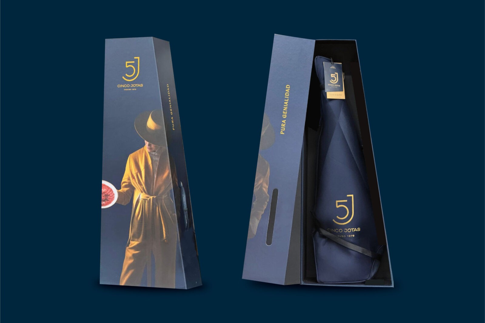
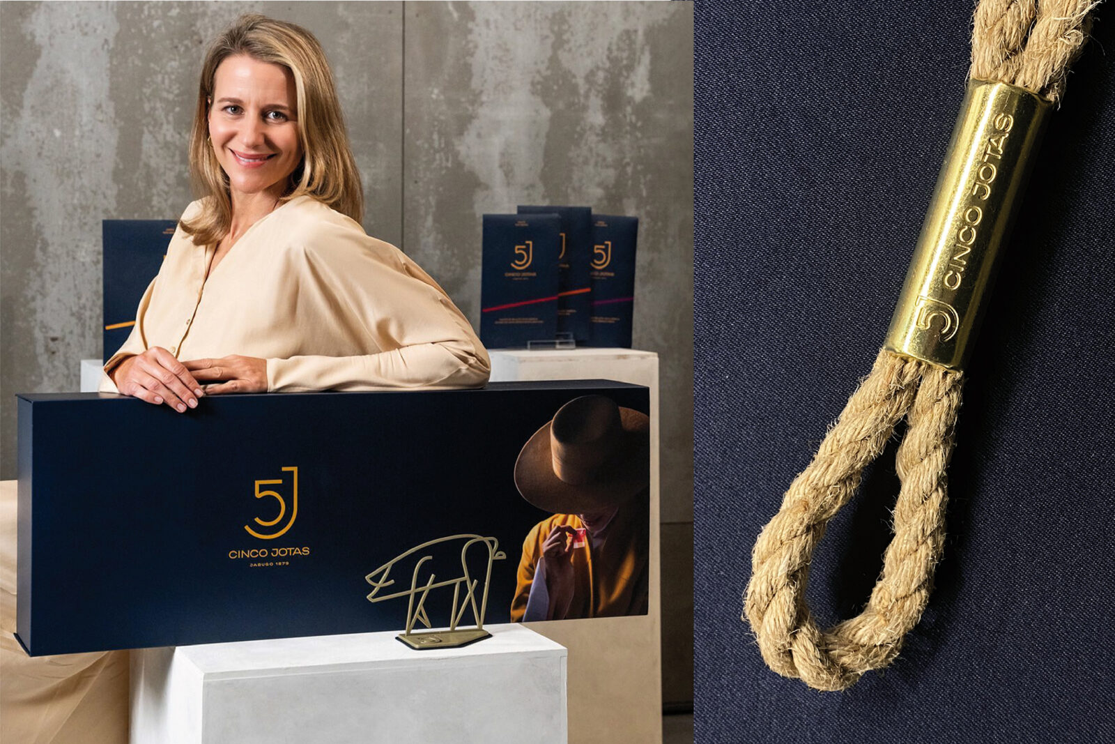
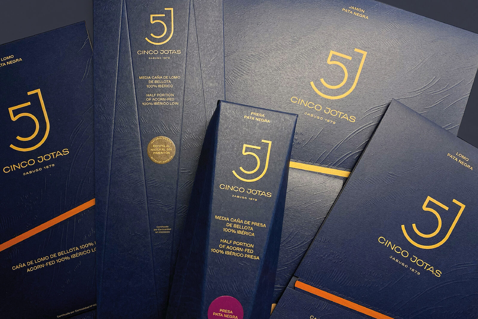
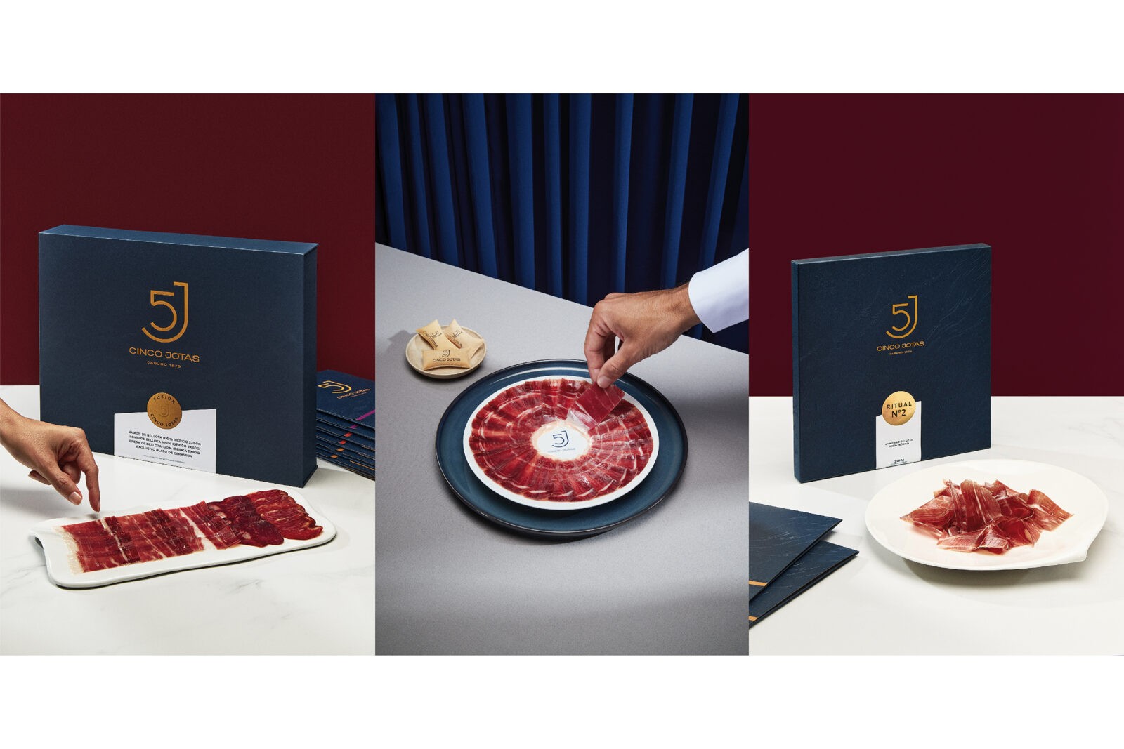
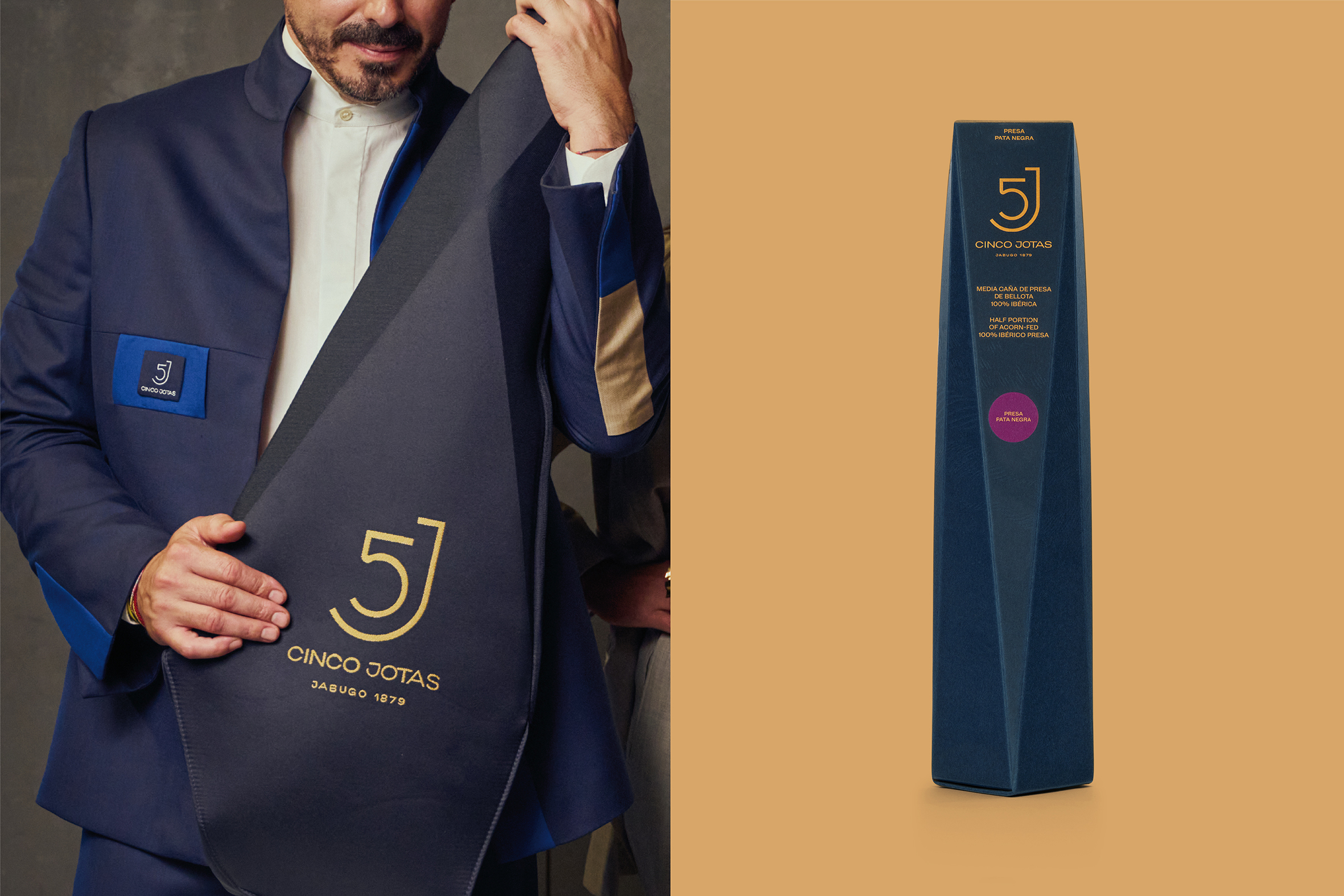
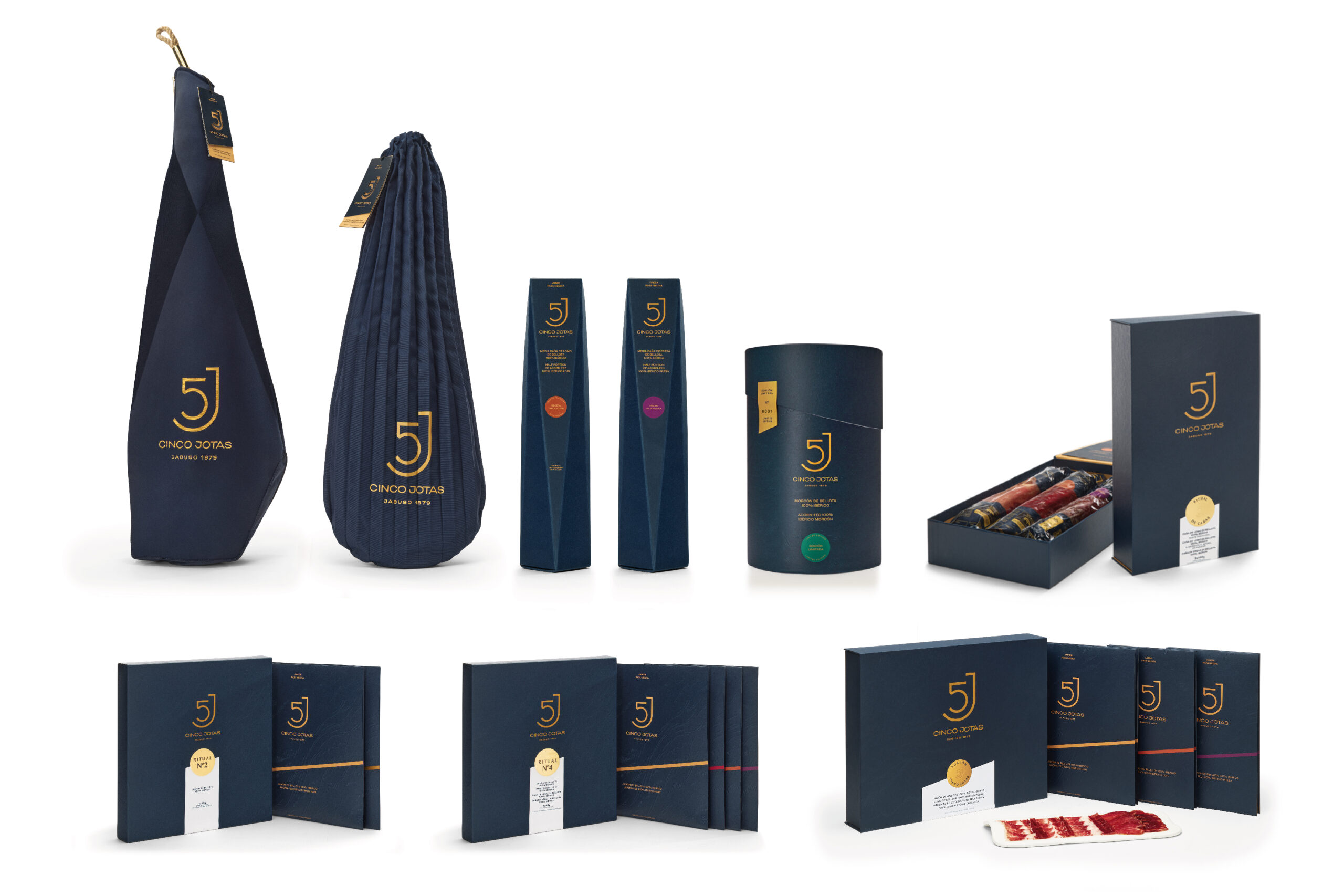
To align with Cinco Jotas’s luxury repositioning, the packaging design has undergone a comprehensive reimagining. Morillas developed a packaging concept that seamlessly blends innovation with sustainability, while maintaining the elegance and reverence this prestigious product demands. The redesigned cases and covers feature haute-couture finishes, employing premium materials and textures to create a sophisticated experience that mirrors the brand’s elevated status.
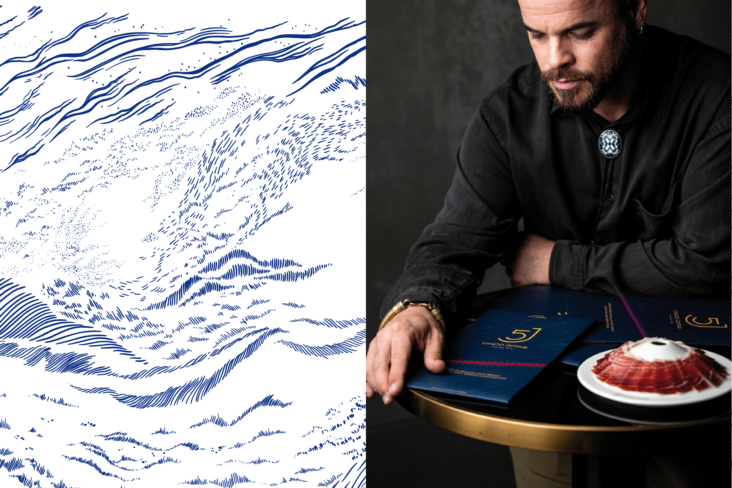
A key element of this new identity is the use of grease-resistant paper in the brand’s distinctive colours. This paper is adorned with exquisite engravings by Pablo Salvaje, evocative of the dehesa—the sun-kissed grasslands of southwestern Spain, where the Iberian pigs roam freely in their natural habitat. This landscape is not merely pastureland; it is a biodiverse ecosystem, rich in acorns, which imparts the unique and exceptional flavours that define Cinco Jotas ham.
The minimalist design, paired with refined tones, not only reflects Cinco Jotas’s unwavering commitment to quality but also honours the brand’s profound connection to its natural heritage. Each packaging element tells a story of craftsmanship, respect for tradition, and a celebration of luxury.
With this transformation, the new packaging strikes a perfect balance between tradition and modernity, respecting the essence of the brand while elevating it to an exclusive level. In doing so, Cinco Jotas reinforces its position as a symbol of luxury in the international market, embodying values of authenticity, sustainability, and a deep respect for its roots. This evolution not only enhances the brand’s identity but also enriches the consumer experience, inviting them to partake in a timeless culinary journey.
CREDIT
- Agency/Creative: Morillas Brand Design
- Article Title: Morillas Redesigns Cinco Jotas Packaging to Marry Tradition and Luxury in Spanish Culinary Artistry
- Organisation/Entity: Agency
- Project Status: Published
- Agency/Creative Country: Spain
- Agency/Creative City: Barcelona
- Project Deliverables: Packaging Design
- Industry: Food/Beverage
- Keywords: WBDS Agency Design Awards 2024/25
- Keywords: WBDS Agency Design Awards 2024/25


