Binomial is a cosmetic brand for Gen Z. Its purpose is to bring the most effective cosmetics to young skin without complications, through high-quality formulations and ingredients. Simple routines, innovative formulas, and surprising textures transform upon application to achieve healthy, radiant skin. A new cosmetic paradigm that debunks myths and focuses on the essence of skincare. In short: effective, innovative cosmetics for young skin.
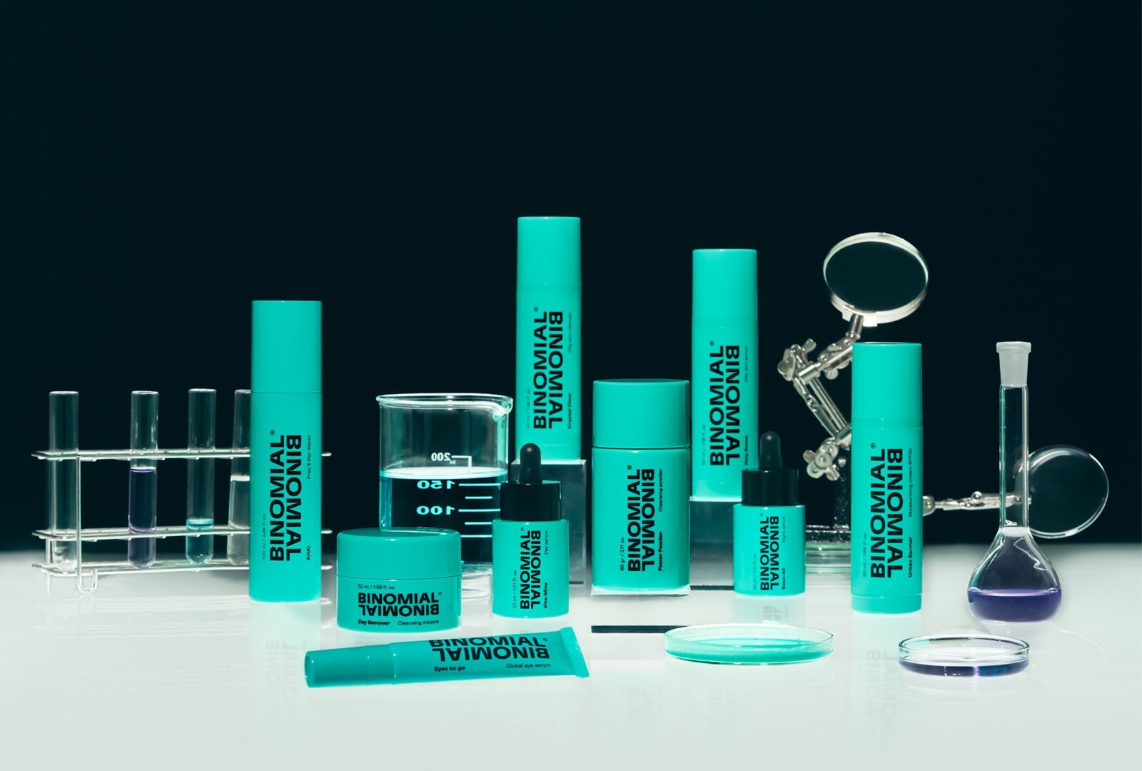
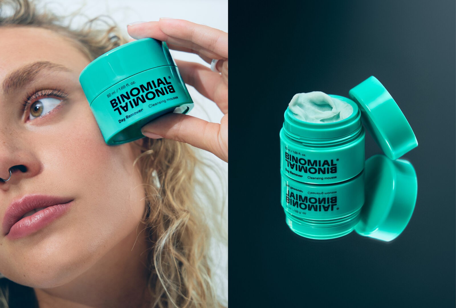
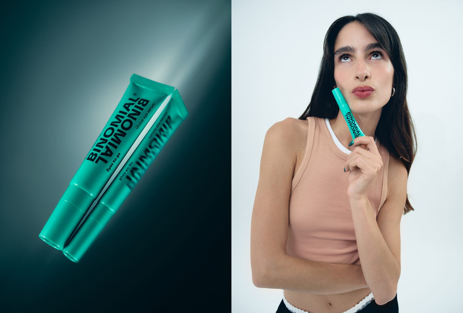
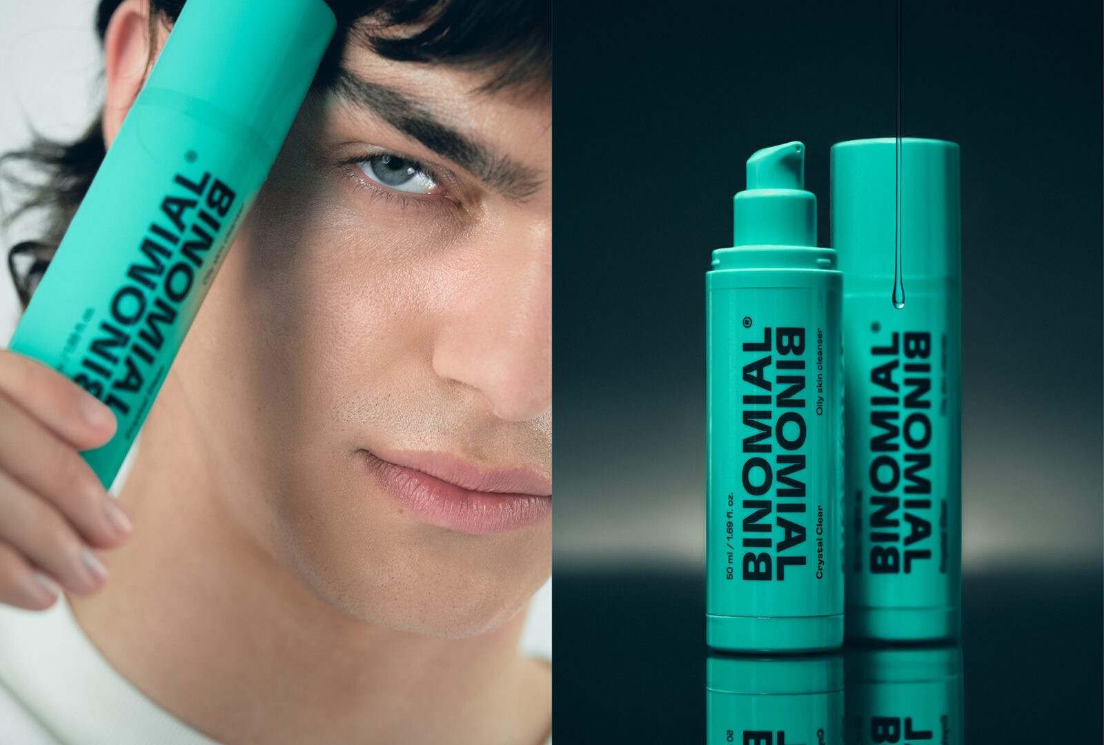
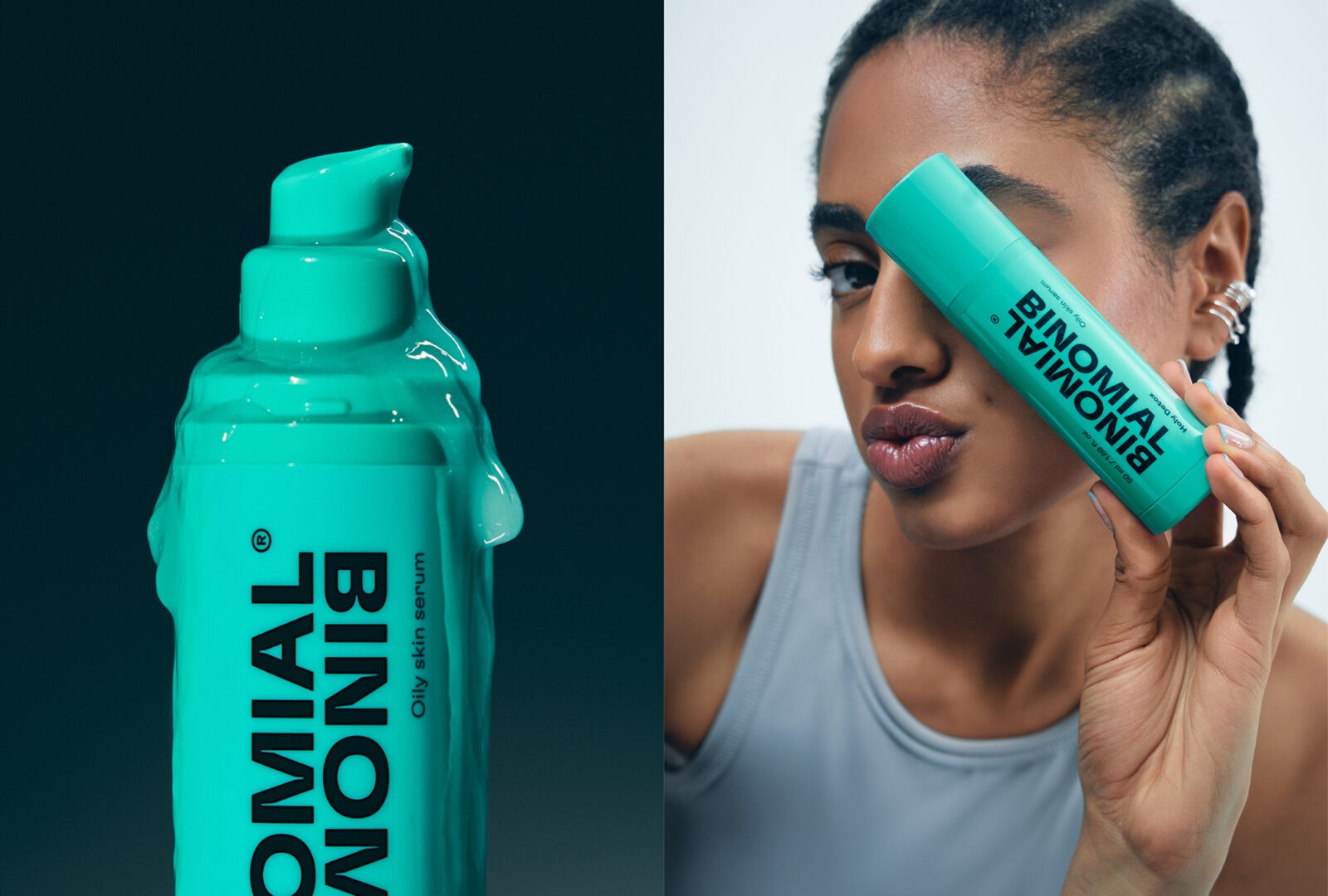
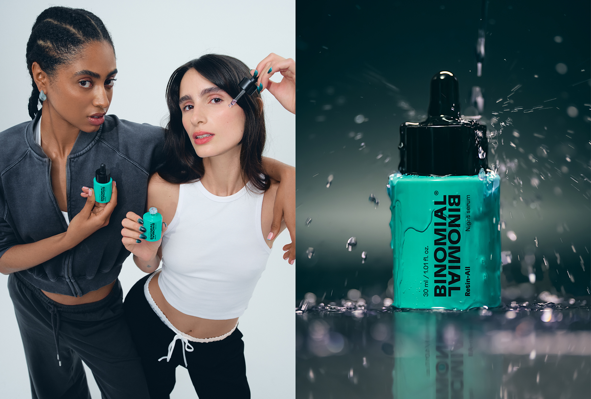
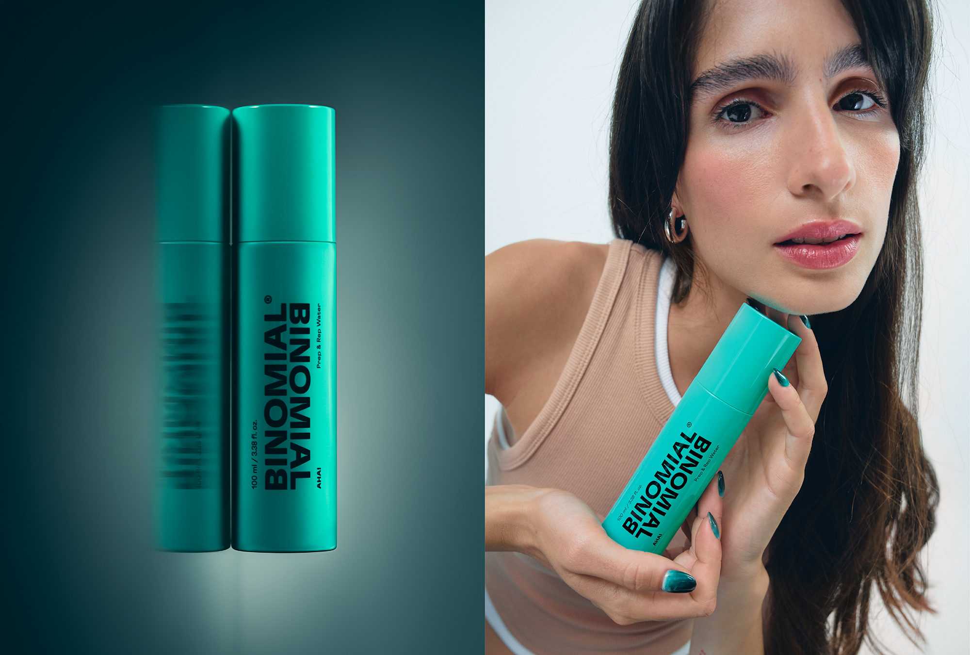
The name Binomial symbolizes the perfect union of an active formula with biotic elements that promote skin health, enhancing the effects of cleansing, hydration, and transformation. The logo is expressed in a simple, direct, and modern way, in line with the brand’s personality. The prefix bi-, meaning “twice,” serves as a pretext to create a visual play through logo repetition, clearly alluding to the name.
The packaging design stands out for its simplicity and contemporaneity, representing the bold and innovative character of the brand. The entire portfolio is designed from a premise: to enhance the brand and the corporate color. The design seeks a strong balance and contrast between the typographic composition of the logo, the secondary information, and the white spaces. Secondary information is minimized and added in a secondary position, so as not to interfere with the visibility of a brand new to the market. The turquoise color evokes freshness and vitality. It is an eye-catching and contemporary color, also very powerful in digital environments. Additionally, it is not strongly associated with any gender, making it ideal for an inclusive brand.
In conclusion, Binomial is redefining skincare for Gen Z with its unique approach that combines scientific innovation and practical simplicity. The brand’s commitment to high-quality ingredients and effective formulations ensures that young skin receives the best care without unnecessary complications. Binomial’s modern aesthetic, reflected in both its packaging and brand identity, appeals to the young demographic’s desire for fresh and bold choices. With a focus on inclusivity and gender neutrality, Binomial stands out as a forward-thinking brand that not only meets but exceeds the expectations of today’s young consumers.
CREDIT
- Agency/Creative: Morillas
- Article Title: Morillas Designs Modern and Inclusive Packaging for Gen Z Skincare Brand Binomial
- Organisation/Entity: Agency
- Project Status: Published
- Agency/Creative Country: Spain
- Agency/Creative City: Barcelona
- Project Deliverables: Packaging Design
- Industry: Beauty/Cosmetics
- Keywords: WBDS Agency Design Awards 2024/25 , Packaging Design: Product Creation , WBDS Agency Design Awards 2024/25
- Keywords: WBDS Agency Design Awards 2024/25
-
Credits:
Photographer: Cristina Morera
Andrés Bustamante: Photographer


