


At Morillas we decided to anticipate and start our revolution by creating a new typeface that represents our new brand universe. Morillas Sans is one of our new identity cornerstones. The idea originated when we felt the need to express our company values in our own way. Typography is a key element in this formula because it permeates through all our touchpoints, from social media, to printed content, physical signage and many other supports.
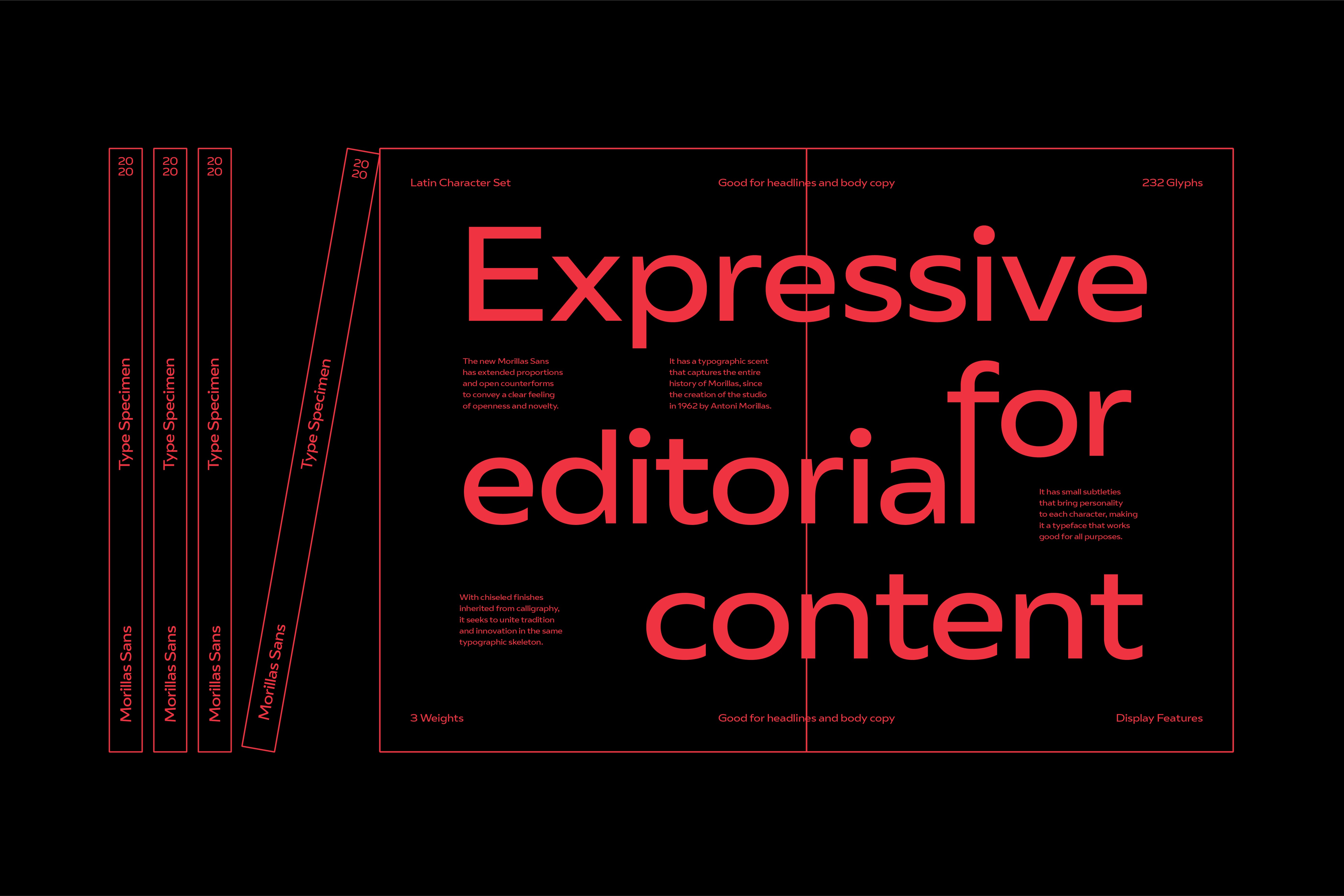
Morillas Sans helps us build a solid narrative and a strong personality when we need to talk to clients or the general public, distinguishing us from the rest of players in our field. It has a typographic scent that captures our entire history from the creation of the studio in 1962 by Antoni Morillas to the present. As such, one of the referents taken into account in the construction of the family, was “Diagonal”, designed by our founder in the 70’s.
Pedro Arilla, the typeface designer is interested in how type plays a narrative role at the intersection of culture, technology, and sociology. And how it can help brands build their personality.
The new type is the result of an extended project, that started in London, in Fontsmith ‘s foundry, and ended in Monotype, where Pedro and his team did an in-depth immersion in Morillas’ history and culture to give birth to this new customized font, that’s the gateway to the new Morillas.
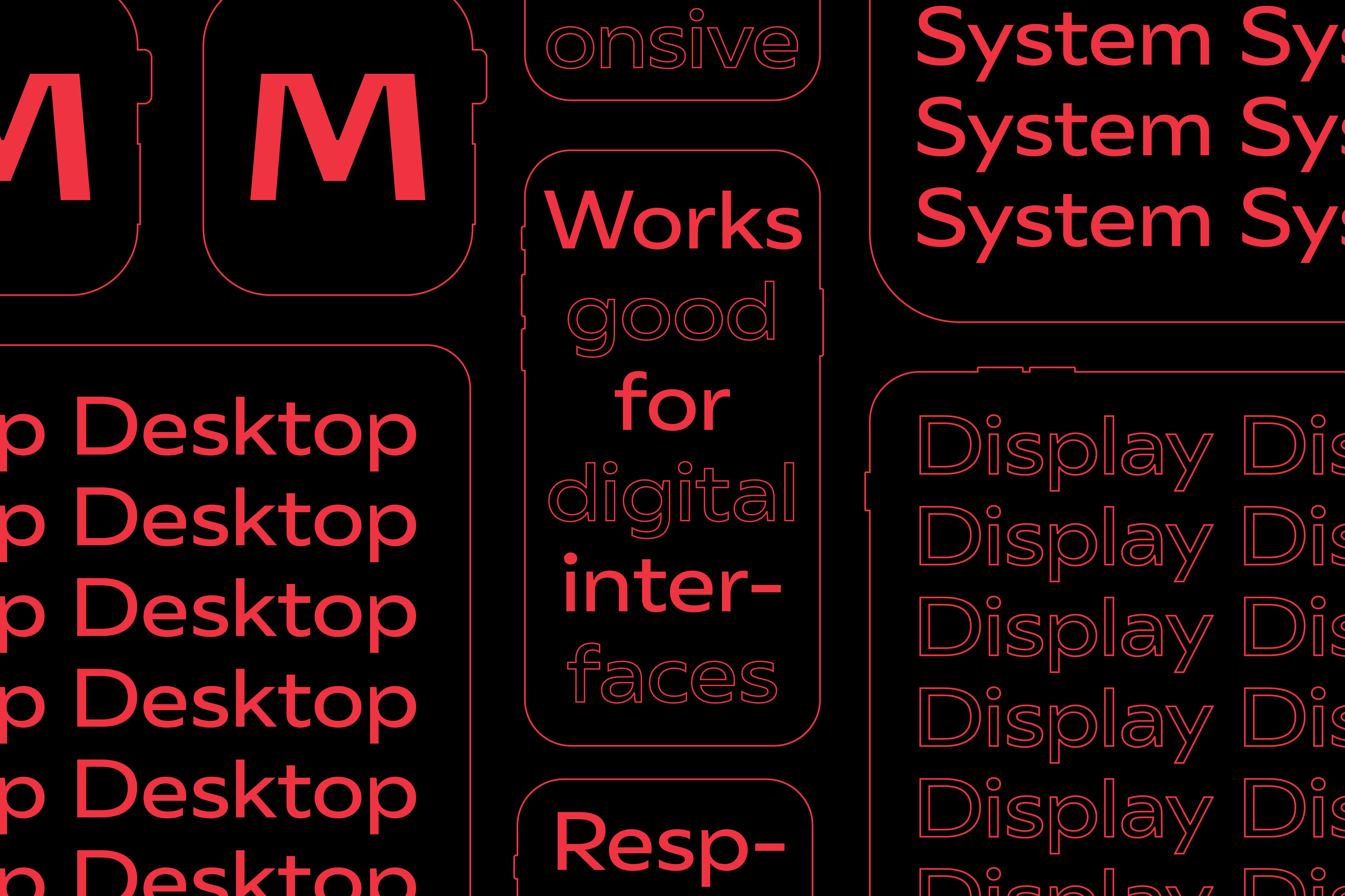
Morillas Sans has extended proportions and open counterforms to convey that feeling of openness and novelty of Morillas in this new stage. With chiseled finishes inherited from calligraphy, it seeks to unite tradition and innovation in the same typographic skeleton. A new contemporary and timeless typeface aligned with the new trends to come. Small subtleties that transmit all the ingredients that make us up.
CREDIT
- Agency/Creative: Morillas
- Article Title: Morillas Creates a New Typeface Morillas Sans
- Organisation/Entity: In-house, Published Self Promotional Design
- Project Type: Identity
- Project Status: Published
- Agency/Creative Country: Spain
- Market Region: Europe
- Project Deliverables: Brand Identity, Brand Strategy, Brand World, Graphic Design, Rebranding, Tone of Voice
- Keywords: Typography, Specimen, Sans, Branding, Wordmark


