Busup is a mobility service provider that wanted to update its proposal from a local B2C focus to a global B2B approach. So, we worked on a new strategy, and on a new visual and verbal identity, and on grounding all the applications to achieve the consistency and differentiation that the brand needed.
Busup was born with a global vocation of bringing available transportation closer to the final consumer at every moment. However, this model has evolved towards corporate commuting and demands are not yet fully covered by public transport. By analyzing the brand and its context, our strategy team dived into the brand essence to develop a new positioning. We focused on the brand’s main value proposals: its new business model and the essential digital capacities that the company had acquired since its foundation, such as the integration of data or the algorithms to optimise routes, thereby offering greater efficiency to clients and users, and contributing to the creation sustainable city models.
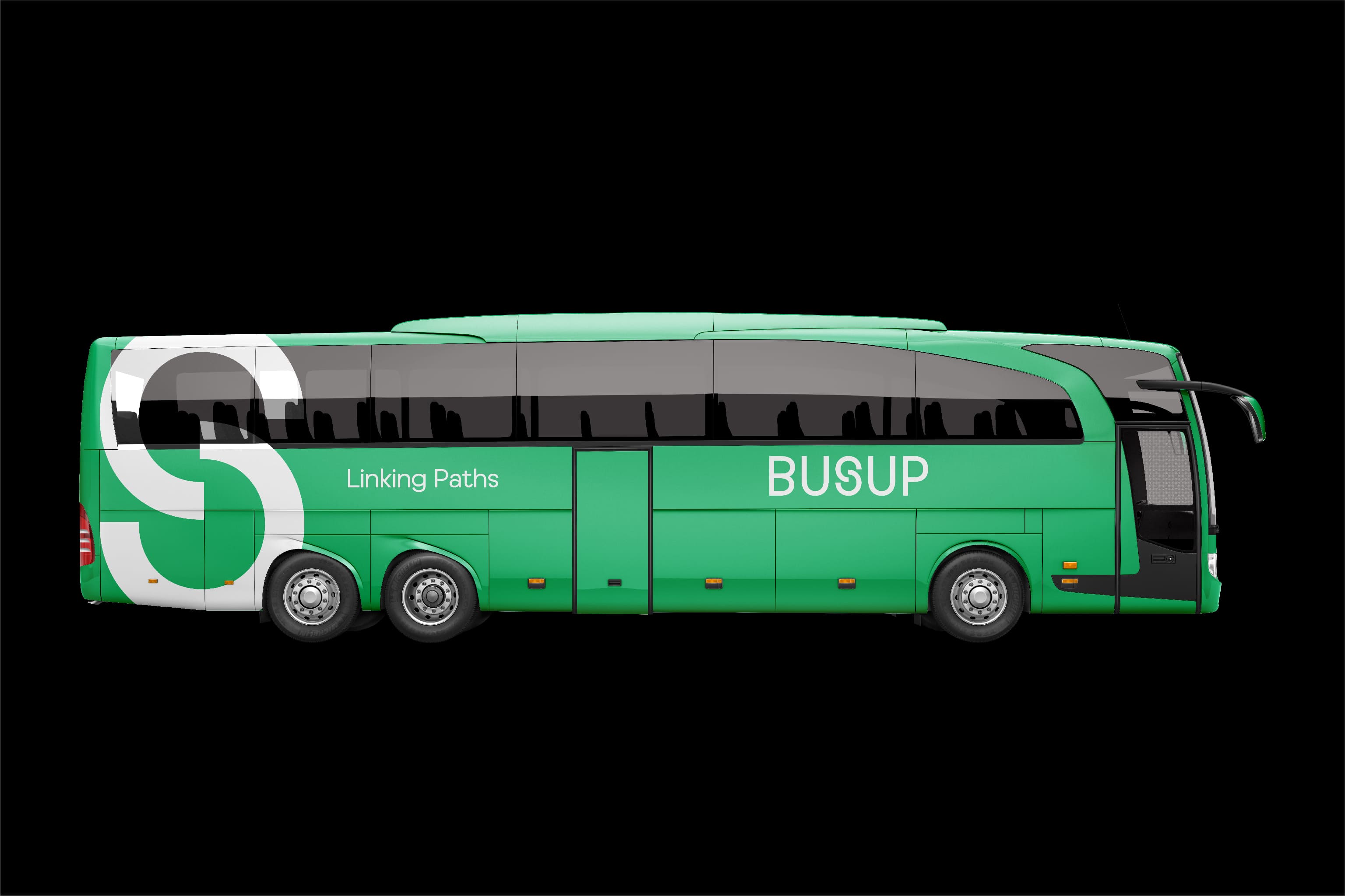
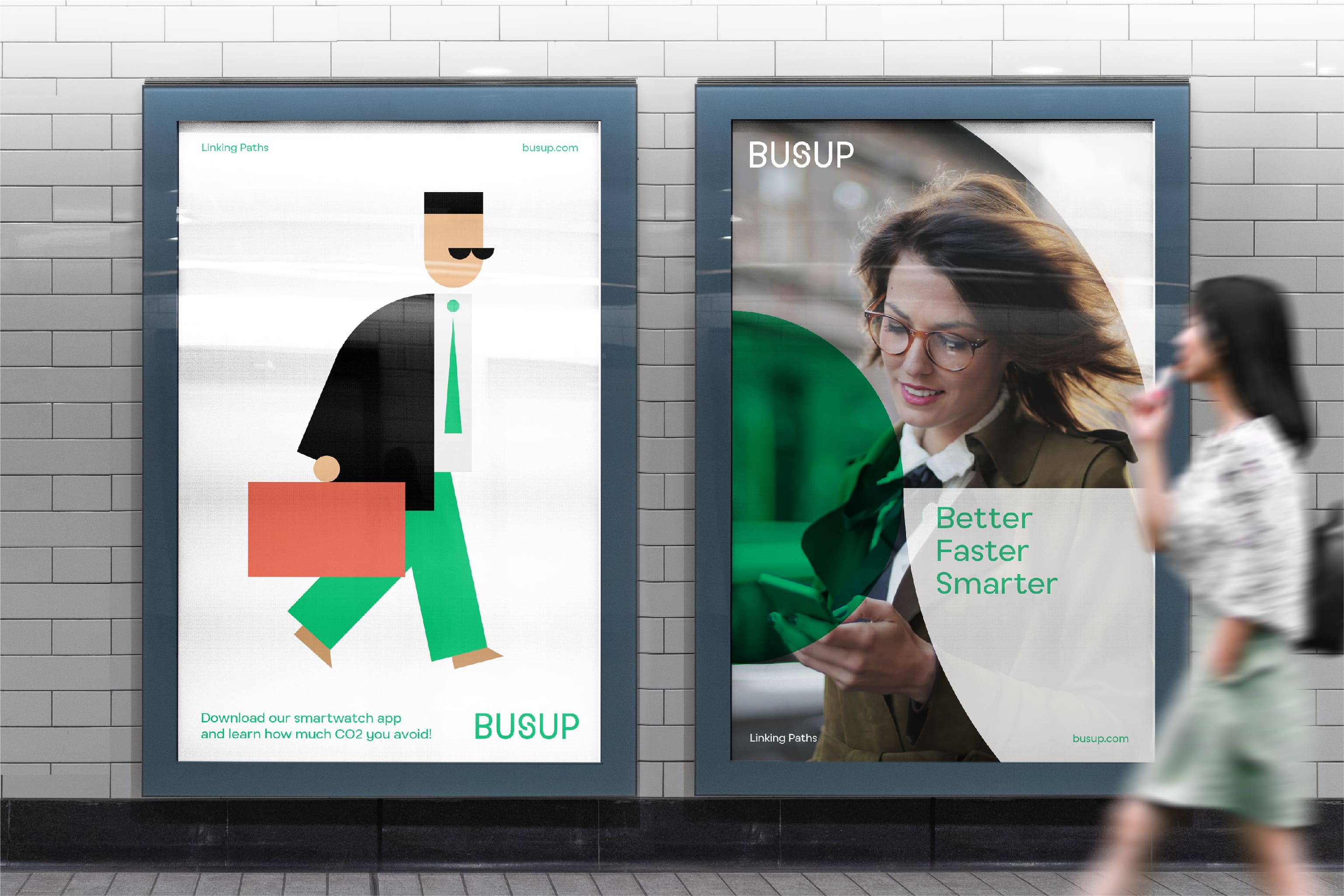
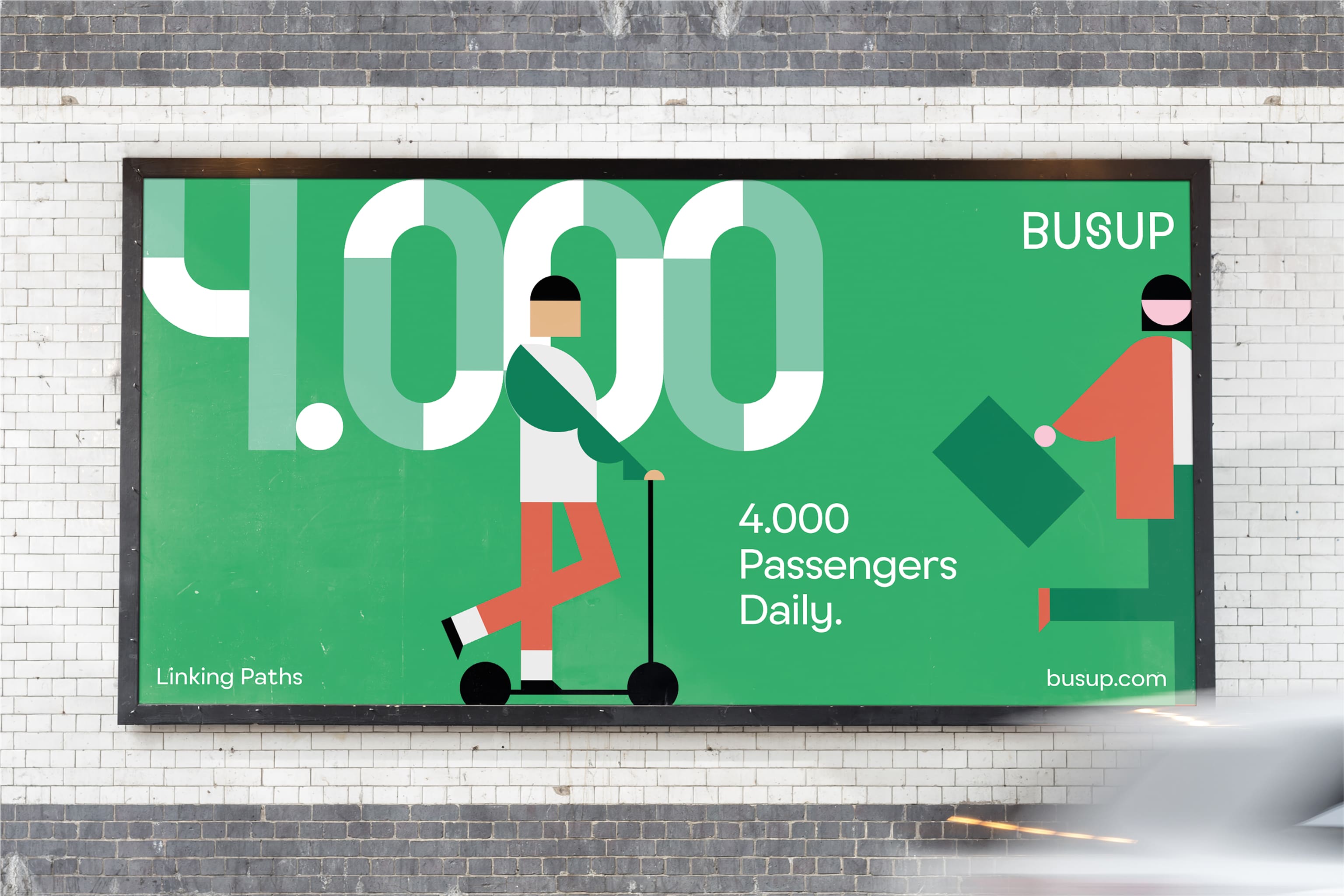
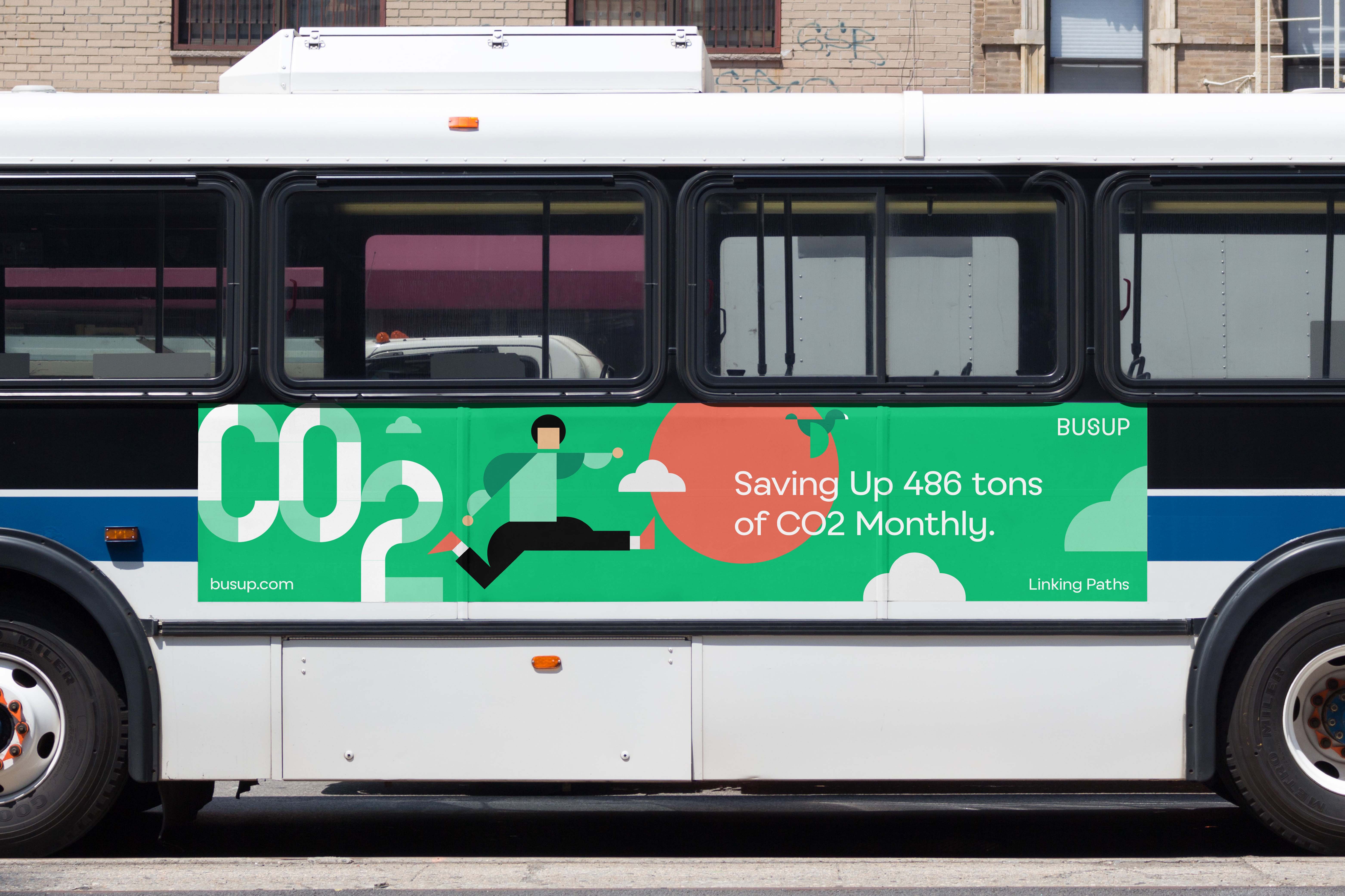
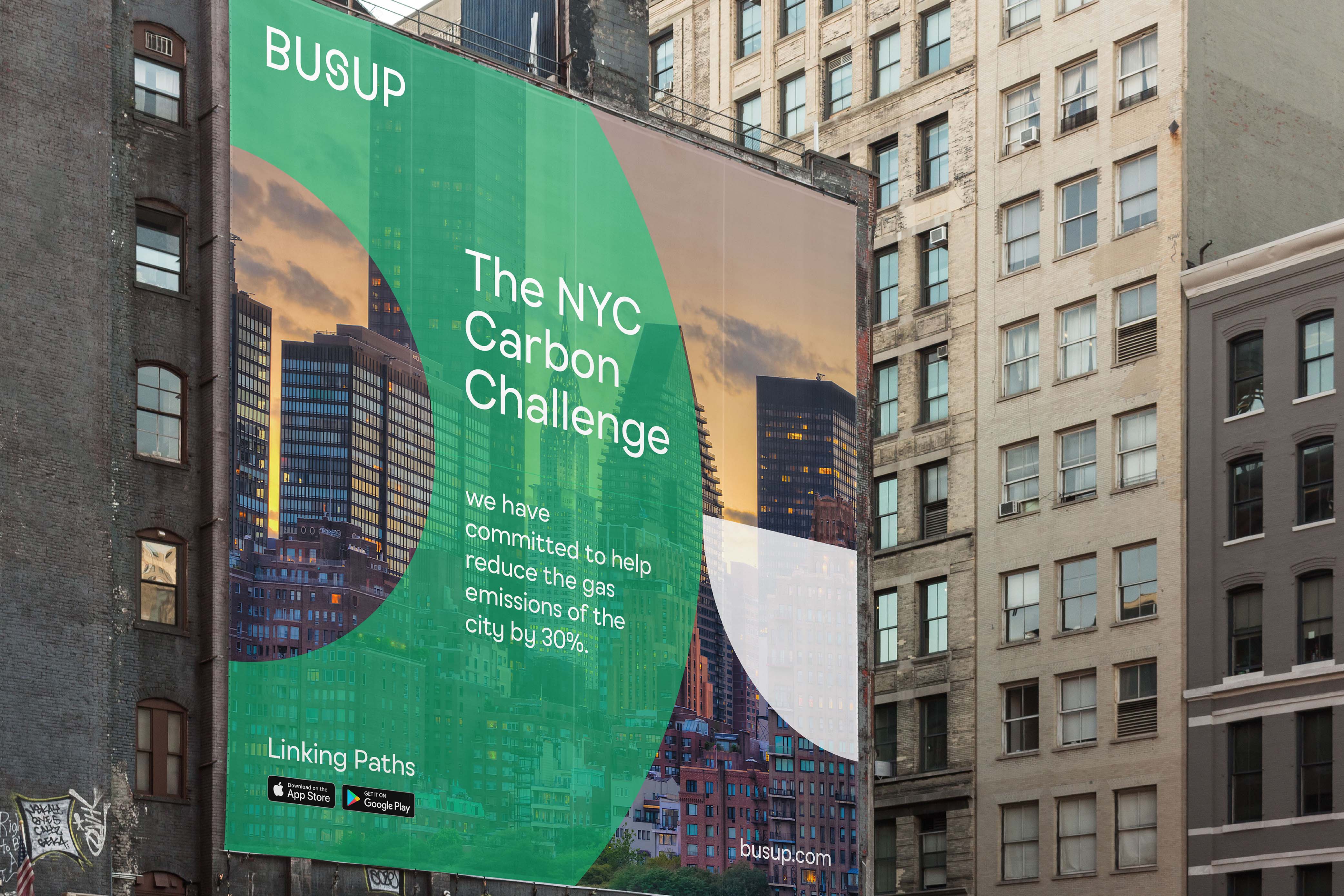
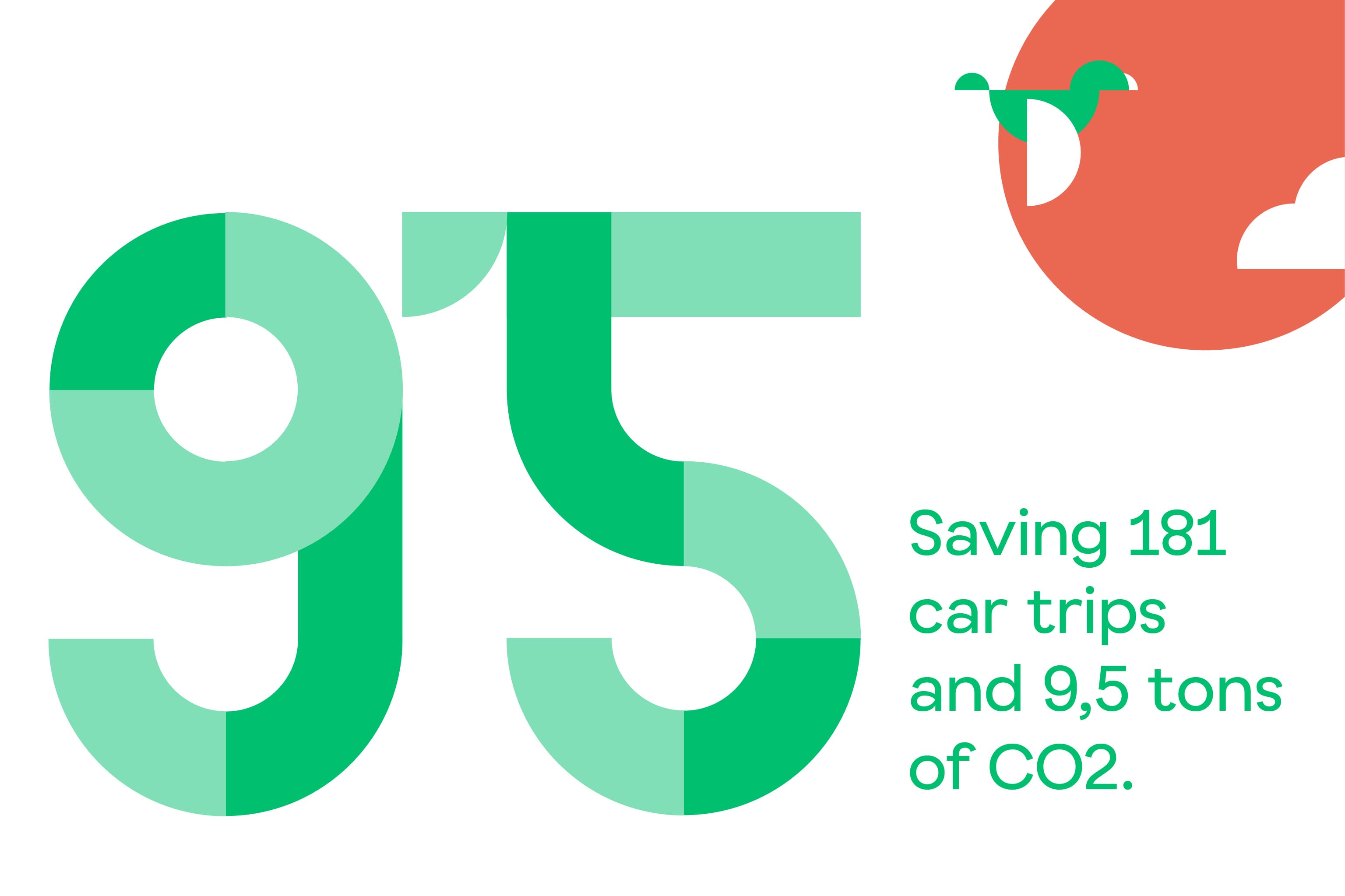
We created a new prominent brand under the big idea of Busup as a connector – a link between companies, their employees, and drivers. A link between city centers and suburbs. A link between cities, people, companies, and their sustainable objectives. This big idea was our launchpad to construct a visual language that achieved the right balance between tech and approachability. Brands are not static; they must go further than expected. This was the rationale behind the dynamic logotype, which shapes the whole brand’s visual language, built through the “S” as a way to ground the brand’s groundbreaking proposal of shared mobility, and convey its dynamic vision. This link helped us to shape the entire visual identity, building the brand’s language through fragments of Busup’s symbol. We leveraged the link concept to create distinctive shapes full of flexibility and dynamism that can be featured in communications, as a way to elevate the brand and convey expertise. In parallel, we worked on a closer visual language, to reach the final consumer target in a more relevant and resonant way, by creating ad hoc illustrations that represent all types of commuters and users, inviting them into the Busup world through friendly illustrations and appealing colours.
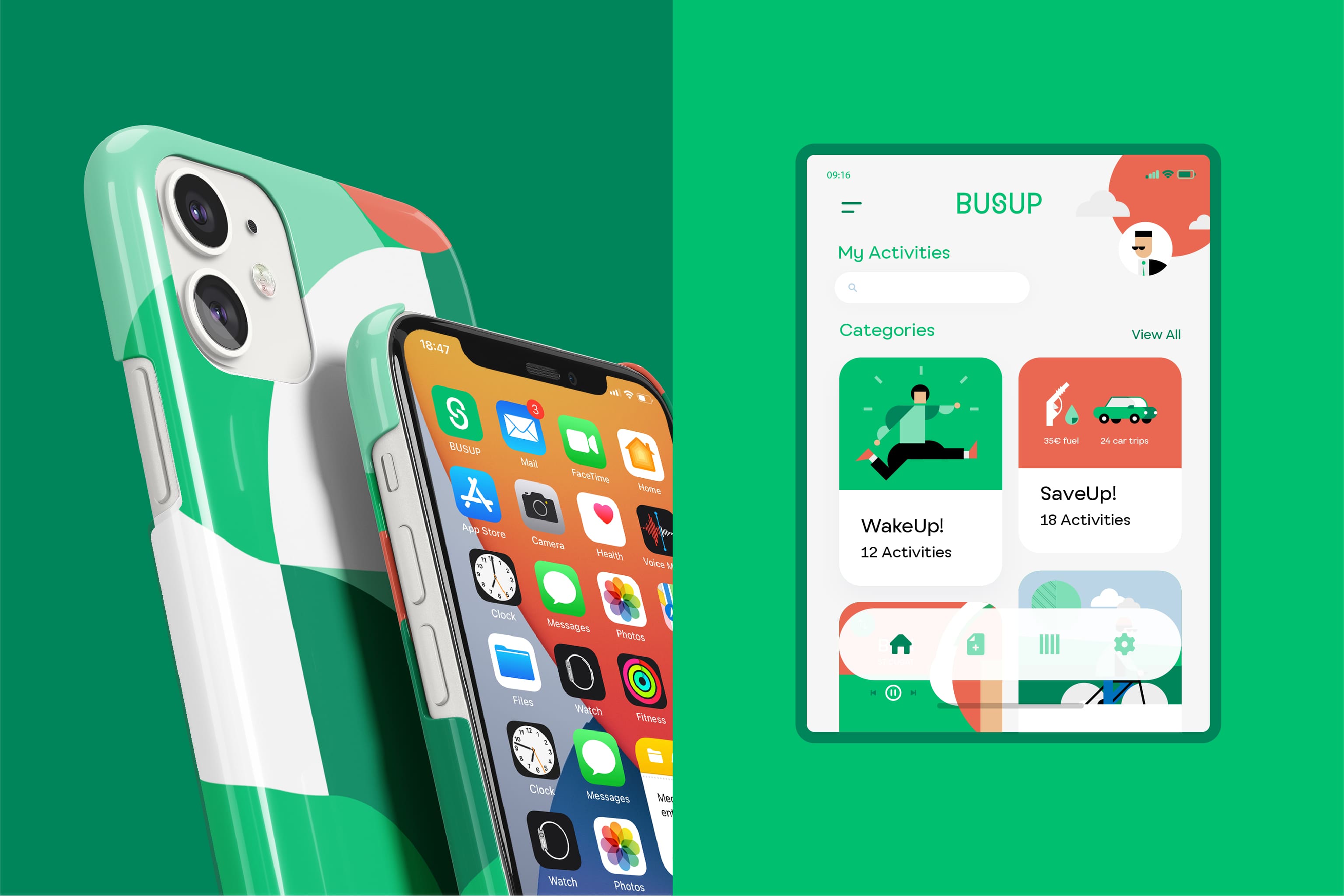
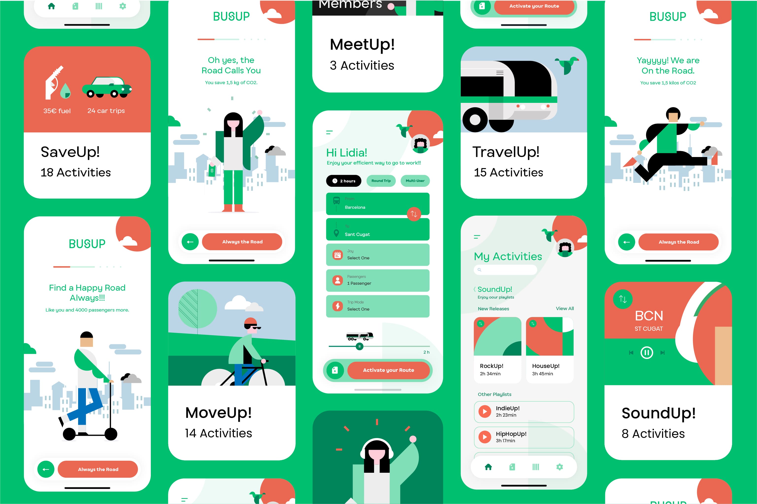
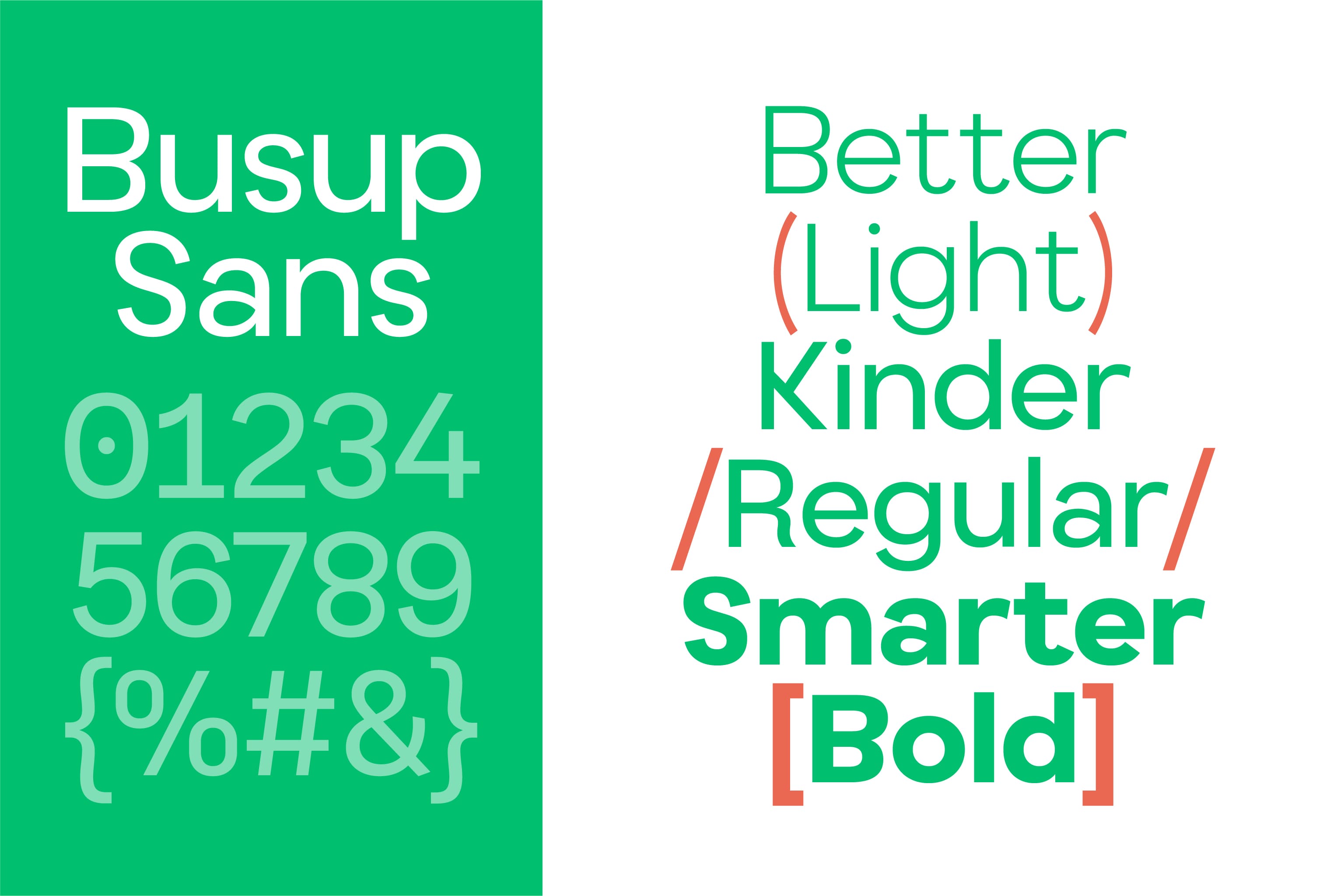
We also designed all the brand’s applications. Given that Busup’s main touchpoint is the digital environment, we developed the visual language with a 100% digital orientation and devised a bespoke app. Taking into account all types of commuters, categories, and functions, we developed a friendly and empathic tone of voice to make the app more engaging. To round off, and give Busup a coherent, global, and inimitable character, we opted for a custom-made typography that would reinforce its identity. Busup Sans was created in collaboration with Pedro Arilla. With its colourful geometric typeface and digital-first approach, it is a future-facing font optimised for legibility on screen that stands out for its ample proportions, the large x-height, and the bold nature we added to its terminals. Fully licensed to Busup, the font gives the brand the freedom to build a distinctive typographic design system that reflects the freshness of its purpose. A coherent brand with a big idea that succeeds in grounding its visual and verbal identity. A prime example of how to build a consistent proposal, making the brand relevant and meaningful in order to connect with its audiences.
CREDIT
- Agency/Creative: Morillas Brand Design
- Article Title: Morillas Brand Design Branding for Smart Mobility in B2B with Busup
- Organisation/Entity: Agency
- Project Type: Identity
- Project Status: Published
- Agency/Creative Country: Spain
- Agency/Creative City: Morillas Brand Design
- Market Region: Europe
- Project Deliverables: App Design, Brand Experience, Brand Identity, Brand Strategy, Graphic Design, Typography
- Industry: Transport
- Keywords: #brandstrategy #branding #graphicdesign #brandpositioning #brandplatform #visualidentity #logo #illustration #verbalidentity #Busup #linkingpaths #transport #sharedmobility #sustainable #morillas #webdesign #app #communication #typography #digital #createsomethingextraordinary
-
Credits:
Typography: Pedro Arilla


