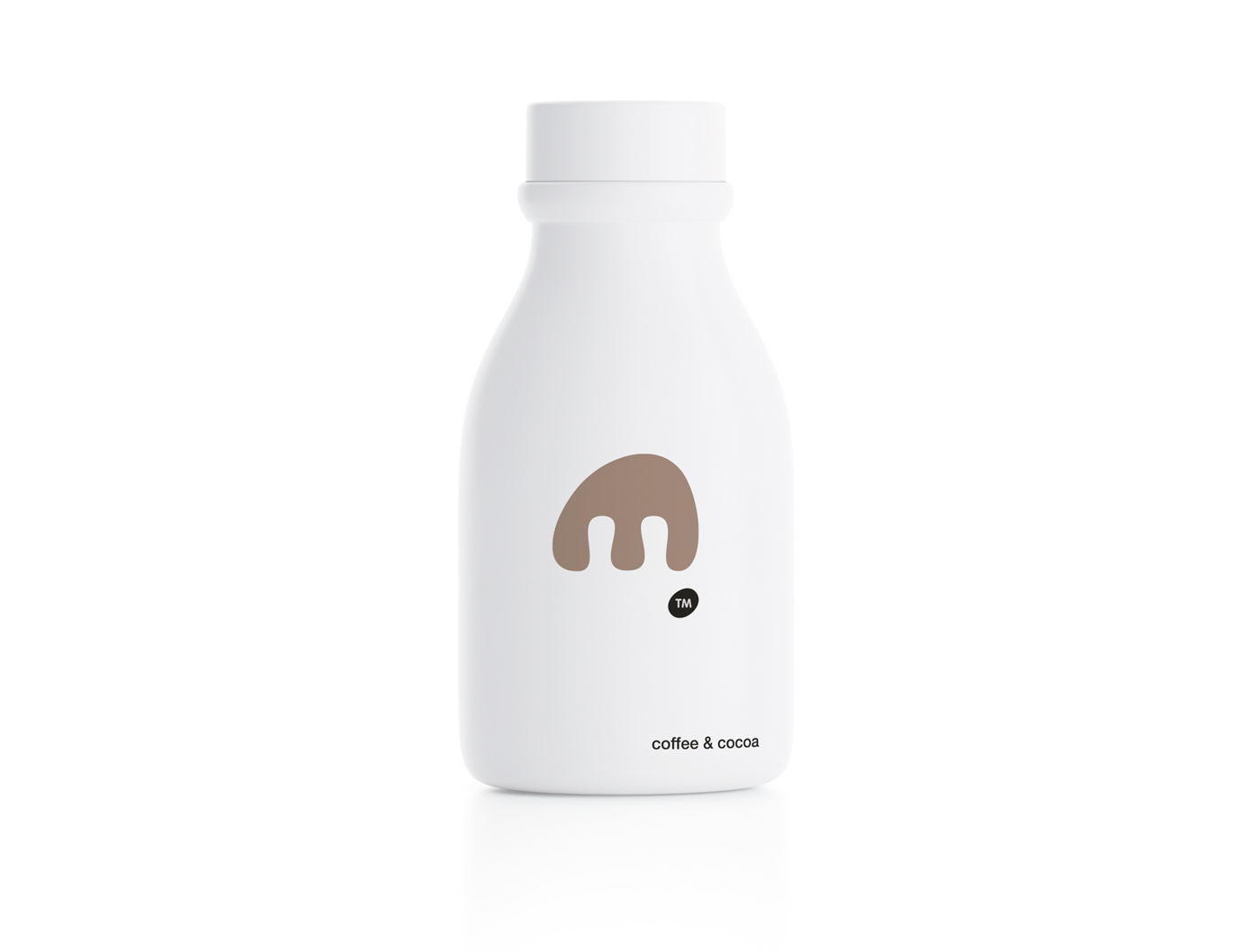
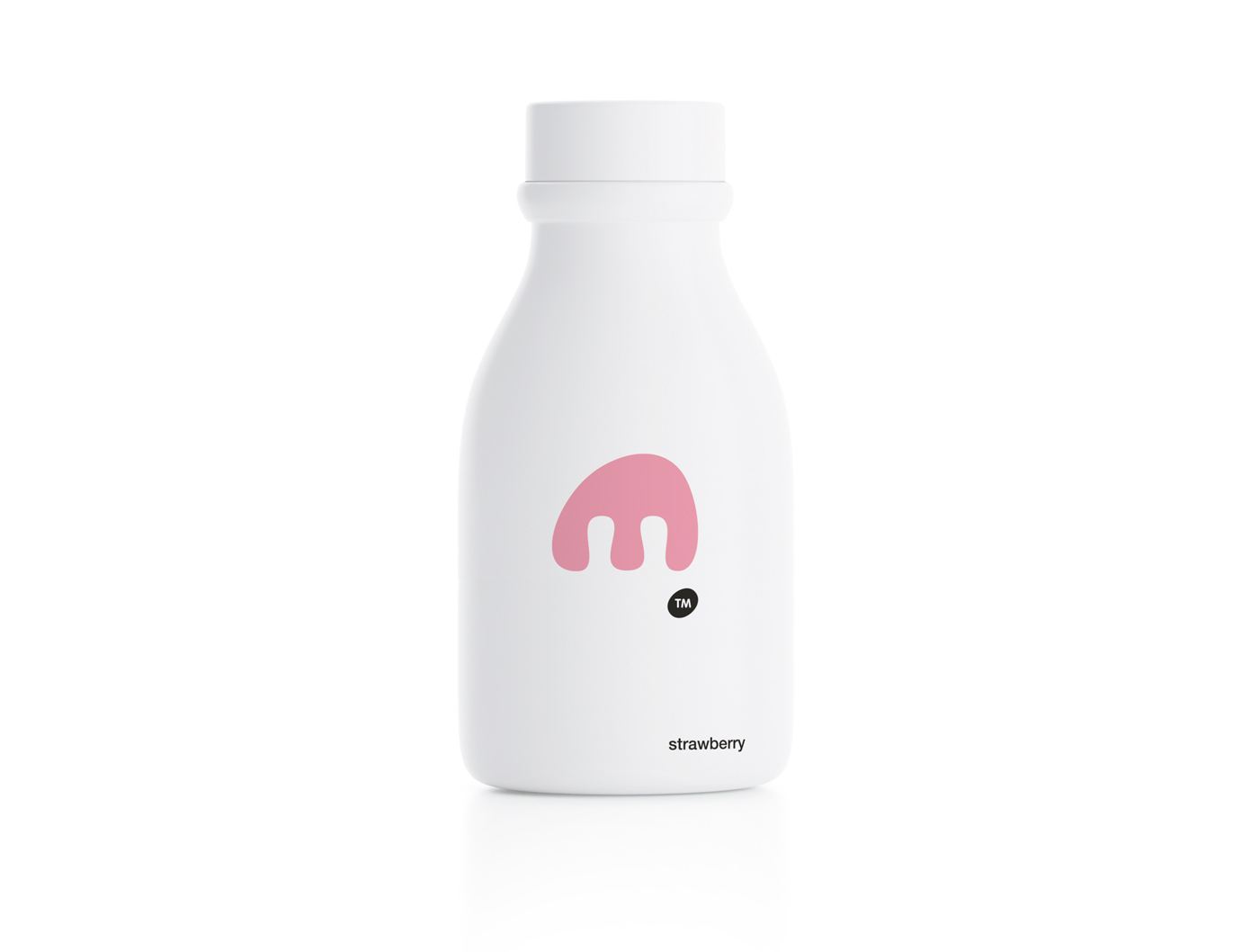
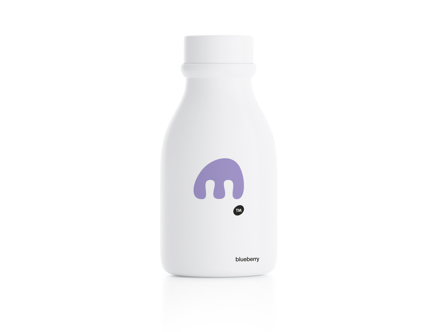
During the design process the creative team may often face various obstacles, like having to comply with the mandatory text requirements for product packaging.
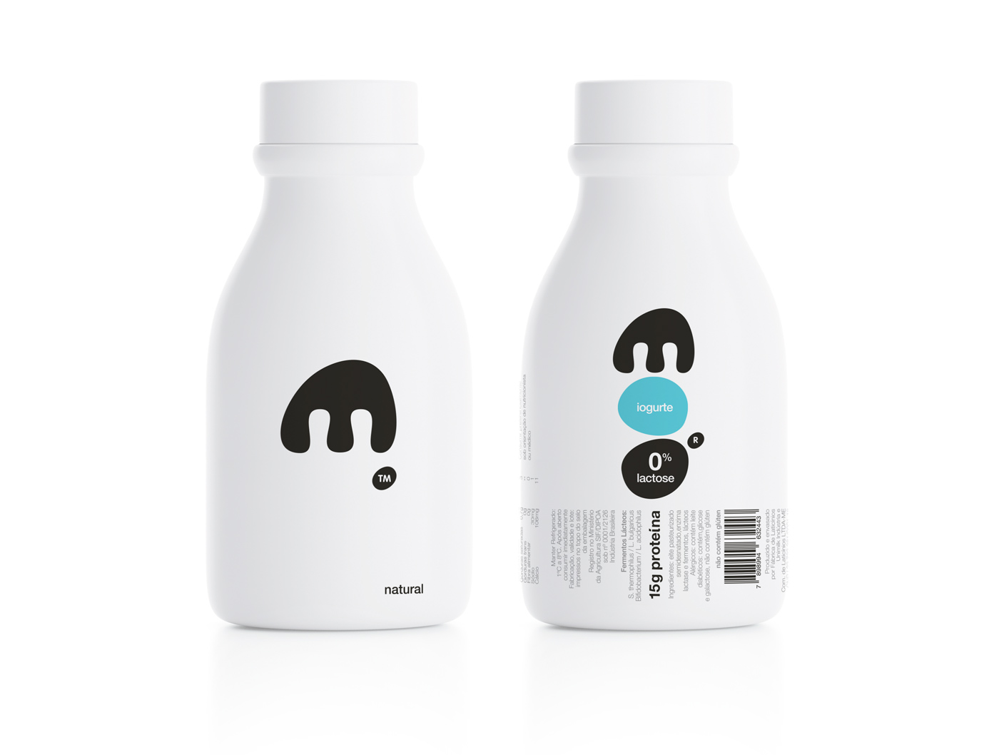
Various local regulatory demands significantly alter the conceived design for a specific product since the host of information must be placed on the front of its packaging. That was the challenge we faced when working with ‘moo drink’ and the Brazilian market.
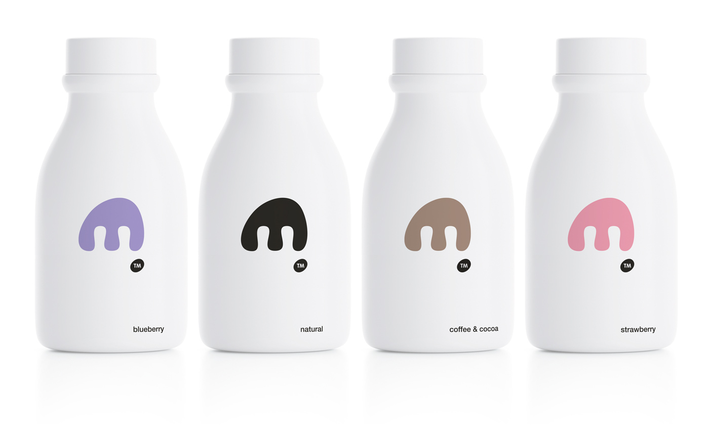
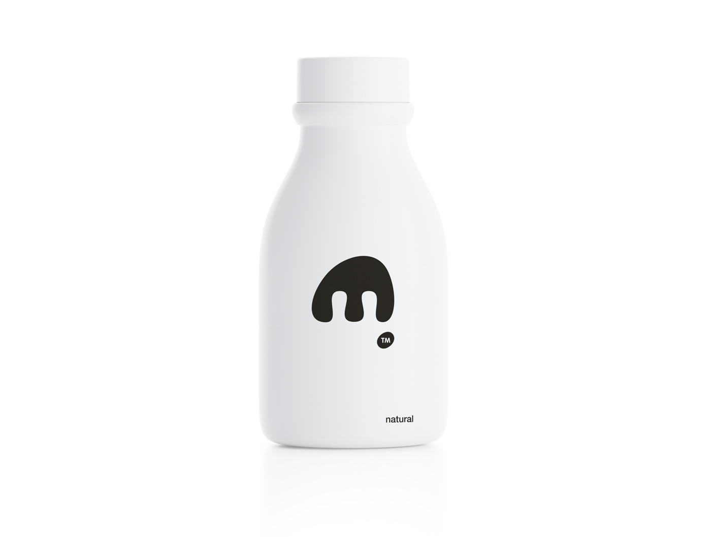
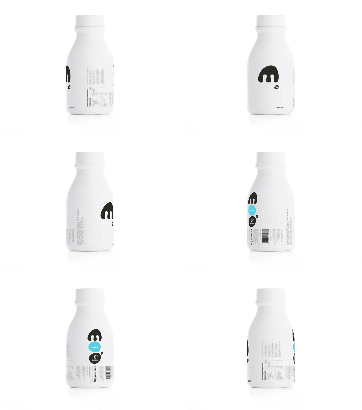
We tried to overcome it by actually reversing the notion of ‘back’ and ‘front’ of our packaging. We treated the back side as the one tha clearly carries the product logo with no other visual noise.
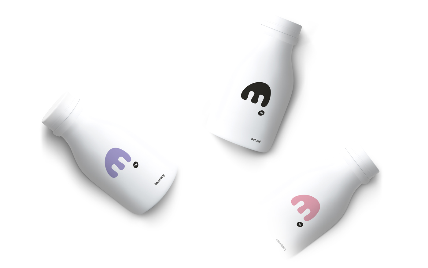
On the other side of the container we developed the “MOO” logo vertically with flavor-indicative, subtle color-coded differentiations. All consumer related, mandatory information is included below that.
With this design approach we suggest that the back and front of a packaging whole can be treated as interchangeable and of equal importance.
CREDIT
- Agency/Creative: mousegraphics
- Article Title: MOO Drinkable Yogurt, How to Get Away With… Rules!
- Organisation/Entity: Agency, Published Commercial Design
- Project Type: Packaging
- Agency/Creative Country: Greece
- Market Region: South America
- Project Deliverables: Graphic Design, Packaging Design, Product Architecture
- Format: Bottle
- Substrate: Plastic


