


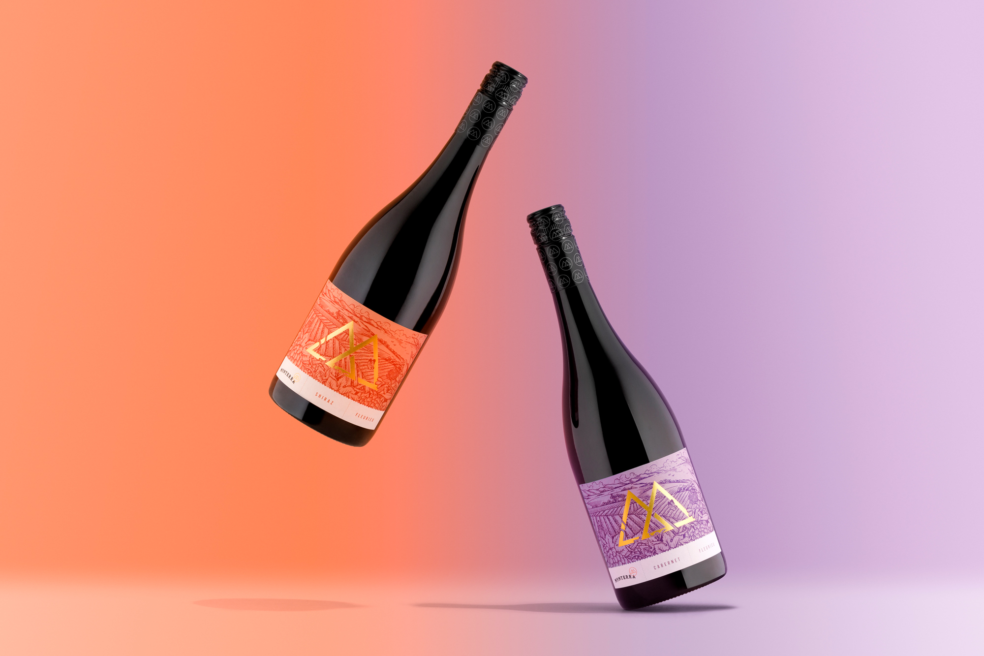
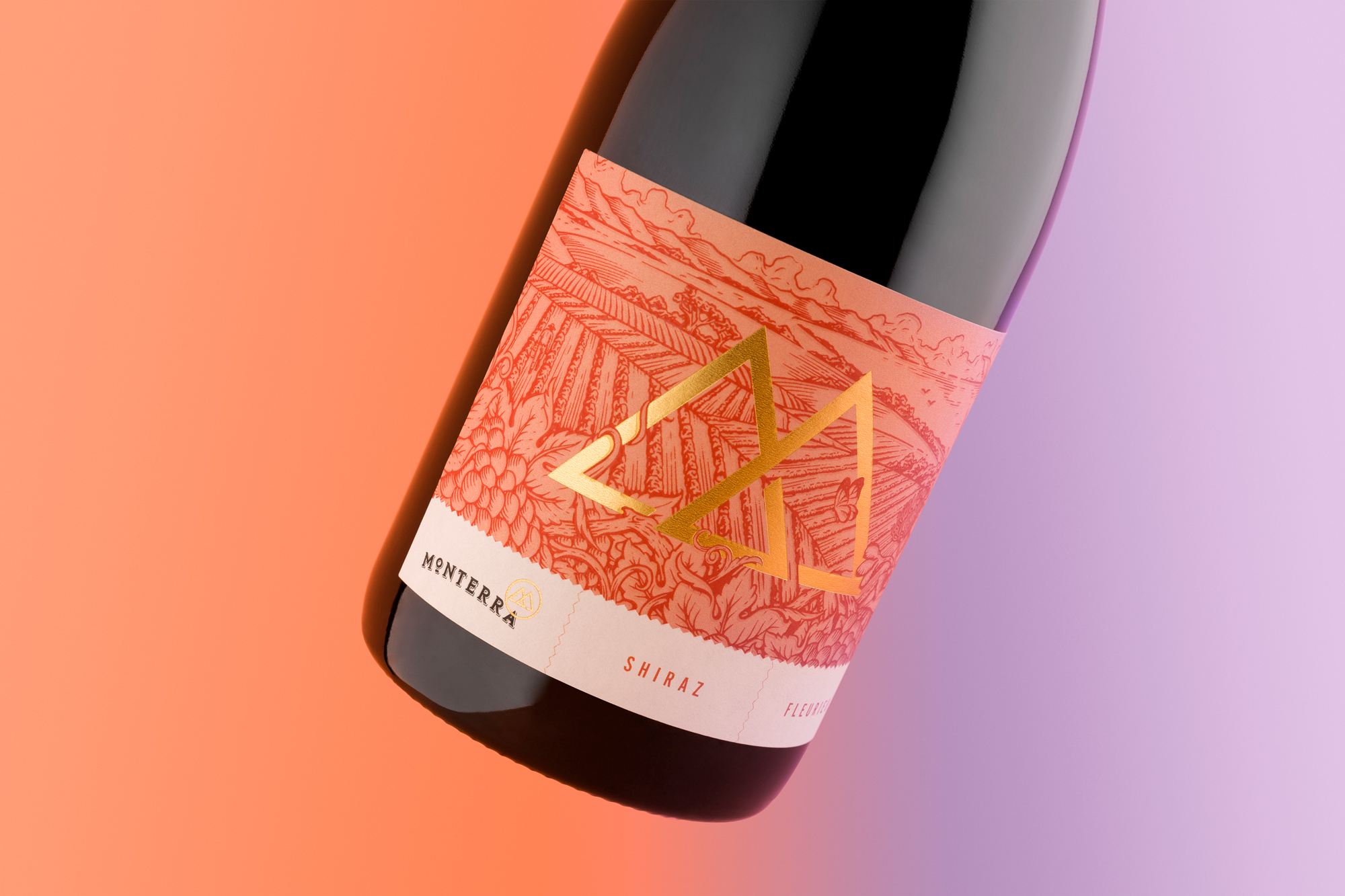
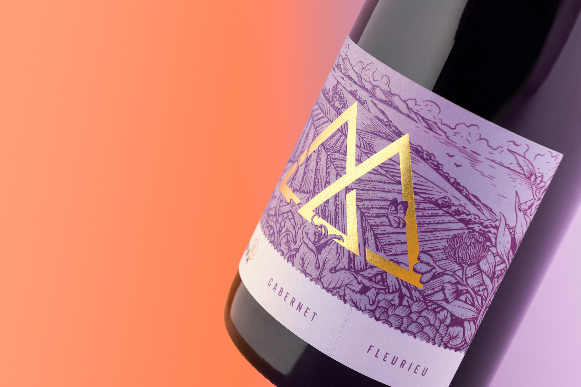
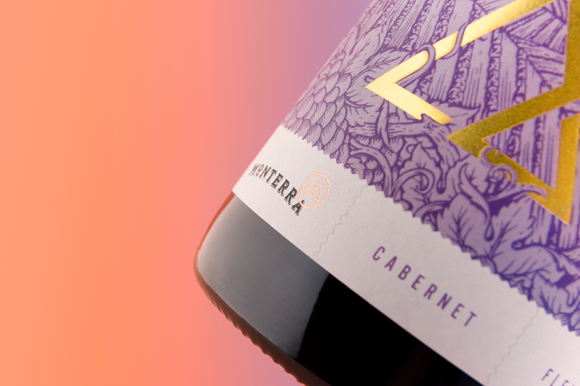
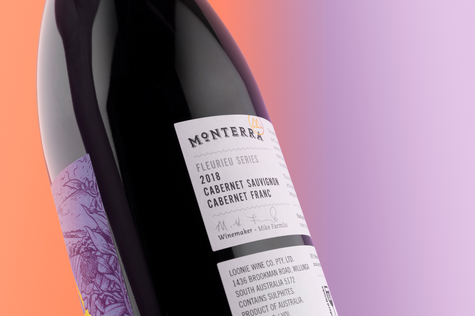
The ‘Fleurieu Series’ is a playful new brand proposition under the Monterra Wines’ folio. This is a new entry-level range offered at an accessible price-point – targeting a more youthful demographic. The labels feature a vibrant etch-styled illustration depicting the Fleurieu Peninsula landscape – a vast and diverse coastal region. It’s a winemaker’s playground – offering many different soils, climates and varietals. These wines are balanced blends of the best vineyards scattered across the region. A lively showcase of the local Fleurieu Peninsula’s true depth.
CREDIT
- Agency/Creative: David Byerlee Design
- Article Title: Monterra Fleurieu Series
- Organisation/Entity: Agency, Published Commercial Design
- Project Type: Packaging
- Agency/Creative Country: Australia
- Market Region: Global
- Project Deliverables: Brand Architecture, Branding, Graphic Design, Illustration, Packaging Design, Retail Brand Design
- Format: Bottle
- Substrate: Pulp Paper
FEEDBACK
Relevance: Solution/idea in relation to brand, product or service
Implementation: Attention, detailing and finishing of final solution
Presentation: Text, visualisation and quality of the presentation


