


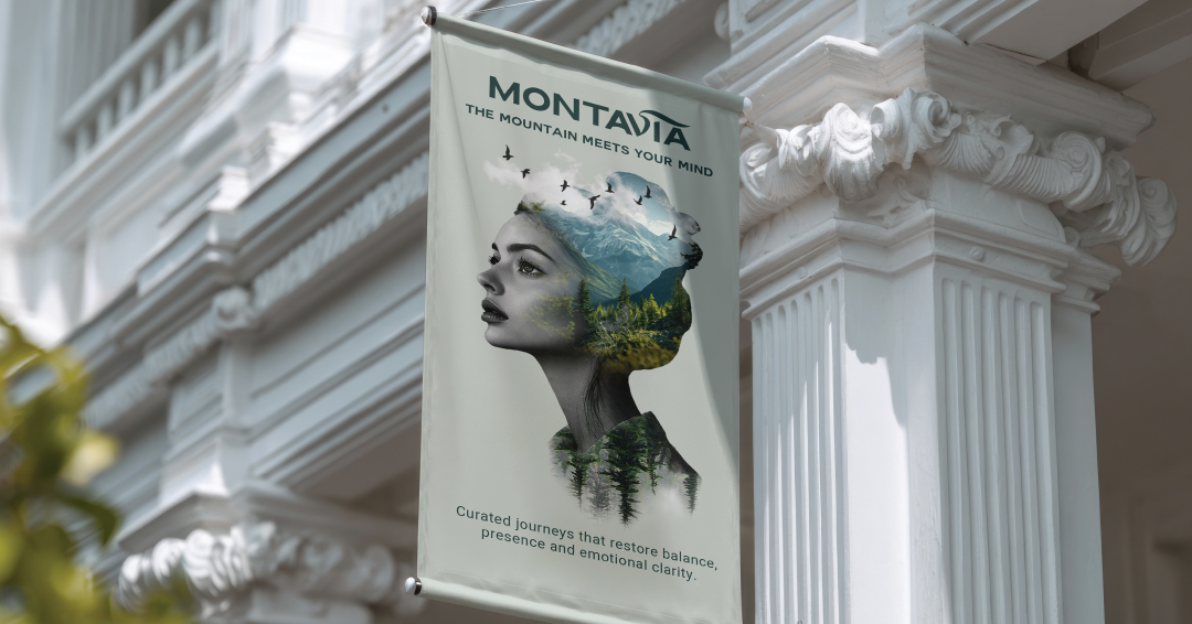
In an era defined by hyper-connectivity, relentless digital noise, and increasing cognitive overload, silence has become one of the rarest and most valuable luxuries. Montavia is a Swiss-inspired premium travel identity designed not only to transport people to a destination, but to guide them toward a specific state of mind.
THE CHALLENGE:
The challenge was to create a brand identity capable of standing apart from the visual intensity of the modern tourism industry. While many travel brands rely on bright colours, crowded imagery, and energetic messaging, Montavia required the opposite approach — a design language that communicates calm, clarity, and space. The project introduced the concept of “State-First Travel,” a philosophy that prioritizes the traveller’s internal experience over a traditional checklist of destinations.
THE CONCEPT: “STATE-FIRST” TRAVEL
Montavia shifts the paradigm from “Destination-First” to “State-First.” The brand philosophy is built around the concept of “Visual Silence.” Every touchpoint is designed to lower the user’s heart rate. The brand promises restoration, clarity, and the permission to pause.
THE VISUAL SOLUTION:
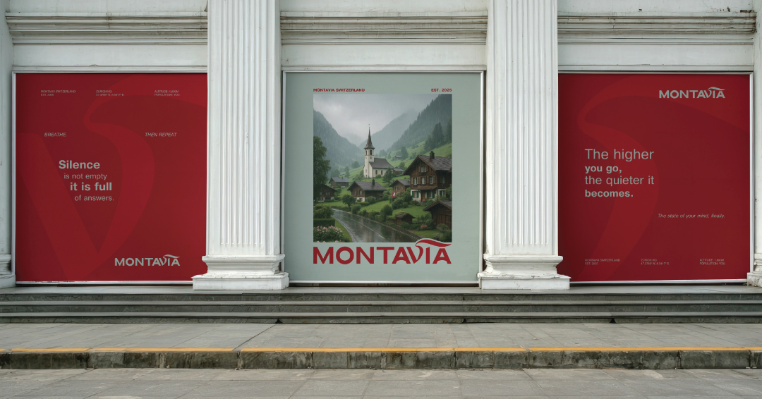
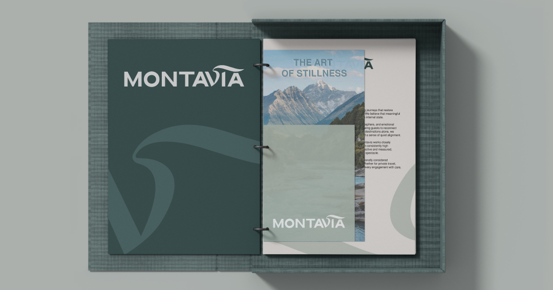
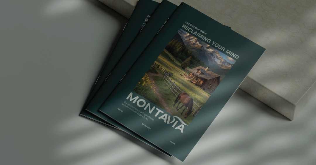
The visual identity is built around the principle of “visual silence.” Drawing inspiration from the heritage of the Swiss International Typographic Style, the system employs precise grid structures, generous negative space, and restrained compositions to create a sense of order, breathability, and quiet sophistication.
The logo moves beyond literal geographical references and instead captures the intangible atmosphere of the Alps. Its fluid form suggests the motion of a deep restorative breath — the intake of crisp high-altitude air — symbolising clarity, openness, and mental renewal.
The name Montavia combines the words mountain and via (Latin for “path” or “way”), suggesting both a physical journey through alpine landscapes and a symbolic path toward mental clarity and inner balance.
COLOR & TYPOGRAPHY:
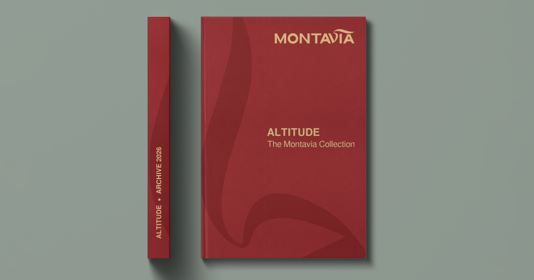
The colour palette establishes a dialogue between nature and Swiss design heritage. Deep Alpine Green evokes the stillness of mountain forests, while Swiss Red is used selectively as a signal of precision and cultural context. Clean modern typography reinforces the identity with clarity and structural balance.
Rather than focusing on spectacle, Montavia builds an environment of quiet luxury and contemplative travel, positioning the brand as a refined alpine experience where design, nature, and psychological restoration intersect.
CREDIT
- Agency/Creative: Milena Kocharyan
- Article Title: Montavia Swiss Travel Identity by Milena Kocharyan
- Organisation/Entity: Student
- Project Type: Identity
- Project Status: Published
- Agency/Creative Country: Armenia
- Agency/Creative City: Yerevan
- Market Region: Europe, Global
- Project Deliverables: Art Direction, Brand Identity, Brand Naming, Editorial Design, Graphic Design, Packaging Design
- Industry: Hospitality
- Keywords: Luxury, Travel, Switzerland, Swiss Identity, Minimalism, Neuroscape Branding, Branding, Packaging, Typography, Editorial, Premium, Visual Identity, Concept.
-
Credits:
Art Director & Graphic Designer: Milena Kocharyan


