Monocle Chocolate is a boutique chocolate company that places great importance on the quality of its ingredients to ensure excellence in every creation. Their overarching mission is to enrich lives and empower communities by transforming the way people experience and appreciate quality products. With a deep-seated desire to inspire and spread joy, each of their treats is crafted to offer a moment of happiness and connection.
Beyond the surface, Monocle Chocolate takes pride in educating customers about the scientific aspects of food production. Their tagline, “An eye on quality,” is an invitation for customers to embark on an imaginative journey of a larger worldview, where they see the great lengths food has taken to reach their tables.
Customers are encouraged to perceive chocolates from a fresh perspective, appreciating the craftsmanship infused into every creation. Overall, Monocle Chocolate symbolizes conscious consumption, meaningful connections, and the celebration of life’s most cherished moments.
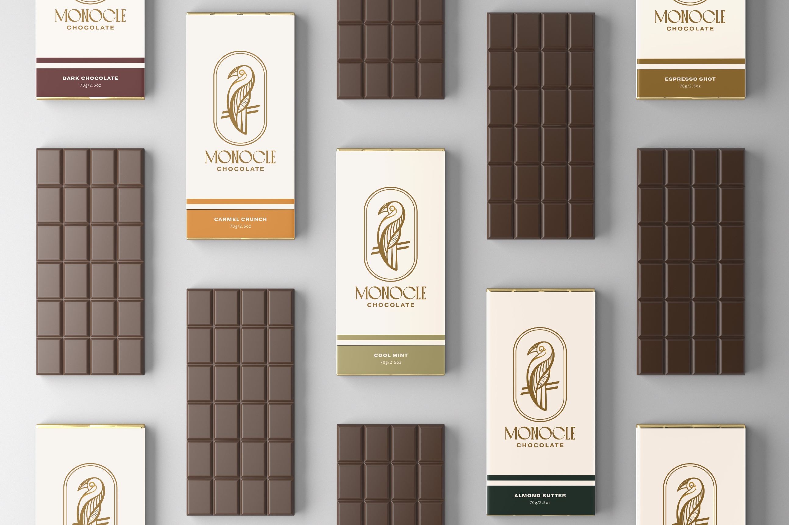
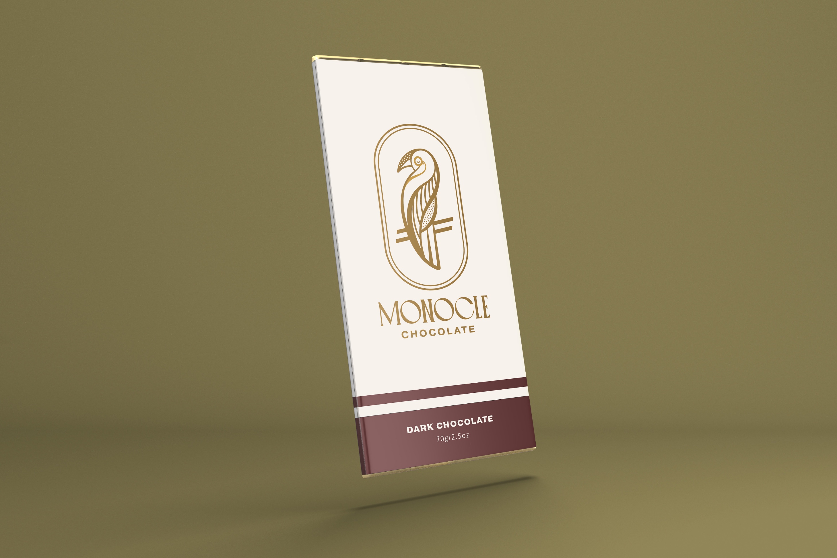
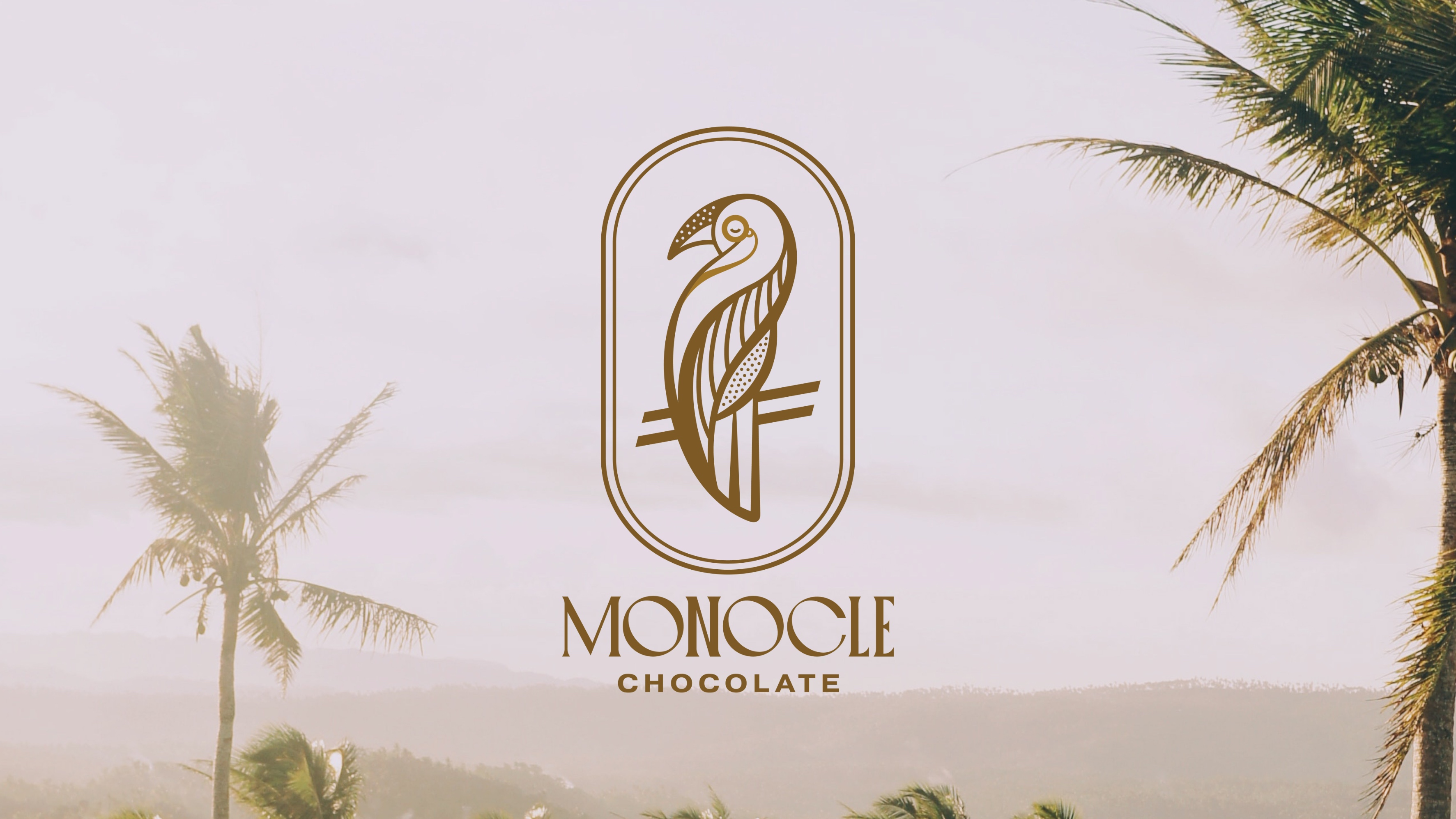
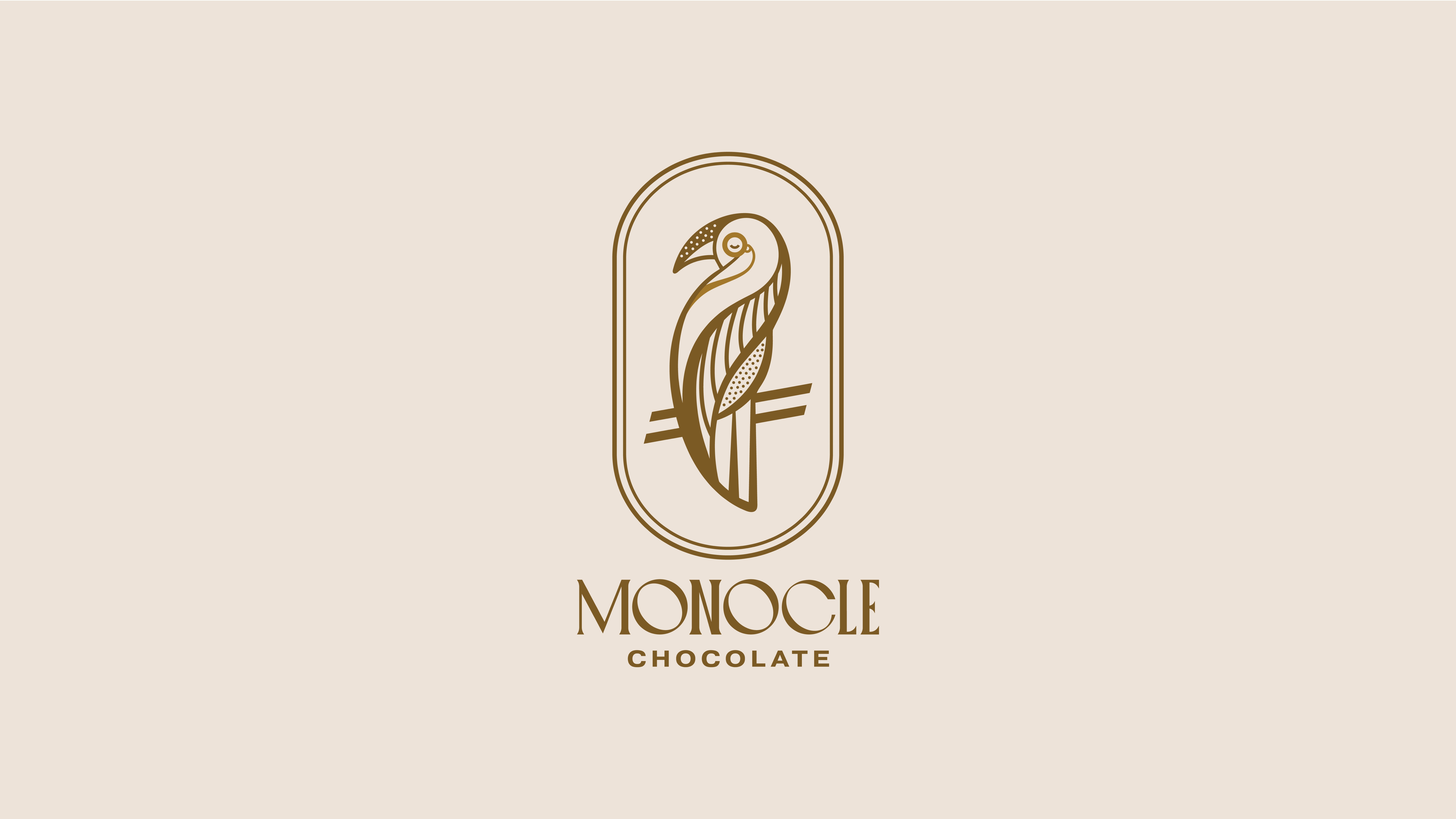
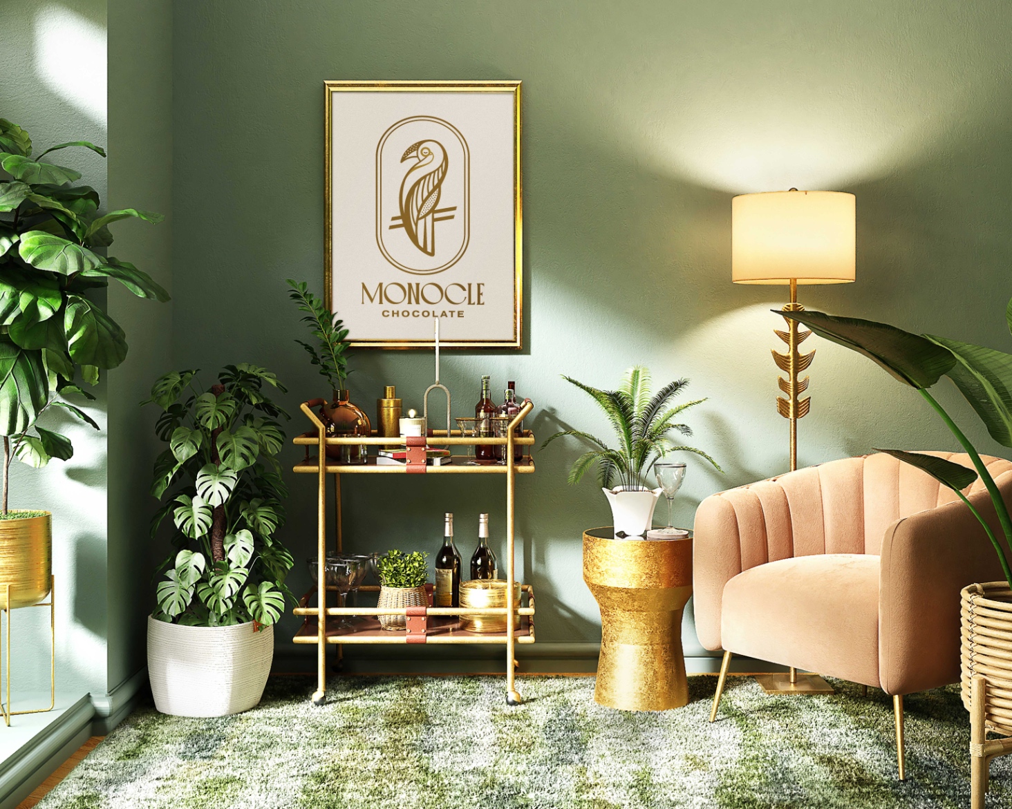
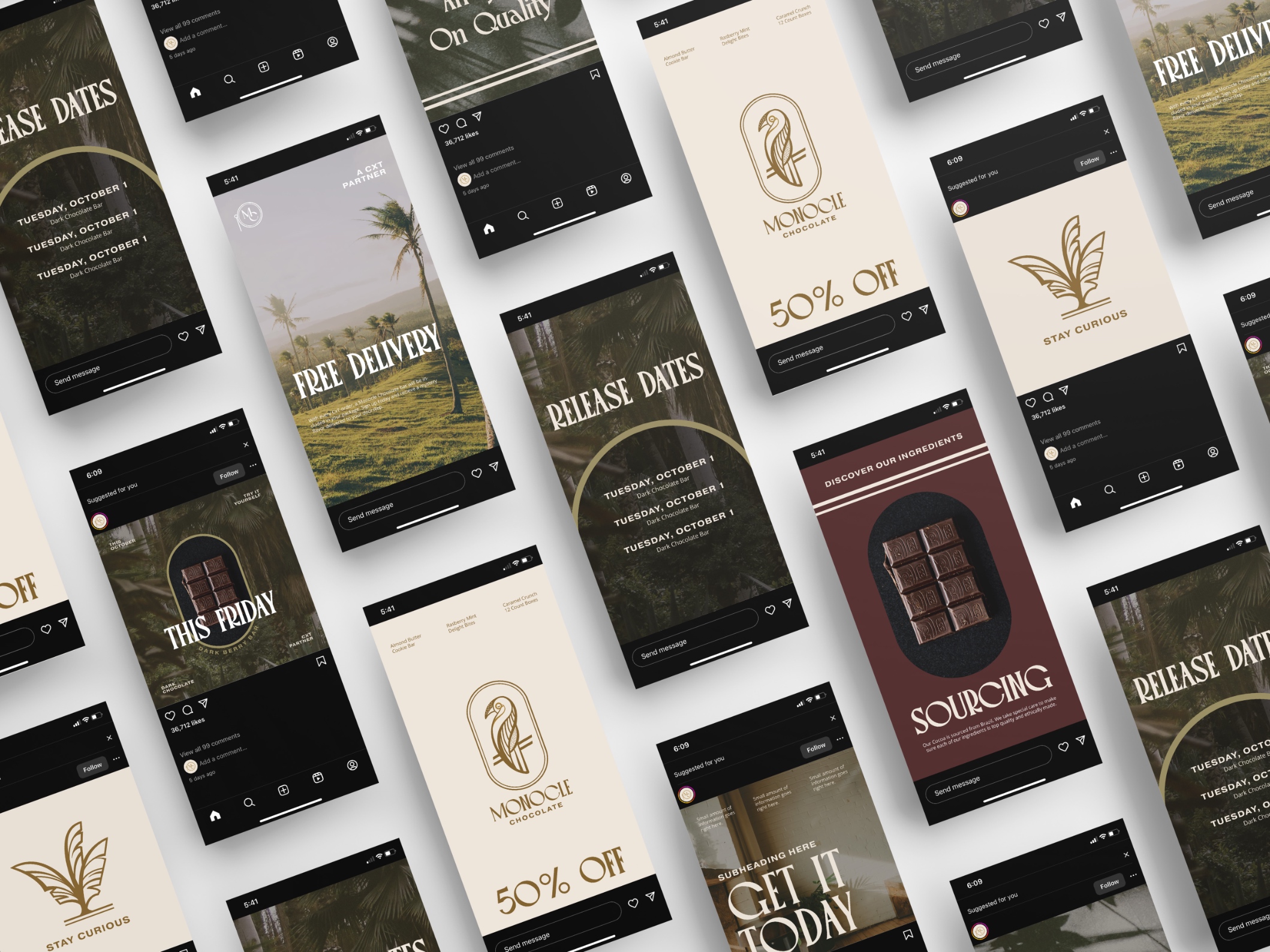
Monocle Chocolate’s brand design by Vetter Design Co. was inspired by a vintage aesthetic, depicted through the combination of thick and thin brush strokes and stippling illustrations that evoke a sense of nostalgia and craftsmanship. The logo, a parrot showing off the quirky and fun side of the brand, represents a unique and vibrant personality. The addition of a monocle to the parrot elevates its sophistication, seamlessly tying in with the name, “Monocle Chocolate.” This juxtaposition of whimsy and refinement is core to all design decisions throughout the brand identity.
The typography uses a vintage-inspired font, with wide-set letters and tilted “C’s” and “O’s,” reinforcing the playful and distinctive character of the brand. This playfulness is stabilized with modern serifs that feel strong and dependable.
Through the combination of a vintage-inspired aesthetic, a whimsical yet refined logo, and playful typography, Monocle Chocolate not only exudes a sense of artisan craftsmanship but also becomes a symbol of joy. Monocle Chocolate is more than just indulging in a sweet treat; it is about participating in a celebration of life’s most precious moments, marked by the intersection of quality, creativity, and a touch of sophisticated whimsy.




CREDIT
- Agency/Creative: Micah Vetter
- Article Title: Monocle Chocolate Brand Identity
- Organisation/Entity: Freelance
- Project Type: Identity
- Project Status: Published
- Agency/Creative Country: United States
- Agency/Creative City: Bloomington
- Market Region: North America
- Project Deliverables: Brand Identity
- Industry: Food/Beverage
- Keywords: WBDS Creative Design Awards 2023/24
- Keywords: Identity, Brand Design Creation
-
Credits:
Creative Designer: Micah Vetter


