


In a field where technical reliability often takes center stage, branding is frequently treated as an afterthought. M-Filter, a filtration specialist working across the food, pharmaceutical, and industrial sectors, approached this space from a different angle. Known for their responsiveness, precision, and tailored solutions, the company had a strong service reputation, but lacked a visual identity that could communicate those values with clarity and distinction. The project offered a chance to rethink how a brand in a highly regulated and practical industry could express both expertise and approachability.
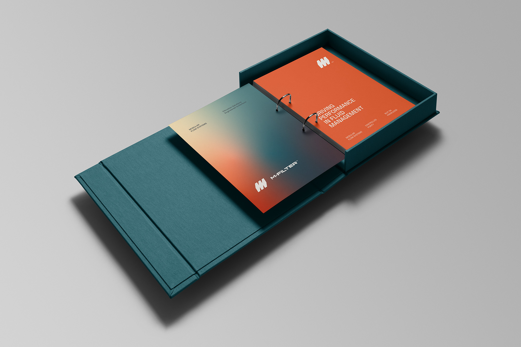
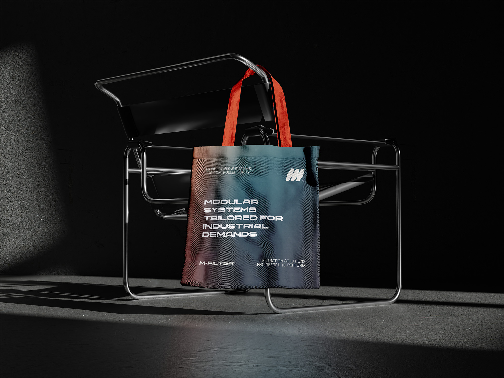
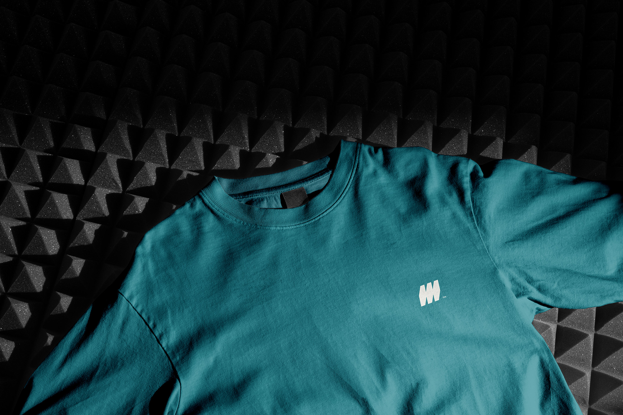
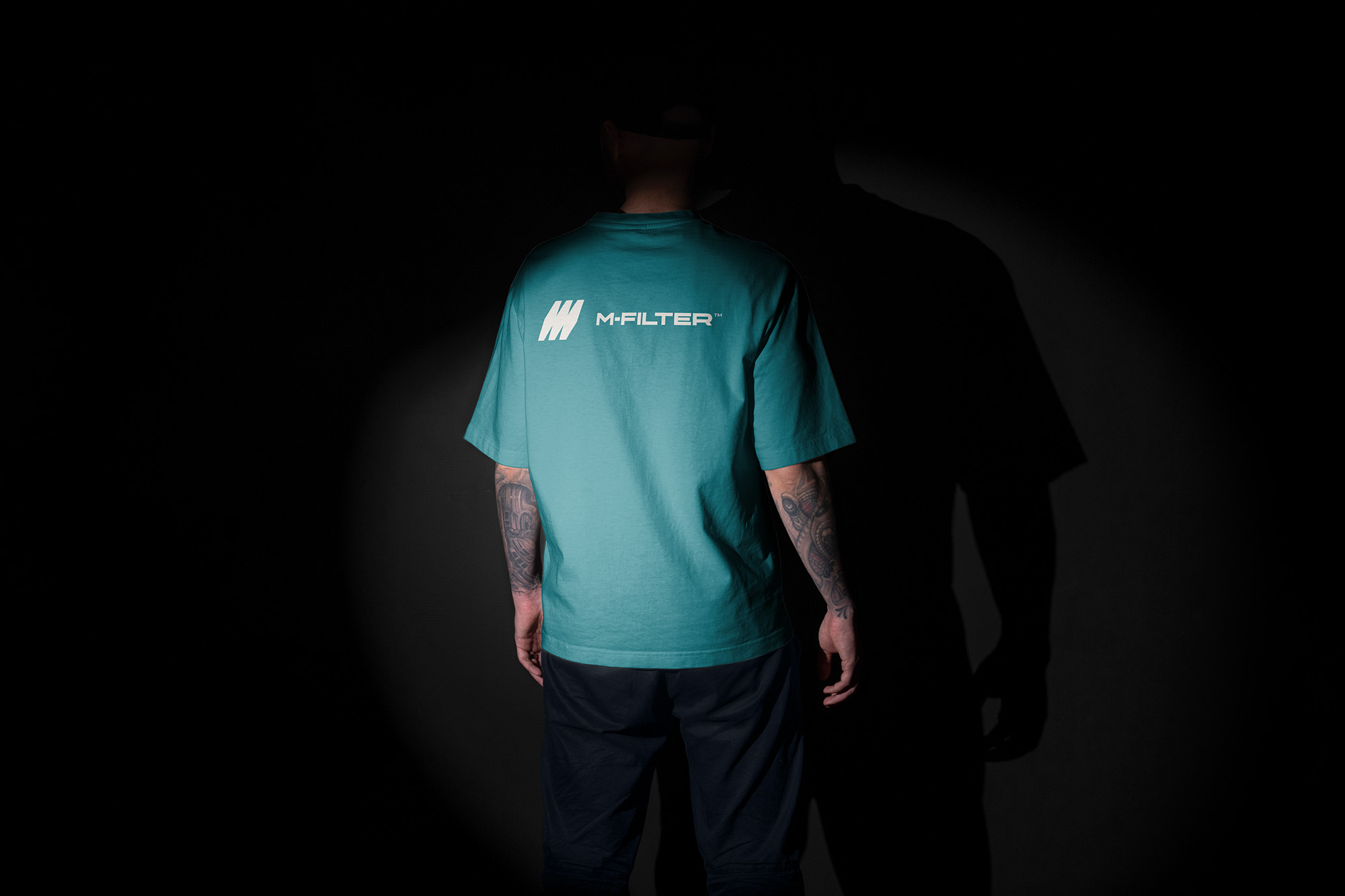
The creative direction was driven by the idea of filtration as a phased, transformative process. Subtle but essential. This concept is reflected in the logo, where the structural form of the letter “M” doubles as a visual metaphor for movement through layers. A considered color palette of fresh green, warm orange, and dark neutrals provides contrast and flexibility—bridging the gap between scientific rigor and human warmth. Gradients were used intentionally, bringing texture and depth into layouts without overwhelming clarity or legibility.
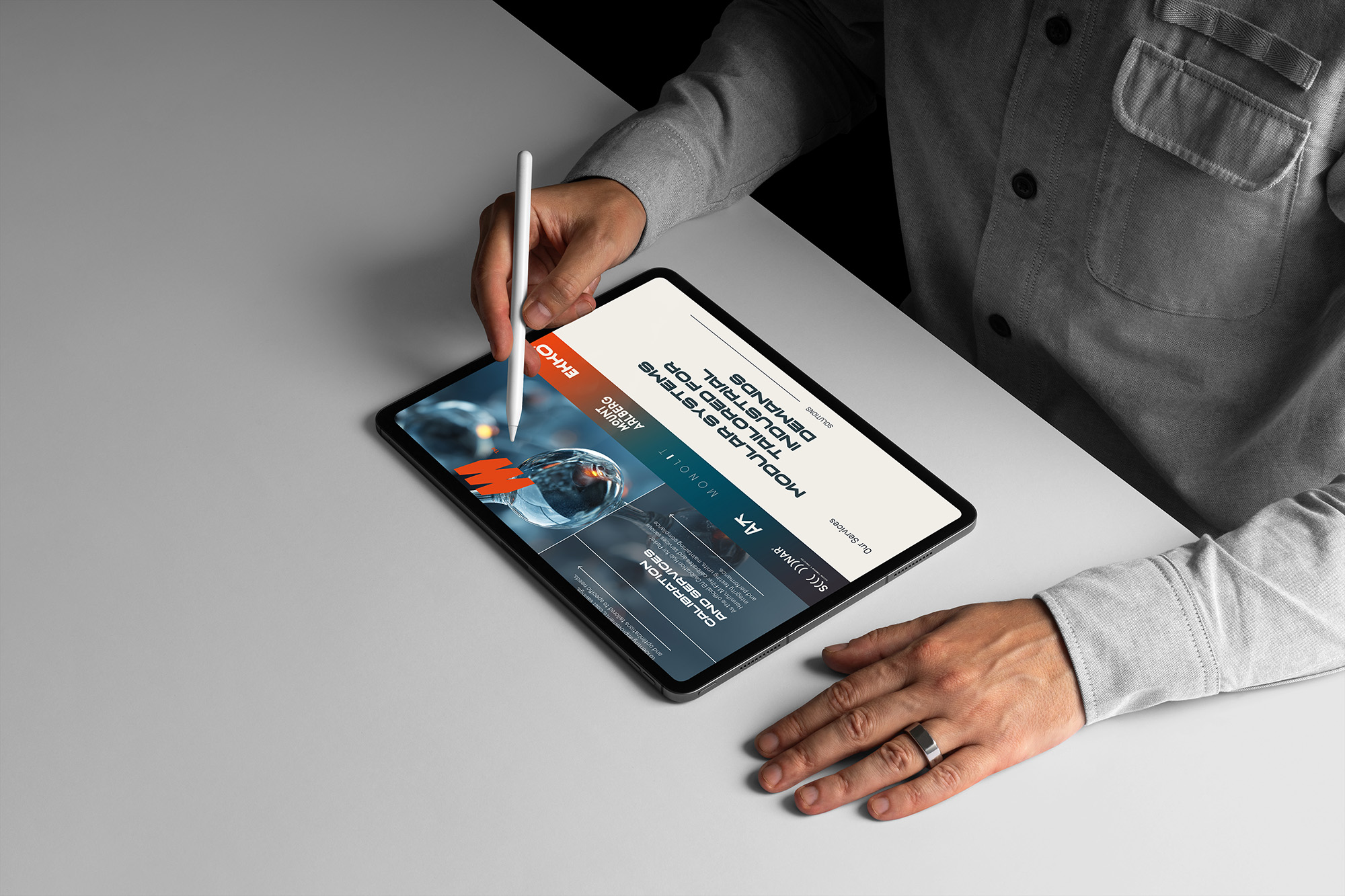
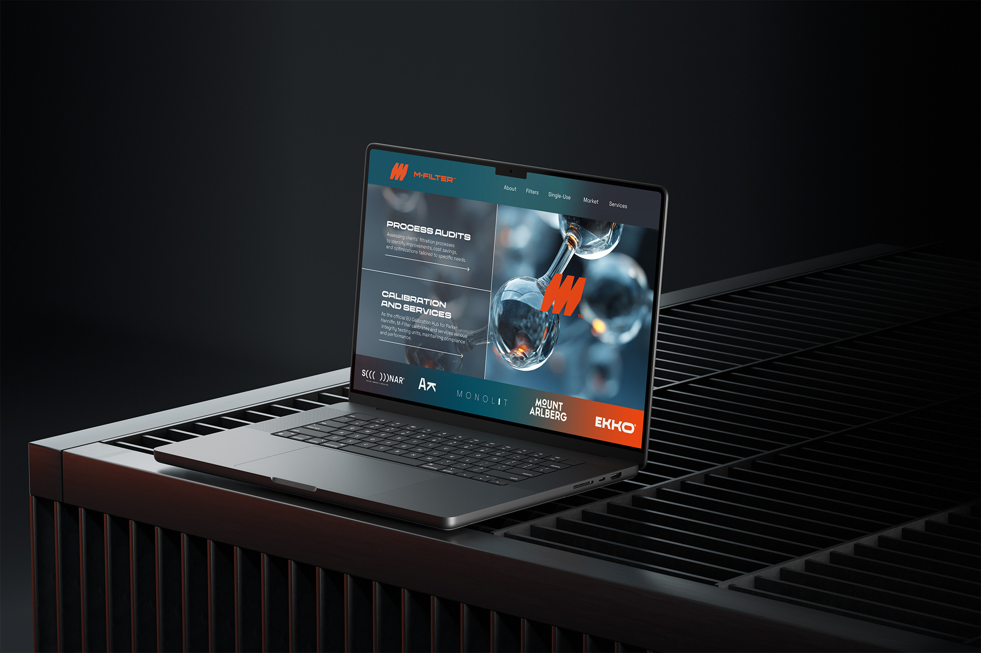
Typography was chosen for its balance of structure and readability, with an extended system that supports everything from technical documentation to digital interfaces. Together, these elements form a brand identity that is flexible, scalable, and distinct—designed to grow alongside the company without sacrificing its roots.
The result is a system that quietly differentiates M-Filter from its competitors—not through loud statements, but through thoughtful design choices that reflect the company’s values and its vision for the future.
CREDIT
- Agency/Creative: Monia Tardiola
- Article Title: Monia Tardiola Designs a Distinct Visual Language for M-Filter’s Multisector Presence
- Organisation/Entity: Freelance
- Project Type: Identity
- Project Status: Published
- Agency/Creative Country: Italy
- Agency/Creative City: Bologna
- Market Region: Europe, Global
- Project Deliverables: Brand Redesign
- Industry: Professional Services
- Keywords: filtering systems, filtration solutions
-
Credits:
Brand Designer: Monia Tardiola


