


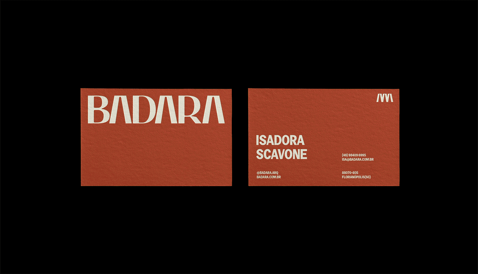
Logo, visual identity, stationery, social media design, web design concept and promotional materials for Badara, an architecture office in Florianópolis-SC that values and is inspired by Brazilian culture. As part of the project we also created the name of the office.
Enriching the brazilian way of living, working together with the roots of nature and culture, Badara operates under the long standing collaboration of three partners-architects and childhood friends—Isadora, Laura and Gabriel.
Our goal was to translate the look-and-feel of Brasil’s authenticity and inovation, alongside the constructivist and interdisciplinary curiosity effort this established triad rely on.
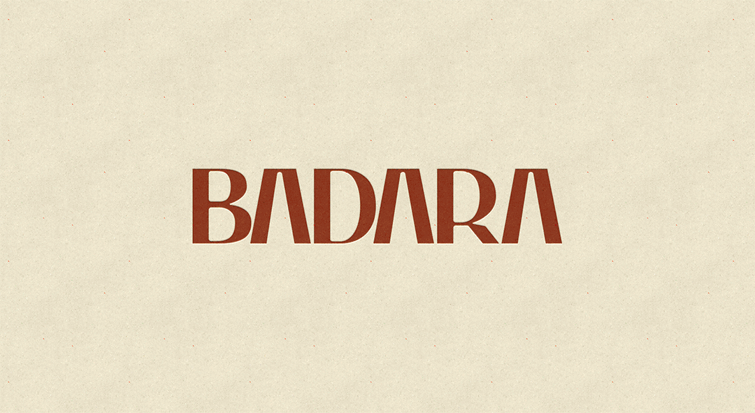
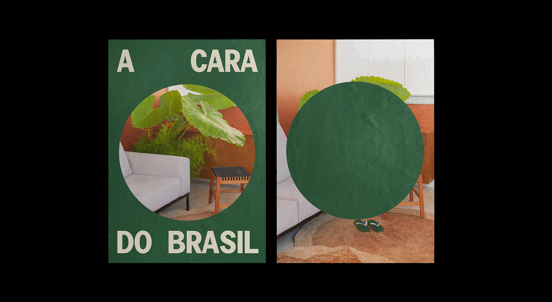
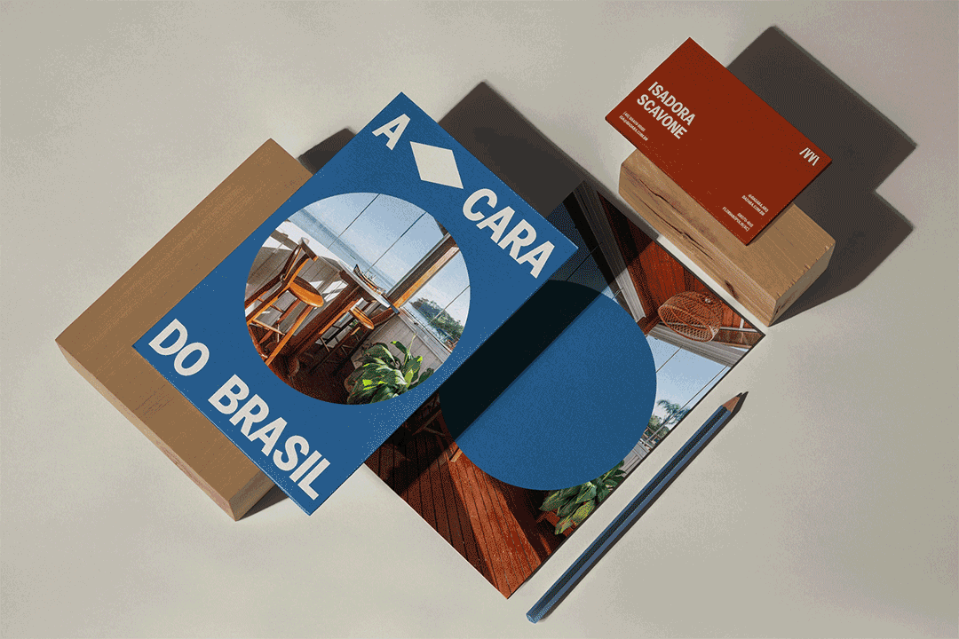
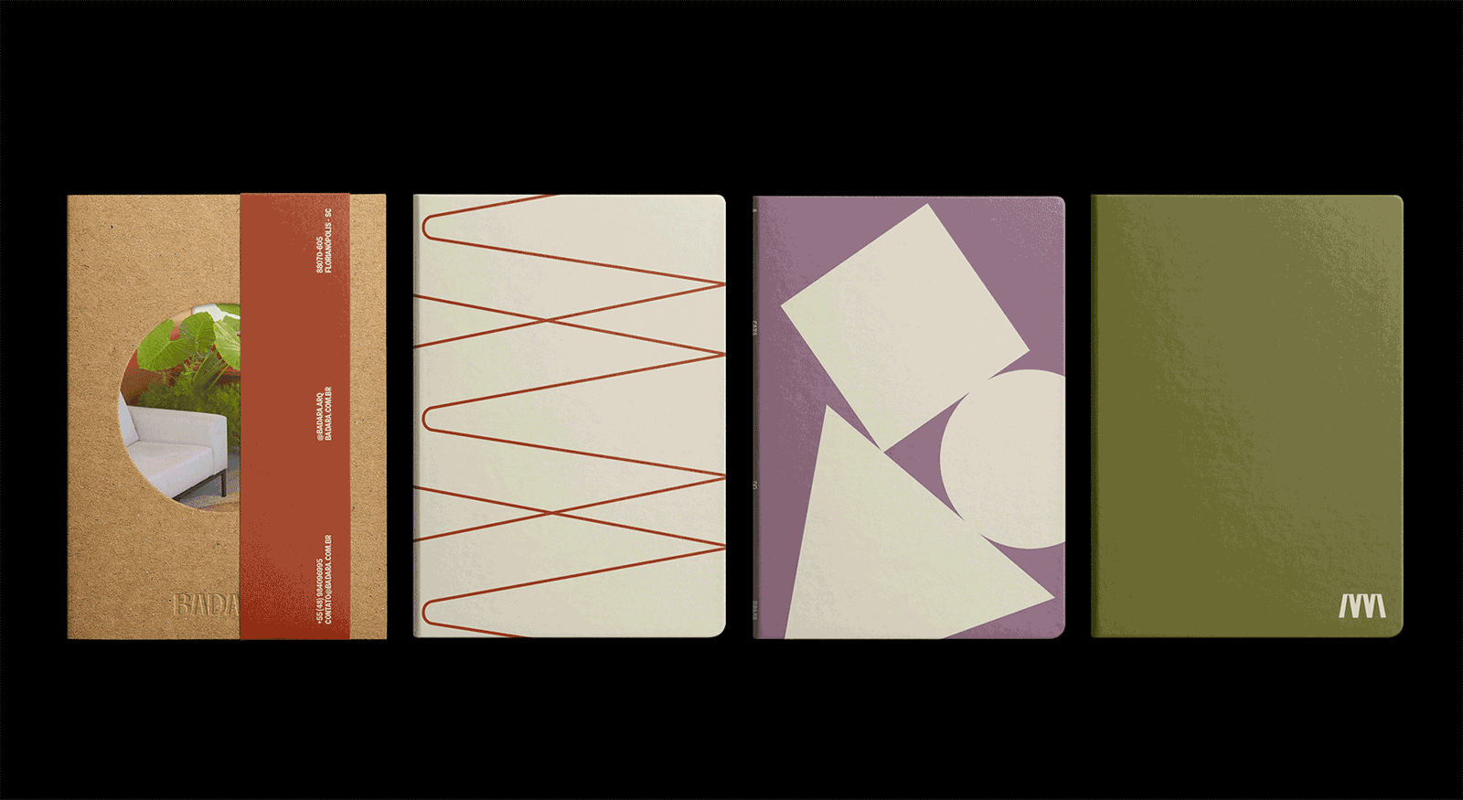
We created the name with the three and the tree in mind—rooted in “Badarra”, an alternative name of Florianópolis’ symbol tree, Guarapuvu. The three syllables represent the joint effort and each partner with an A, also existing in their names. To reenforce this triad concept, we took the three shapes from Brazil’s flag—a square, rhombus and cirlce—also used to represent constructivism in design.
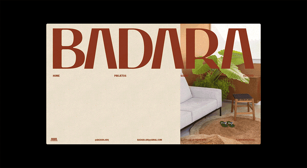
The logo was based on the typeface Caju, designed by the brazilian designer Kauan Miranda; by taking the A crossbars to convey the strenght of a well-designed column and the radial union of roots, and slightly rounding the internal spaces of the letterforms, indicating the softness required to feed the curiosity of an adult individual, kept on the outside drawing of the letters, we created an unique and strong yet delicate lettering.
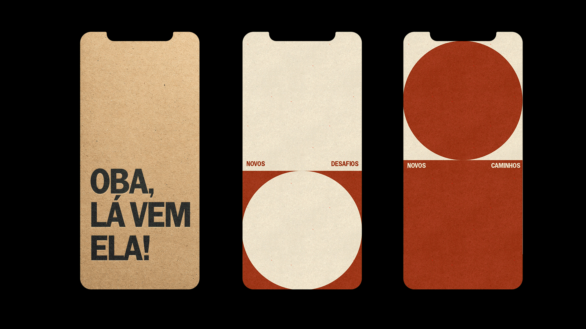
The colours were based off of the brazilian flag, but slightly less saturated and expanded into a broader palette, inspired by nature and local architecture textures, we created an earthy yet colourful palette that is youthful, brazilian and elegant.
After four years of neglected government by the Brazilian ex-president and the rise of far-right and conservative movements, Brazil’s image was akin to their symbols of nationalism, fascism and hostility. We, as citizens and designers, were directly affected by the depiction and appropriation of those—our symbols—and as workers and creators of images and visual representations, were put in a very tricky spot. Thus, we are working on reclaiming what is ours and what makes Brazil, Brasil—creativity, joy, playfulness and authenticity.

CREDIT
- Agency/Creative: Monga Design
- Article Title: Monga’s Id for Badara: A cara do Brasil
- Organisation/Entity: Agency
- Project Type: Identity
- Project Status: Published
- Agency/Creative Country: Brazil
- Agency/Creative City: Florianópolis
- Market Region: South America
- Project Deliverables: Art Direction, Brand Design, Brand Guidelines, Brand Identity, Brand Naming, Branding, Graphic Design, Logo Design
- Industry: Construction
- Keywords: architecture, brasil, brazil, colorful, rustic
-
Credits:
Visual Identity: Monga Design
Naming: Estúdio Sete


