


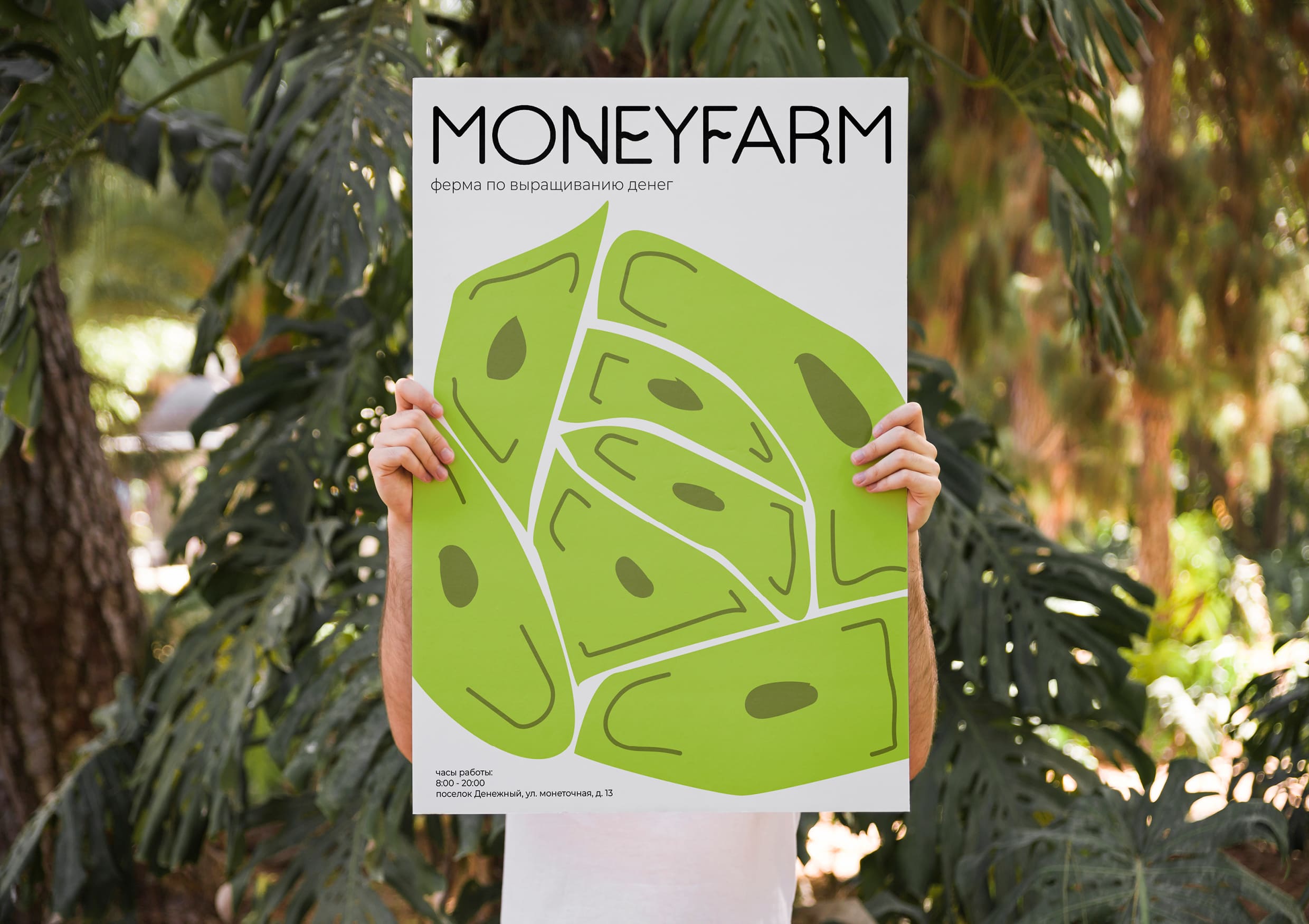
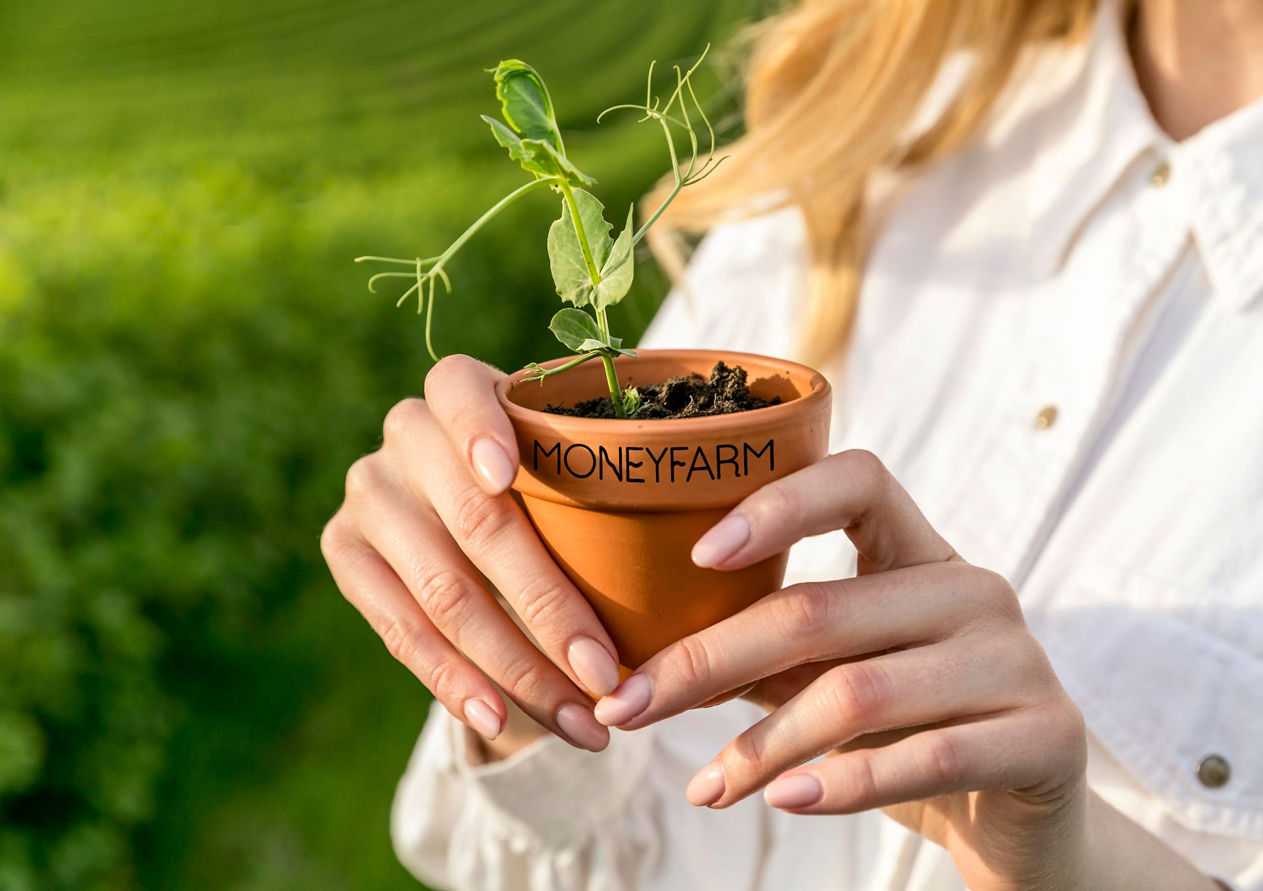
Many have heard the phrase “Money does not grow on trees”, and so, the fantastic Moneyfarm project, just about the fact that money is grown, though not on trees, but in garden beds, just like vegetables.
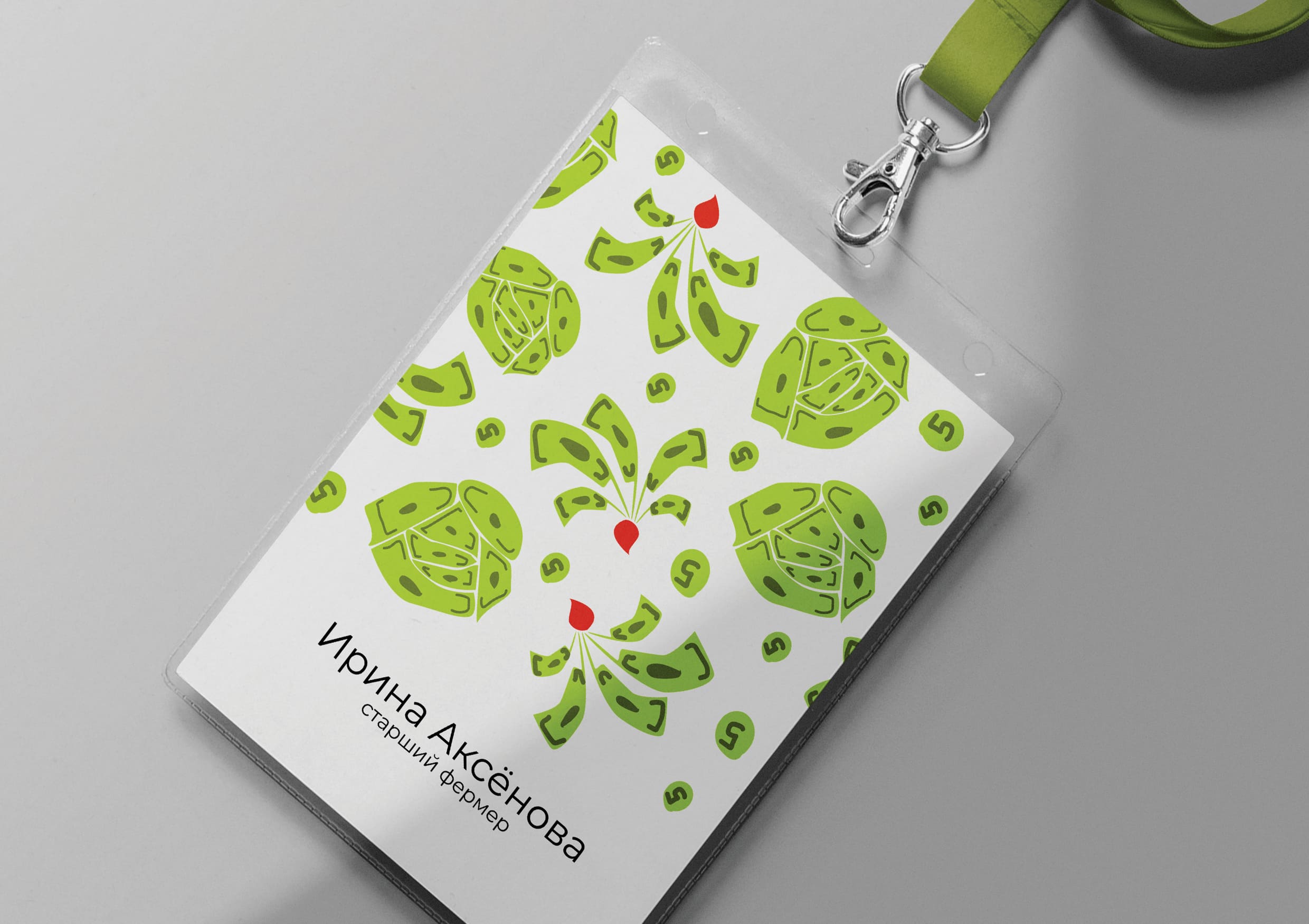
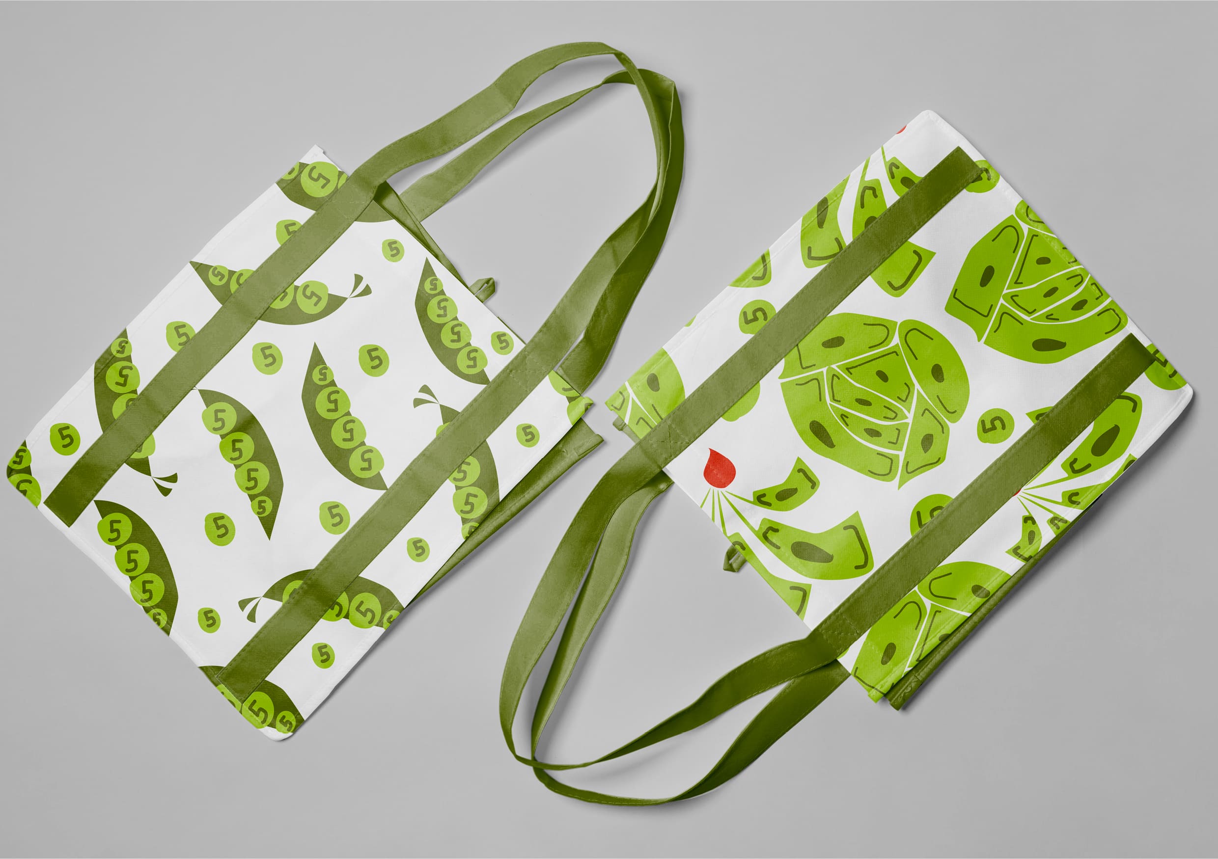
For such a fantastic farm, the identity should also be specific, and this is how it turned out: funny and at the same time as understandable as possible – we literally see how money sprouts on vegetables: banknotes grow on radishes and cabbages, coins grow on peas. Vegetables, in turn, are assembled into cheerful and bright patterns, which are later used as one of the identity elements.
The laconic Moneyfarm logo also echoes the general mood of the corporate identity – its small wavy strokes of letters resemble living plant sprouts. Green, the main color of the corporate identity, was taken for a reason, it gives an association with both money and plants. In addition to it, there are several more colors in the corporate style: red and white. Red and black give a slight accent, and white – contrast and juiciness.
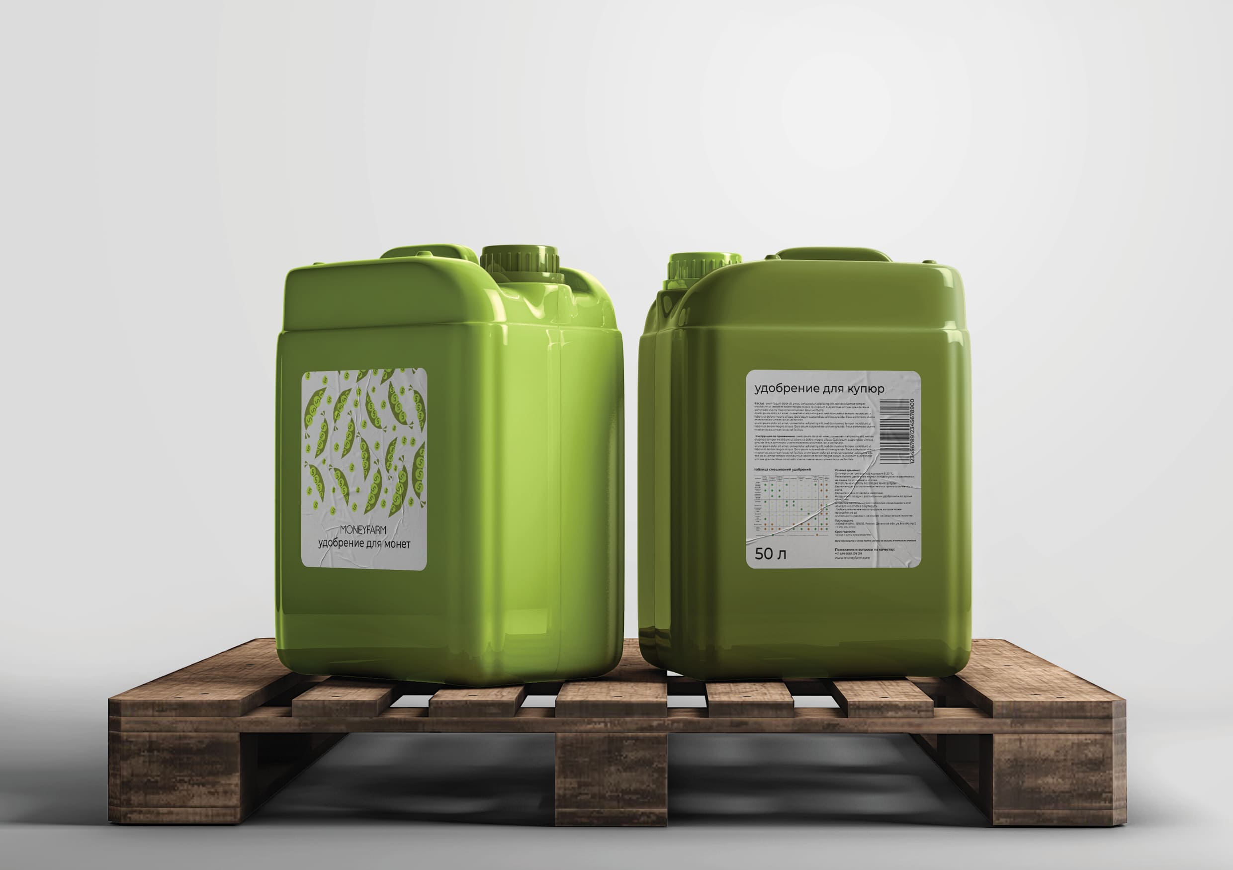
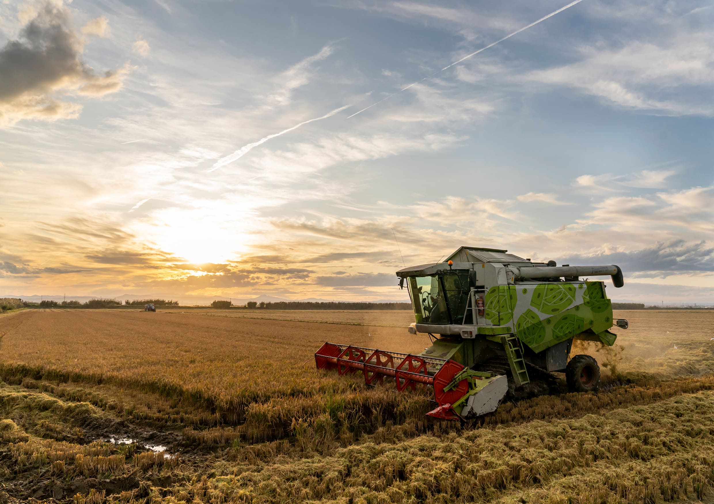
Like regular vegetables, farm-grown money needs proper care to grow well. For this, all the necessary attributes have been developed. For example, garden tools, seed packages, fertilizer cans, as well as the design of agricultural machinery for harvesting.
Do not forget about the employees, a special uniform has been created for them: a simple and strict apron with a logo, a T-shirt and a cap with a bright pattern, a badge.


CREDIT
- Agency/Creative: Katya Nadina
- Article Title: Moneyfarm Brand Identity Concept by Katya Nadina
- Organisation/Entity: Student
- Project Type: Identity
- Project Status: Non Published
- Agency/Creative Country: Russia
- Agency/Creative City: Moscow
- Market Region: Global
- Project Deliverables: Brand Identity
- Industry: Agriculture
- Keywords: Katya Nadina brand identity farm
-
Credits:
University: HSE Art and Design School
Student: Katya Nadina
Tutor: Tanya Dunaeva


