Overview
MoMo, Vietnam’s leading super e-wallet app with over 30 million users, partnered with M — N Associates for a complete brand transformation to capture its innovative essence and broaden its reach. As a driving force in shifting Vietnam’s financial landscape towards cashless transactions, MoMo is establishing itself as the most accessible financial supporter for its users.
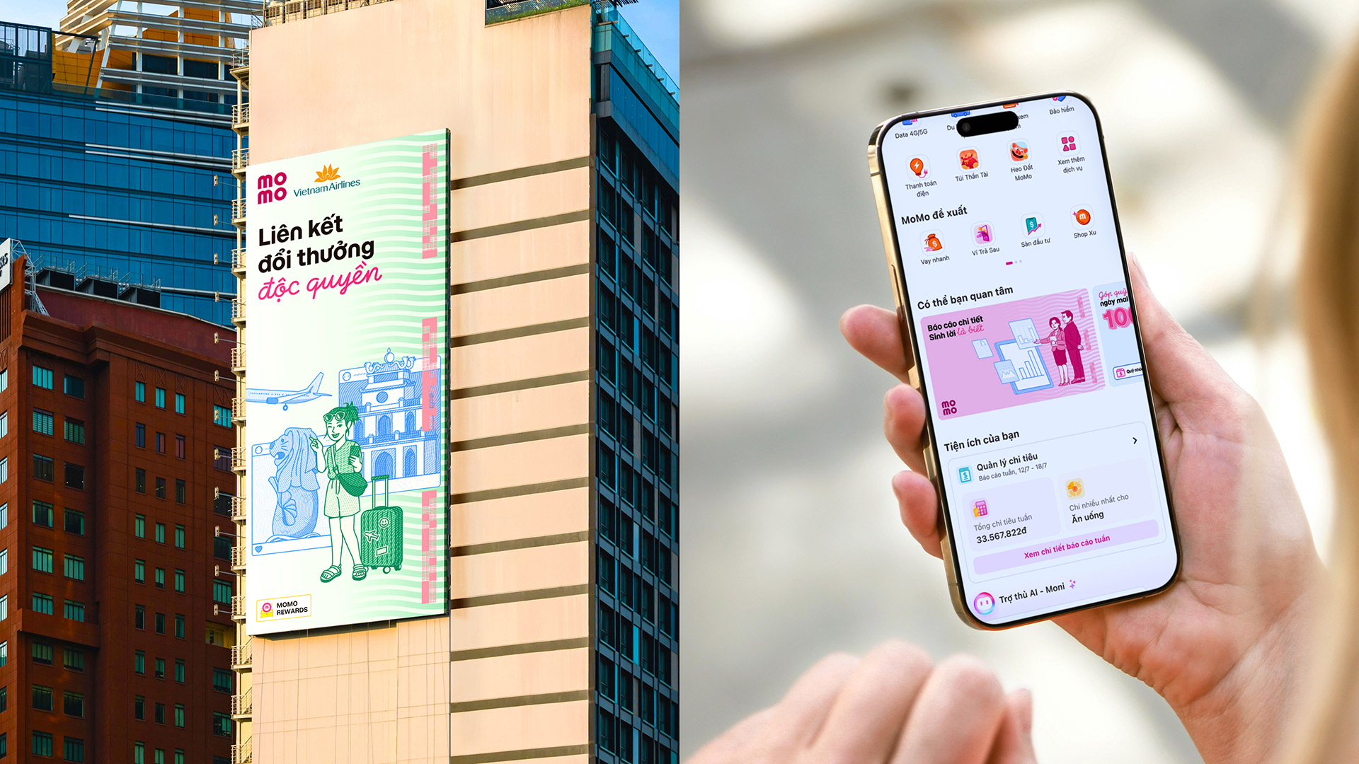
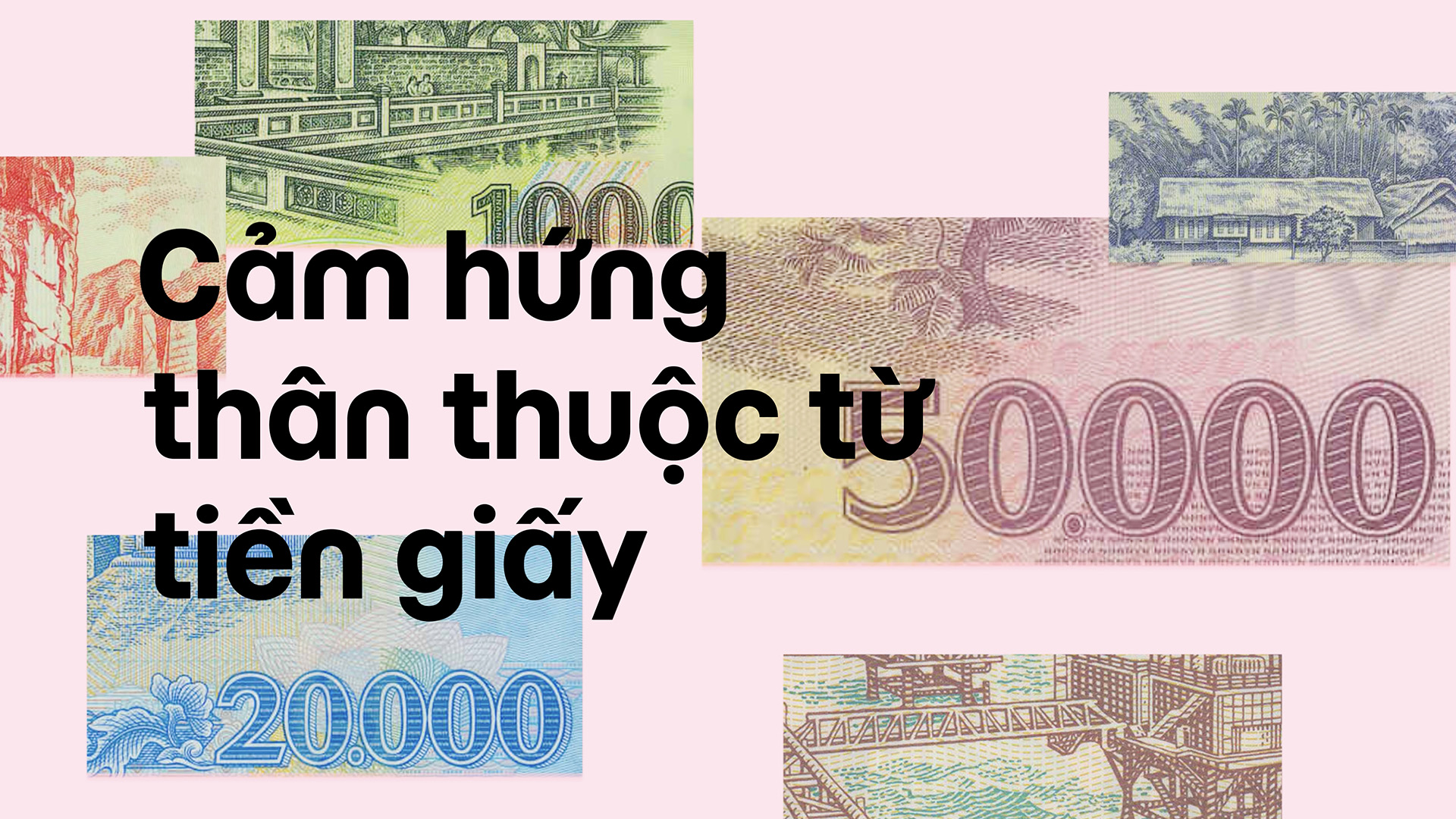
For the rebranding, we took inspiration from the intricate textures and craftsmanship of traditional paper banknotes, reinterpreting these elements into a sleek, digital-friendly design. This layered approach reflects the structured complexity of banknotes, with each layer representing a key aspect of MoMo’s services—trust, accessibility, and innovation—brought together to create a cohesive, contemporary identity.
momo.vn
Banknote Inspiration
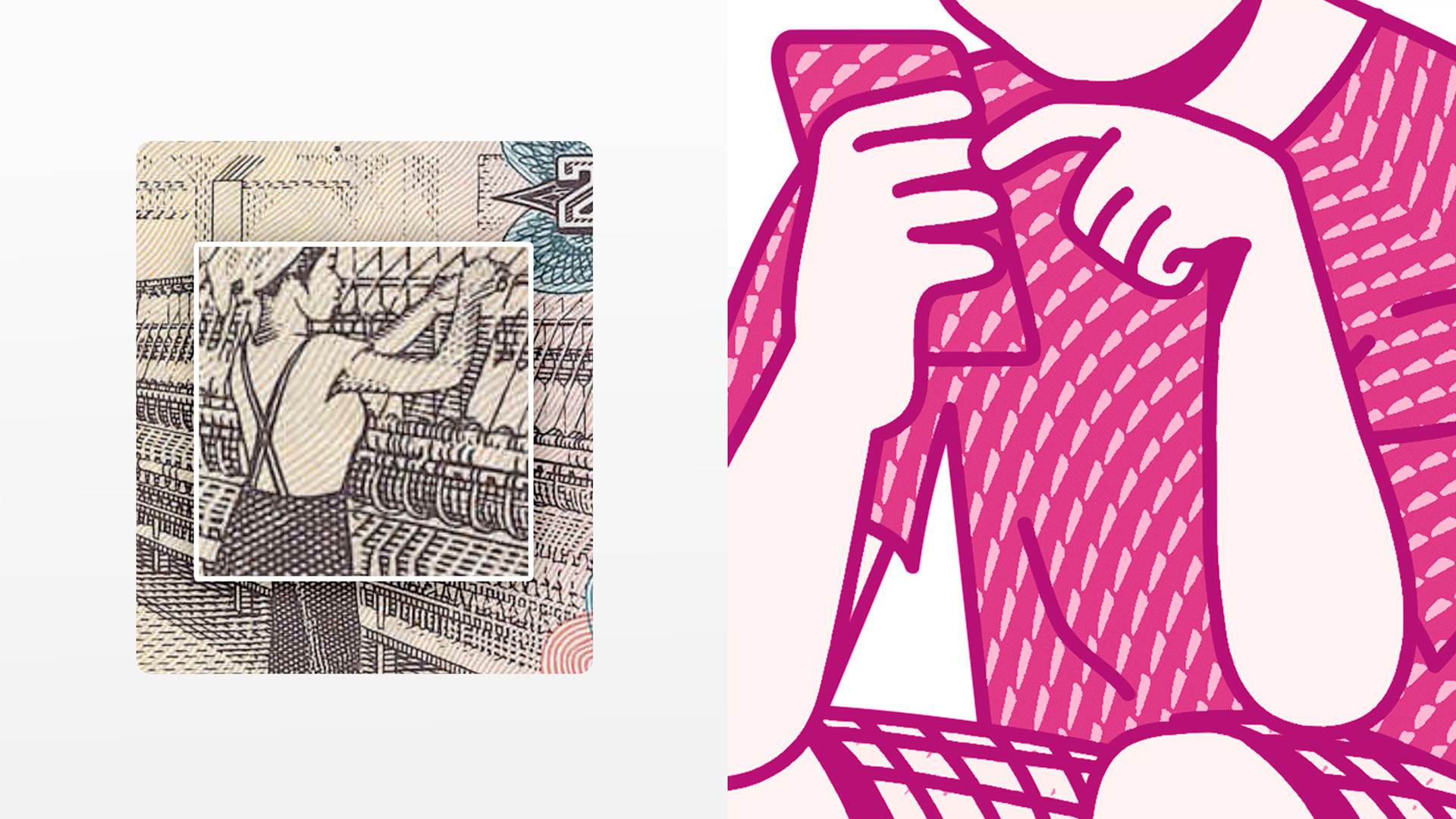
The core concept of MoMo’s rebranding is a visual system inspired deeply by the visual structure of paper banknotes. We translated the familiar textures, colors, layers, and detailed patterns of currency design into a digital format, creating a brand identity that feels both secure and dynamic.
Typeface
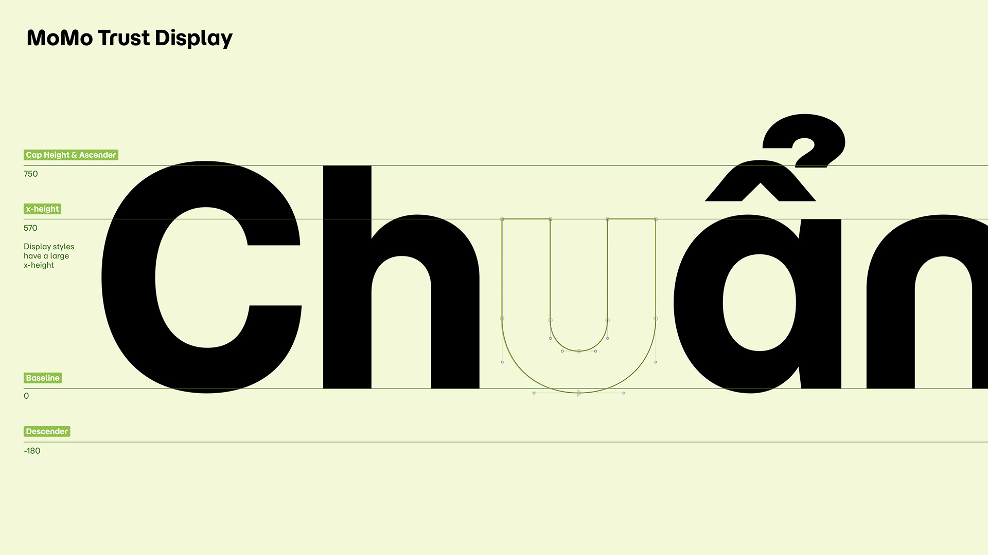
MoMo’s new family are MoMo Trust Display, Trust Sans, and MoMo Signature, designed to enhance its human-centric and user-focused identity.
MoMo Trust Display and Trust Sans draw inspiration from the MoMo logotype, incorporating subtle cues from the rounded, approachable forms that define the brand’s core look. MoMo Signature, inspired by handwritten signatures, adds a personal touch that reinforces trust and individuality.
Together, these typefaces convey a seamless blend of professionalism and warmth, reflecting MoMo’s role as a reliable, user-friendly financial partner.
Security elements
A dynamic 3-corner QR frame, drawn from the essential QR code, signifies both security and accessibility. The pixelized “money band” with data visualization adds digital abstraction, while detailed display numbers with intricate internal patterns echo banknote typography, enhancing authenticity.
Together, these elements create a visually engaging, secure brand identity aligned with MoMo’s user-focused approach.
Money Illustrations
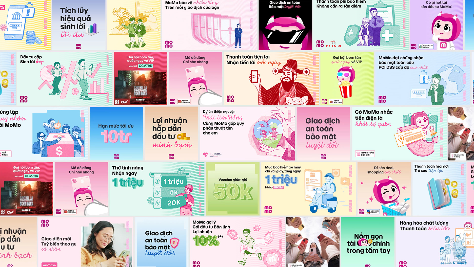
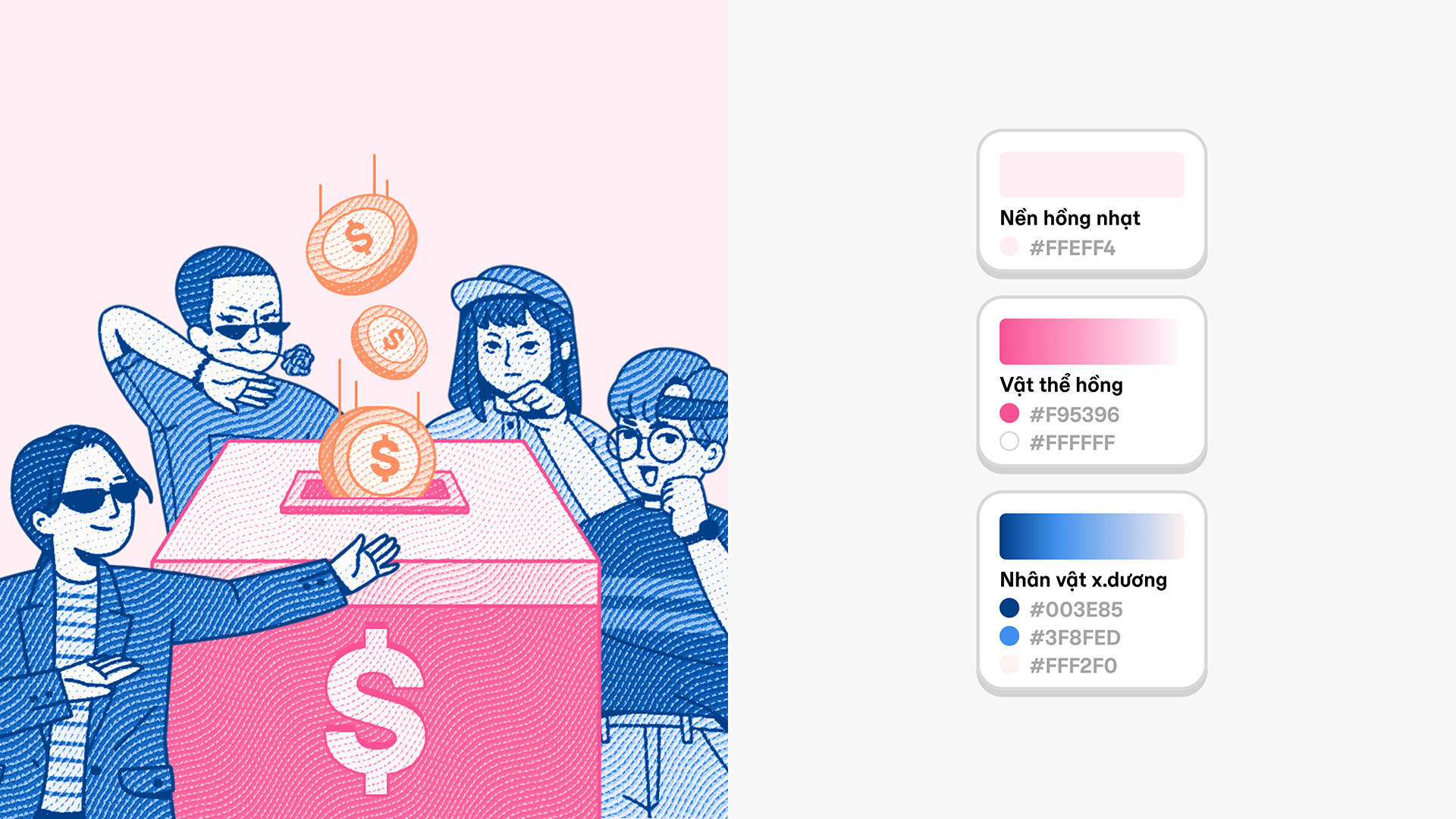
Introducing a collection of lively people illustrations, filled with subtle wavy money patterns in vibrant new colors that expand the “MoMoverse” into the biggest brand element.
These illustrations capture a playful, finance-inspired world full of humor and everyday financial activities, resonating with local culture and daily life. This approach creates a friendly, relatable brand presence that feels close to users’ lifestyles, making MoMo an essential part of Vietnam’s financial landscape.
Mascot
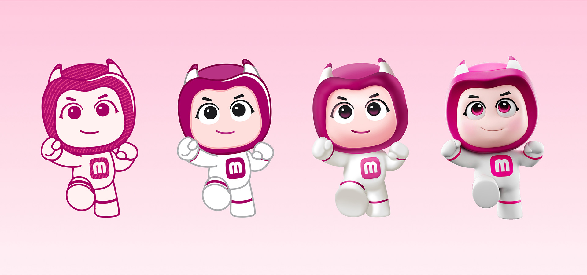
With the sophisticated MoMoverse system, the new mascot features a dynamic and friendly human form that enhances relatability and engagement. Its design allows for flexibility, adapting to various visual styles—from money-textured illustrations to vibrant 3D representations. This ensures the mascot remains integral to the MoMo identity, effectively interacting with users in a multitude of contexts within the MoMoverse, making financial concepts more accessible and enjoyable.
Money Layout
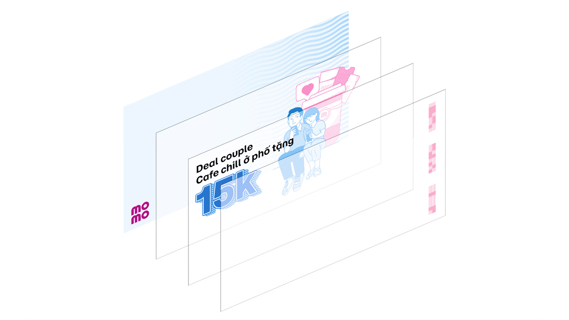
The MoMo rebranding employs a money layering layout system consisting of four distinct layers: Security Layer – Content Layer – Visual Layer – Background Layer
Together, these layers create a cohesive visual experience that balances security, functionality, and creativity, reinforcing MoMo’s position as a friendly and trustworthy financial partner.


CREDIT
- Agency/Creative: M — N Associates
- Article Title: MoMo E-Wallet’s Brand Transformation by M — N Associates Brings Banknote-Inspired Digital Identity to Life
- Organisation/Entity: Agency
- Project Type: Identity
- Project Status: Published
- Agency/Creative Country: Vietnam
- Agency/Creative City: Ho Chi Minh City
- Market Region: Asia, Global
- Project Deliverables: 2D Design, 3D Art, 3D Design, 3D Modelling, 3D Motion, Advertising, Animation, App Design, Art Direction, Brand Architecture, Brand Creation, Brand Design, Brand Experience, Brand Guidelines, Brand Identity, Brand Mark, Brand Redesign, Brand Refinement, Brand Strategy, Brand Tone of Voice, Brand World, Branding, Character Design, Design, Editorial Design, Graphic Design, Illustration, Logo Design, Motion Graphics, Pattern Design, Sound Design, Type Design, Typography
- Industry: Financial
- Keywords: momo, rebrand, m-n associates, vietnam
-
Credits:
ECD: Duy — N
Creative Director: Anh Nguyen, Phuc Tran
Design Director: Phuc Tran
Project Manager: M — Lan
Senior Designer: Bao Truong, Vy Le
Junior Designer: Giang Nguyen, Phung Vu, Anh Le, Tu Nguyen, Khanh Tran
Main Illustrator: Giang Nguyen
Supporting Illustrator: Phong Vu, Khuong Duy
3D Characters: Gudlag Studio
Copywriters: Ly Nguyen, Tan Nguyen, Thoa Cao
Digital Guideline Developer: Blank Co.
Type Design: Type Associates
Type Director: Duy — N
Type Designer: Phuc Tran, Bao Nguyen
Branding: M — N Associates


