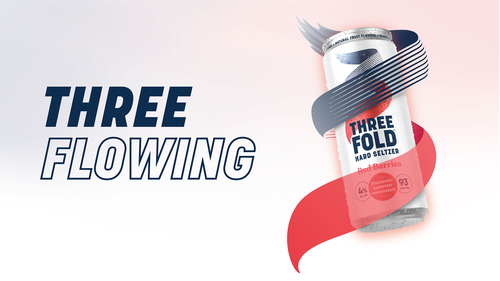
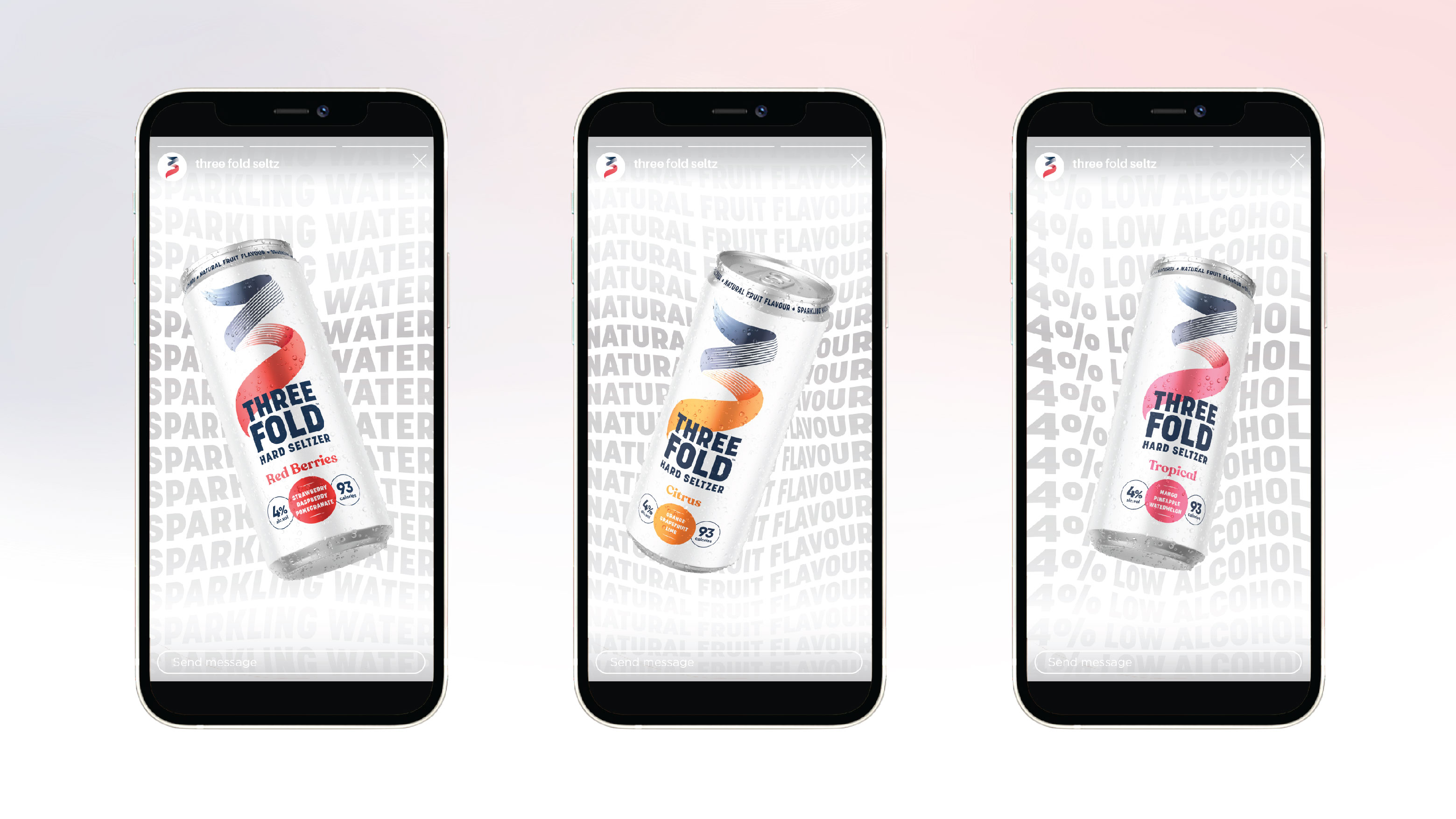
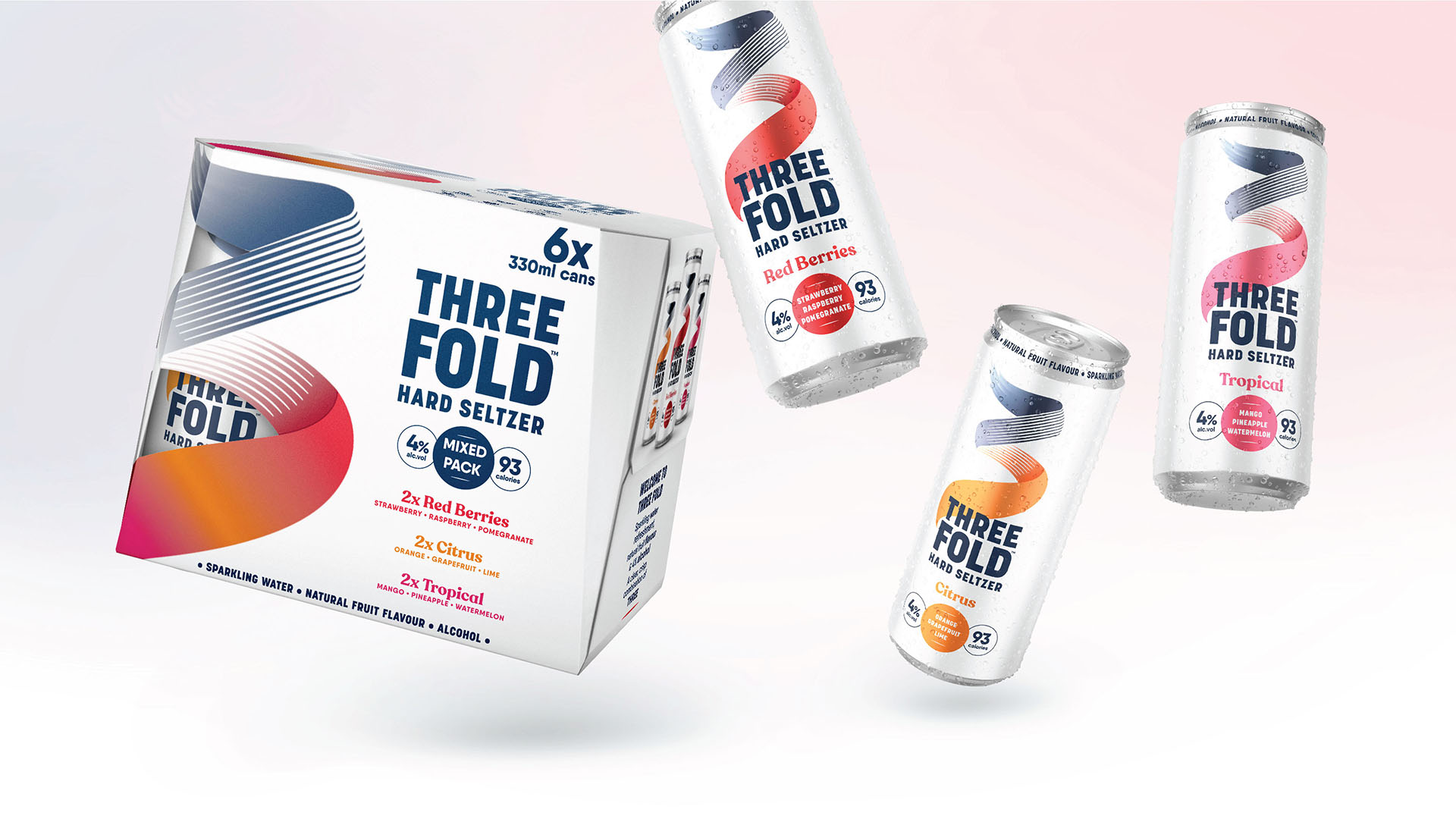
Molson Coors Beverage Company is on a mission to dominate the UK and western European markets, with its new hard seltzer brand Three Fold. In stores now, the beverage giant has unveiled a multi-dimensional identity for the bold brand, which has been created for people who ‘flow their own way’. Global brand-led creative agency BrandOpus has developed the brand strategy, positioning, and striking visual identity.
Whilst the US hard-seltzer market has grown rapidly, the UK and western European markets are still in their early stages. With the launch of Three Fold, Molson Coors are hoping to deliver a market-leading proposition. It’s made of three simple elements; sparkling water, natural fruit flavour and alcohol, which fold majestically together to craft a crisp and clean seltzer that’s light in flavour and big on taste. The BrandOpus team were briefed to create a disruptive brand that would appeal to a legal drinking age Gen Z target audience and take ownership of the category.
A deep dive into the category highlighted that brands were congregating around similar aesthetics. BrandOpus’ biggest challenge was to retain familiarity by adhering to conventions yet disrupt the growing market – coding the category quickly and gaining instant impact. The new identity has a multi-faceted personality that reflects its audience approach to life as well as the product’s three components and flavours. Rooted in the idea that identity isn’t a fixed concept, the confident, clean, and energetic visual system celebrates self-expression through the power of threeness.
Design details:
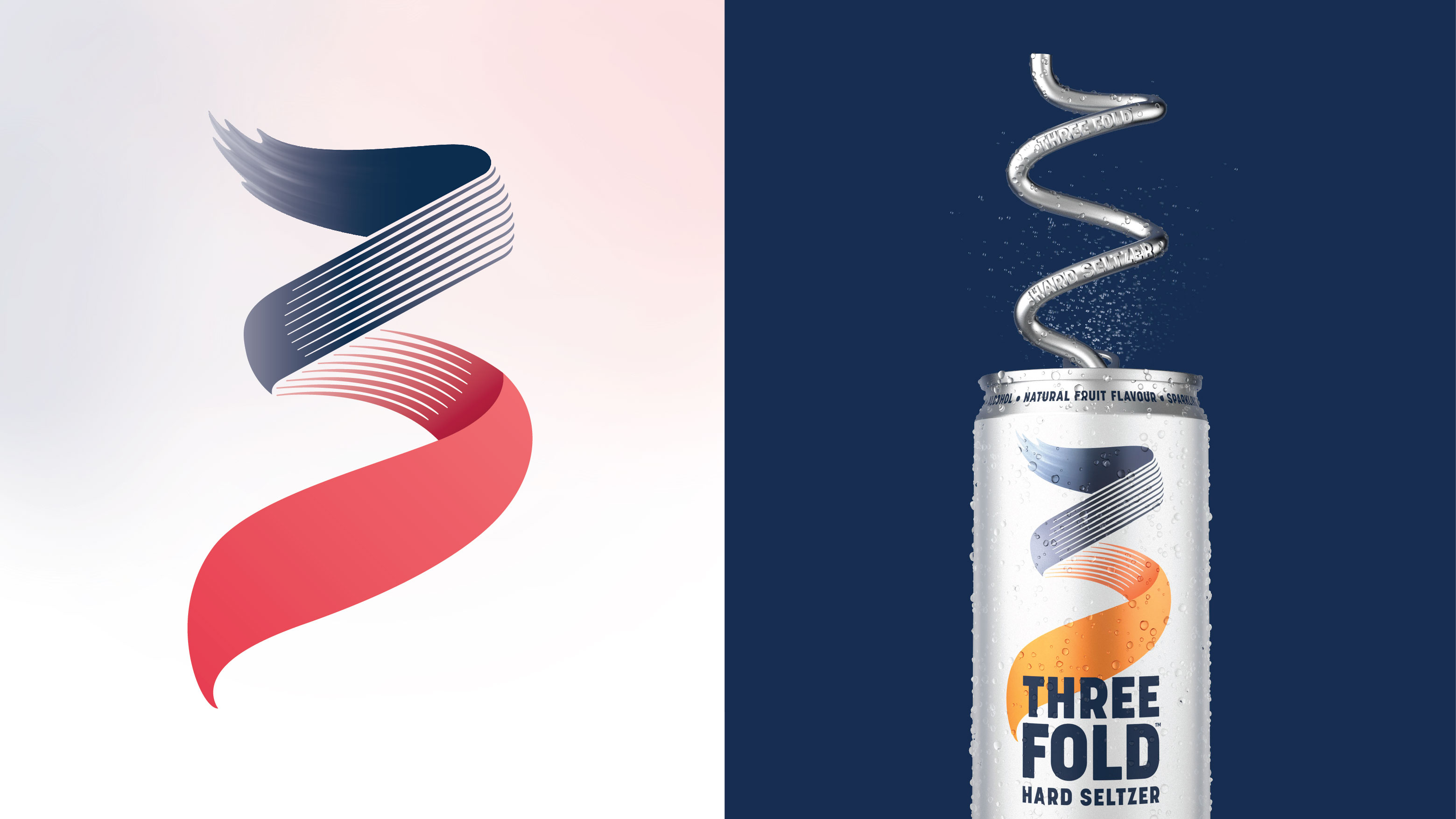
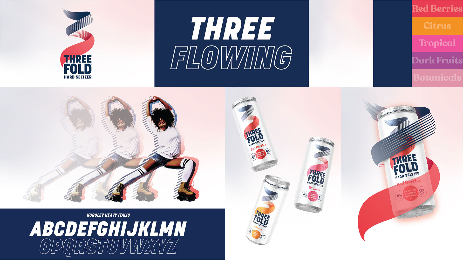
• The brand mark, named ‘the Flow’, evokes the spirit of fluidity and free-flowing movement. Forming a ‘3’, it folds and transforms effortlessly through three states – fluid, solid and transparent – to echo the brand’s multi-dimensional character, audience, and product.
• Paired with a bold and straight-forward typography style, the overall look and feel includes a softness and stripped back aesthetic that reflects the purity and naturalness of the drink.
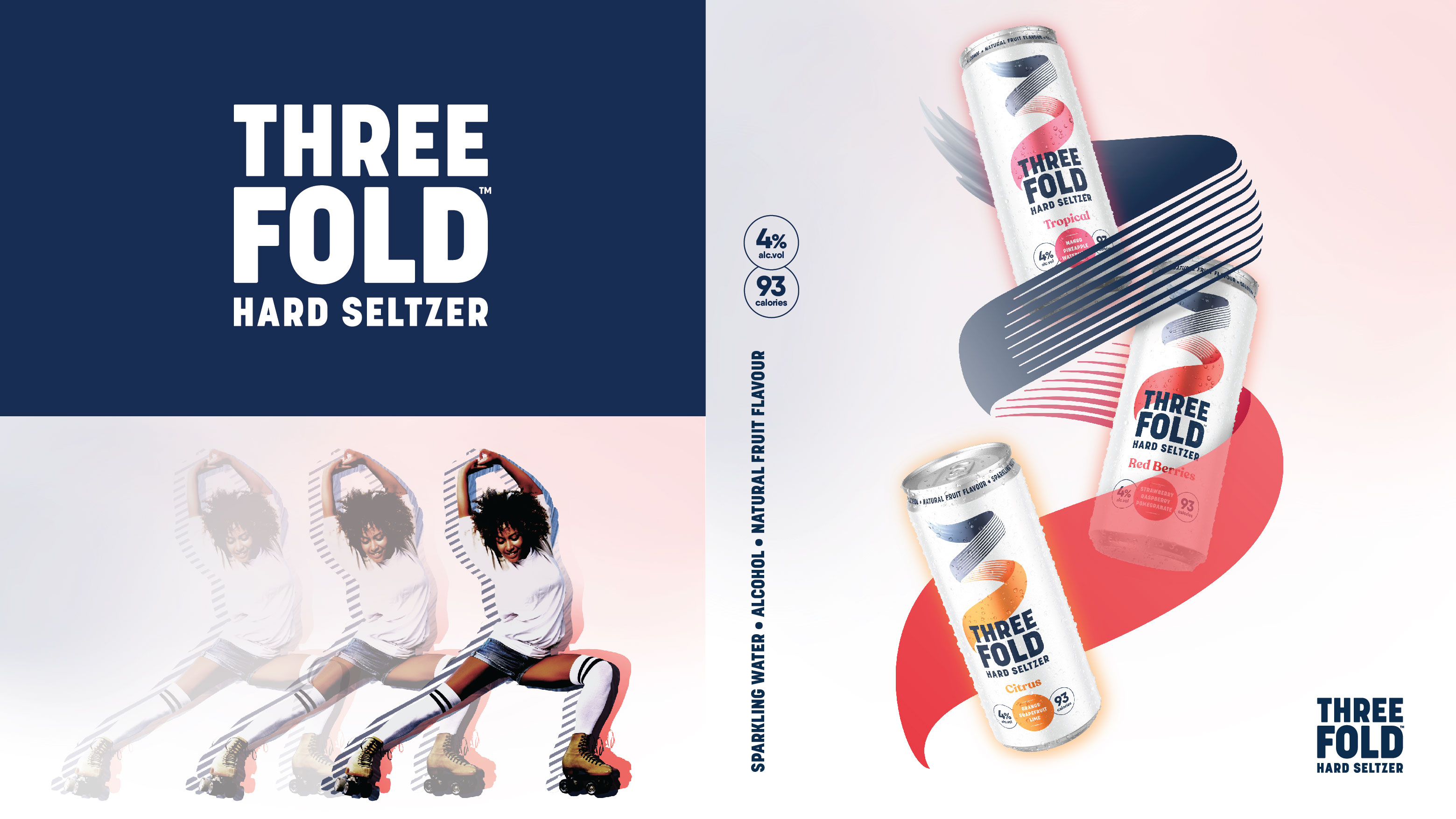
• Embracing a refreshingly simple and pared-back colour palette, the clean white canvas is overlaid with pops of natural colour and soft vignettes to inject a sense of lightness.
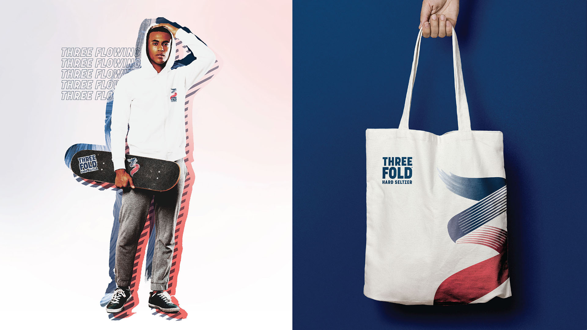
• Expressive brand world photography features real people in their natural flow, cut out, and overlaid against the three textural elements from within the identity, combining to create an ownable and dynamic treatment.
Paul Taylor, chief creative officer and founding partner, BrandOpus, comments “In treading the fine line between being disruptive, yet familiar, Three Fold is a rebellion against playing it safe and sticking to mainstream conventions. Inspired by free-flowing movement, we landed on the expressive visual identity that – like its consumer – doesn’t sit still. Whether that’s the brand’s personality, audience or liquid, the power of three works harmoniously together to champion self-expression in all its forms”.
Charlotte Revill, brand manager, Molson Coors Beverage Company, comments ““We wanted to create a new kind of seltzer brand, for legal drinking age Gen-z’ers who don’t like to be defined but flow their own way. Teaming up with BrandOpus, we believe Three Fold’s multi-dimensional branding captures our ambitions and nature of the product perfectly. It’s an evolution of traditional category norms and we’re eager for it to break through on shelf.”
The new branding is rolling out across key touch points including visual identity, packaging, brand world and comms. It is already available at UK retailers including Morrison’s, Revl, Ocado and Amazon.
CREDIT
- Agency/Creative: BrandOpus
- Article Title: Molson Coors Champions Self-expression in All Its Forms With New Hard Seltzer Brand Three Fold
- Organisation/Entity: Agency
- Project Type: Identity
- Project Status: Published
- Agency/Creative Country: United Kingdom
- Agency/Creative City: London
- Market Region: Europe
- Project Deliverables: Brand Creation, Brand Design, Brand Identity, Brand Naming, Brand Strategy, Brand Tone of Voice, Brand World, Design, Identity System
- Industry: Food/Beverage
- Keywords: Seltzer, FMCG, drink, beverage, alcohol, hard seltzer
-
Credits:
Branding agency: BrandOpus


