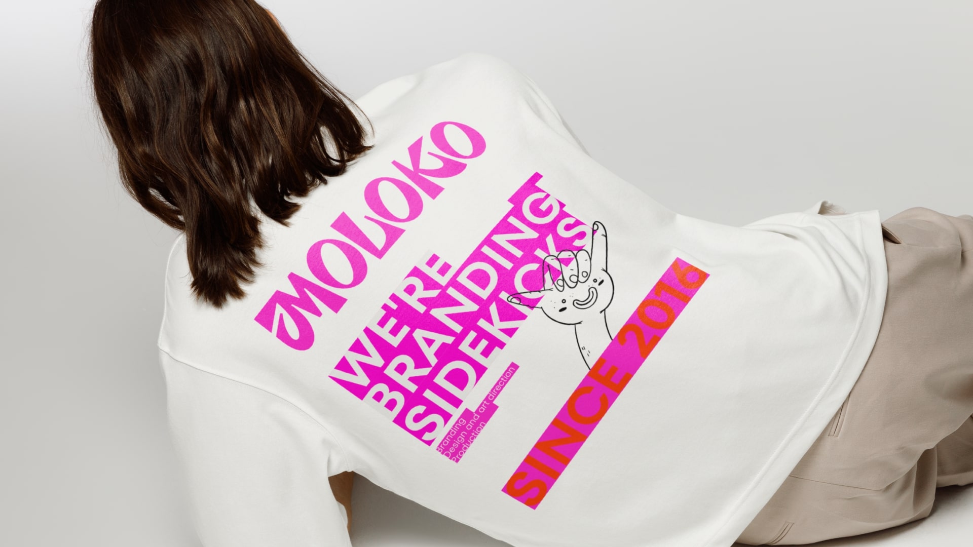
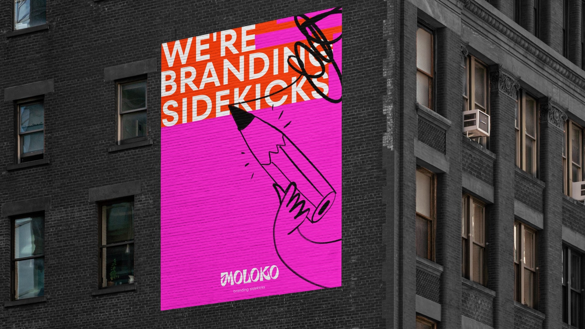
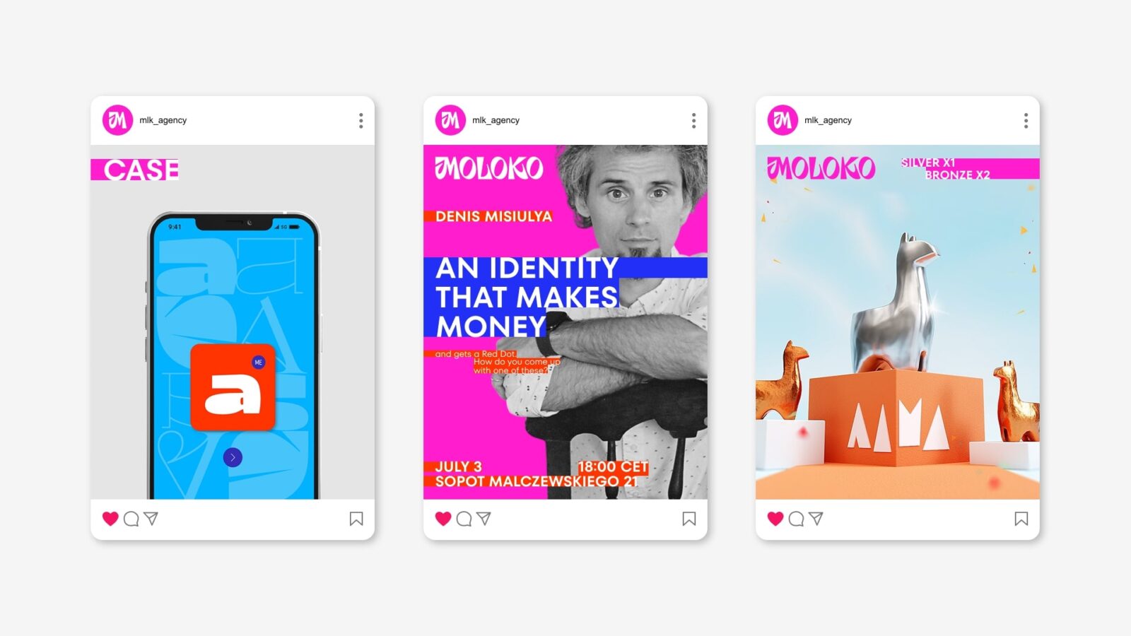
Since 2016, Moloko has been creating brand strategies, launching new products to market and doing 360 advertising campaigns. It was time for an update, so we refreshed our logo, colors and visual elements to match our positioning. A completely new, fresh and intense visual style.
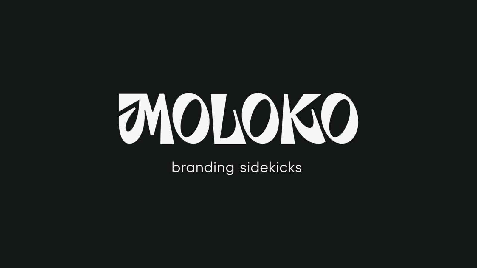
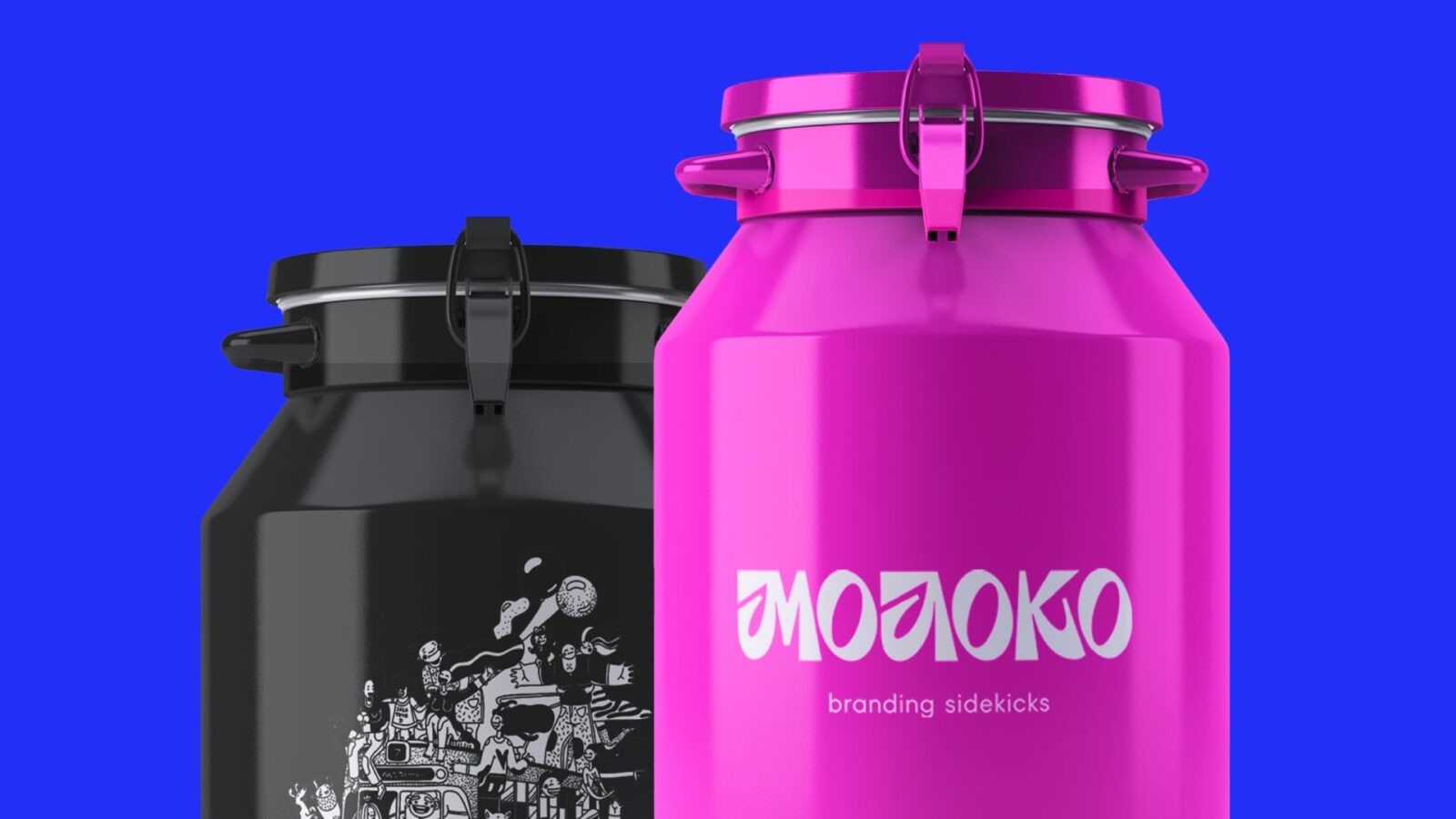
The new logo is once again typographic as proof of our love for letters and the fact that typography in today’s world is a brand. The logo is based on accented lettering. Dynamism is achieved by the slope of the letter O, the trapezoidal shape of the main stroke and the characteristic “leg” of the letters M, L and K.
The descriptor to the logo is our essence, a reflection of the idea of why the market needs us at all. And who are Branding Sidekicks? They are partners, branding assistants who build a close relationship with the client. Moloko Branding Agency is Sancho Panza, Dr. Watson, Tonto, Robin or Friday – those partners without whom the main characters would not do well. Our mission is to help the brand play its own rock ‘n’ roll – to experiment, to stand out, to please its audience.
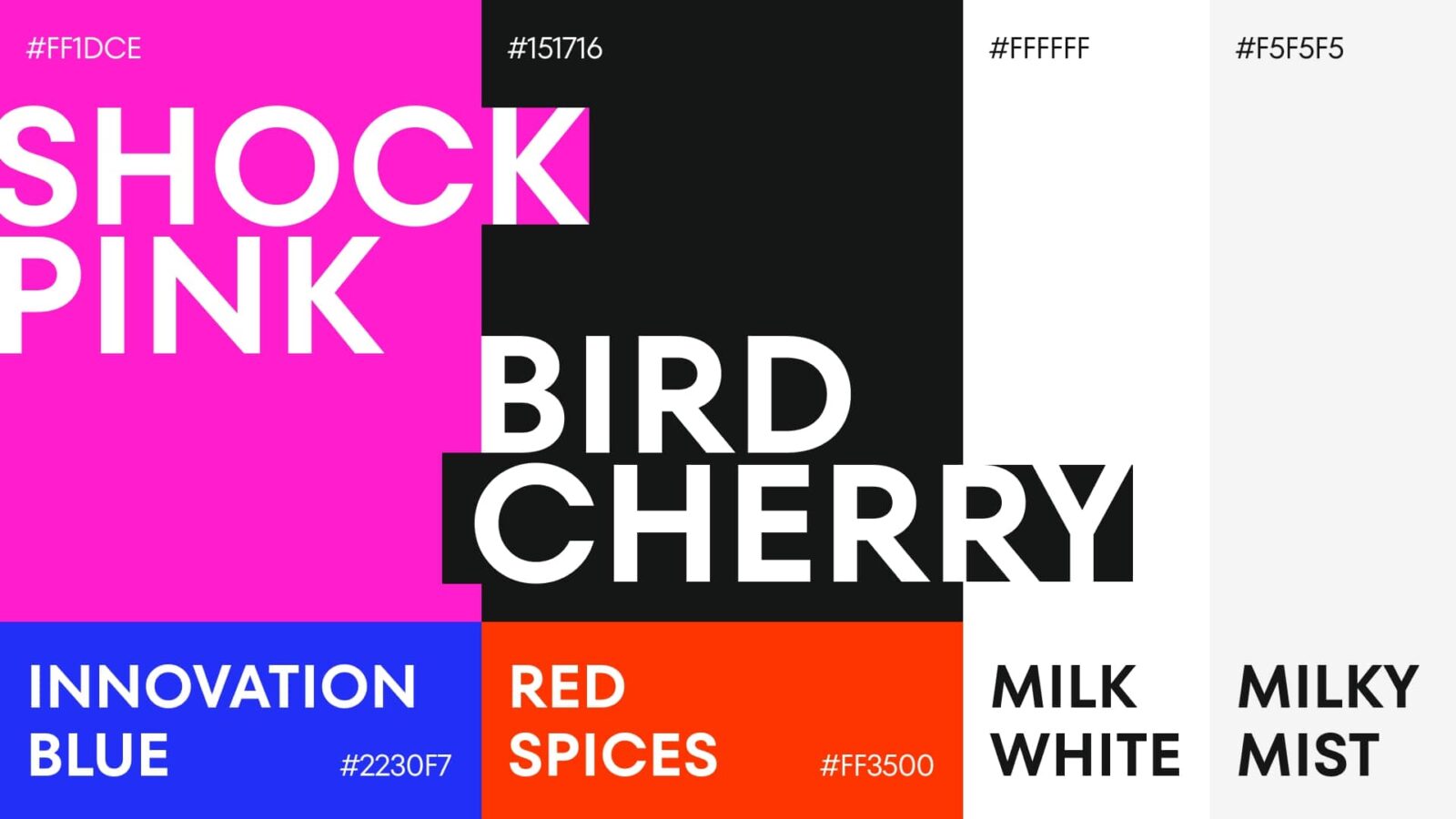
The new colors (Shock pink, Innovation blue, Red spices, Milk White, Milky mist and Bird Cherry) are carefully selected and highlight our values: a love for innovation, for unconventional and sometimes even shocking solutions. It is a thirst to create our own “dishes” with unique ingredients and to communicate new knowledge to our customers in the simplest possible way.
The fonts for our communication are TT Fors and TT Fors Display. It’s a harmonious pair that works well with photos and illustrations.
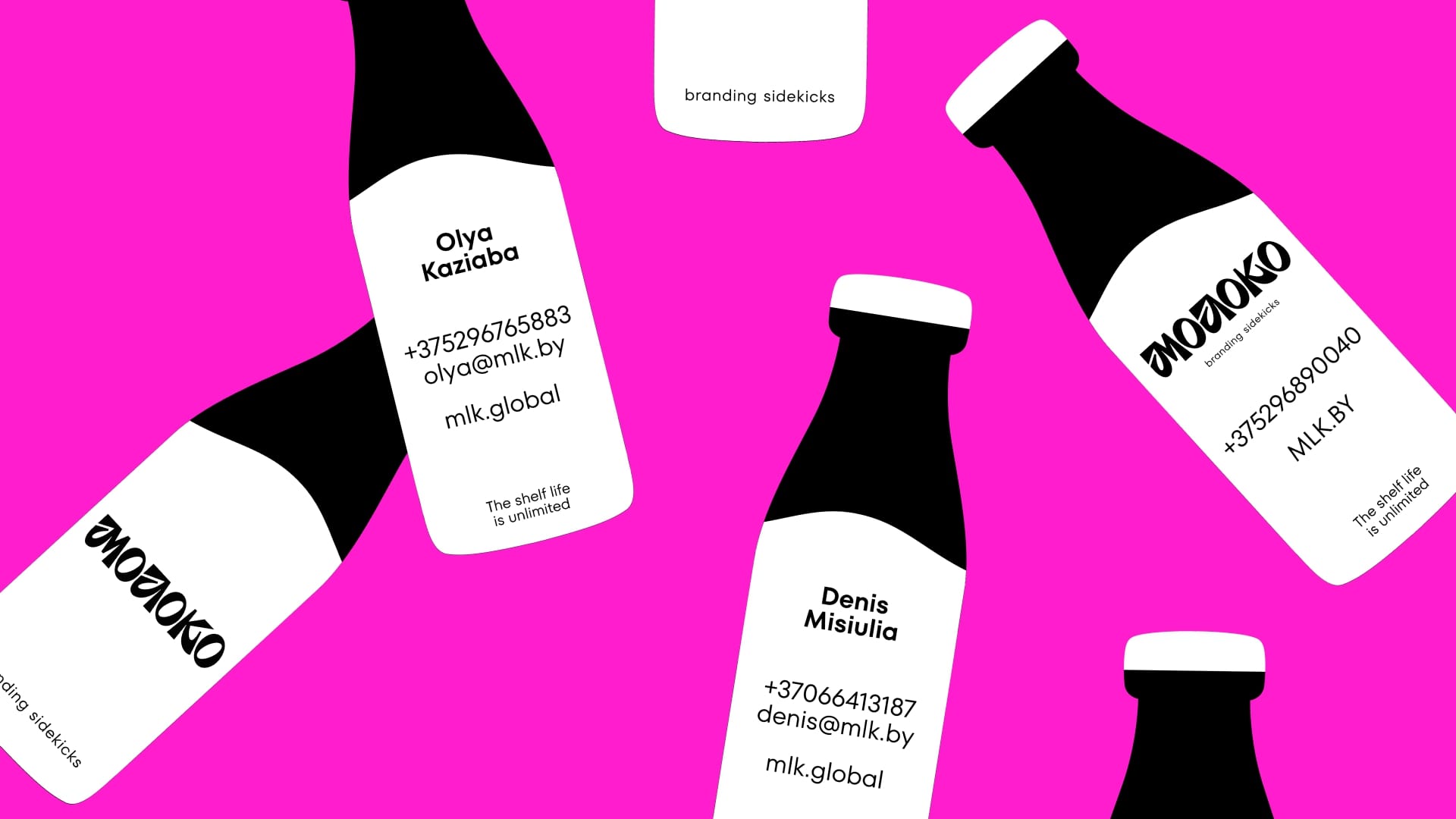
The business cards are none other than in the shape of milk bottles. And it’s a literal reflection of a market need: when you need a strategic and creative approach to solving business challenges, try Milk – you’ll love it!
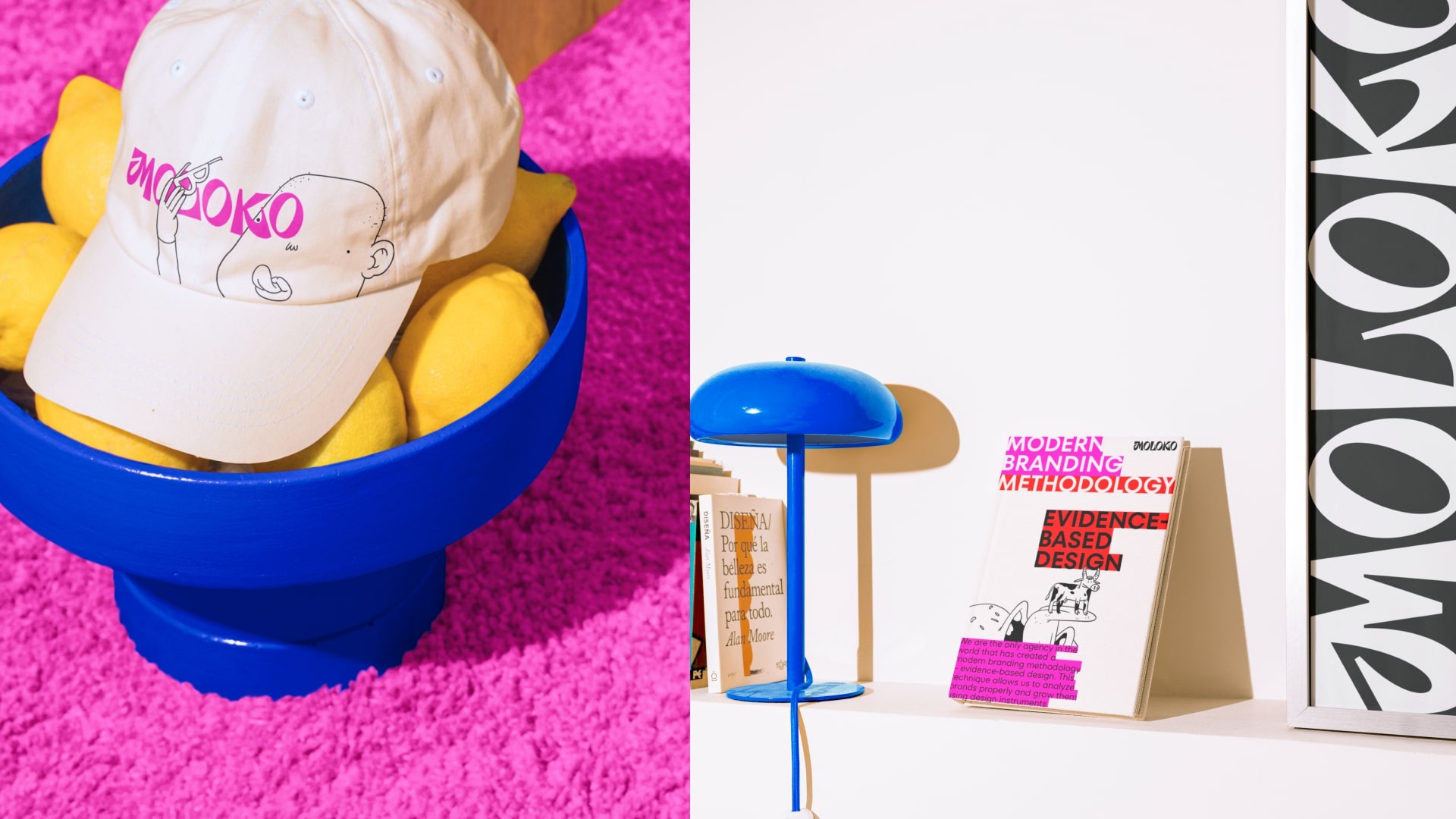
All the visual elements emphasize our values well and reflect a vibrant, sometimes unconventional approach to solving customer challenges. We are ready to stand out and encourage customers to be bold in their decisions.

CREDIT
- Agency/Creative: Moloko Branding Sidekicks
- Article Title: Moloko Rebranding: Font, Shock Pink Color and Positioning Branding Sidekicks
- Organisation/Entity: Agency
- Project Type: Identity
- Project Status: Published
- Agency/Creative Country: Lithuania
- Agency/Creative City: Vilnius
- Market Region: Europe
- Project Deliverables: Brand Design, Rebranding
- Industry: Professional Services
- Keywords: Moloko, branding, brand strategies, new products, 360 campaigns, refreshed logo, typography, branding sidekicks, Shock pink, TT Fors, milk bottles
-
Credits:
Creative Director: Dzianis Misiulia
Lettering Designer: Anastasia Khizovets
Graphic Designer: Alina Kozhbakova


