Brand identity for the medicine delivery service
How can we transform complex logistics into a simple visual language? For the apteka.by pharmaceutical delivery service, we developed an identity based on a simple yet profound metaphor — the dot.
This simple graphic symbol encapsulates the brand’s core values and serves as the primary building block for the entire visual ecosystem. In the world of modern design, simplicity is the ultimate sophistication, and for apteka.by, the dot is more than just a shape. On the one hand, the dot is the final destination on the map, the precise geographic coordinate where the order is waiting for its recipient. It marks the successful completion of a journey, a moment of relief for the customer who has found exactly what they need.
On the other hand, it represents the dramatic shortening of distances: we have transformed complex, multi-layered logistics chains into the shortest possible route from the warehouse to the most convenient pharmacy for you. In an era where time is the most precious commodity, our design reflects the elimination of friction. Now, the complex inner workings of the service — the sorting, the healthcare product management, and the intricate routing — become invisible and transparent to the client. This “invisible” design approach saves them from the arduous task of searching for the right medication across the city, comparing prices, and making unnecessary trips in bad weather or traffic.
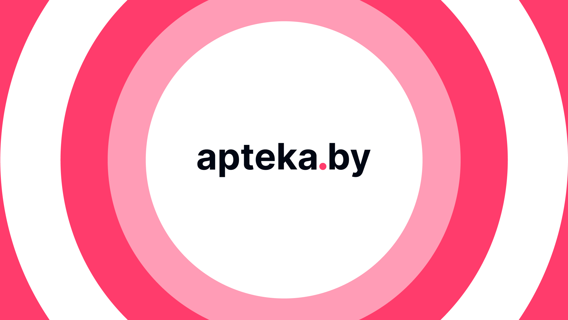
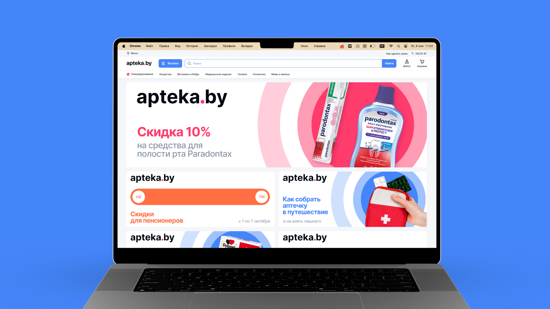
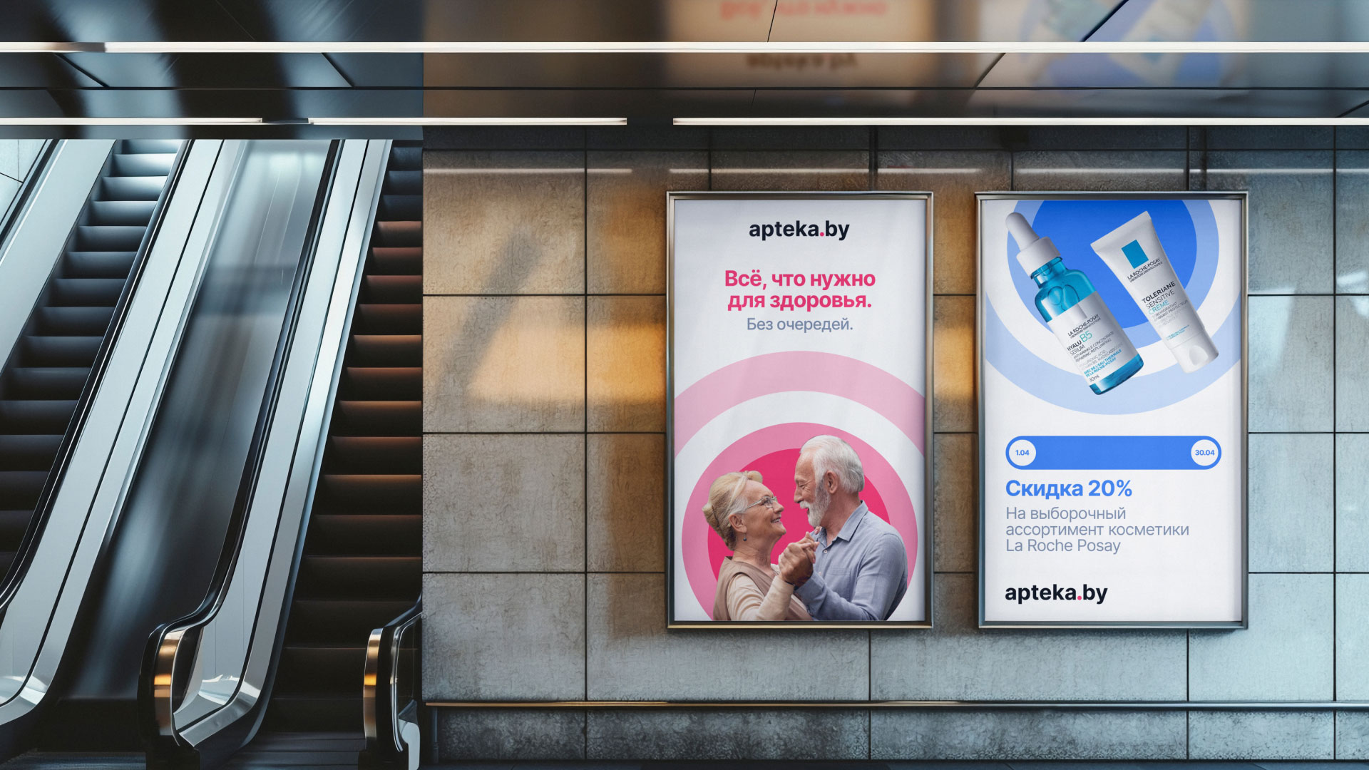
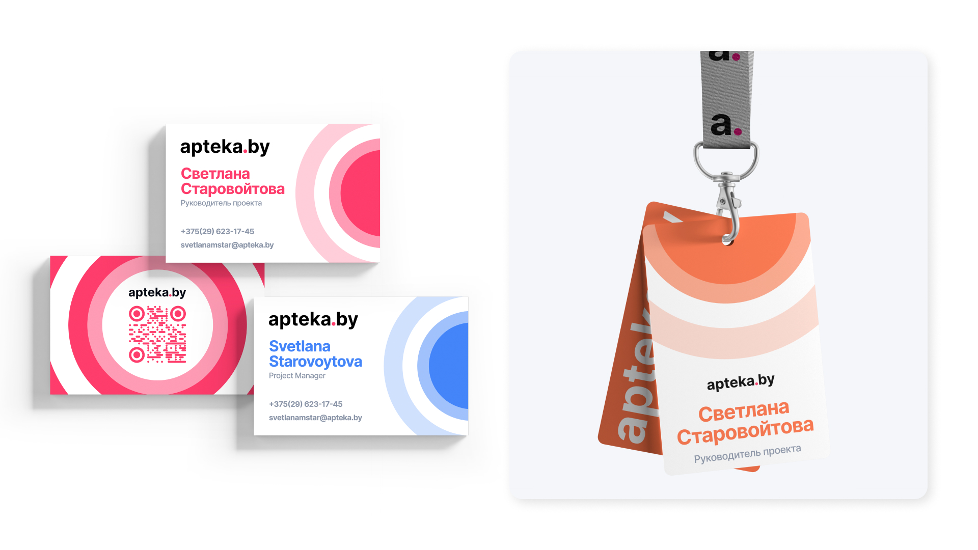
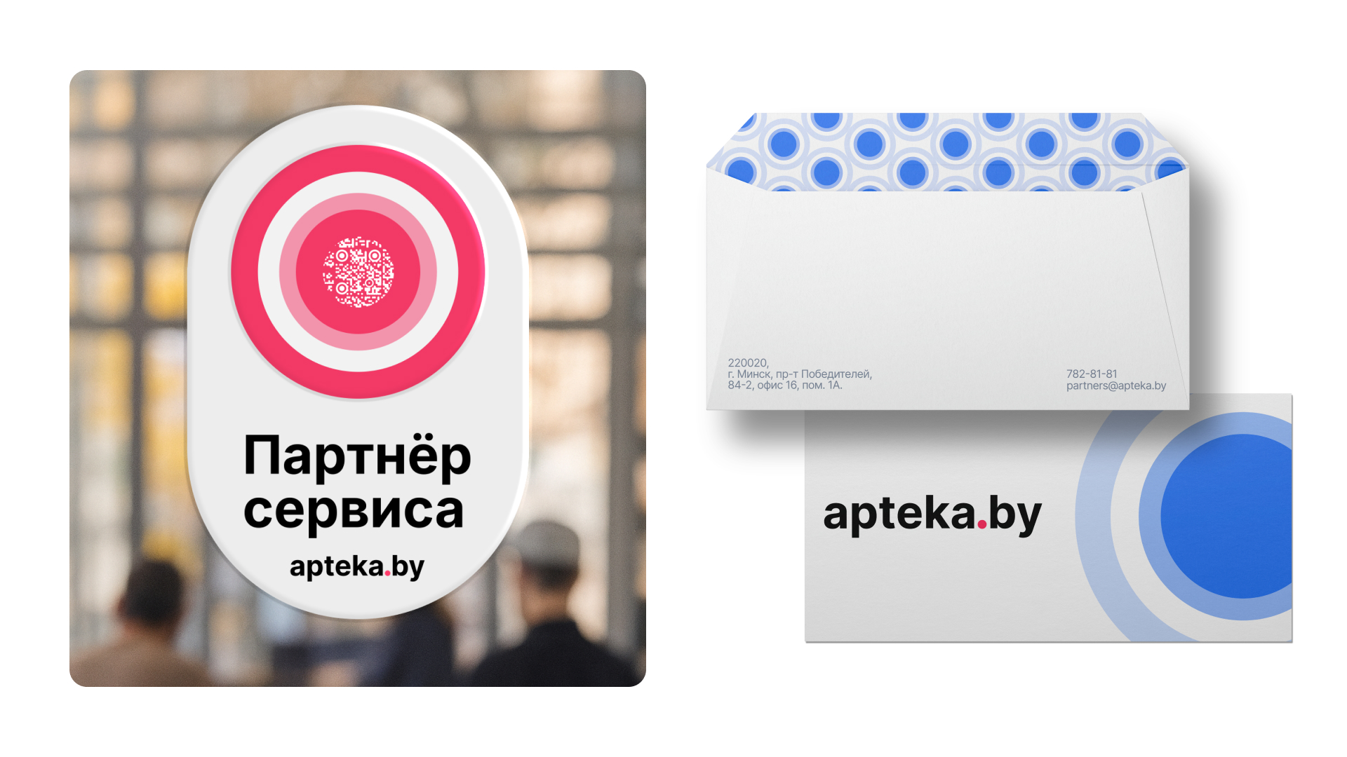
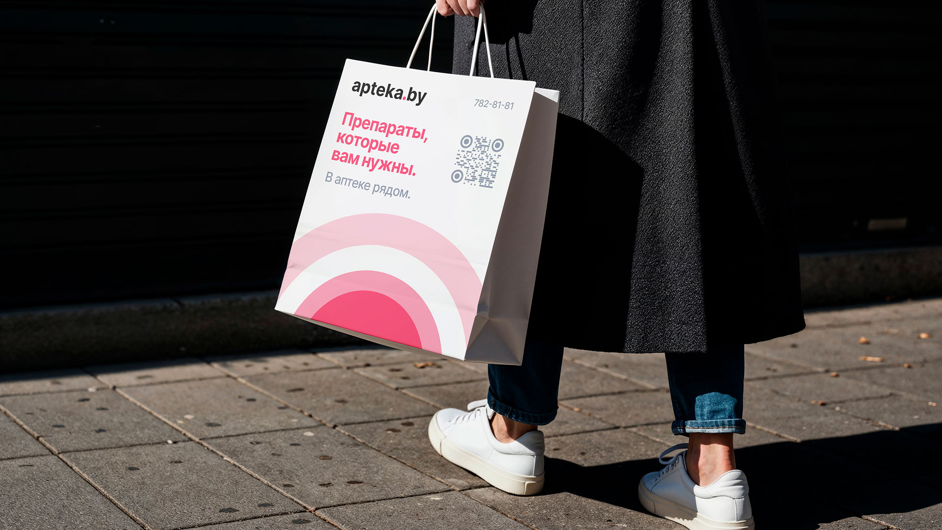
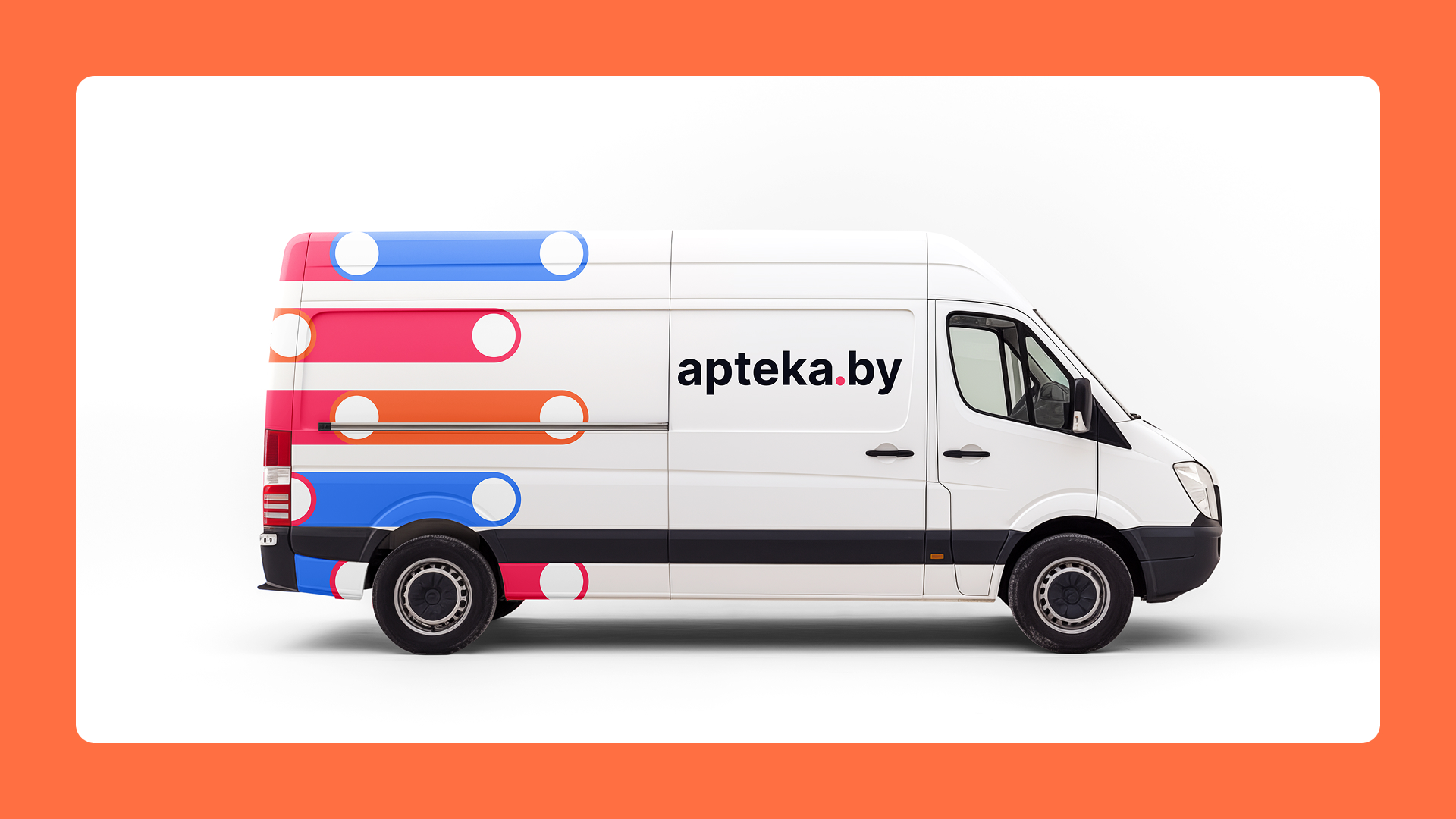
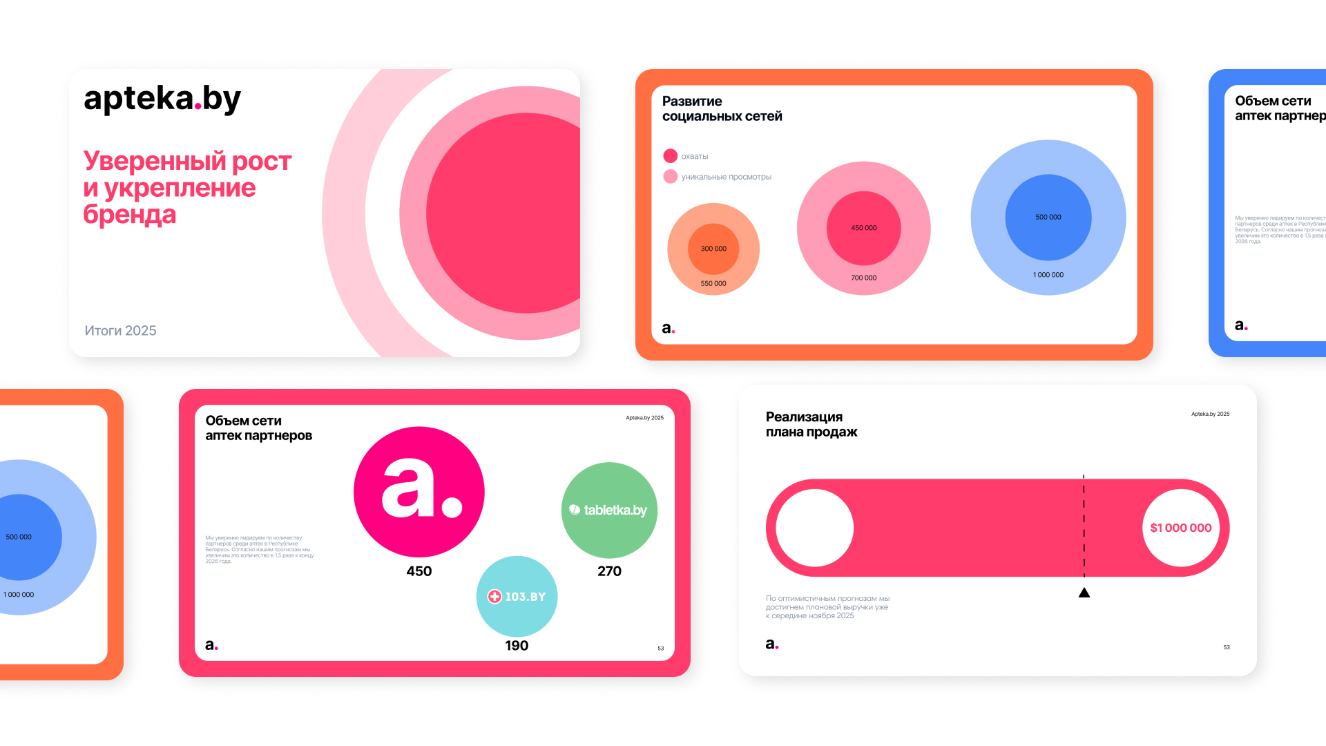
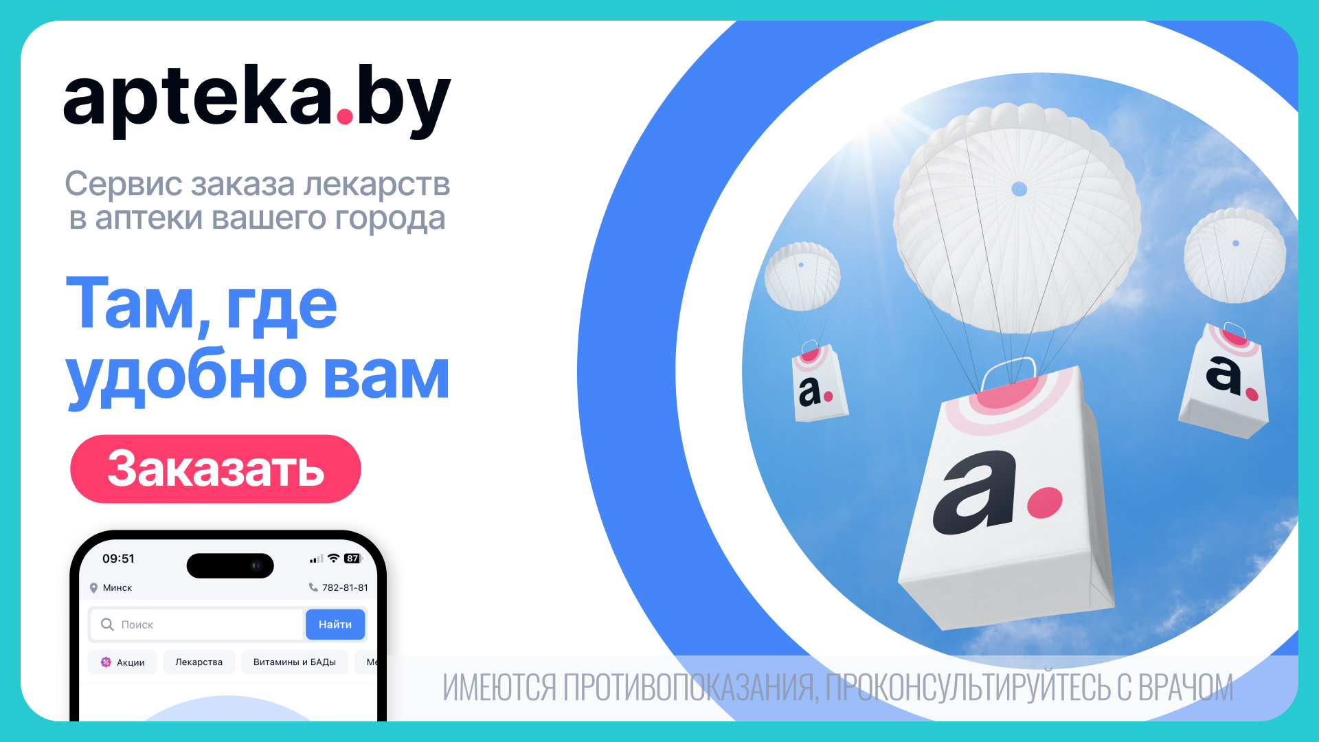
This conceptual idea is further visualised by the way the dot transforms into dynamic, pulsating circles on the mock-ups, symbolising the brand’s expanding reach, care, and comfort for each user. These concentric circles evoke a sense of ripples on water, representing the positive impact that a seamless healthcare service has on a community. We emphasize this idea of lightness and technological sophistication with a vivid, surrealist image — packages delivered by hot air balloons.
The balloons, which mirror the shape of our ideal point (the dot), visualise the concept of “weightless” logistics. In our brand universe, the order seems to float effortlessly above city traffic jams, urban noise, and long queues, landing precisely on target with surgical precision. This imagery challenges the traditional perception of logistics as something heavy, industrial, and slow. Instead, we present it as an airy, dreamlike process where technology does the heavy lifting behind the scenes.
CREDIT
- Agency/Creative: Moloko. Branding Sidekicks
- Article Title: Moloko Branding Sidekicks Designs a Dot-Led Brand Identity for apteka.by
- Organisation/Entity: Agency
- Project Type: Identity
- Project Status: Published
- Agency/Creative Country: Lithuania
- Agency/Creative City: Vilnius
- Market Region: Europe
- Project Deliverables: Brand Design, Brand Identity
- Industry: Pharmaceutical
- Keywords: Branding, identity, medical services, pharmaceutical industry
-
Credits:
Creative Director: Denis Misyulya
Brand Creator: Anastasia Eliseeva
Senior Brand Designer: Alina Kozhbakova
Brand Designer: Vlad Sultanov
Brand Designer: Liubou Korzan
Motion Designer: Marharita Tsikhanovich
Business Diretor: Olga Kaziaba
Marketing Manager: Hanna Yarotskaya
Marketing Manager: Anna Stepuro
Account Manager: Mary Boiko


