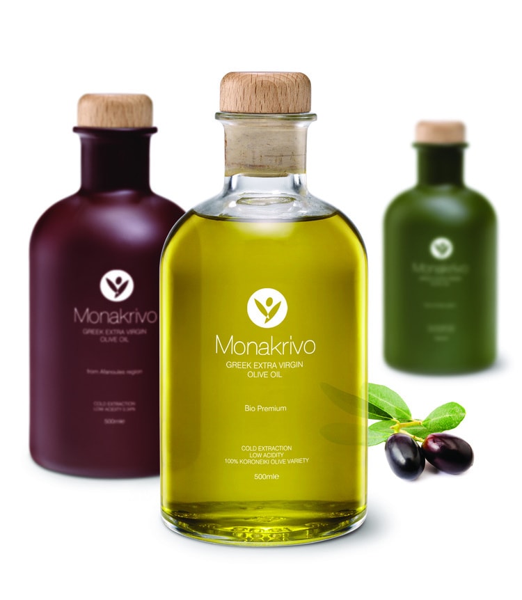
“The brand name: Several prerequisites and basic criteria for the brand name evaluation were agreed upon with our client. The brand name had to be legible in Latin, convey properties and values of the product, be differentiated from the competition, place the product in the market environment that it aims and finally tell a story. We therefore came up with the name Monakrivo, which in Greek means unique, precious and beloved. Monakrivo is a word which carries great sentimental value, usually used when referring to a child.”
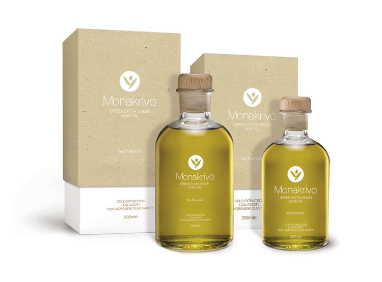
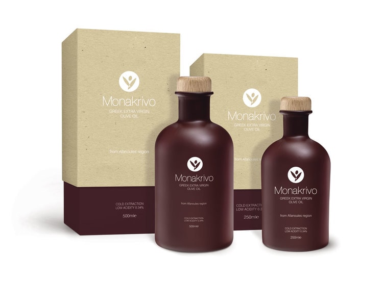
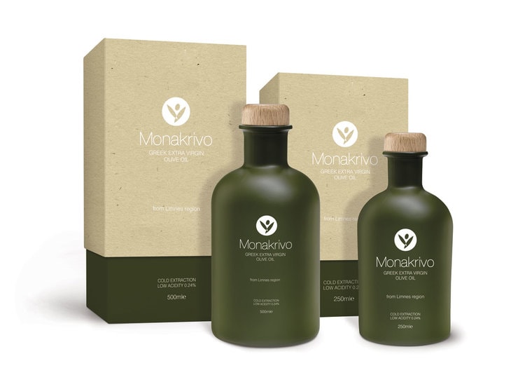
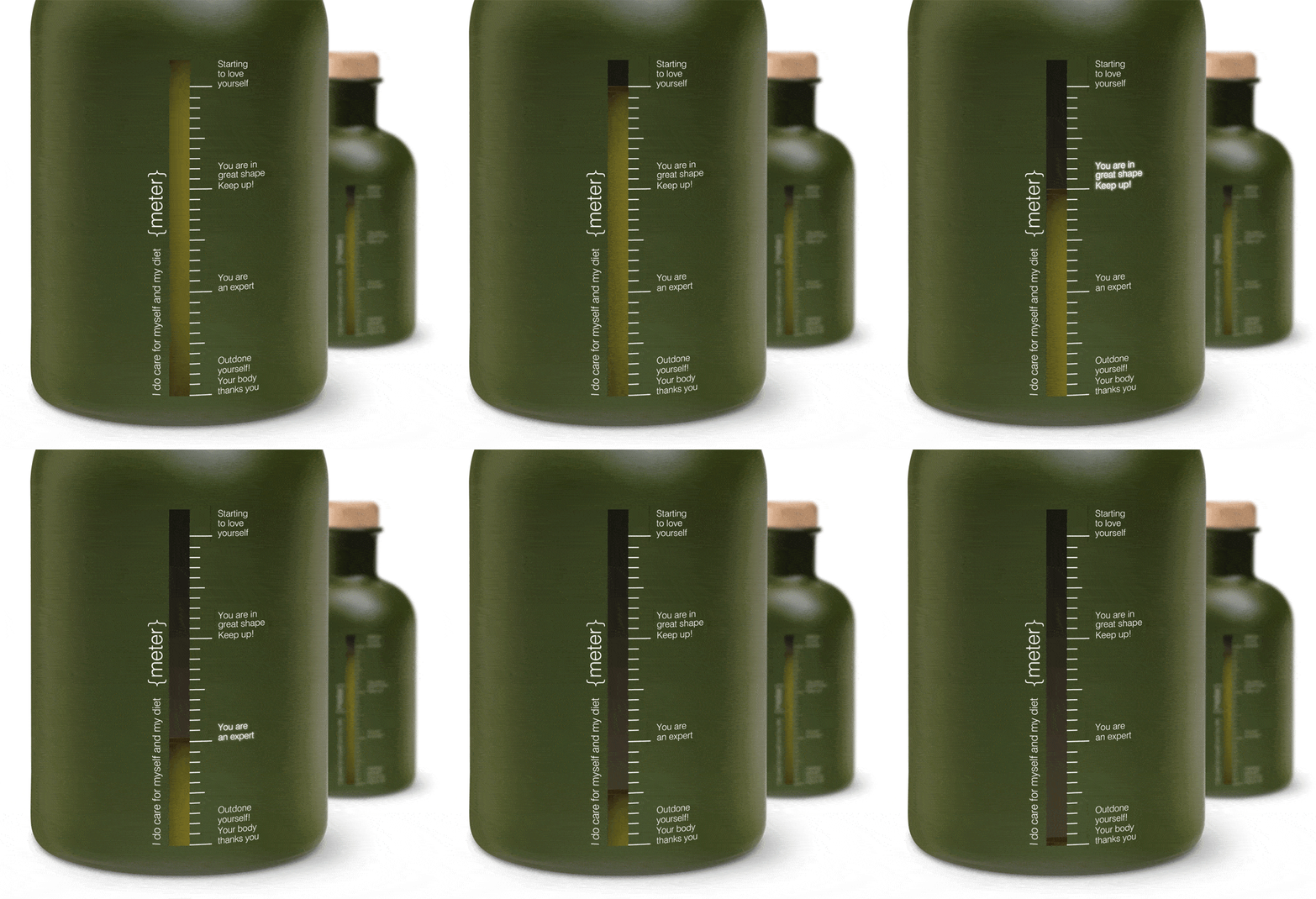
“Our aim was to harmoniously combine simplicity and prestige with a friendly disposition. The visual approach for the logo and label is simple, elegant and timeless. We created an abstract visual leaf and olive fruit that at the same time take the form of symbol/seal. Our client wanted to stress the importance of the nutritional value of olive oil. So we designed a creative approximation indicating the level of consumption (bottle/side view). We remind consumers of the nutritional value of olive oil by rewarding consumption with cheerful and encouraging words.”
CREDIT
- Agency/Creative: Molivi - Design Studio
- Article Title: Molivi – Design Studio – Monakrivo Extra Olive Oil
- Project Type: Packaging


