


Dry pasta is one of the most crowded and visually noisy categories on the shelf. Speed, value messaging, and exaggerated food imagery dominate the space. MOLA was created as a deliberate counterpoint to this culture — a brand that focuses not on the meal itself, but on the quiet moment before it.
The brief was not simply to design packaging for pasta, but to translate the idea of slowness into a tangible, everyday object. The result needed to feel calm without becoming invisible, and elevated without feeling distant from home.
MOLA’s brand story centers around the 8–10 minutes while water boils. It’s the moment when the phone is put down, the kitchen fills with steam, and time briefly pauses. The packaging was designed as an extension of that moment — something that lives on the counter and quietly participates in the ritual.
Rather than relying on aggressive branding or heavy visual storytelling, the goal was to let the product, materials, and space do most of the talking.
Minimalism in a loud category comes with a risk: disappearing. One of the key challenges of the project was ensuring that MOLA could maintain its restrained tone while still achieving strong shelf presence.
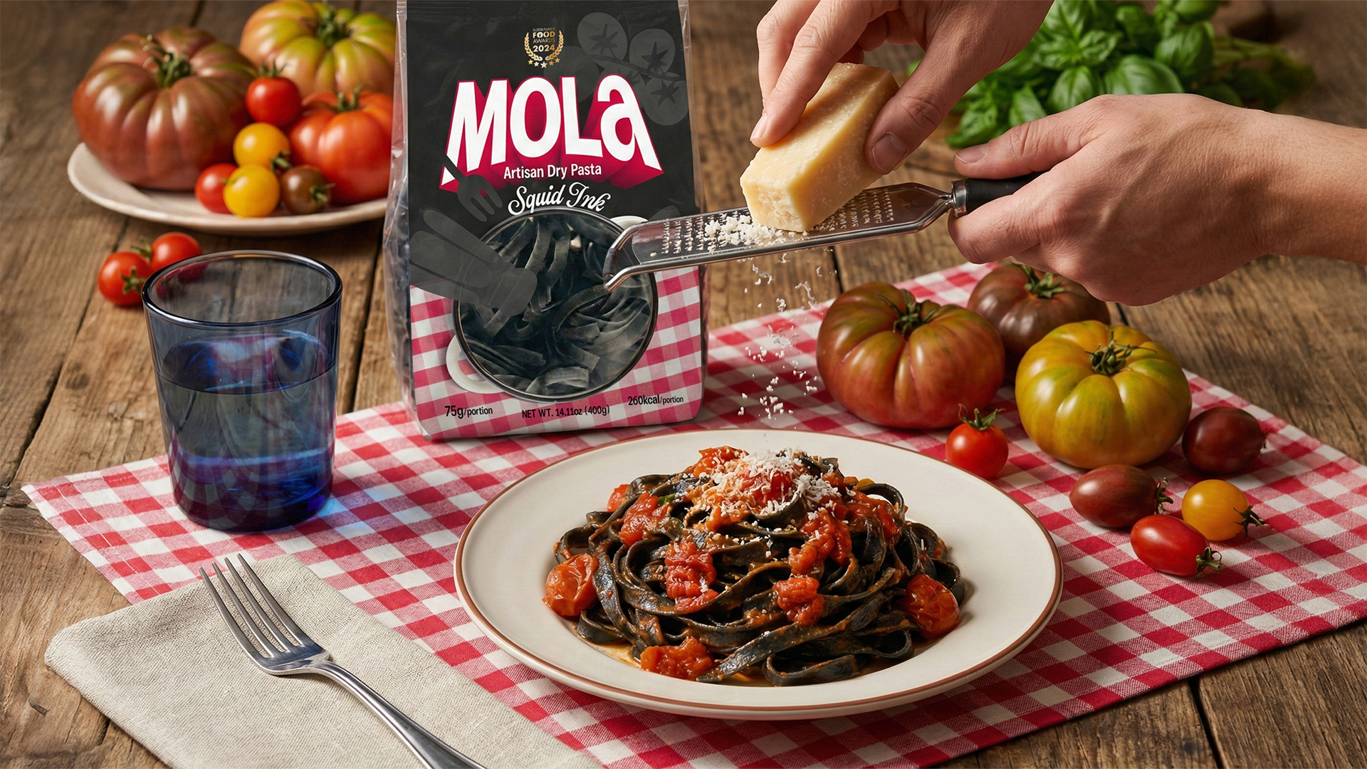
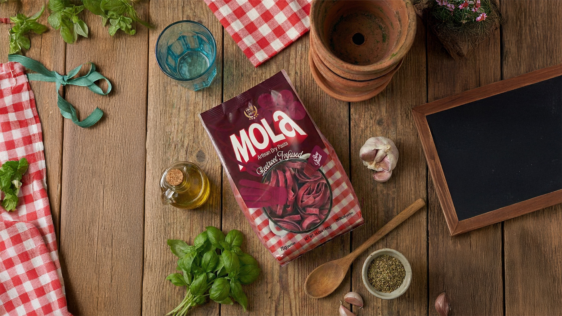
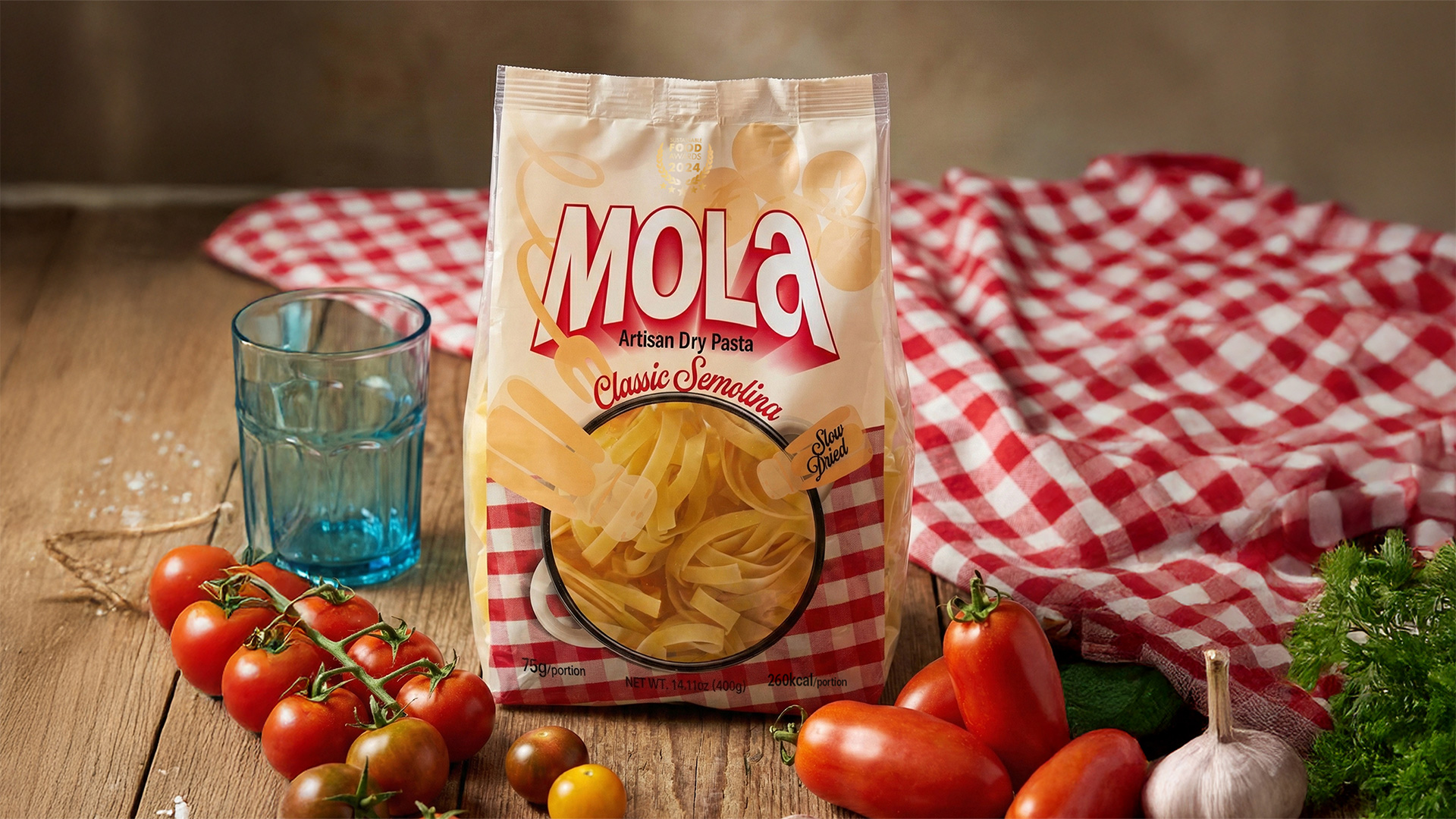
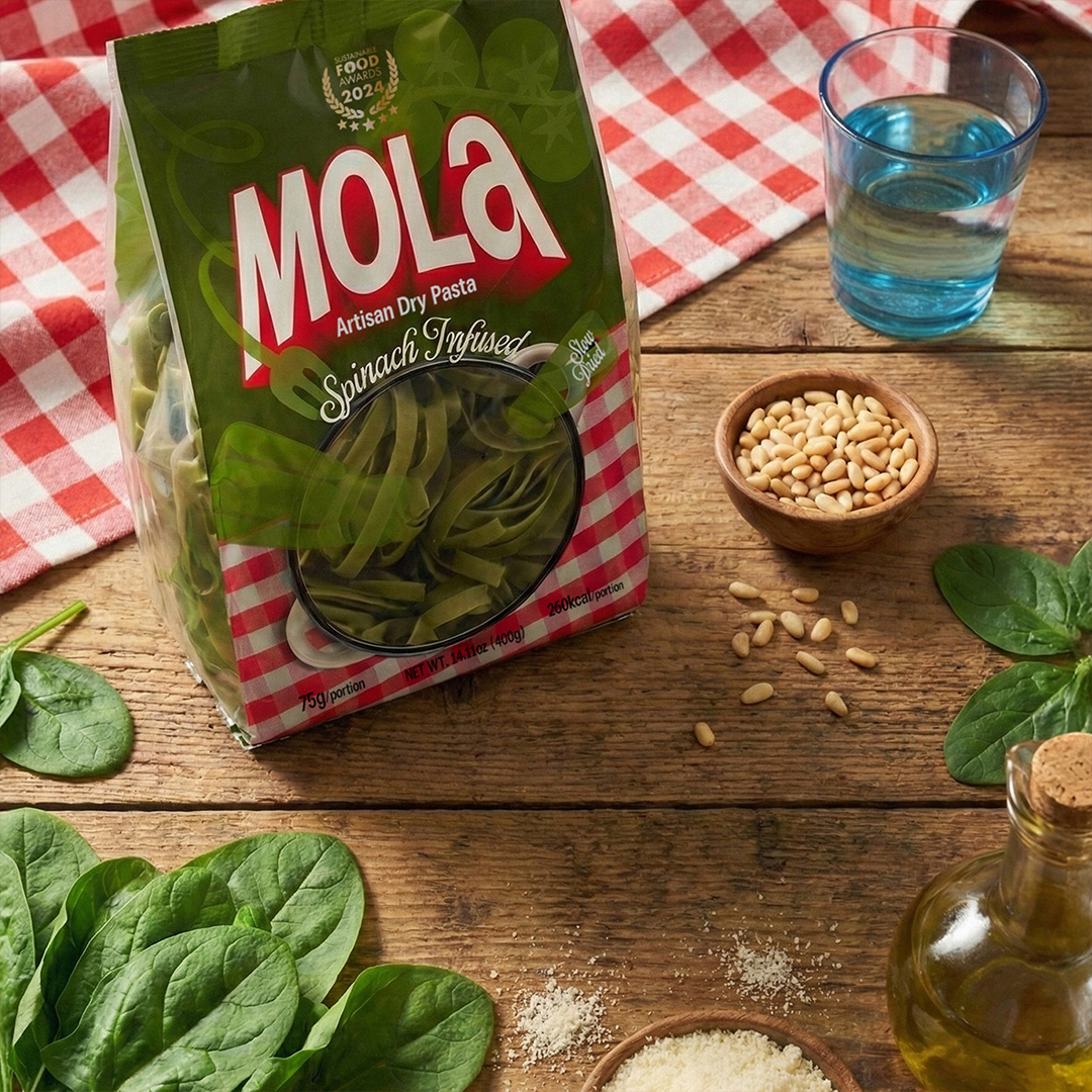
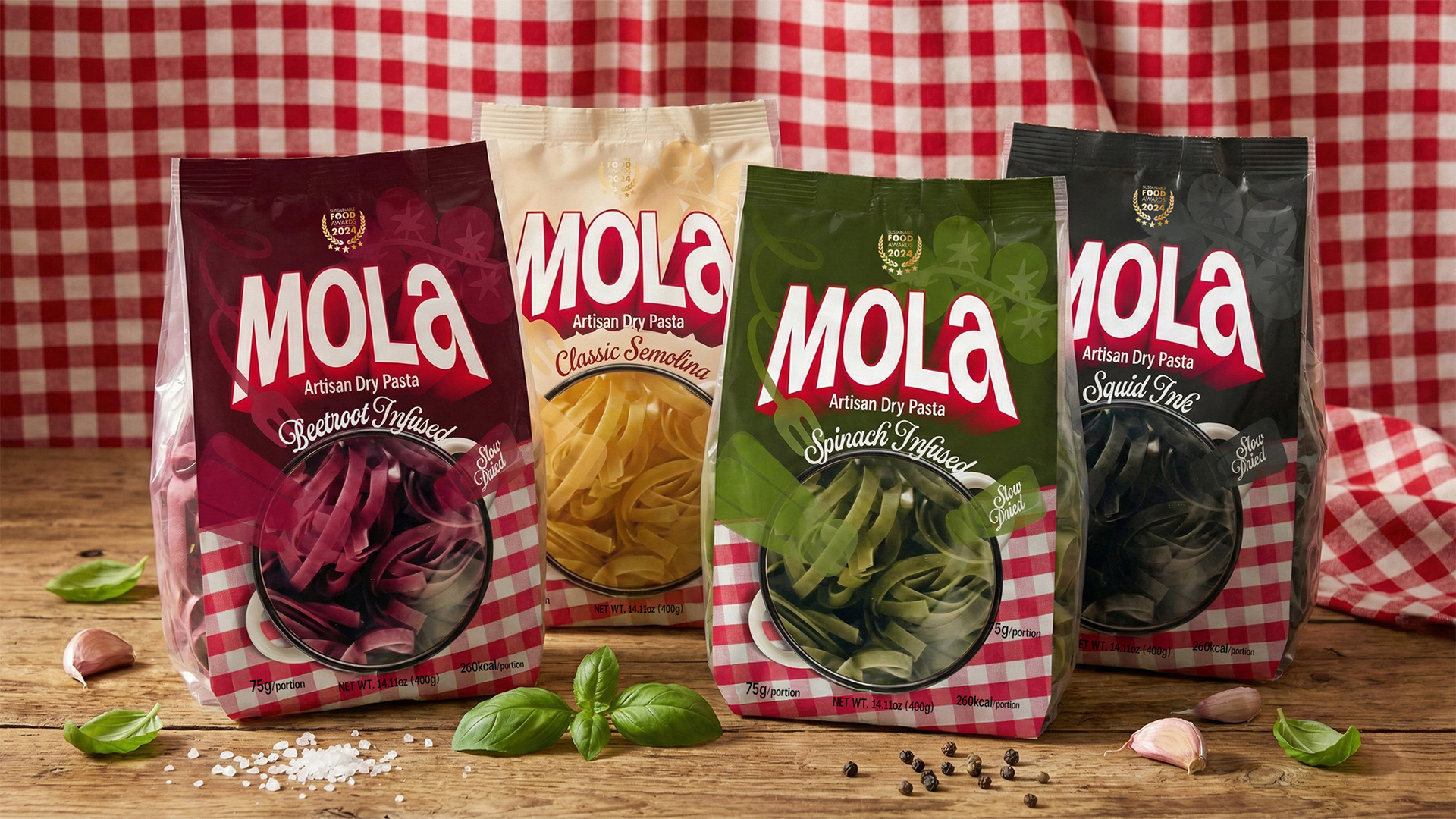
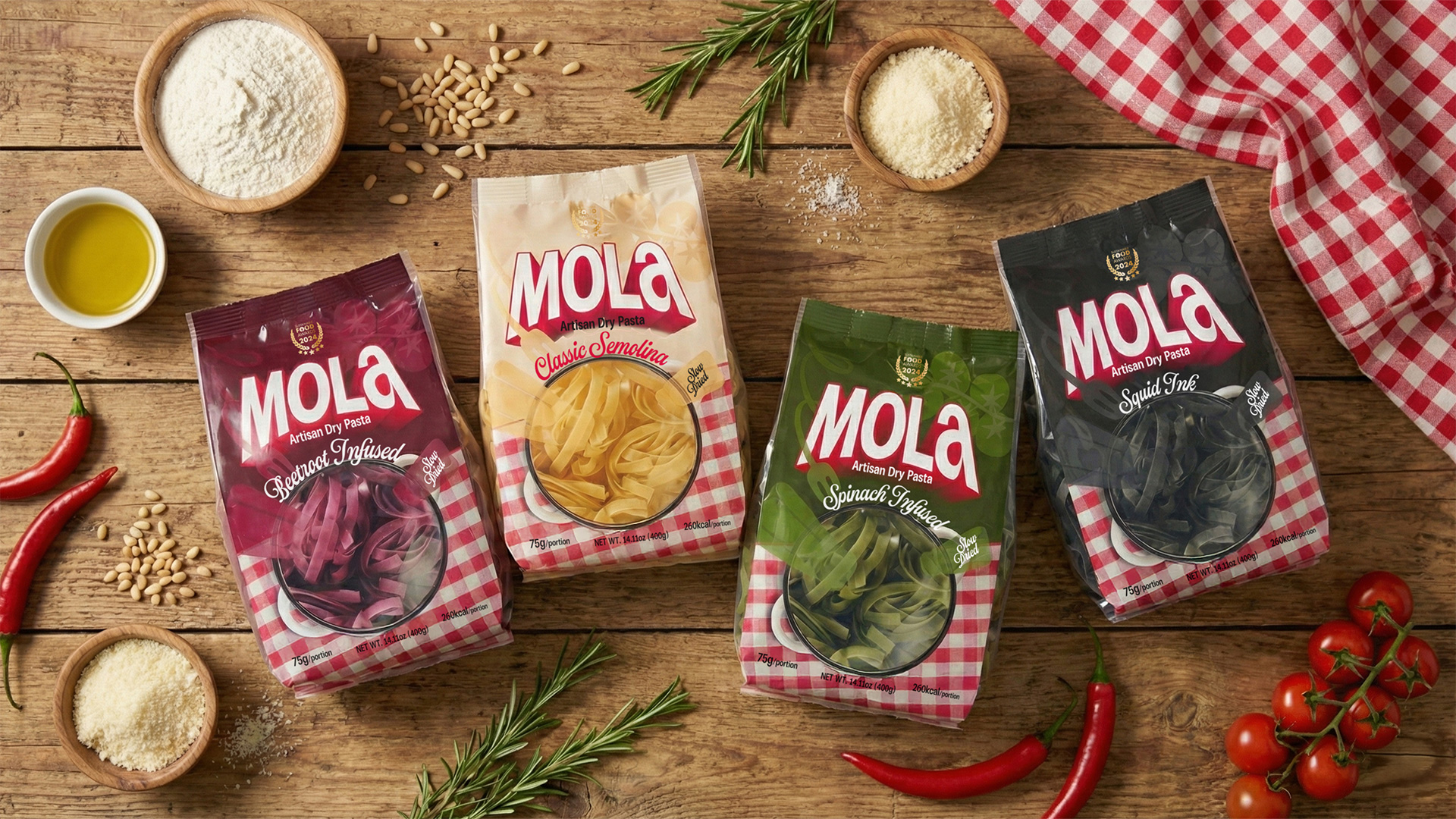
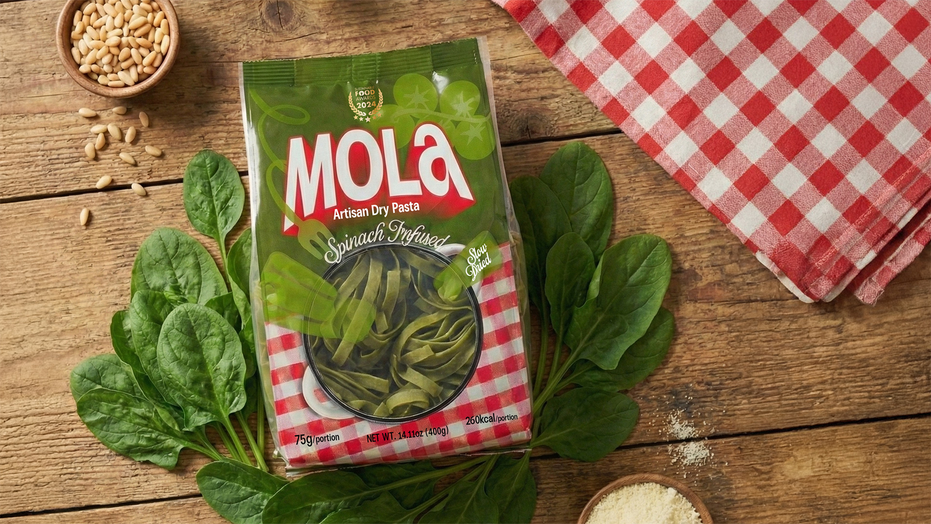
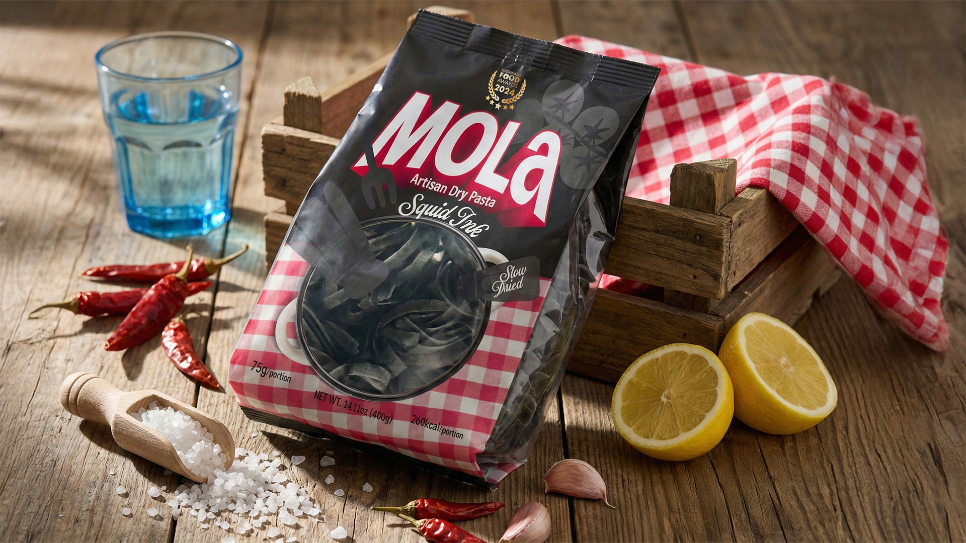
Instead of adding more elements, the solution came from clarity and confidence. Each product variant was built around a single dominant color — Sarı, Yeşil, Kırmızı, and Siyah — creating a clear visual system that reads instantly from a distance. This color-blocking approach allows MOLA to stand out precisely because it doesn’t compete in the same visual language as its surroundings.
At the core of the packaging design is the idea of the boiling pot. A soft, organic window cut reveals the pasta inside, making the product itself the main visual feature. This choice removes the need for printed food photography while reinforcing transparency, trust, and material honesty.
Subtle flowing line graphics inspired by steam and water motion introduce movement without noise. They are not meant to be noticed immediately, but rather felt — much like steam itself.
A kraft base paired with a matte, soft-touch finish was chosen to support the brand’s calm, home-oriented tone. The tactile quality of the packaging reinforces the idea of warmth and familiarity, avoiding gloss or premium excess in favor of quiet confidence.
The material doesn’t try to impress — it invites touch.
The final MOLA packaging system turns an everyday pantry item into a moment of pause. It stands out on shelf by doing less, not more — using color, material, and concept to communicate without shouting.
MOLA proves that even the most ordinary products can carry emotional meaning when design is guided by intention, restraint, and respect for the user’s time.
CREDIT
- Agency/Creative: Cem Kutlu
- Article Title: MOLA Pasta Packaging by Cem Kutlu Introduces Calm Minimalism to a Crowded Food Shelf
- Organisation/Entity: Freelance
- Project Type: Packaging
- Project Status: Non Published
- Agency/Creative Country: Turkey
- Agency/Creative City: Cem Kutlu
- Market Region: Europe
- Project Deliverables: Advertising Photography, Food Photography, Packaging Design
- Format: Bag
- Industry: Food/Beverage
- Keywords: pasta, artisan dry pasta, betroot pasta, spinach pasta
-
Credits:
Graphic Designer: Cem Kutlu


