


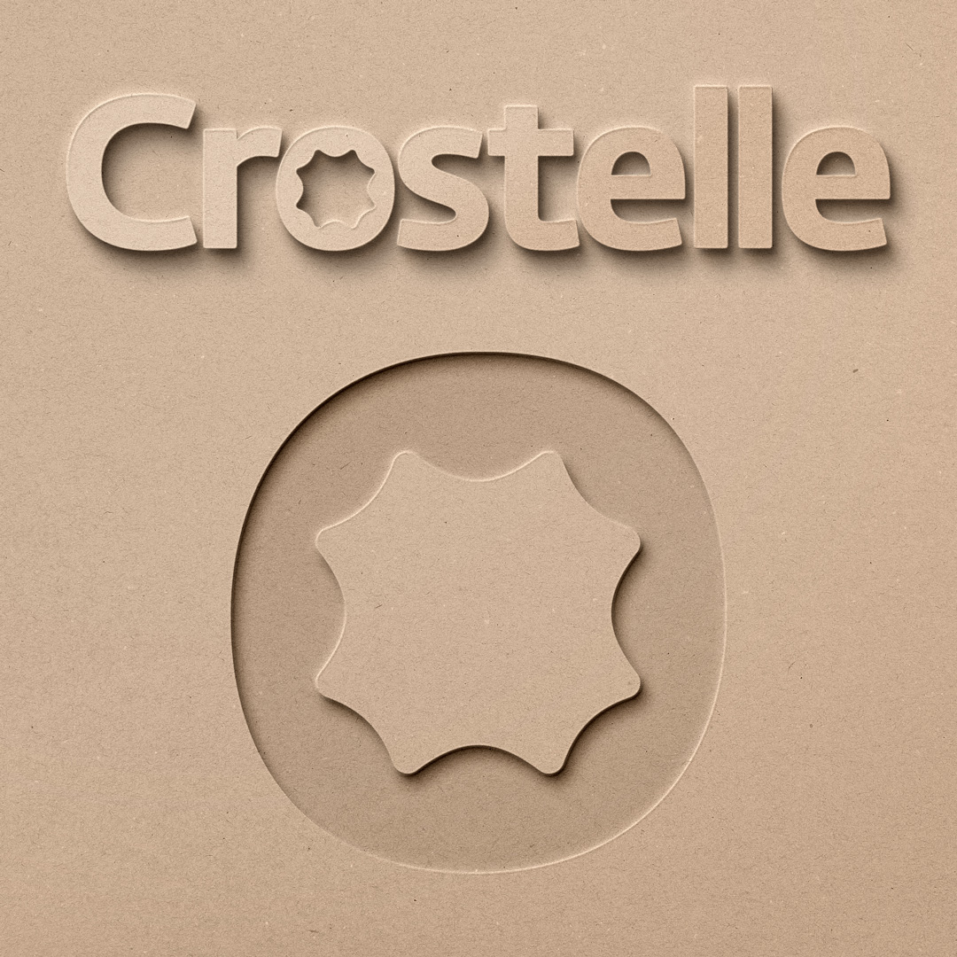
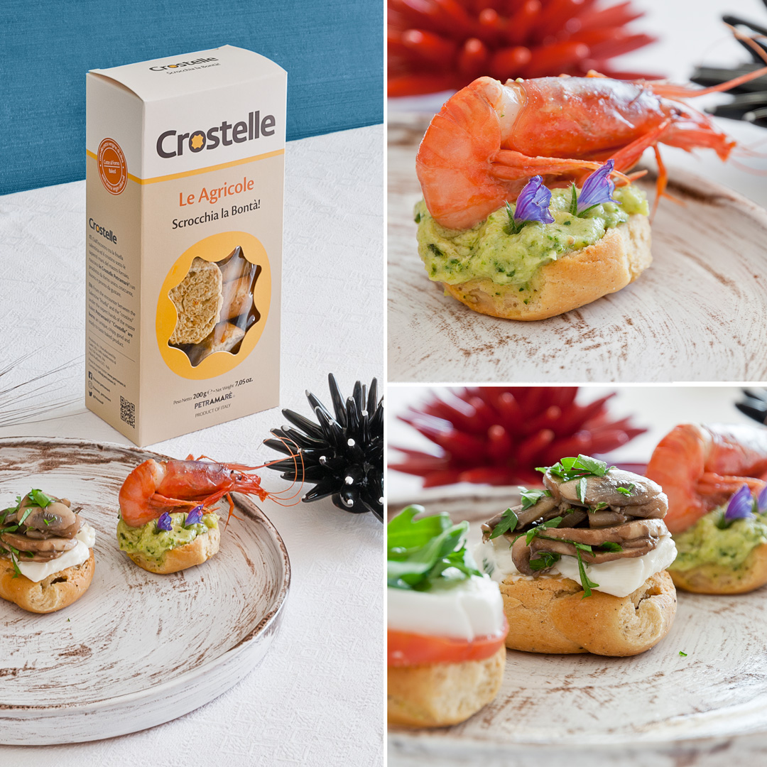
“Crostelle®” are part of a series of foods from the “Friscous®” family and is the fusion between “Crostino” and “Friselle”, a typical italian grain-based finger foods from the Salento region, and hence the origin from its name: Crostelle®.
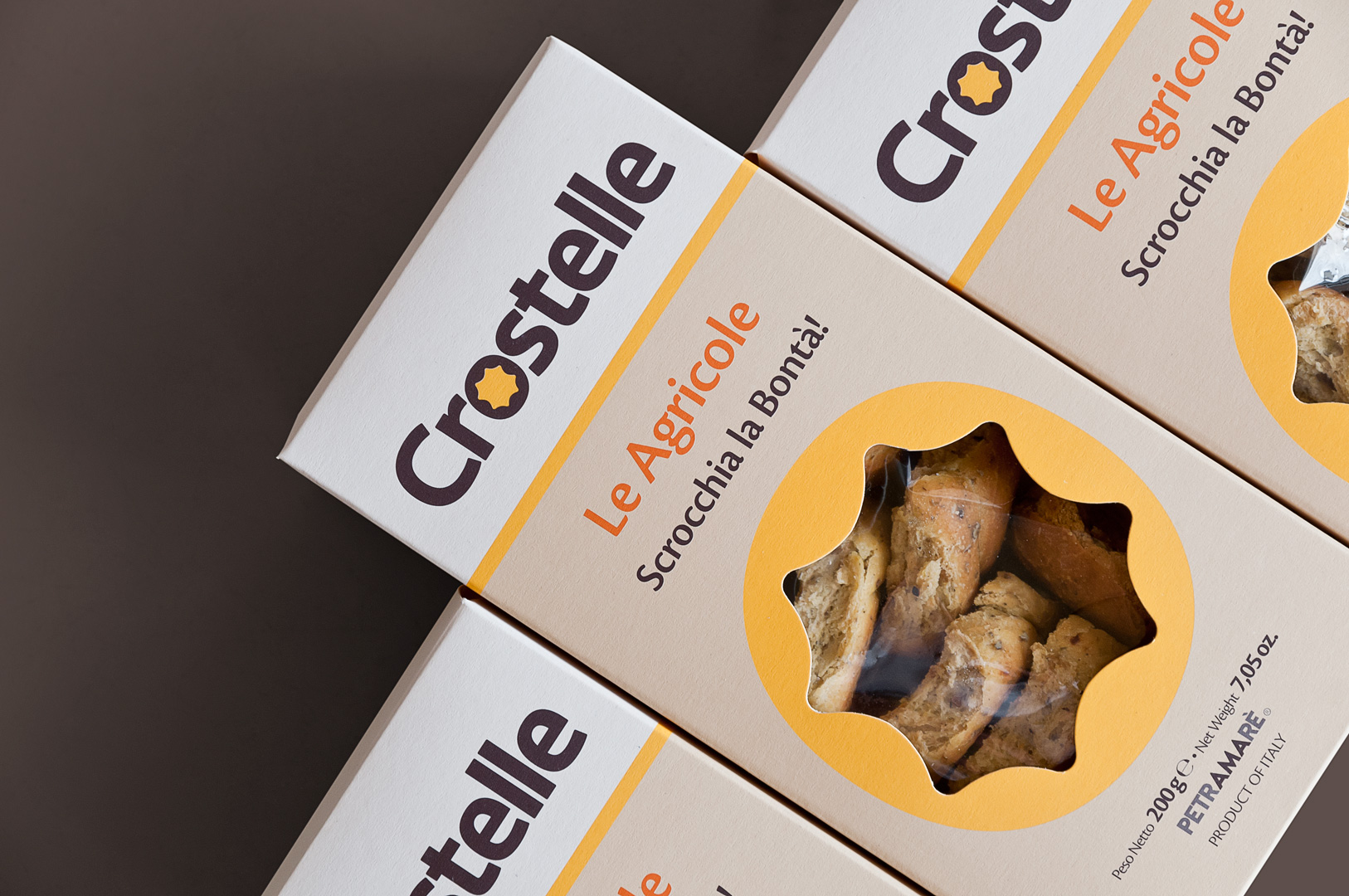
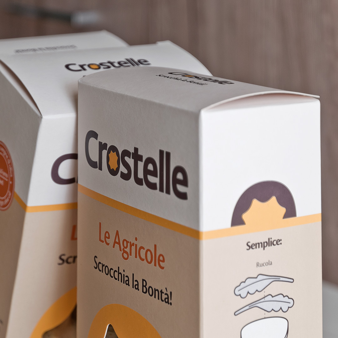
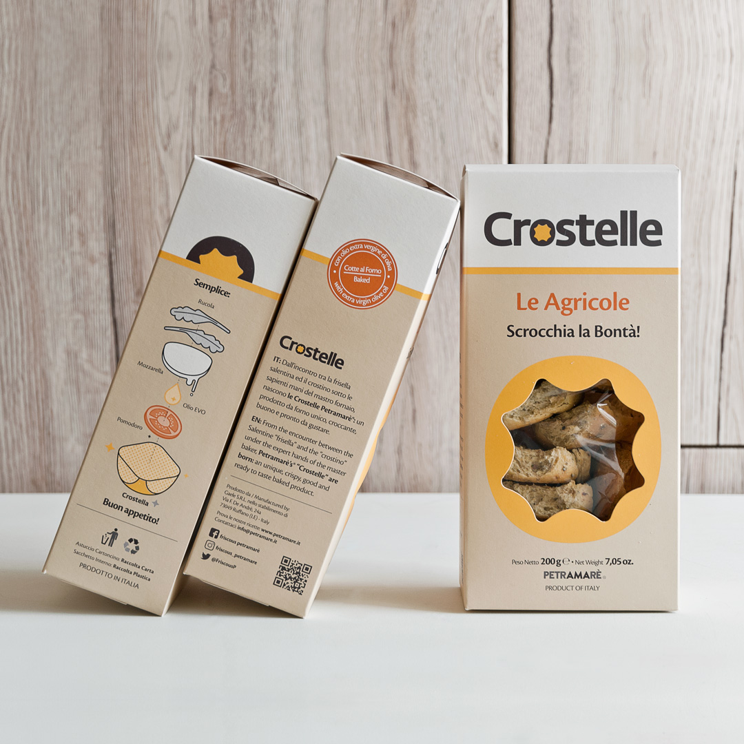
It was very important for our Client to communicate through the packaging that Crostelle® and Friscous® are related since one derives from the other; therefore we decided to keep some important graphic elements that could refer to both: the Friscous® grain merges with the “O” to give life to a new symbol.
We are maintaining the Friscous® colours and at the same time we give way to two additional colors that help to give the packaging its own identity, compensate the light tones with the warm ones and communicate an intuitive idea of craftsmanship without neglecting the design.
CREDIT
- Agency/Creative: Mol Design Studio
- Article Title: Mol Design Studio Creates New Packaging Design for Crostelle
- Organisation/Entity: Freelance, Published Commercial Design
- Project Type: Packaging
- Agency/Creative Country: Italy
- Market Region: Europe
- Project Deliverables: Brand Identity, Brand World, Branding, Graphic Design, Identity System, Packaging Design
- Format: Box
- Substrate: Pulp Carton


