Daria Kalenchuk – Moi Gostinci
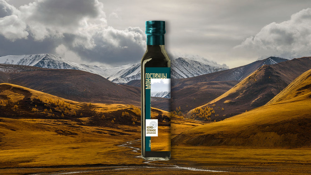
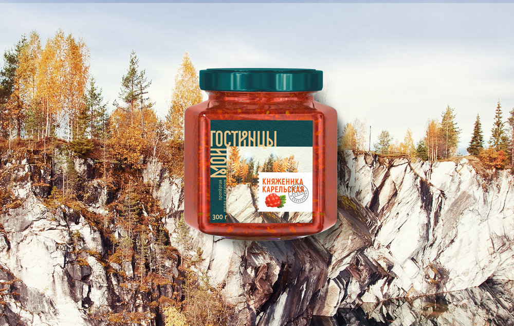
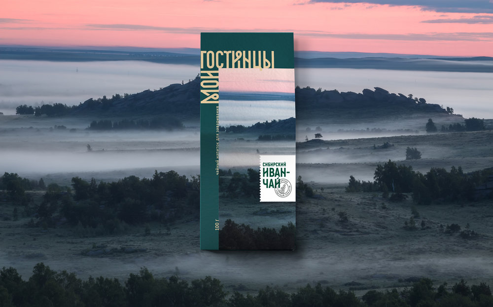
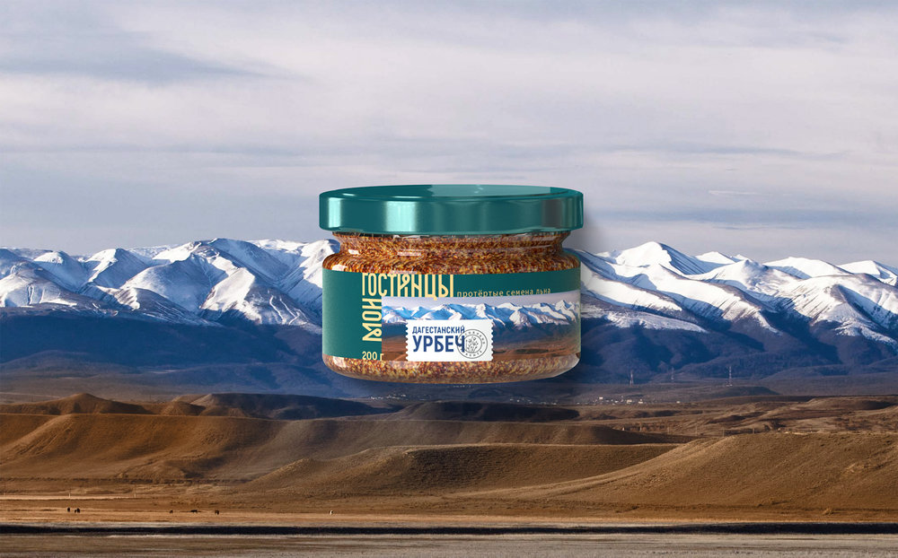
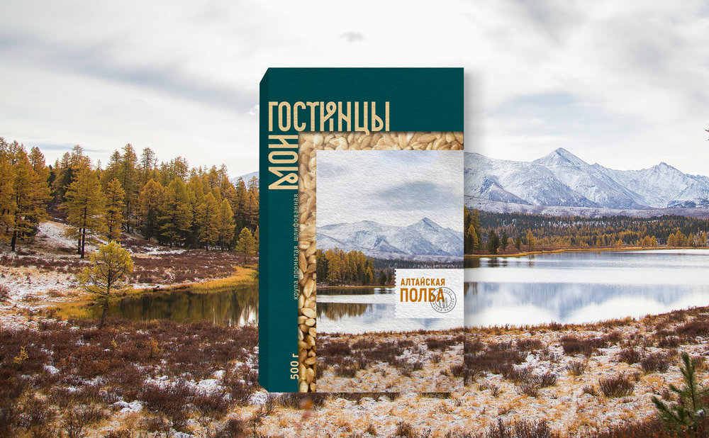
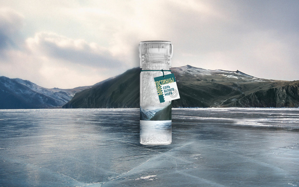
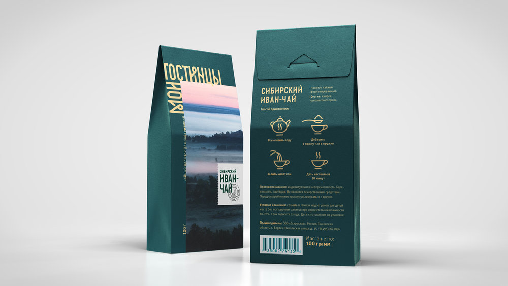
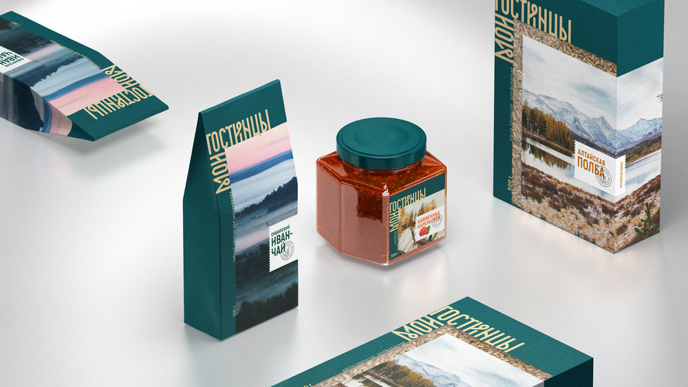
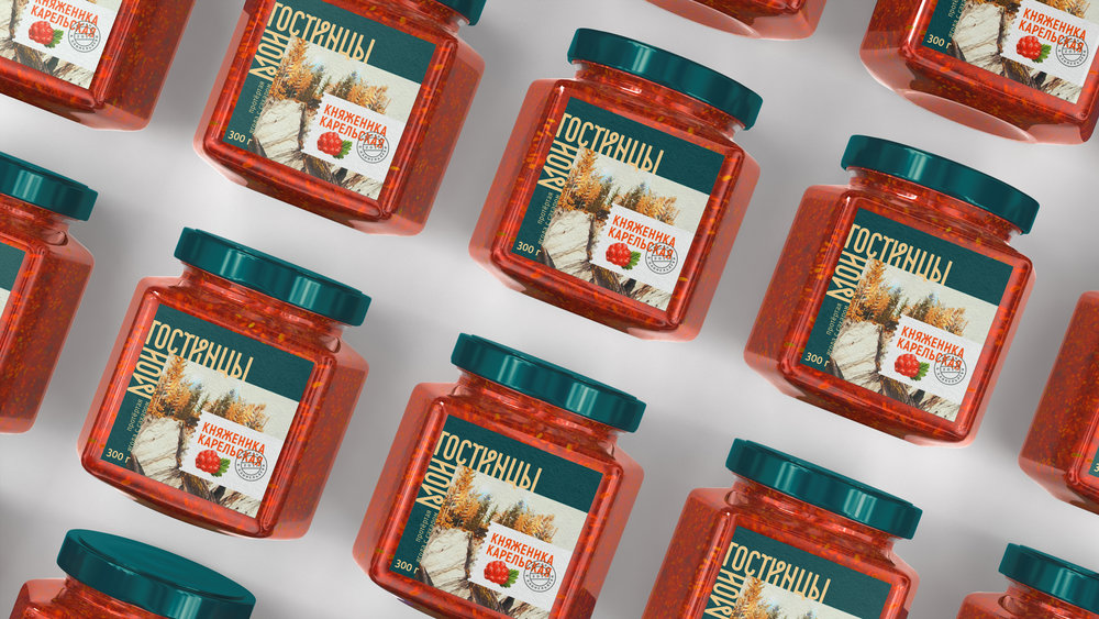
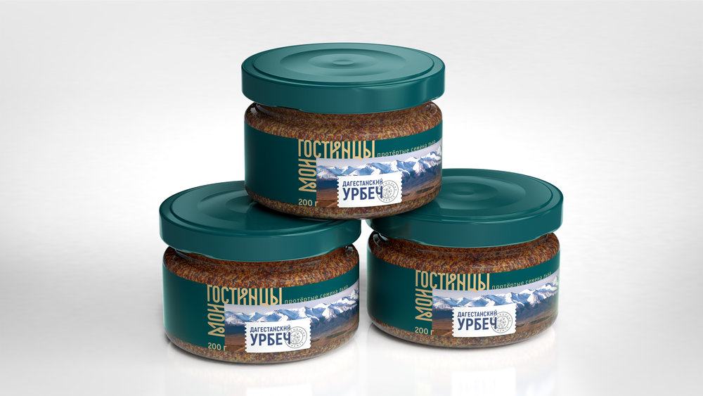
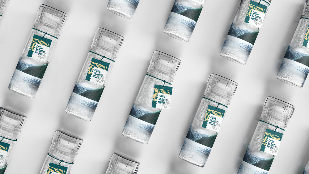
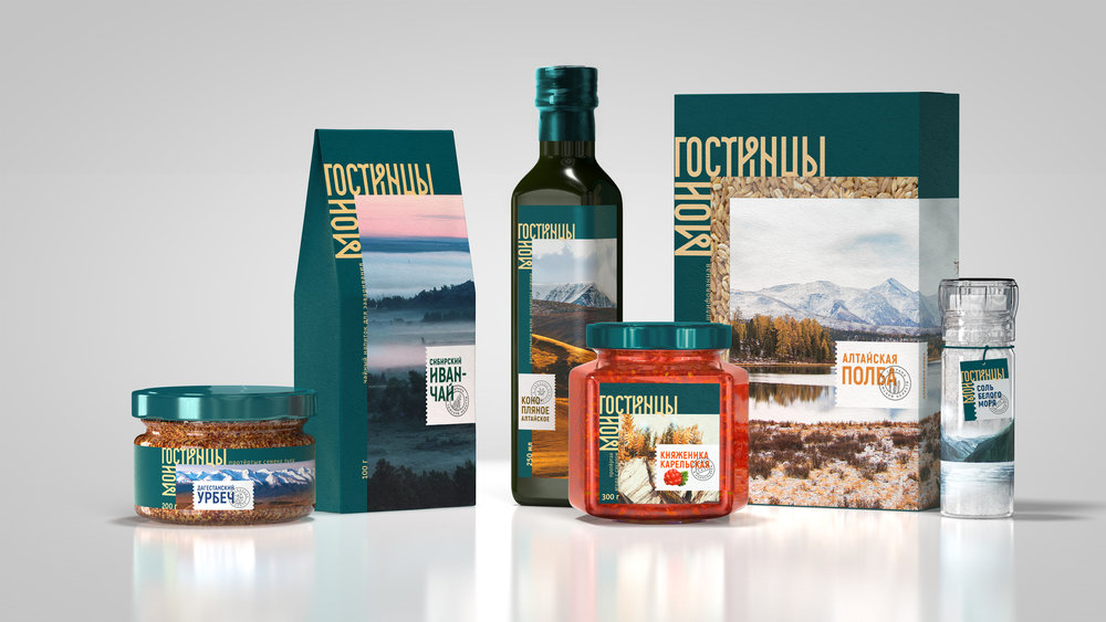
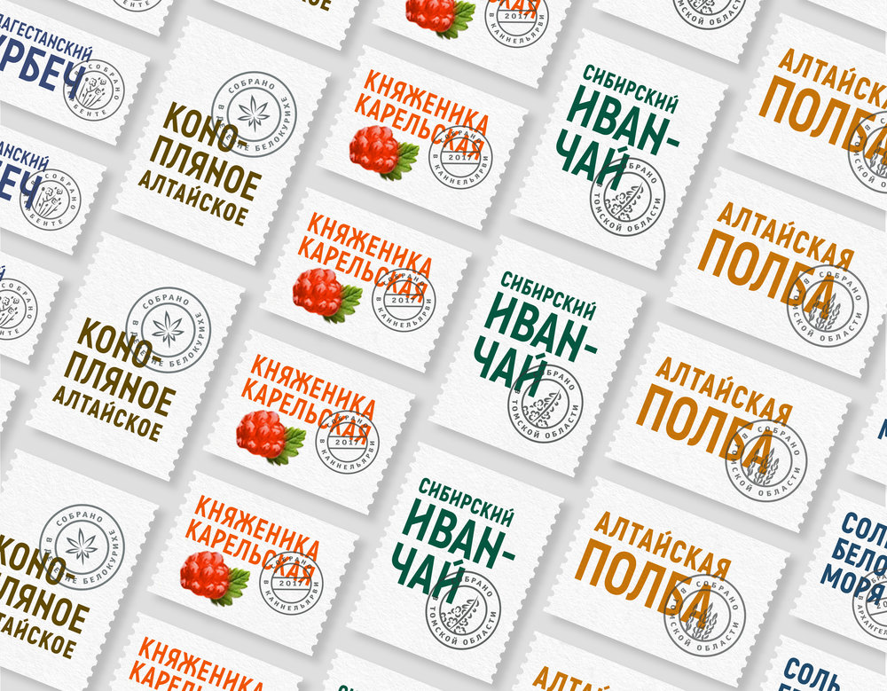
In Russia there are lot of small regional manufacturers of unique foods, such as spelt from Altai, berries from Karelia, urbech (seed paste) from Dagestan, Siberian herbs and others. But they all have one common problem: it’s difficult for them to go to the market with just one product. So my client united all these manufacturers under one brand to help them launch and develop further. My task was to reflect modernity and traditions, because of authentic nature of these foods.The main idea is a gastronomic journey to different regions of Russia without leaving home. It is expressed through photos of landscapes. To reflect connection with traditions, the logo was stylized with the old Russian ligature.Not only consumers take journeys, but foods as well. They travel from the place of growth to the consumer’s dining table. That’s information about the product is displayed in the post stamps shaped fields.The brand name Moi Gostinci is translated from Russian language like “gifts, that I brought from far away”. Gostinci—is an old archaic Russian word had been used long time ago.
CREDIT
- Agency/Creative: Daria Kalenchuk
- Article Title: Moi Gostinci Food Range Brand Design
- Organisation/Entity: Agency Promotional, Self Published
- Project Type: Packaging
- Agency/Creative Country: Russia
- Market Region: Multiple Regions
- Format: Bottle, Box, Jar
- Substrate: Glass, Pulp Carton, Pulp Paper


