


Background
Mohayej is a ready-to-drink coffee brand founded on the idea of cultural diversity and human unity. In a global market saturated with functional and category-centric FMCG products, Mohayej set out to be much more than another canned coffee: it desires to be a platform of human-centric meaning, bridging East and West, and celebrating diversity through a daily ritual we all know coffee.
Brief
The brief called for a visual identity and packaging system that would both deliver shelf impact in the crowded coffee segment and articulate a deeper brand story of connection, multiculturalism and inclusivity. The brand name itself, “Mohayej”, implies excitement, movement, celebration. The design challenge was two-fold: create an identity that works at a glance in the modern retail environment, and embed a meaningful narrative so that the brand becomes memorable, shareable and symbolic rather than purely functional.
Strategy
At the heart of the strategy is the idea of unity in diversity drawing on the human ritual of coffee as a universal moment of pause, conversation and connection. Accordingly the design language was conceived to merge East and West visually, and to encode global stories in approachable design. We decided on a minimalist yet meaningful approach: the logotype fuses the English letter “O” and the Persian letter “ه” (heh) into a stylised coffee bean symbol a mark of connection between East and West.
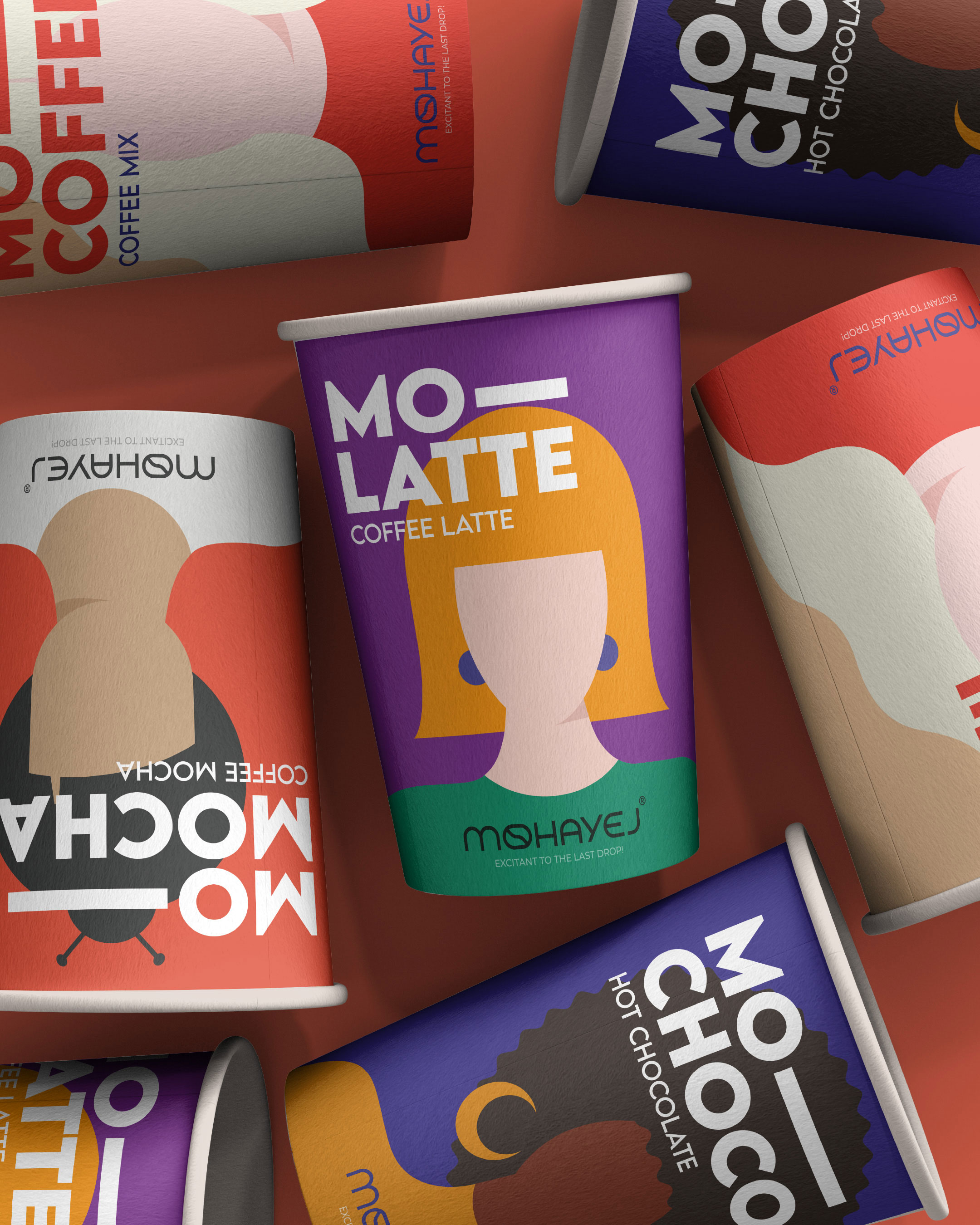
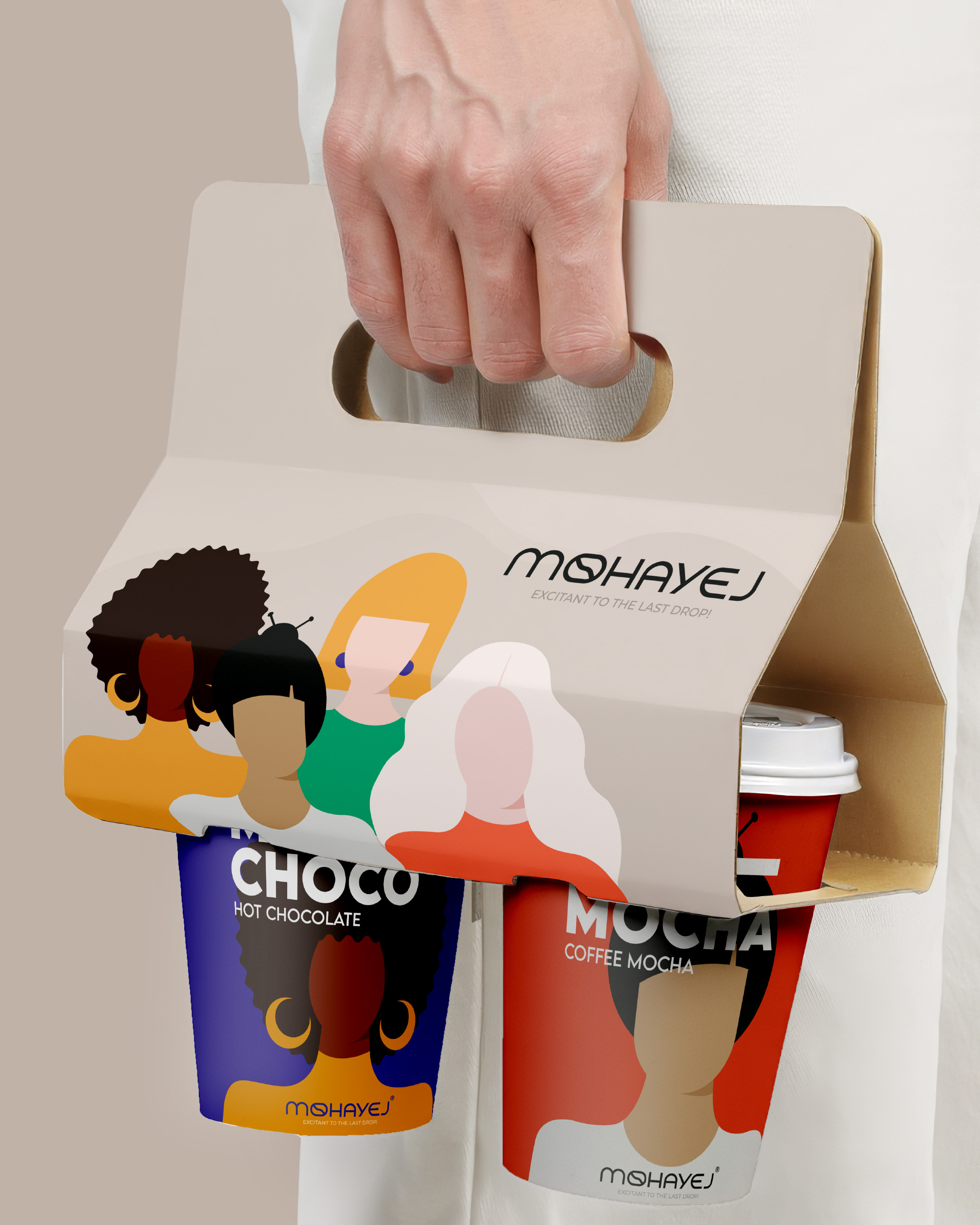
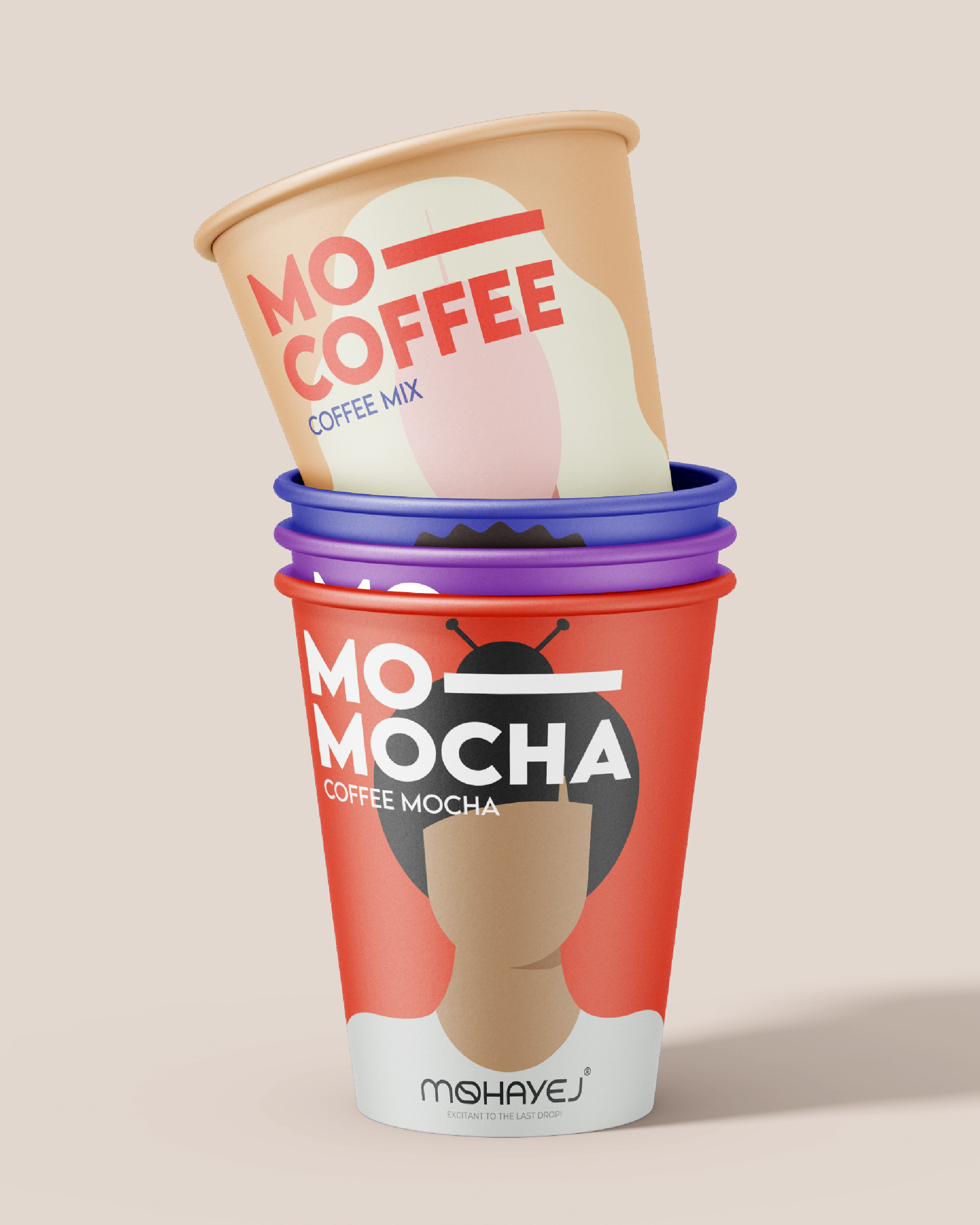
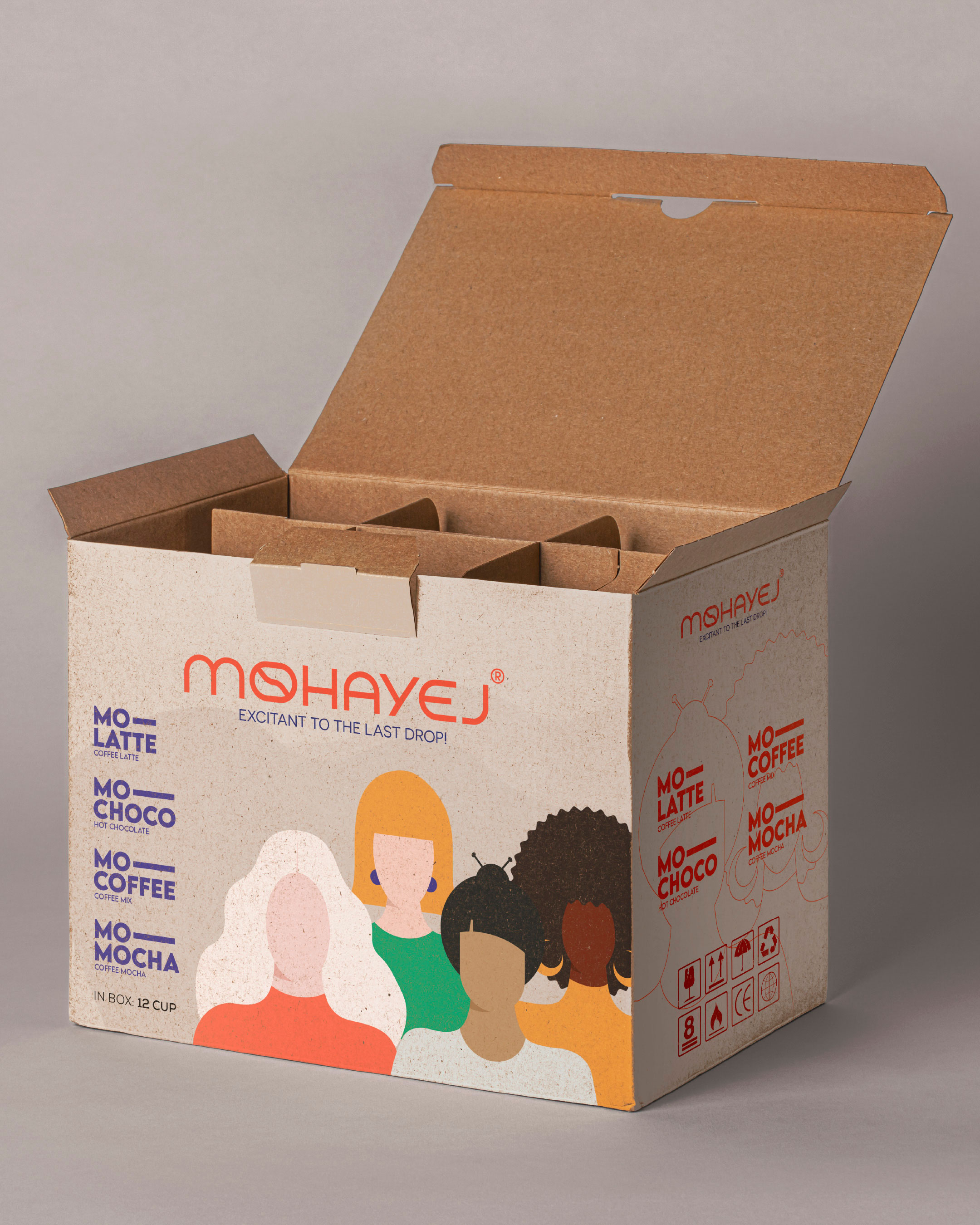
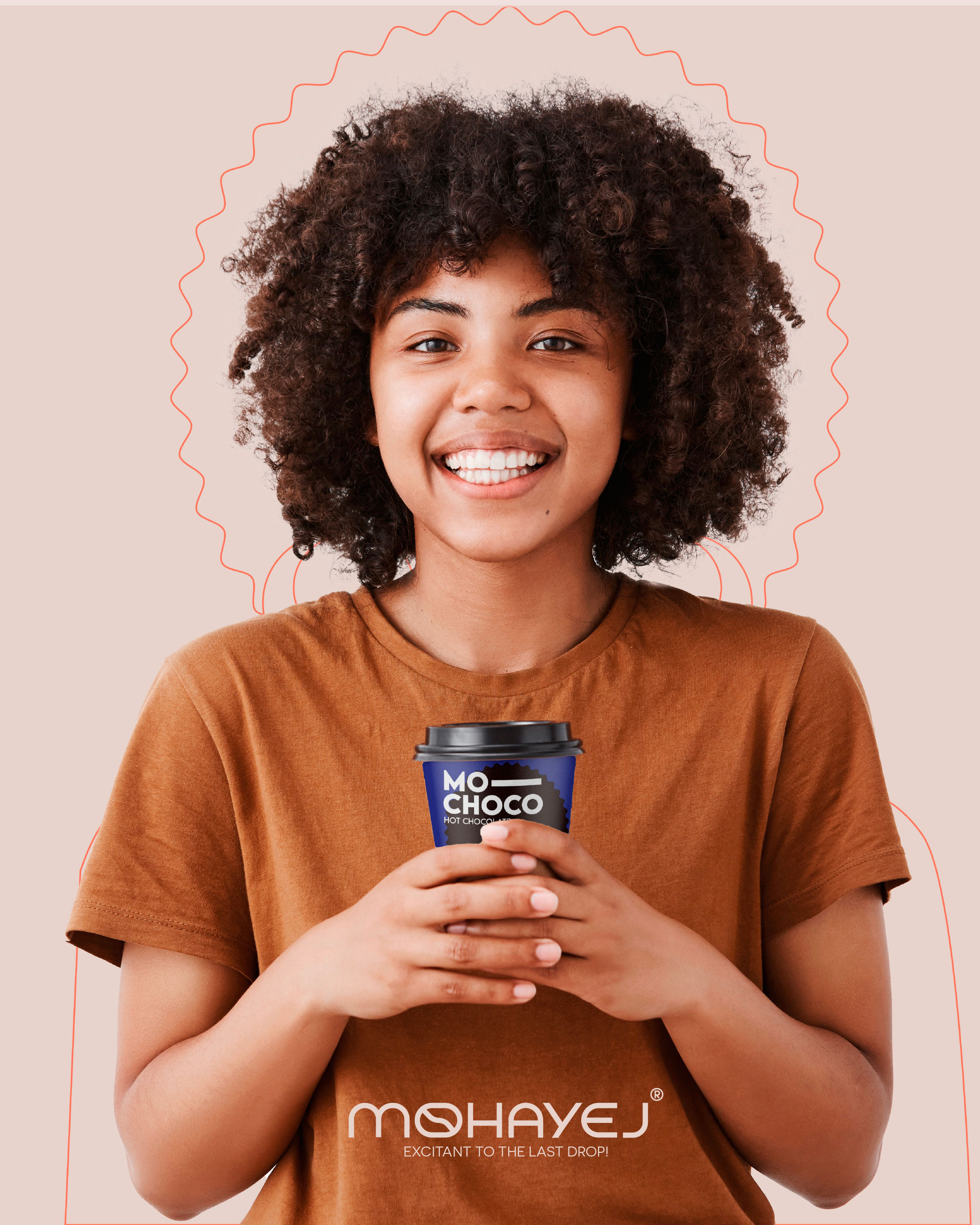
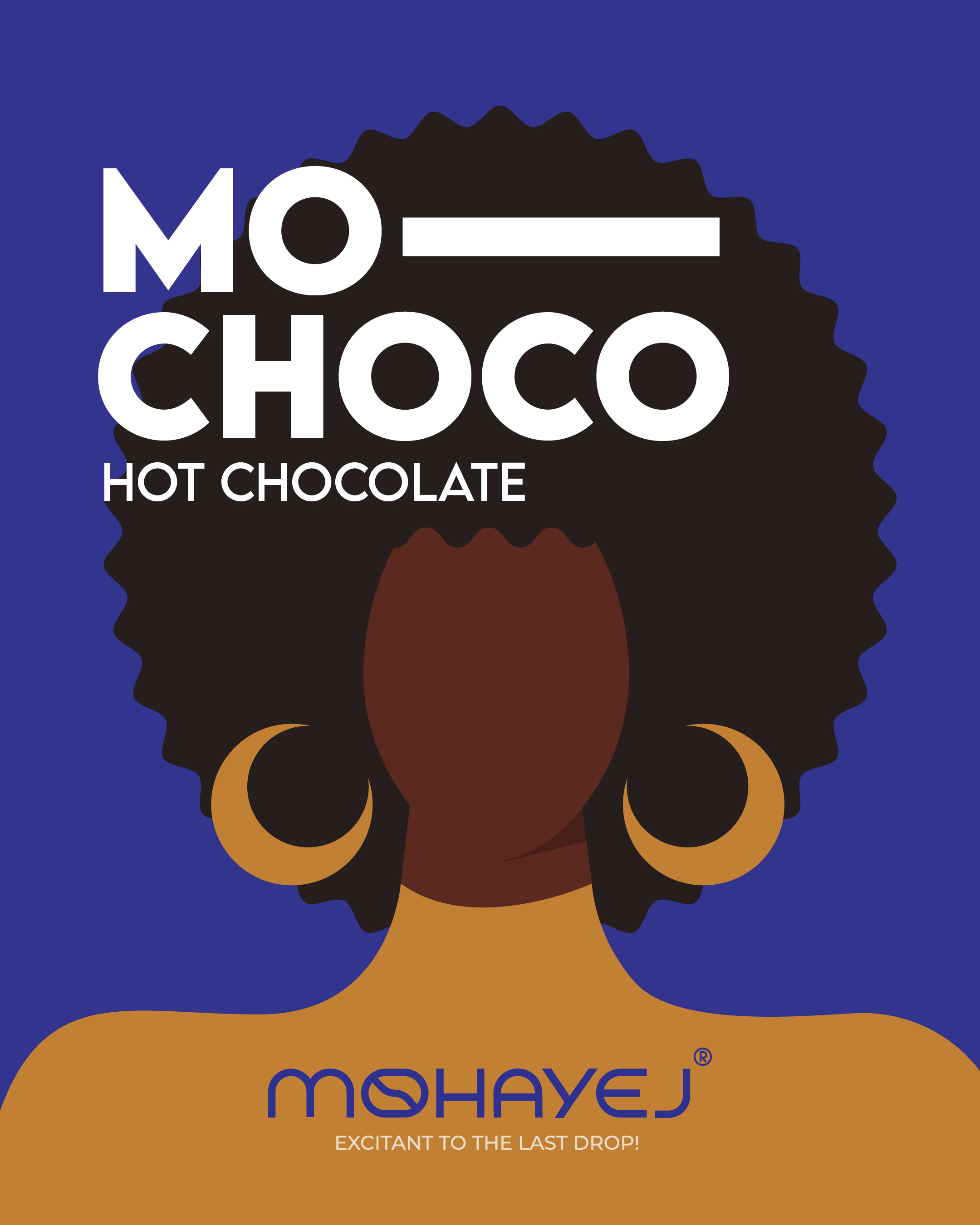
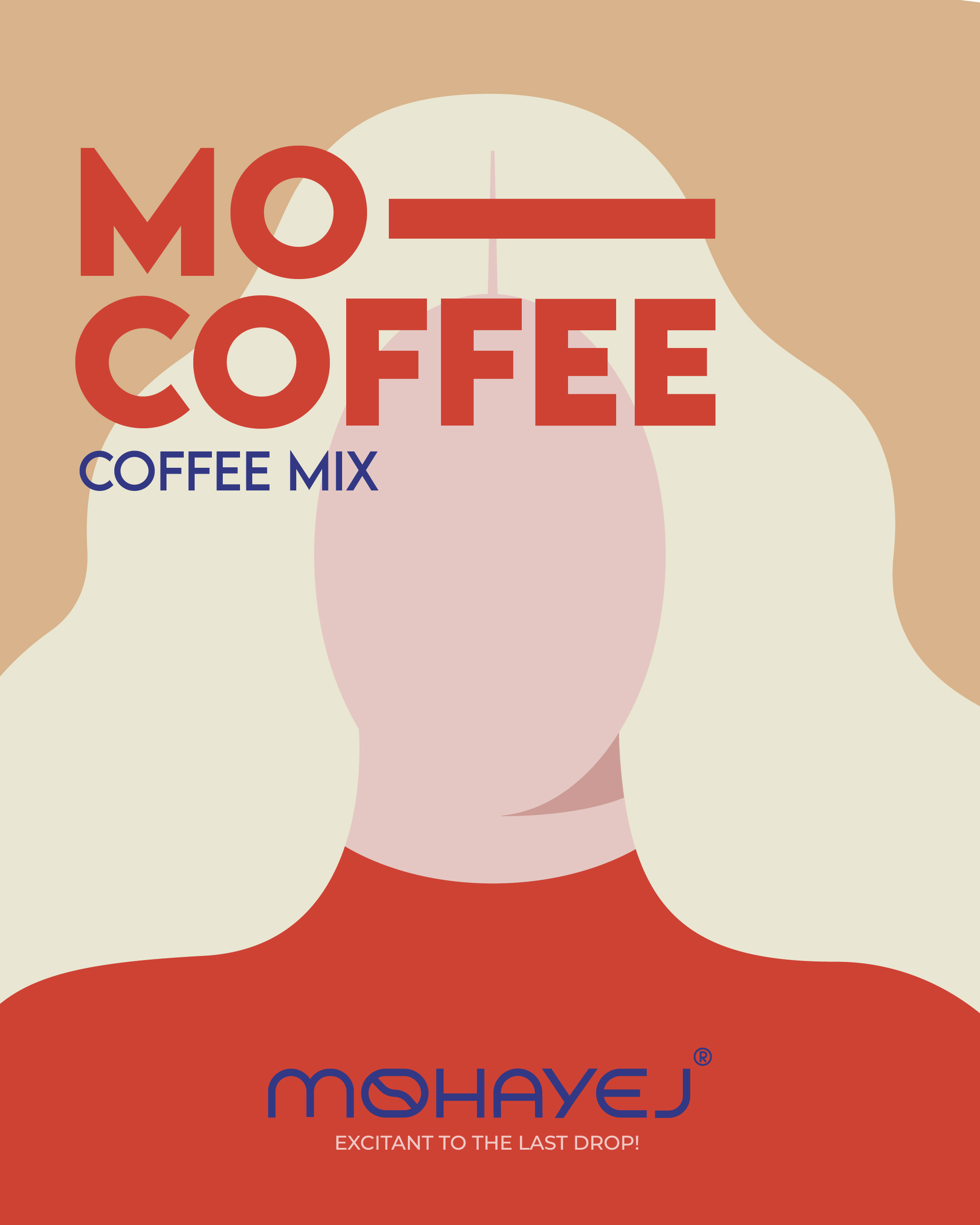
On packaging, the strategy uses personification of flavour via nationality: each flavour features a minimal illustration of a woman from a different nationality, representing the character and personality of that blend and thereby communicating a message of beauty in difference, acceptance and global connection, through the familiar medium of coffee. Colour strategy, illustration direction, naming (Mo-Coffee, Mo-Latte, Mo-Mocha, Mo-Choco) and packaging layout all reinforce the brand position as bold, human-centred and contemporary.
Design & Process
The design process began with brand workshops exploring semiotics of East/West fusion and cultural symbolism of coffee. Sketches of the logotype exploration led to the unique glyph/bean hybrid, tested for legibility, scalability and iconic potential across print, digital and packaging.
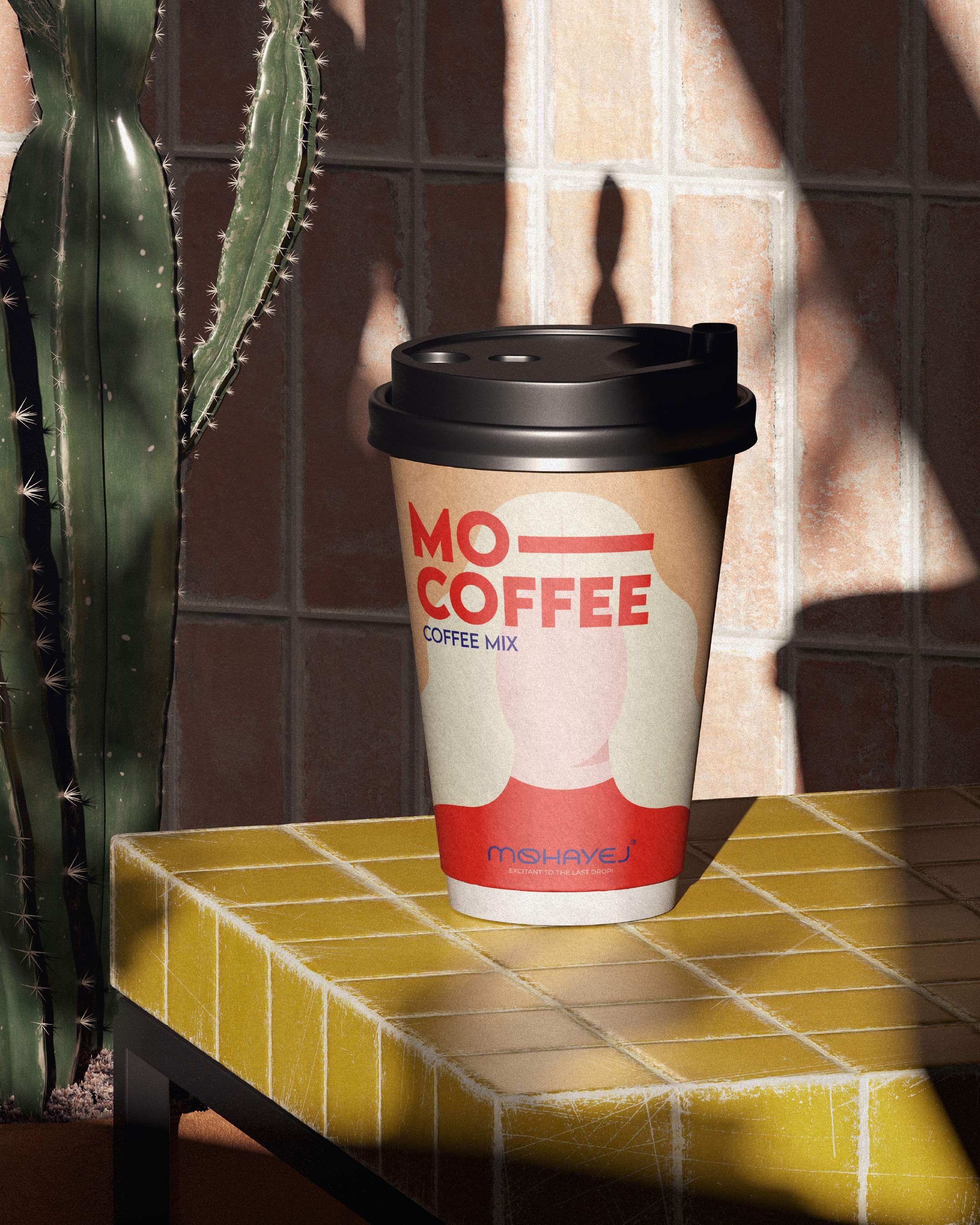
For packaging the workflow included: flavor segmentation via colour palette (so each variant is instantly distinguishable), illustration development of nationalities (researching visual cues for each nationality while maintaining minimal iconographic style), typography and logotype placement for maximum shelf visibility, and mock-ups for retail context to validate hierarchy, contrast and clarity.
Packaging structural decisions considered ease of production, recycling and shelf presence, while the graphics were designed to balance minimalism (to stand out amidst clutter) with narrative depth (so the consumer sees beyond just flavour). Naming conventions (Mo- prefix) unify the range and reinforce the brand name Mohayej while the illustrations bring warmth and personality to each variant.
Results & Impact
The final result is a cohesive visual system that stands out on shelf, communicates flavour variety clearly, and invites consumer engagement via its human stories. Early market feedback indicates strong shelf recall, consumer appreciation of the brand’s narrative and differentiation versus generic coffee brands. The brand positioning (diversity, unity, global connection) resonates especially with younger, culturally-aware consumers, and the minimal yet meaningful design aesthetic has made Mohayej markedly recognisable.
By seamlessly merging identity and packaging, Mohayej is more than a coffee—it is a visual conversation across cultures, inviting consumers to pause, connect, enjoy coffee together, and reflect on what unites us. This makes it a strong contender in the WBDS packaging/brand identity category, both for its strategic depth and for its executional clarity.

CREDIT
- Agency/Creative: Daan Branding Agency
- Article Title: Mohayej Visual Identity and Packaging Design by Daan Branding Agency
- Organisation/Entity: Agency
- Project Type: Packaging
- Project Status: Published
- Agency/Creative Country: Iran
- Agency/Creative City: Shiraz
- Market Region: Middle East
- Project Deliverables: Art Direction, Brand Creation, Brand Design, Brand Identity, Branding, Illustration, Packaging Design, Typography
- Format: Box, Cup
- Industry: Food/Beverage
- Keywords: Packaging , daan agency
-
Credits:
CEO & Creative Director: Jamal Shahmoradi


