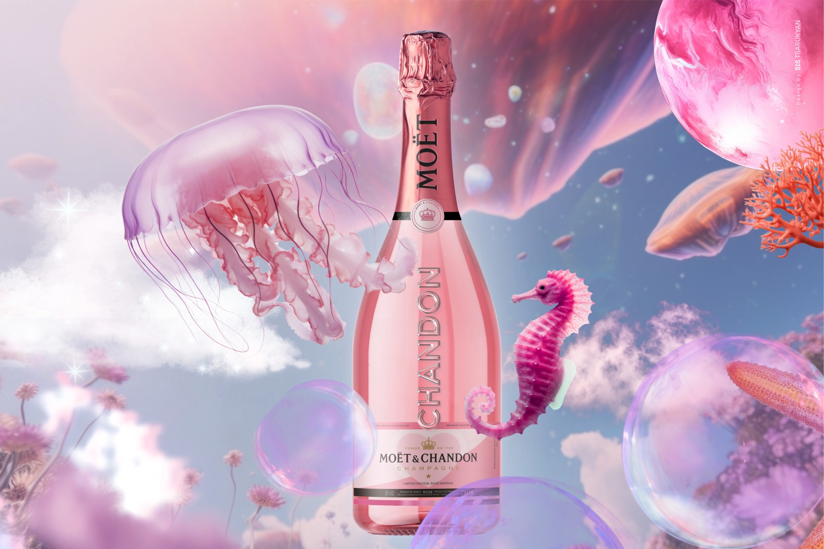
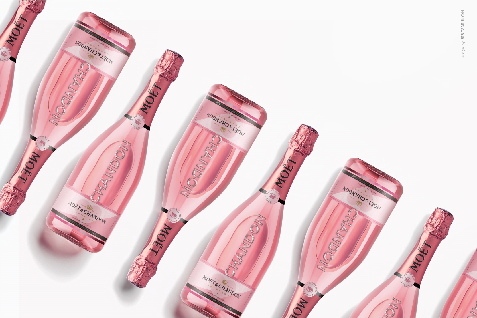
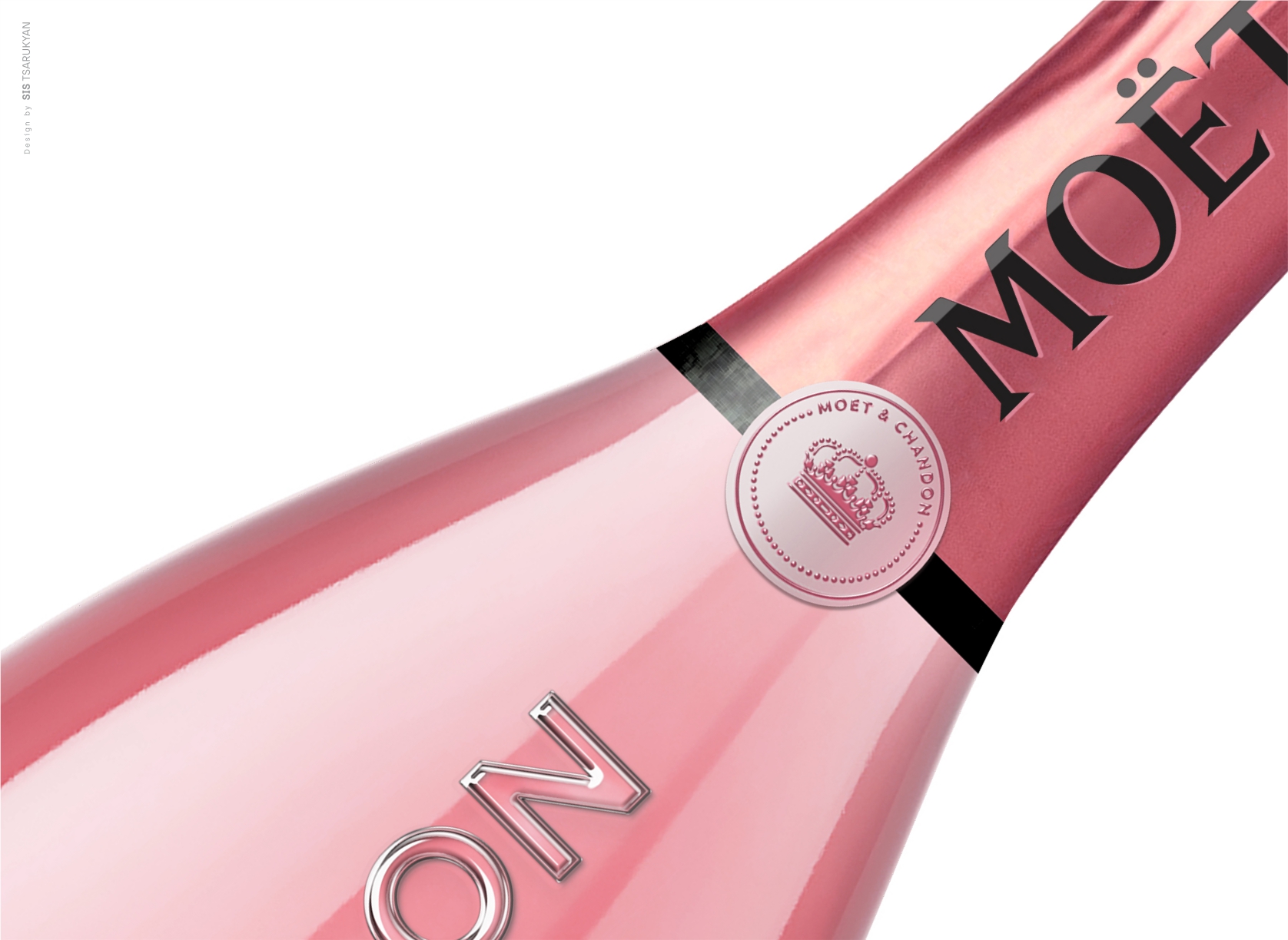
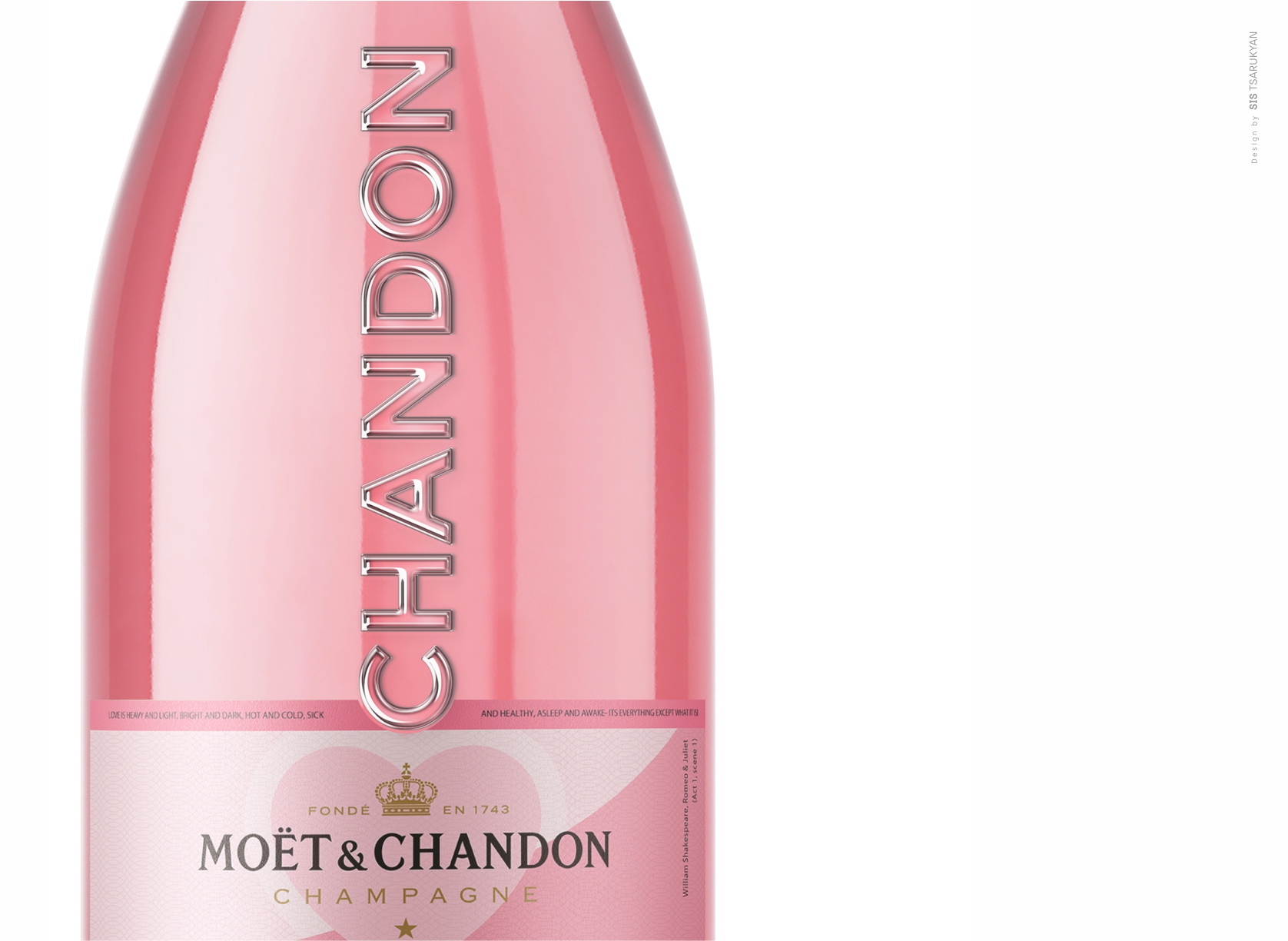
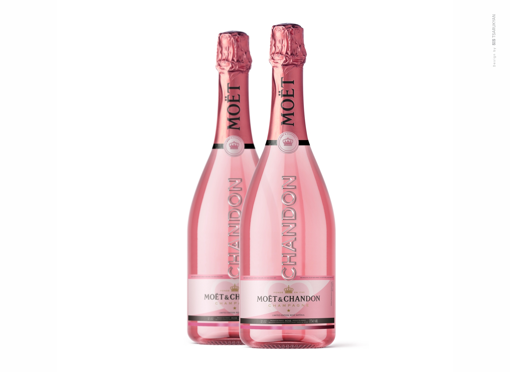
The design thoughtfully incorporates the distinctive features with the “Moet & Chandon” company, imbuing the product with a refreshing, modern aesthetic.
The Rosé Impérial is a seductive wine: built around the Pinot Noir, both spontaneous and melting, the blend brings out a lively, slender and very supple fruitiness. The blend of red wine also gives it feminine copper highlights.
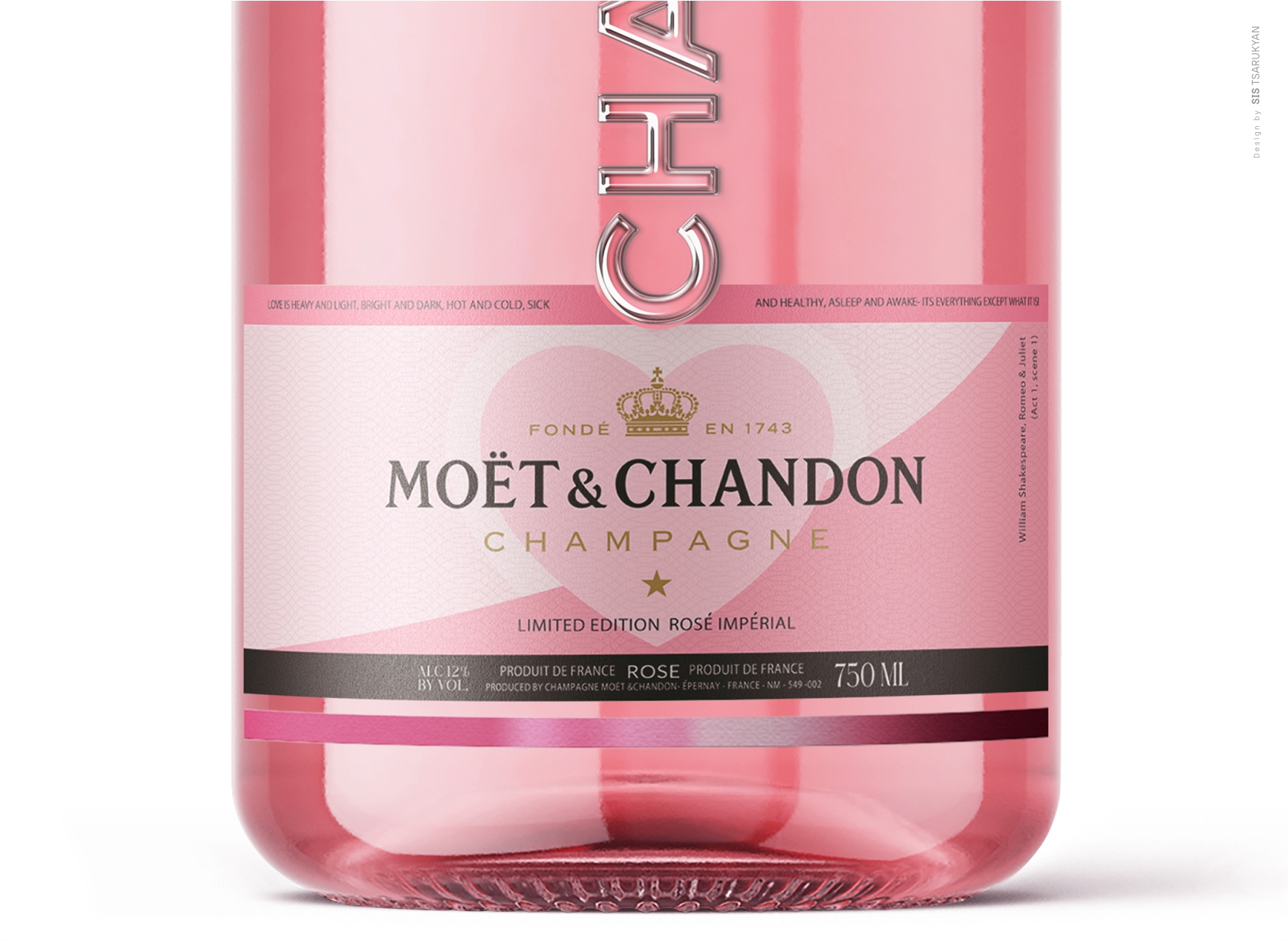
The predominant pink color palette gracefully reflects the drink’s inherent delicacy and beauty. Inspired by Shakespeare’s timeless masterpiece, Romeo and Juliet, the label delicately likens love to wine through a couplet: “Love is heavy and light, bright and dark, hot and cold, sick and healthy, asleep and awake – it’s everything except what it is!” This artful expression serves to emphasize the wine’s delicate and seductive taste with the utmost refinement.
Moët et Chandon is one of the world’s largest champagne producers and a prominent champagne house. Moët et Chandon was established in 1743 by Claude Moët, and today owns 1,190 hectares (2,900 acres) of vineyards, and annually produces approximately 28,000,000 bottles of champagne.
Moët et Chandon began as Moët et Cie (meaning “Moët & Co.”), established by Épernay wine trader Claude Moët in 1743, and began shipping his wine from Champagne to Paris. The reign of King Louis XV coincided with increased demand for sparkling wine. Soon after its foundation, and after son Claude-Louis joined Moët et Cie, the winery’s clientele included nobles and aristocrats.
CREDIT
- Agency/Creative: Sis Tsarukyan Designer
- Article Title: Moet & Chandon Rose Imperial Champagne Packaging Design
- Organisation/Entity: Freelance
- Project Type: Packaging
- Project Status: Published
- Agency/Creative Country: Armenia
- Agency/Creative City: YEREVAN
- Market Region: Global
- Project Deliverables: Label Design, Packaging Design
- Format: Bottle
- Industry: Food/Beverage
- Keywords: Alcohol drink / Champagne
-
Credits:
Designer: Sis Tsarukyan


