Merril Cledera – Wallop Beer
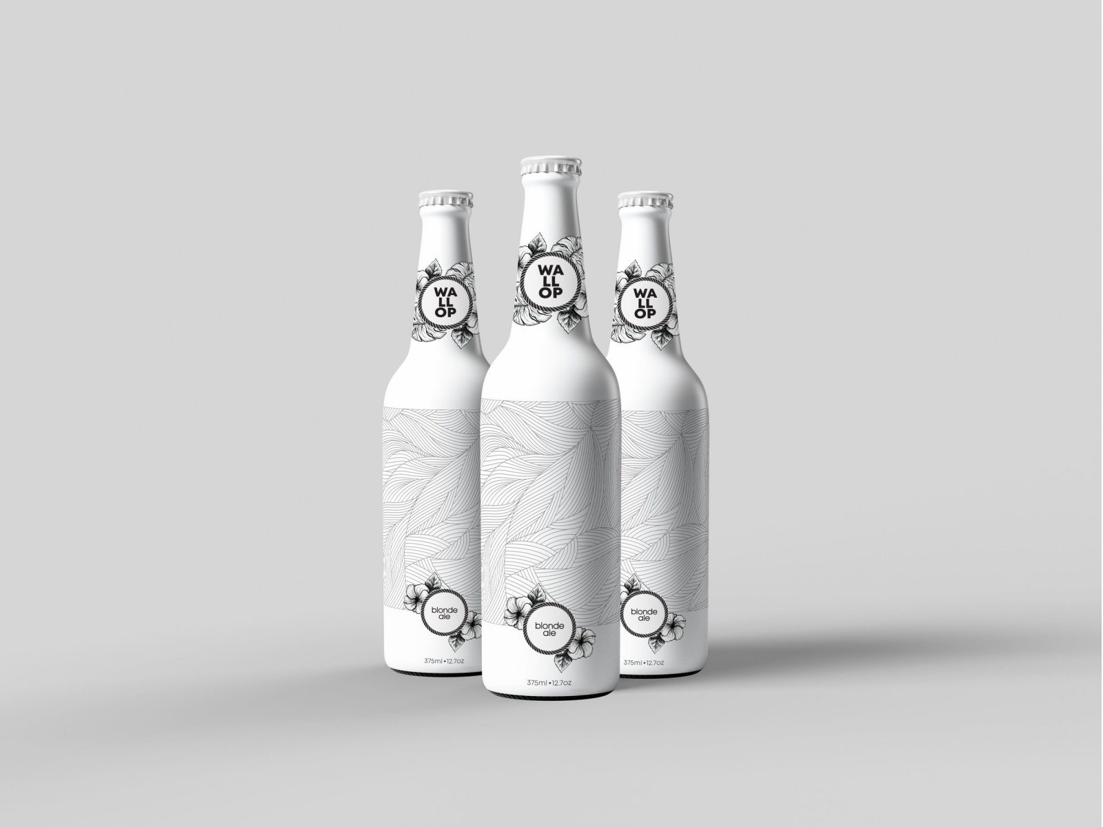
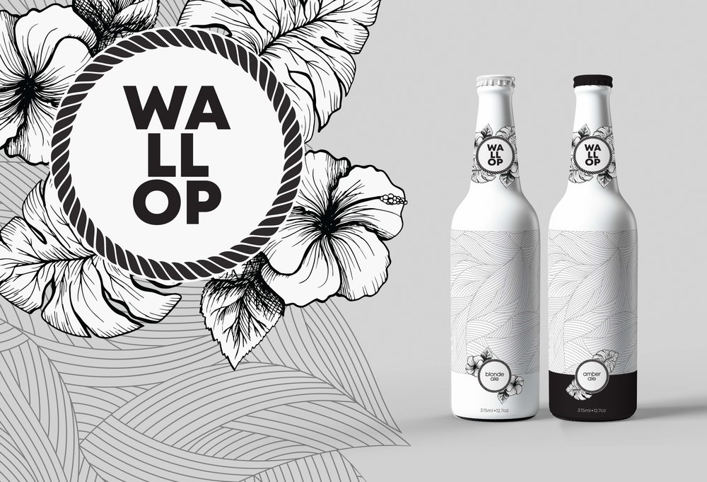
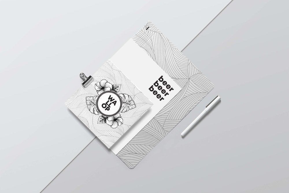
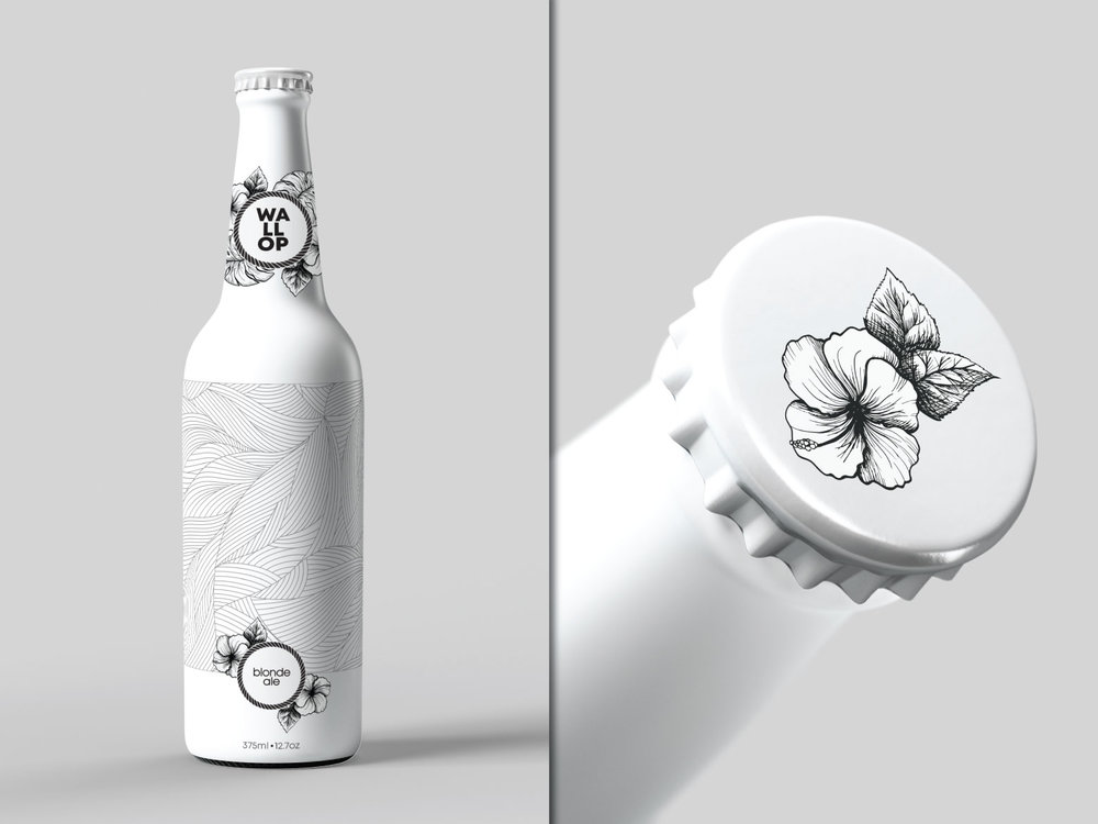
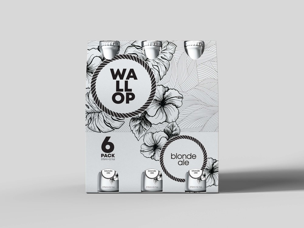
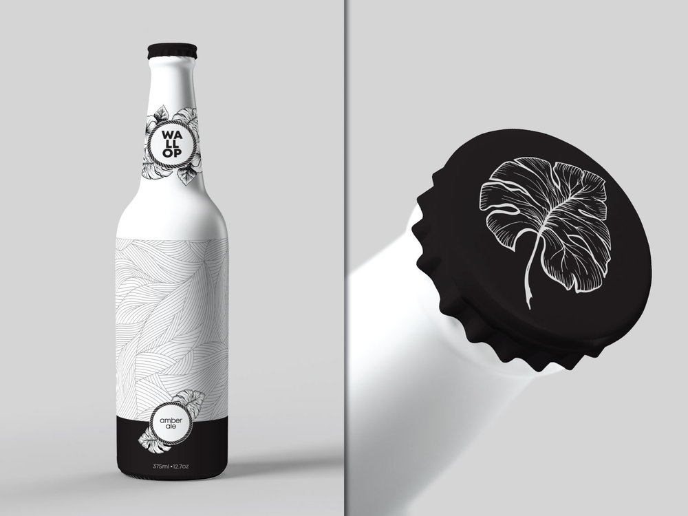
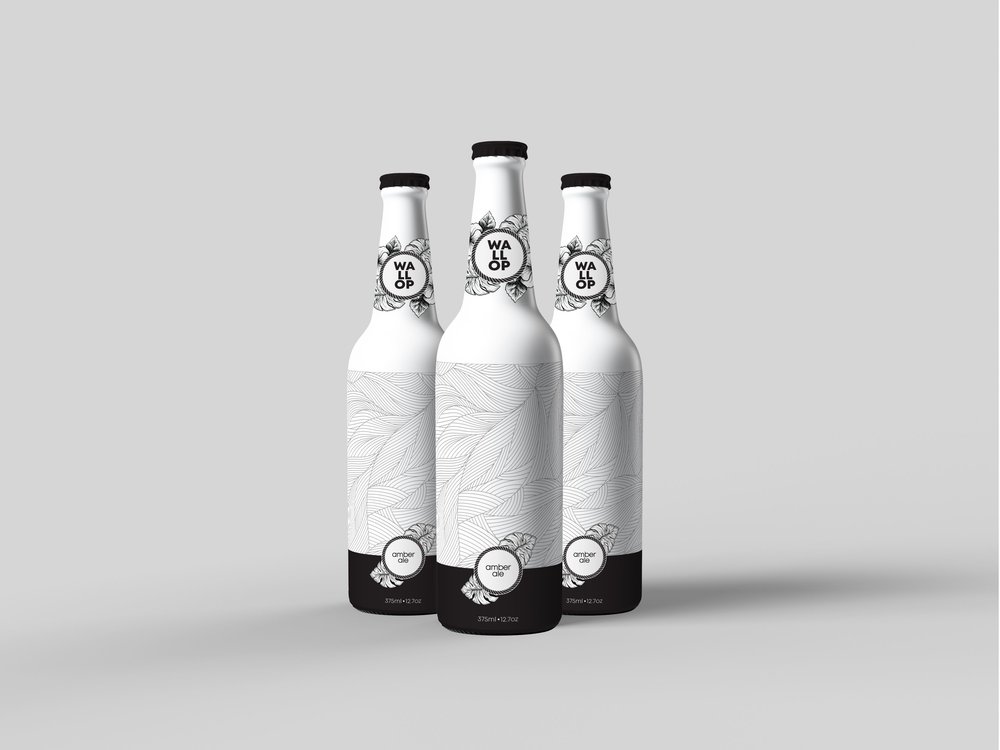
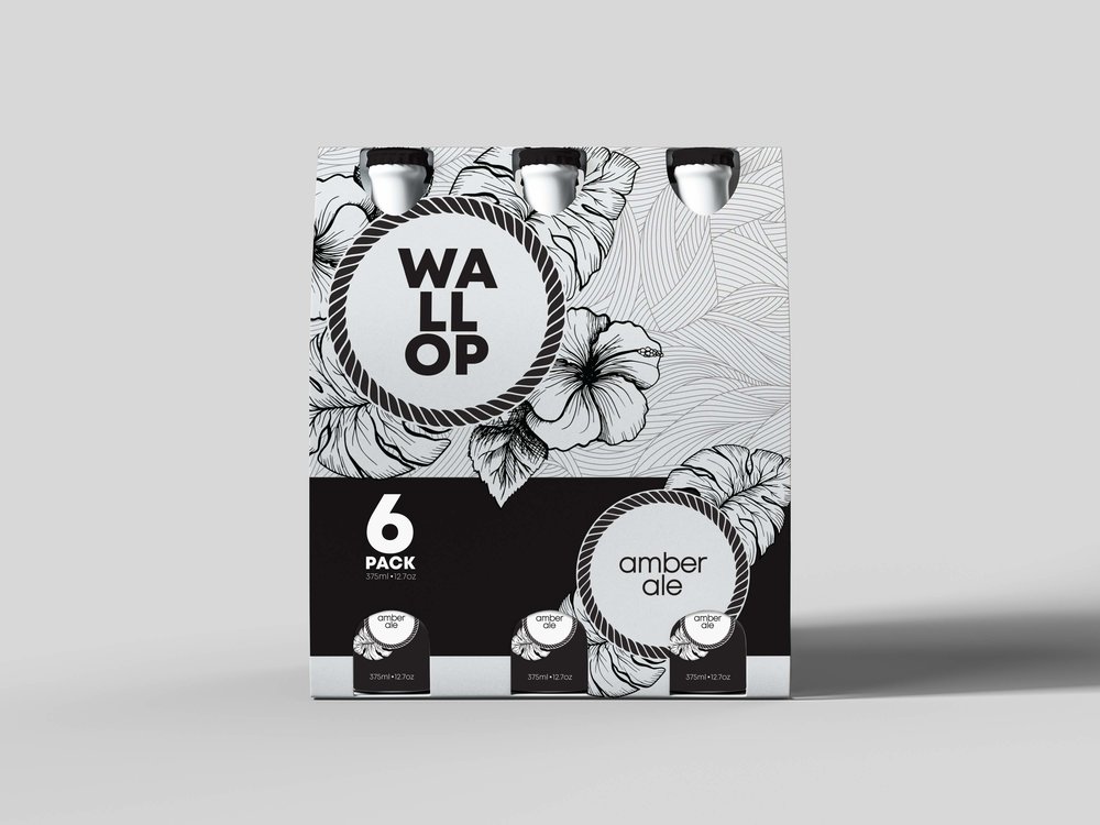
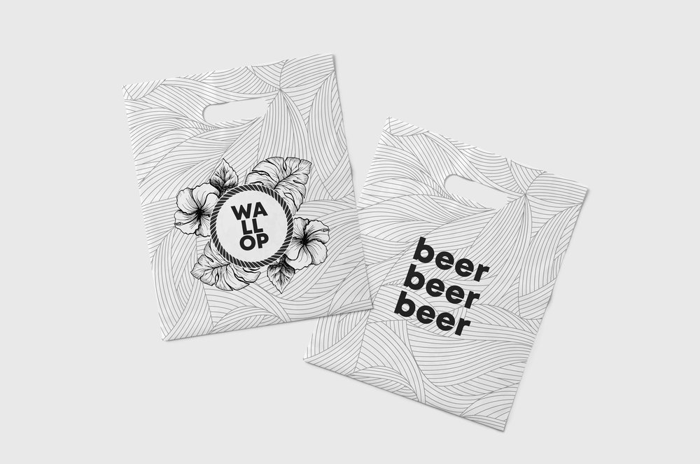
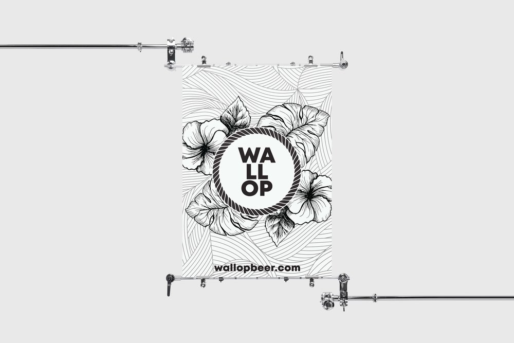
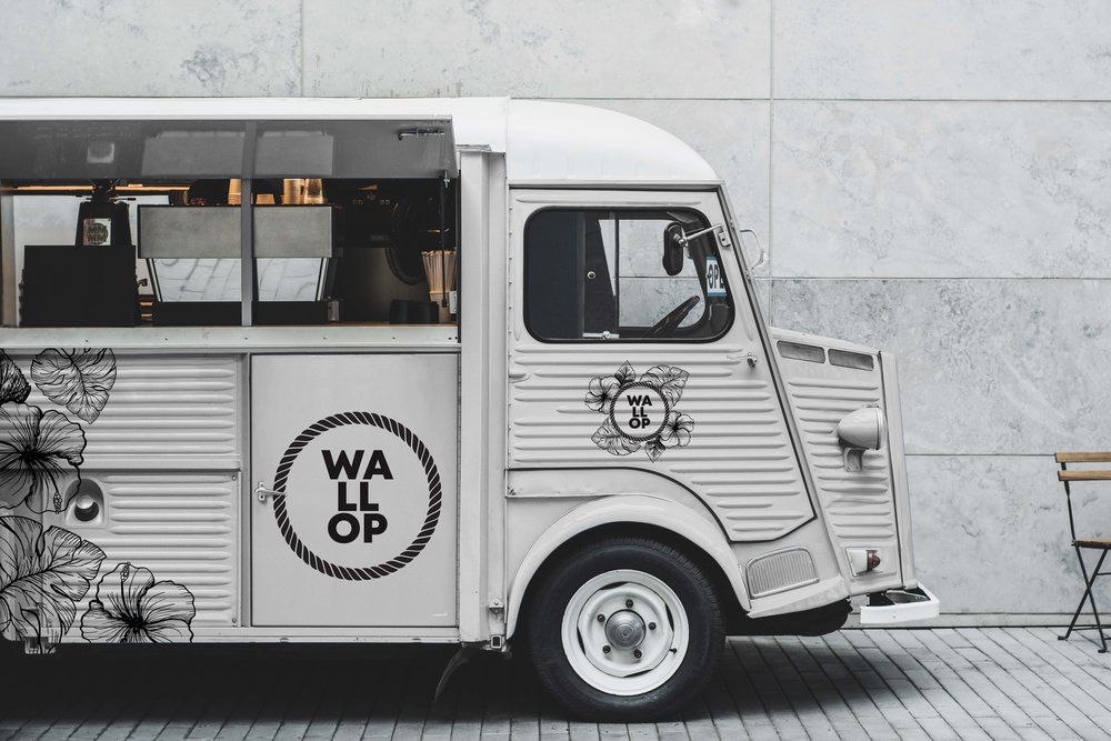
As the popularity of craft beers continues to accelerate, competing aesthetics have emerged: the two most common styles are spartan, logo-forward, sans-serif minimalism and over-the-top, colorful displays of tongue-in-cheek humor. The goal with Wallop was to maintain a certain degree of approachability while evoking the creative science of craft beer brewing. Making Wallop boring and intimidating is definitely not a good idea. Thus, the best design that would fit the Wallop brand is a balance in the contrast between a simple bold sans-serif logo and unpretentious geometric illustrations prominently featuring figurative, natural elements.

CREDIT
- Agency/Creative: Merril Cledera
- Article Title: Modern Packaging Design for a Beer Company
- Organisation/Entity: Freelance Concept, Non Published
- Project Type: Packaging
- Agency/Creative Country: United States America
- Market Region: North America
- Format: Bag, Bottle, Box, Case
- Substrate: Glass, Metal, Pulp Board, Pulp Carton
FEEDBACK
Relevance: Solution/idea in relation to brand, product or service
Implementation: Attention, detailing and finishing of final solution
Presentation: Text, visualisation and quality of the presentation


