lucalange.design – Shelby Distillery Branding and Packaging Design
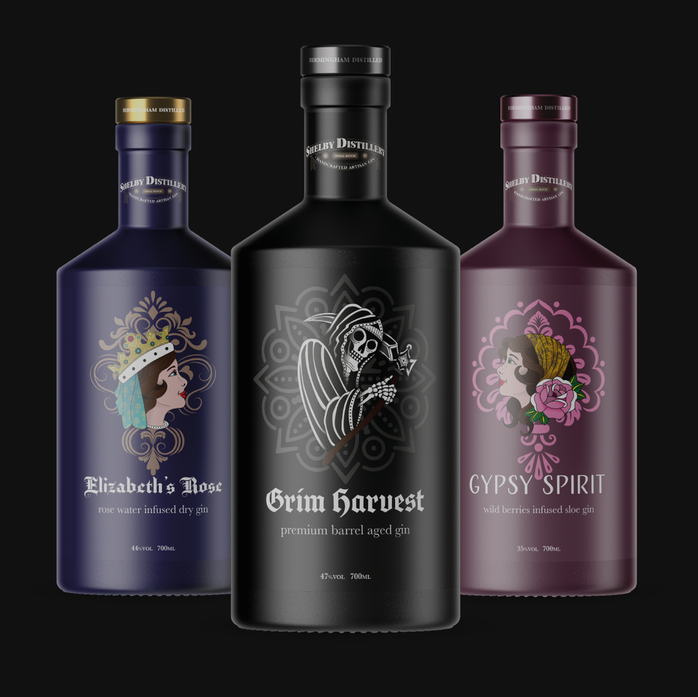
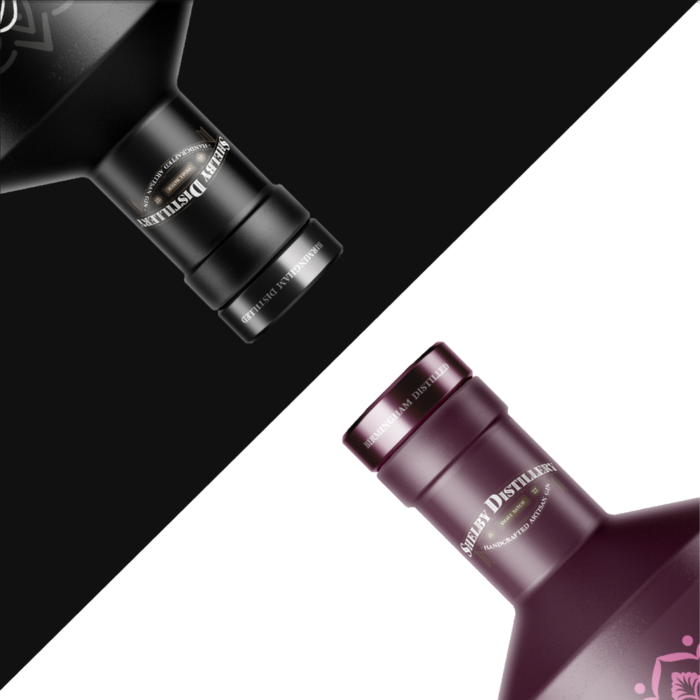
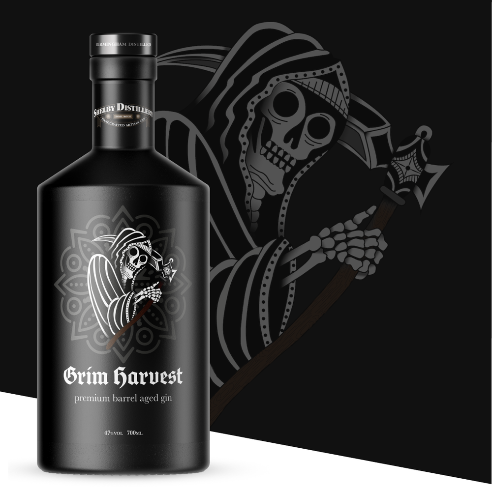
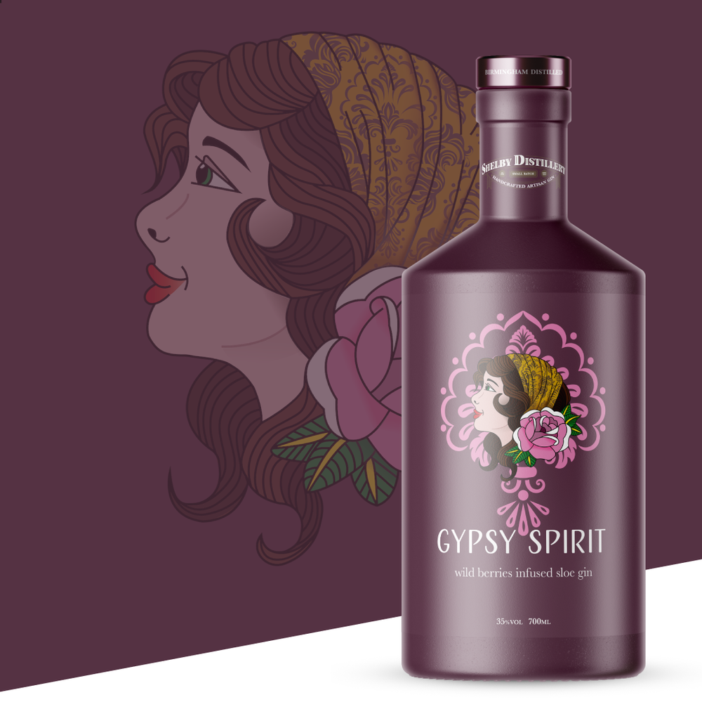
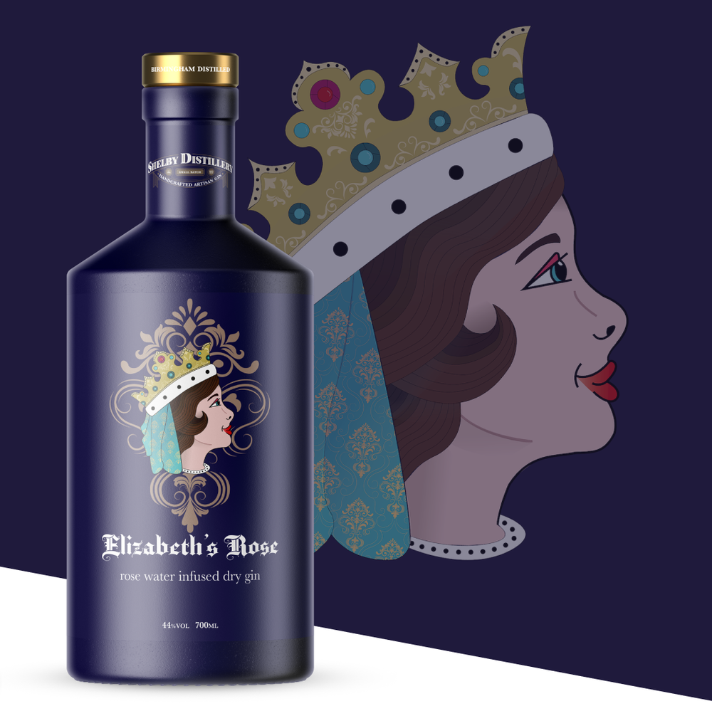
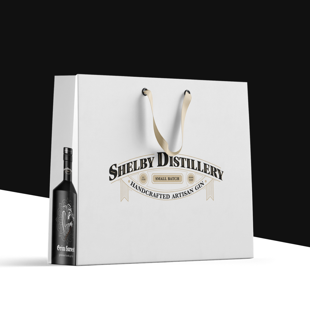
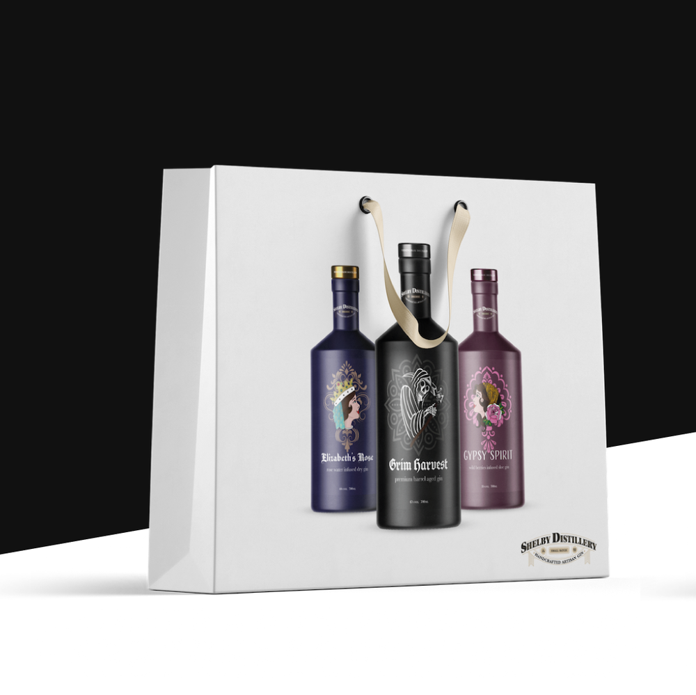
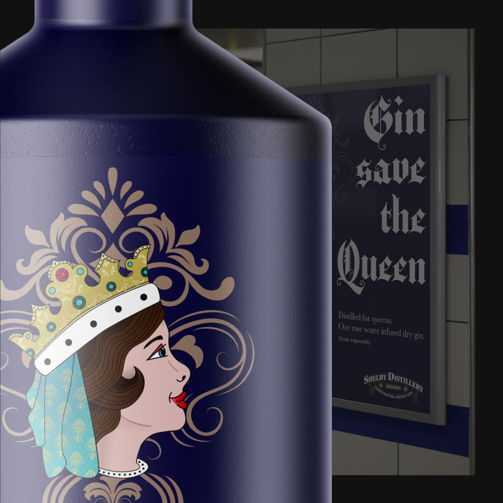
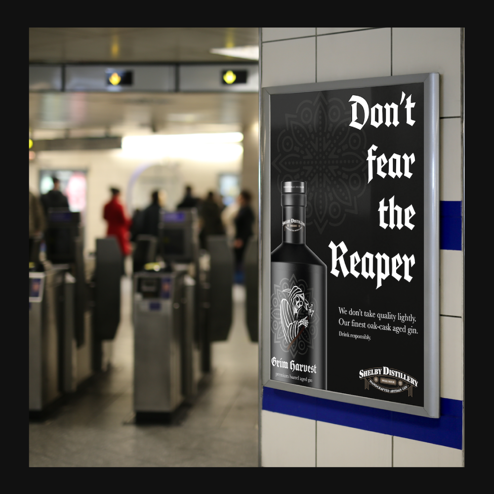
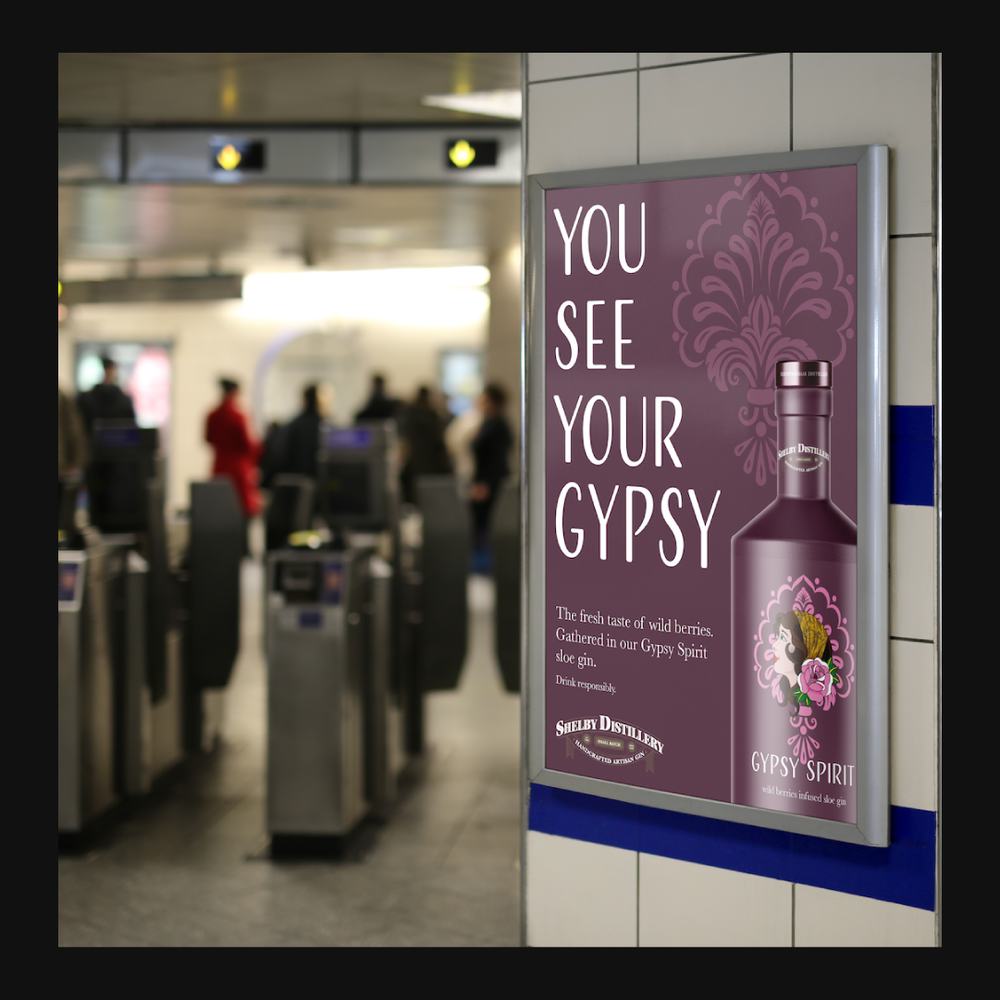
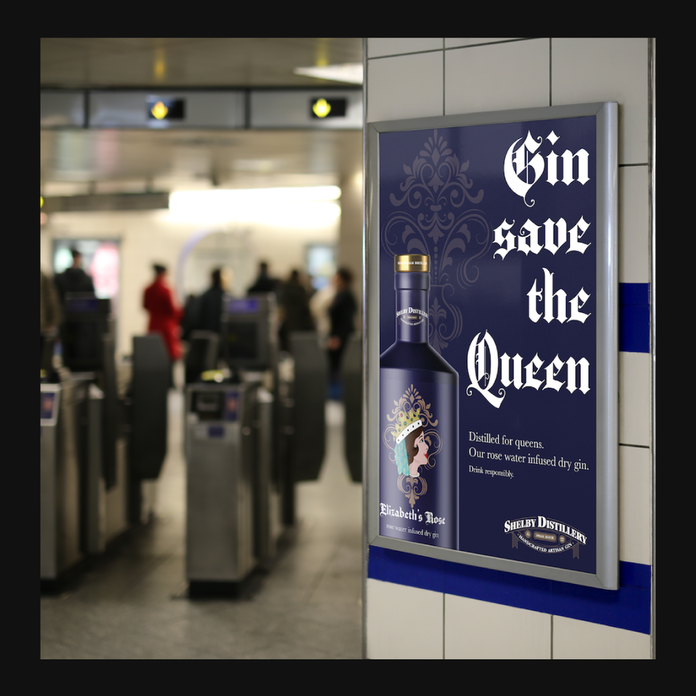
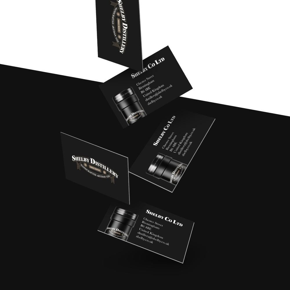
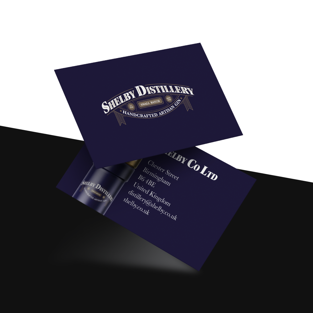
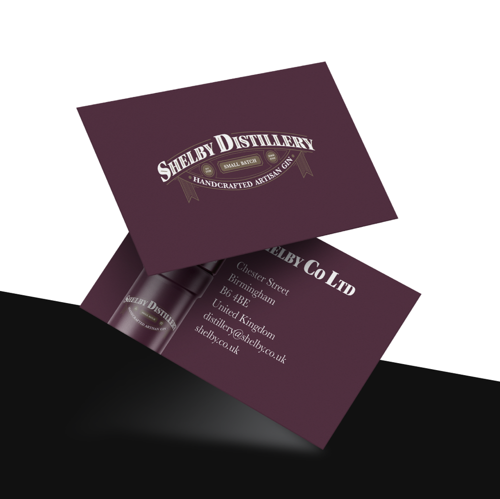
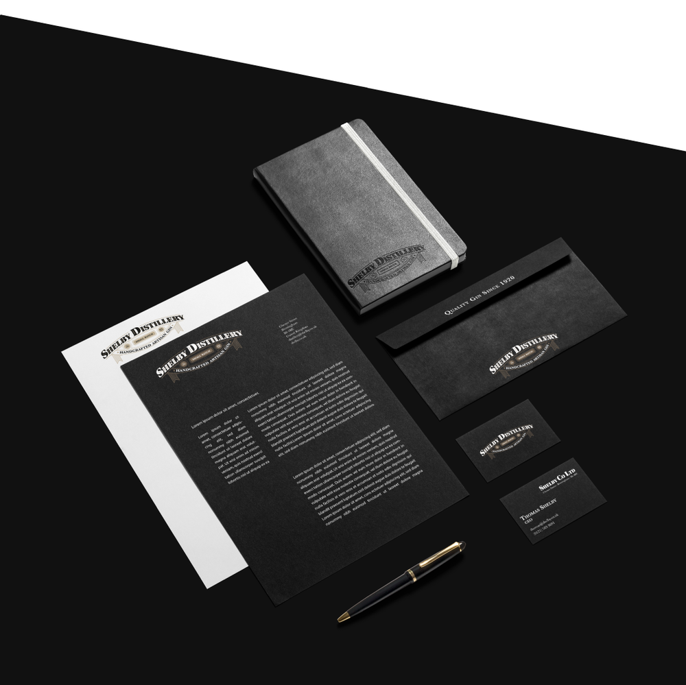
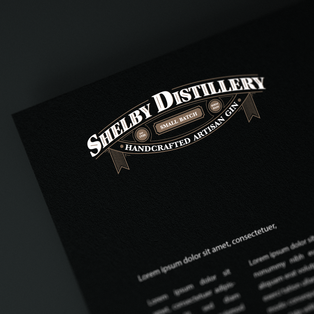
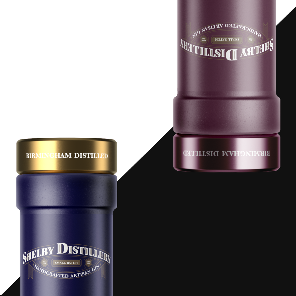
“Shelby Distillery – Artisan Gin since 1920 with a new face. A traditional company with a new take on packaging. For the gin bottle design I made illustrations and gave the three different types of gin a name that fits to either the flavor or feel of the kind of gin. The Illustrations are based on traditional tattoo designs that are intended to attract a new younger audience in a time where gin becomes more and more fashionable and “trendy”. The Shelby logo emphasises the company’s tradition in a classic, yet modern looking batch design. The combination of the typefaces Utopia Std and Baskerville Bold communicate the tradition and history of the company and keeps the corporate serious feel, while the products itself emphasise the modern rebrand to attract younger customers.”
CREDIT
- Agency/Creative: lucalange.design
- Article Title: Modern Packaging Design and Traditional Corporate Brand Design
- Organisation/Entity: Freelance Promotional / Self Published
- Project Type: Packaging
- Agency/Creative Country: Germany
- Market Region: Europe
- Format: Bottle
- Substrate: Ceramic


