


the Labelmaker – Merul Wine Labels – The Story Behind Wine Packaging Design
“The story behind wine packaging design is the beginning of everything if you want to create successful product. A meaningful story is always the perfect foundation for every new brand and it is the perfect key to unlock consumers mind as well.
Merul was not a new brand when I started working on it but it was strongly related with the oldest Bulgarian history dating back from the times of Thracian kings. So in this case study I will try to tell the story behind Merul wine packaging design and how it helped me create recognizable wine labels for this wine brand.
Let’s start with the story of Merul and a quotation from my wine label:
“Merul is the name of a small region located in the vicinity of the town of Panagyurishte, Bulgaria. There in 1949 the Deykovi brothers found the incredible Panagyurishte Gold Treasure of the ancient Thracians who inhabited these lands.”
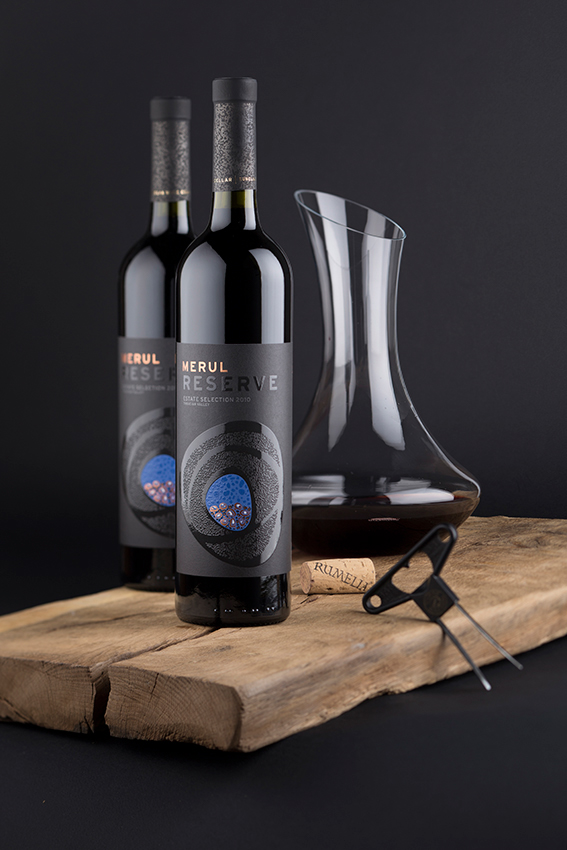
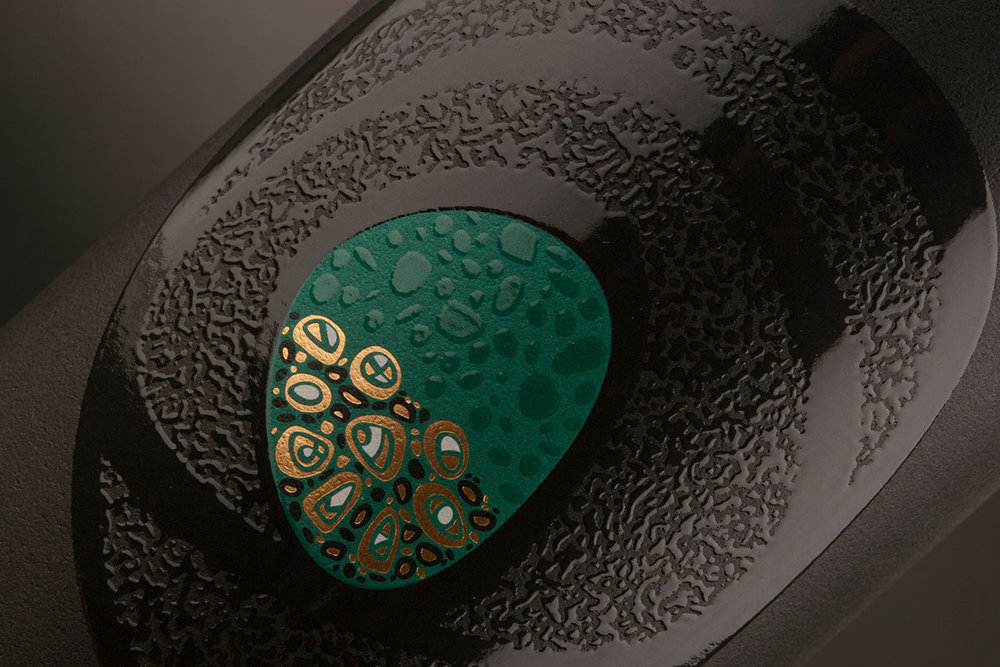
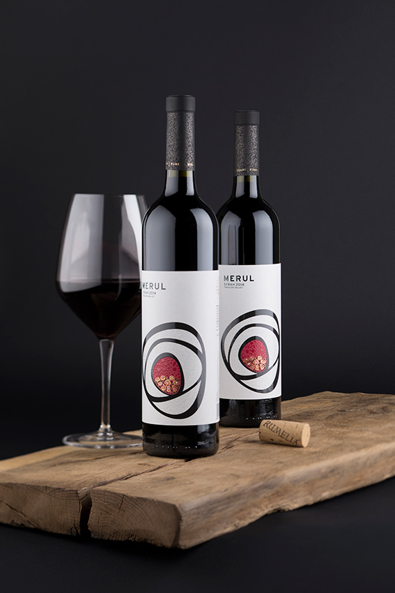
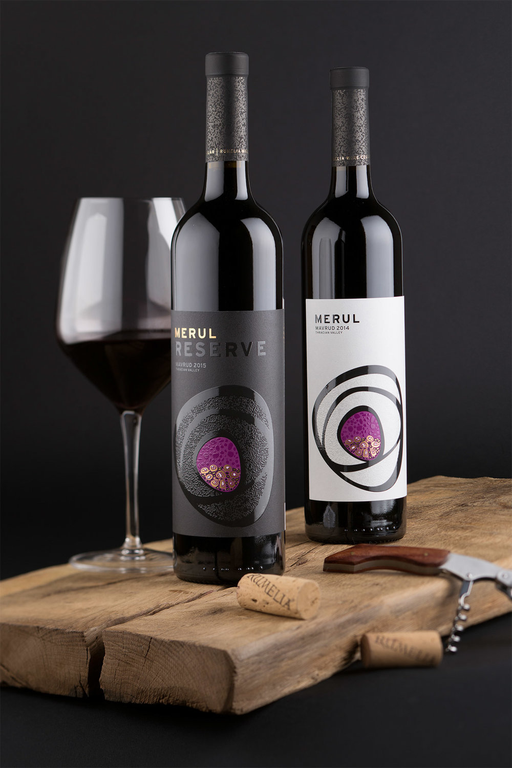
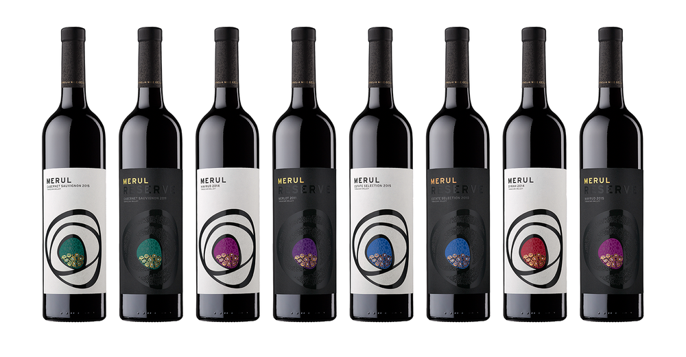
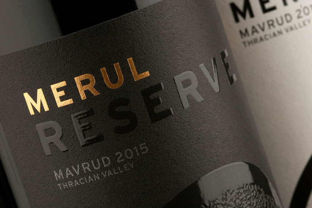
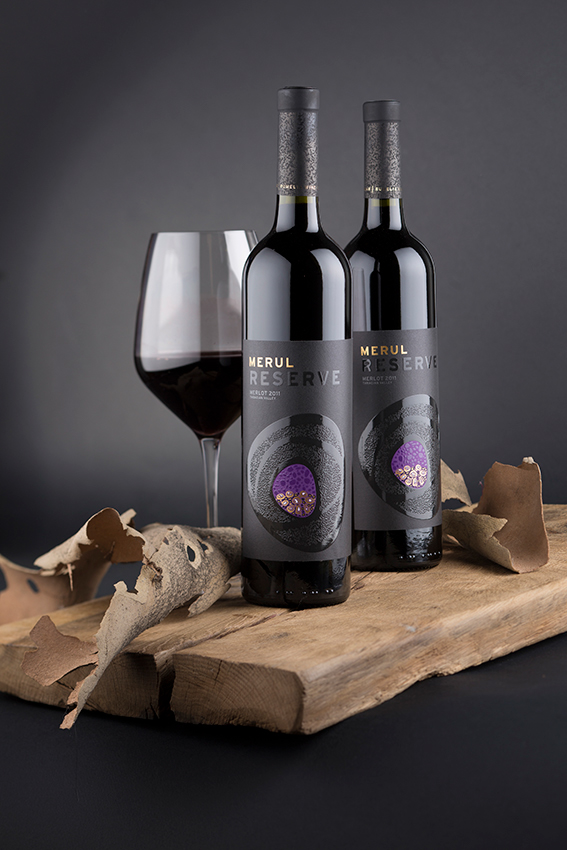
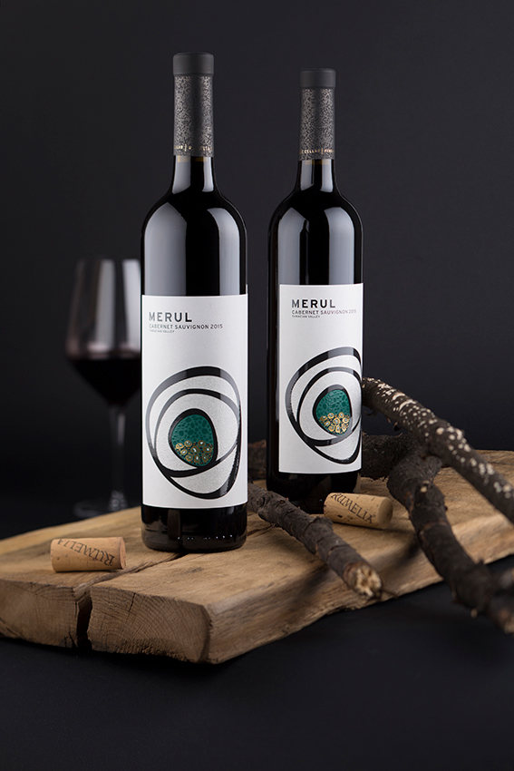
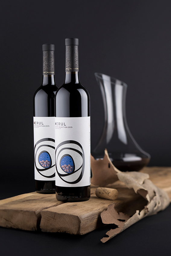
Short and simple this text gave me enough information start thinking of Merul’s new labels. The Deykovi brothers were 3 so I decided to depict each of them with round oval shape – large, mid-size and small – concentrated around one central point where I placed a dozen of random shaped objects stamped with gold hot foil and tactile varnish. I used them to create an abstract image for the gold treasure. The oval where the treasure lies reminds of a hollow space and I used the rest of it to fill it with color – different for each of the wines inside the range. This is how I created the color scheme of all Merul wine labels so that one could easily recognize one wine from another. Speaking of colors I forgot to mention that there were at least 10 wines in Merul range and half of them were Reserves. They used different more expensive technology to produce these wines so I decided to use solid black background and make them look more serious than the rest of the wines inside the range.
Bottle and label size always go hand in hand and Merul is no exception. The bottle has very elegant slim silhouette and it is taller than most of the wine bottles hitting nearly 330mm of height. That was a good reason to think of larger label and this is how the idea to unite front and back label came. Larger label means huge surface of paper placed against glossy glass bottle. I needed very smooth paper with delicate texture and fine details to wrap around this elegant bottle and I thought that Snow Country by Arconvert was the perfect choice. Paper texture was essential for another important reason too – I wanted to get it in harmony with the large areas of the ovals because they were overprinted with glossy tactile varnish and the play between gloss and matt was really important here.
The capsule is also using the same effect of matt & gloss but this time it is all black with delicate pattern around its surface.
Merul was not an easy job but I am happy with the result. The authentic story behind wine packaging design helped me a lot to unlock my creativity and come up with strong and memorable design for this extensive wine range.
Other projects for Rumelia Wine Cellar: ERELIA, RUMELIA.
Learn more about Panagyurishte Gold Treasure.”
CREDIT
- Agency/Creative: the Labelmaker
- Article Title: Modern Designed Wine Labels for Wine Range with a History
- Organisation/Entity: Agency Commercial / Published
- Project Type: Packaging
- Agency/Creative Country: Bulgaria
- Market Region: Europe
- Format: Bottle
- Substrate: Glass


