The Labelmaker – Modern Wine Label, Epic – a Modern Wine Label with Non-Traditional Two-Part Design
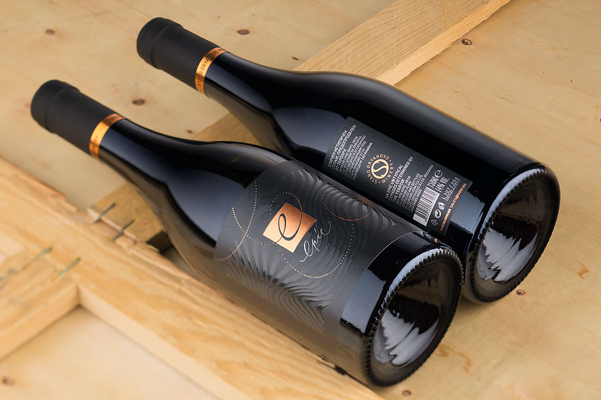
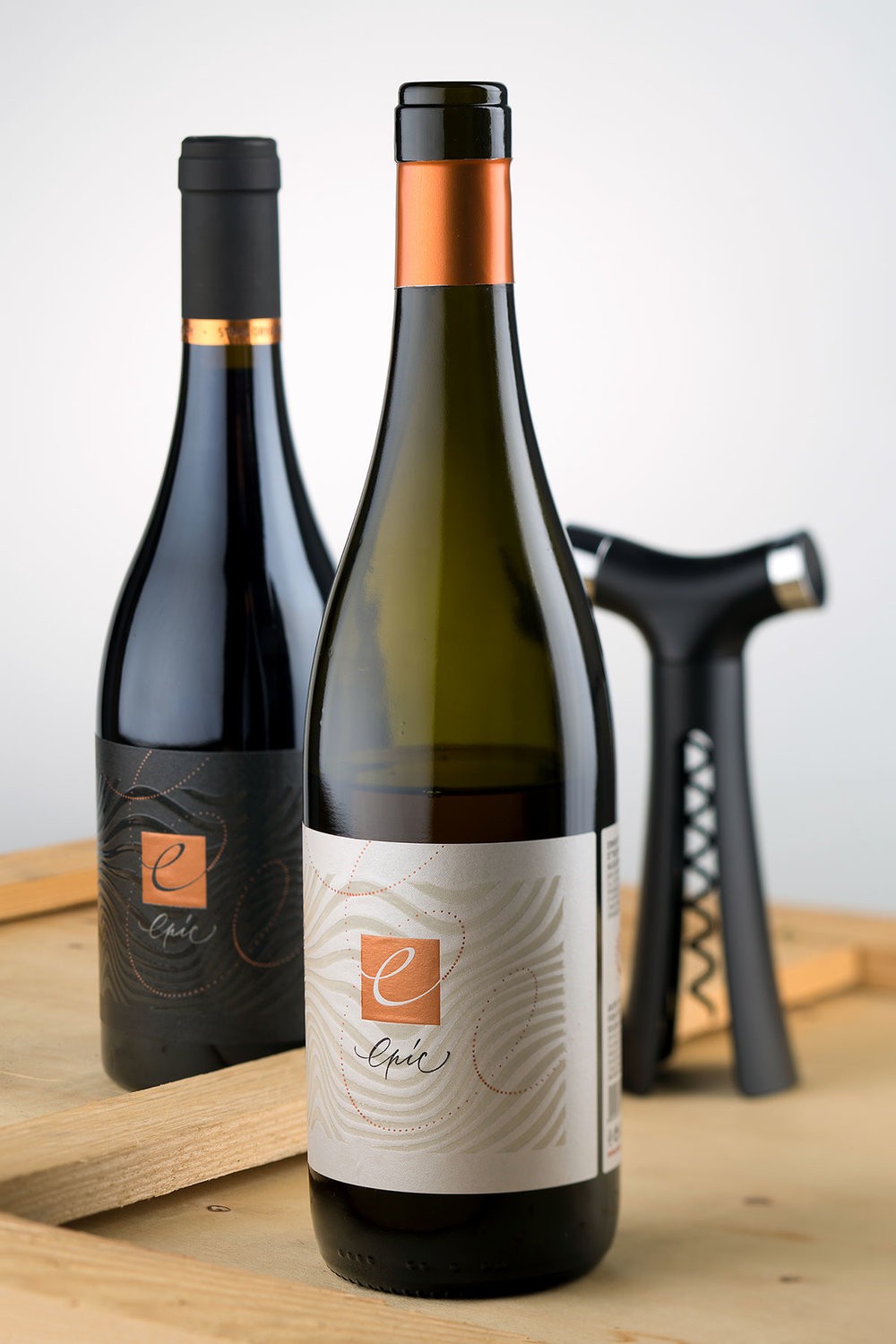
Epic – a Modern Wine Label with Non-Traditional Two-Part DesignEpic wines are on the border line where art and crafts meet and unite. I started working on this range in 2015 with the idea to create a modern wine label design with non-traditional two-part label shape. Together with the brand owner and winemaker Simo Simov, we decided to call this wine range Epic because we wanted somehow to indicate that these wines are more special, and they are strongly influenced and even determined by the terroir of the winery. On the other hand, we also wanted a fresh modern wine label design that reflected the modern style of the wines. This is how Epic was born.My creative process started from the label designs I have already done for Staro Oryachovo Winery (see White Story wine labels). Just like Epic they were also very modern and non-traditional, and I wanted to continue in my future work in this style. I took the abstract wavy pattern from the tree in the old label and decided to crop and scale it up and use it as a specific recognizable background on my new label. Since I chose my very favorite Jade raster paper I wanted somehow to blend this pattern with the paper without dominating its beautiful finish. I decided to overprint the pattern with semi-raised tactile varnish and thus to preserve the paper beauty but also to show the character of the pattern.At the center of the label I placed a copper stamped square with elegant cursive lowercase ‘e’ letter. In fact, I should have started my story of creation with the dotted spiral winding from side to side of the label. This spiral depicts the creative process in winemaking and its intersection with the copper square at the center of the label creates the ‘e’ letter to show where the magic of these wines happened. This is how I visualized the Epic moment in this modern wine label design.The other interesting feature in this label is that it consists of two parts. Most of the modern wine labels in the industry feature front and back label. Some use one larger label for front and back wrapping around the bottle (see Deuce Brand Design).And in our case, we decided to use a little non-traditional two-part solution – we have large front label and a smaller one at the same size separated with 5mm gap from the front. The feeling here is different because what you see is one label uniting front and back but technically you have two separate labels following one after another. For me this was a very good solution for looking non-traditional without losing labels’ functionality and contemporary look. The back label took all legal info and as a final touch I decided to place the brand new logo of the winery stamped with copper hot foil.Whites and Reds use burgundy style bottle – Italian for whites and French for reds.I decided to enhance the difference between whites and reds in this modern wine label design by making all reds on black background while the whites used the natural paper color.The capsules we picked were copper for whites and black for reds.”

CREDIT
- Agency/Creative: the Labelmaker
- Article Title: Modern Bulgarian Wine Label with Non-Traditional Two-Part Design
- Organisation/Entity: Agency Commercial / Published
- Project Type: Packaging
- Agency/Creative Country: Bulgaria
- Market Region: Europe
- Format: Bottle
- Substrate: Glass


