Yuta Takahashi – Chiyonokame
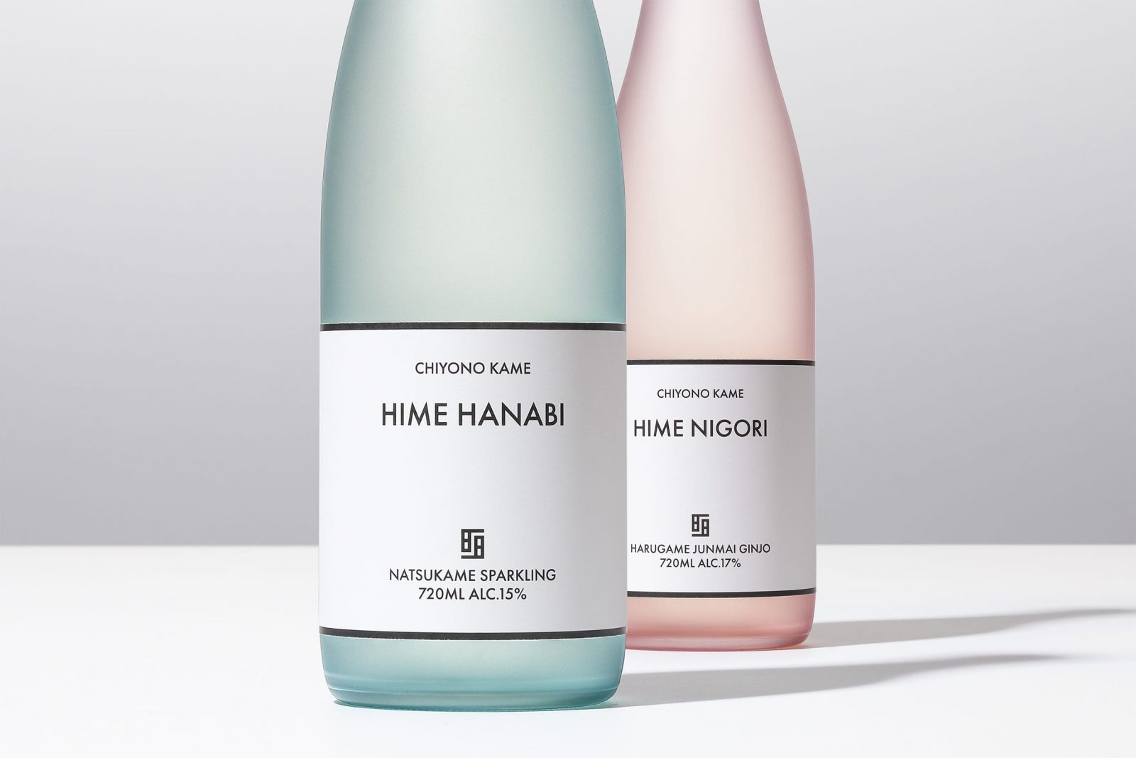
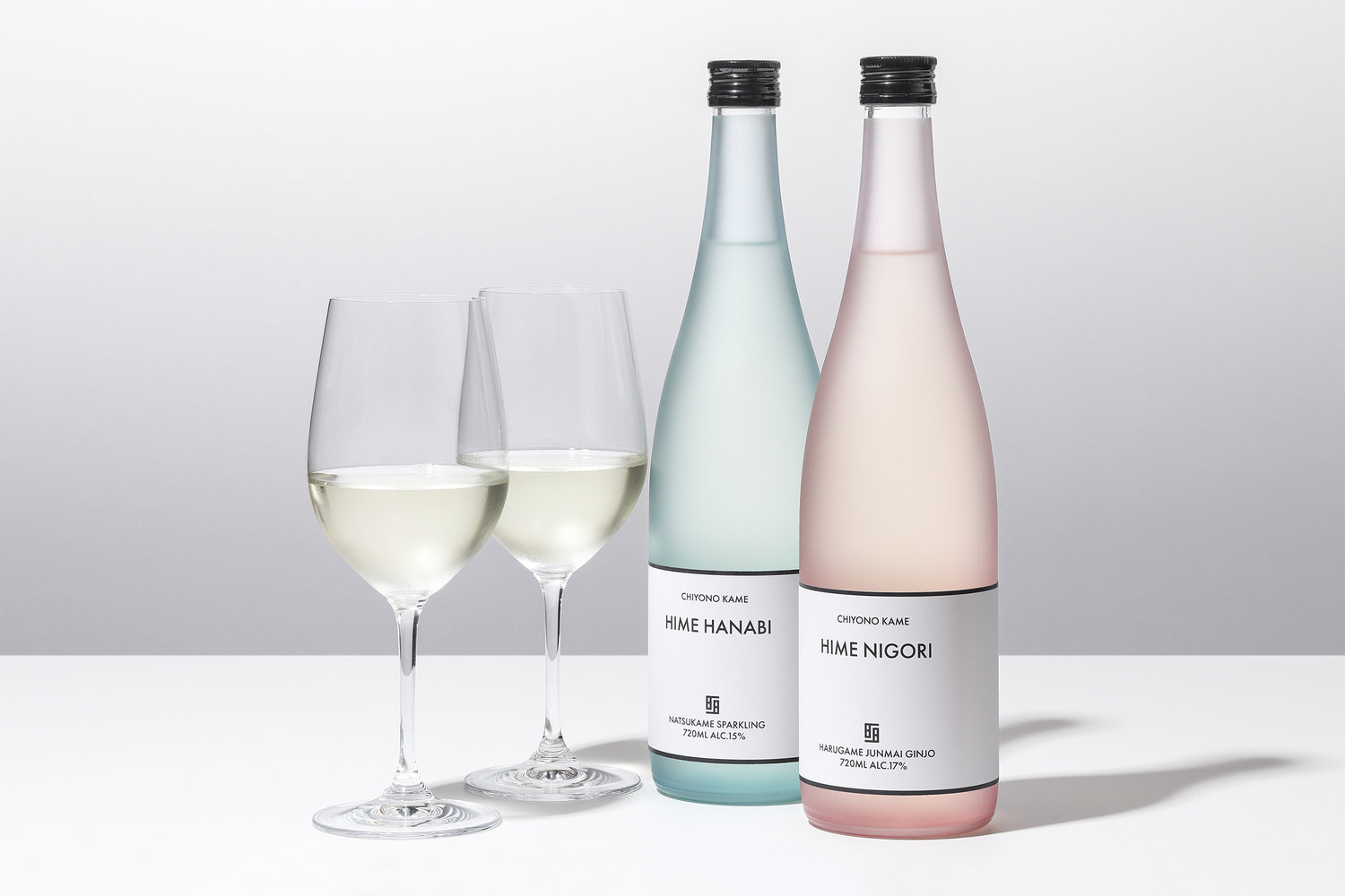
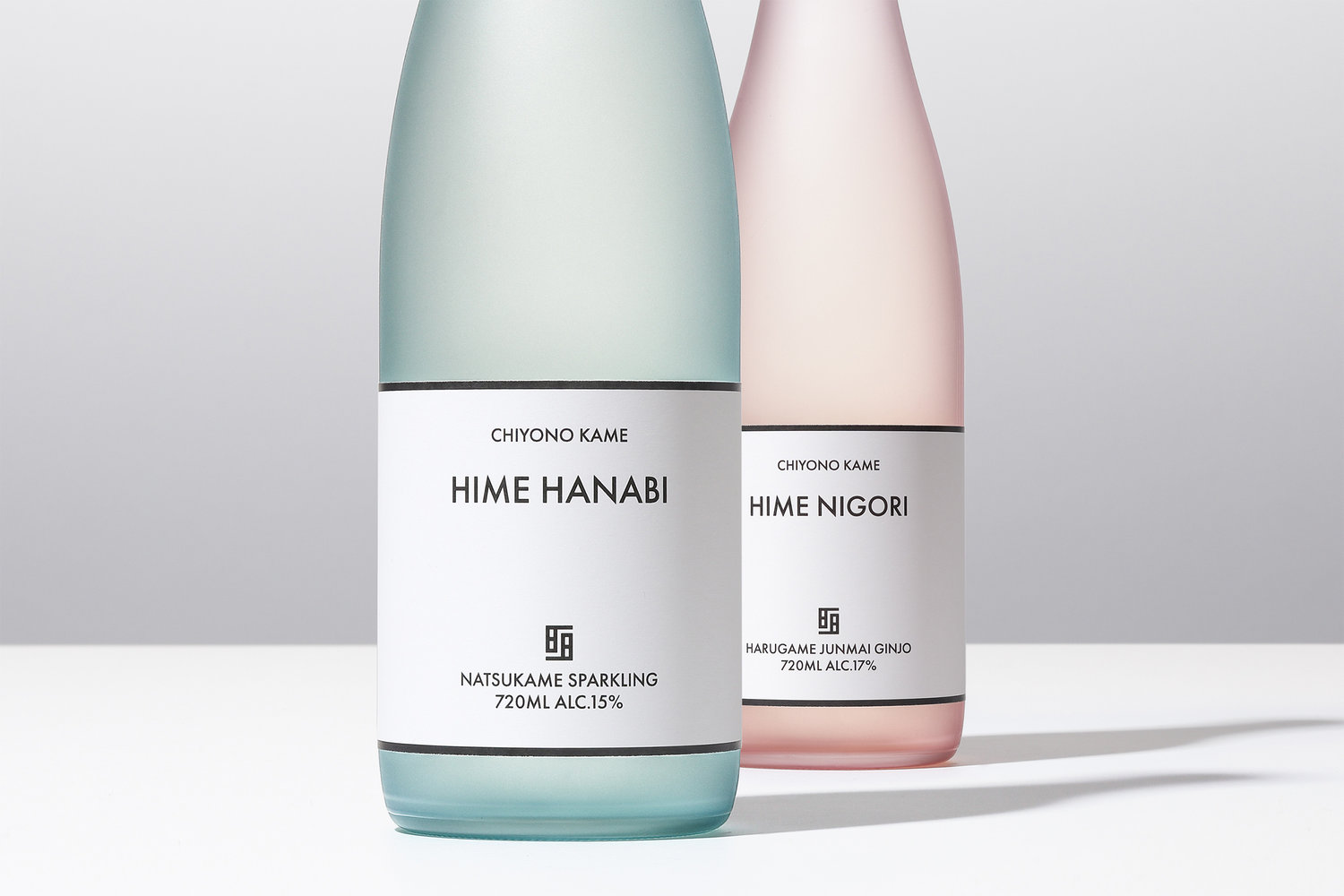
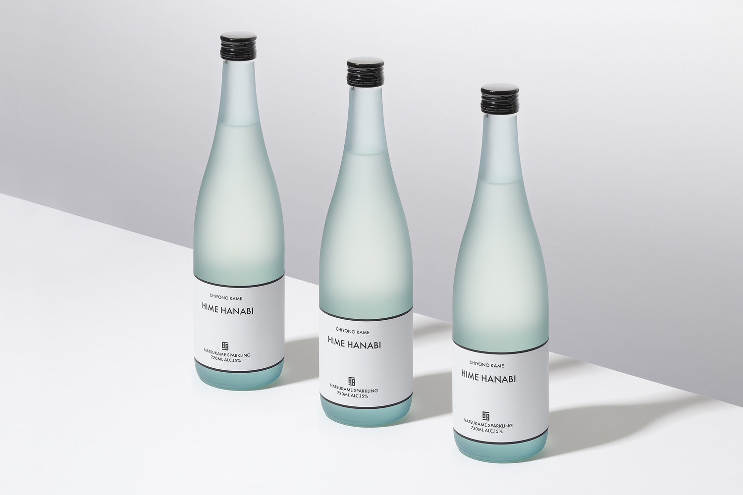
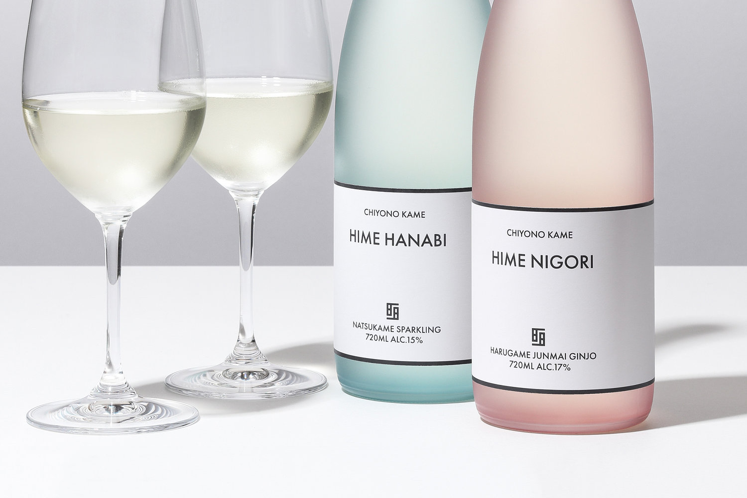
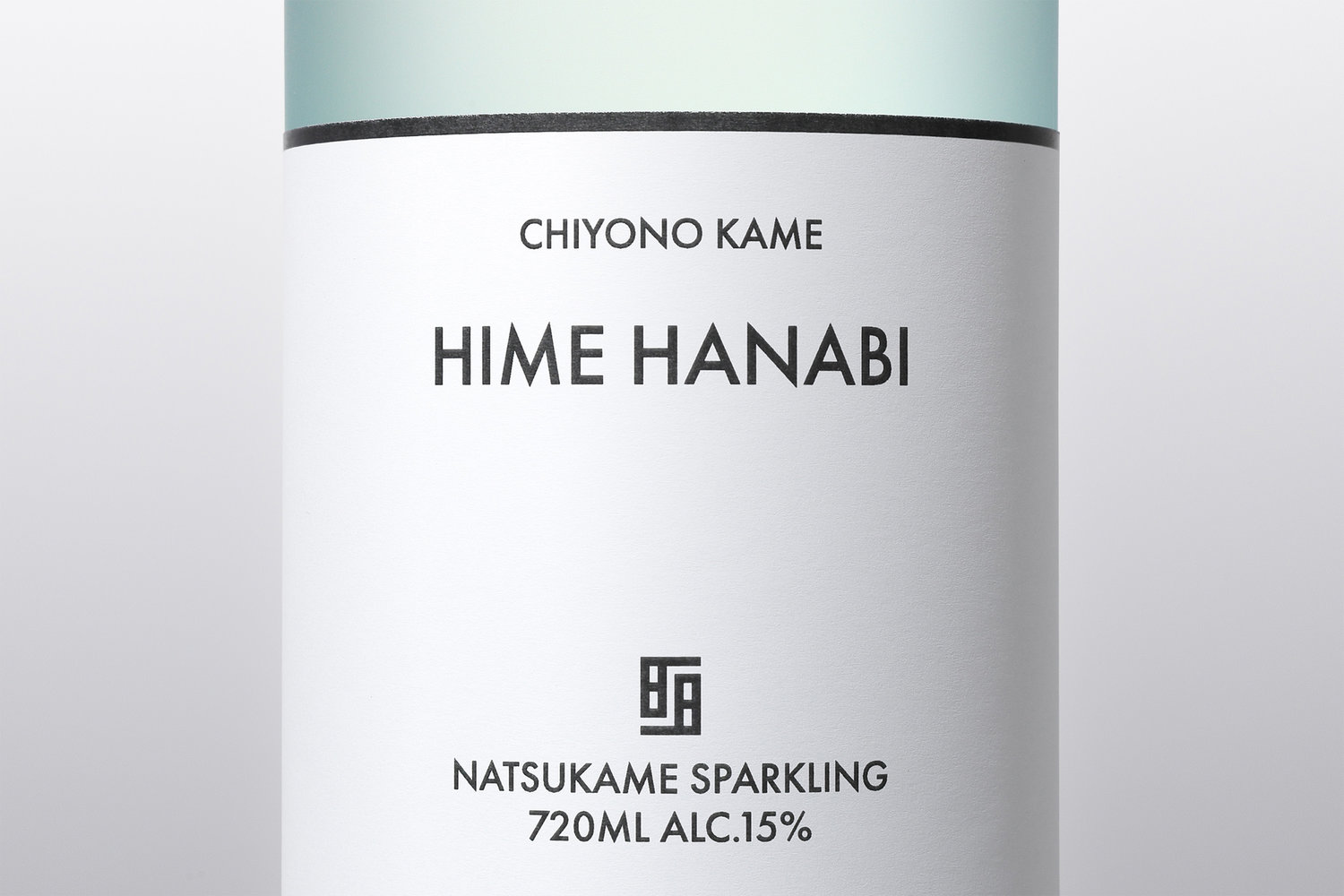
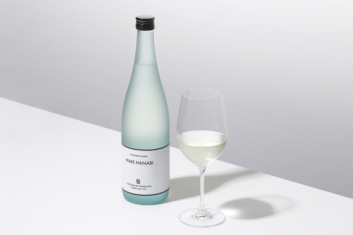
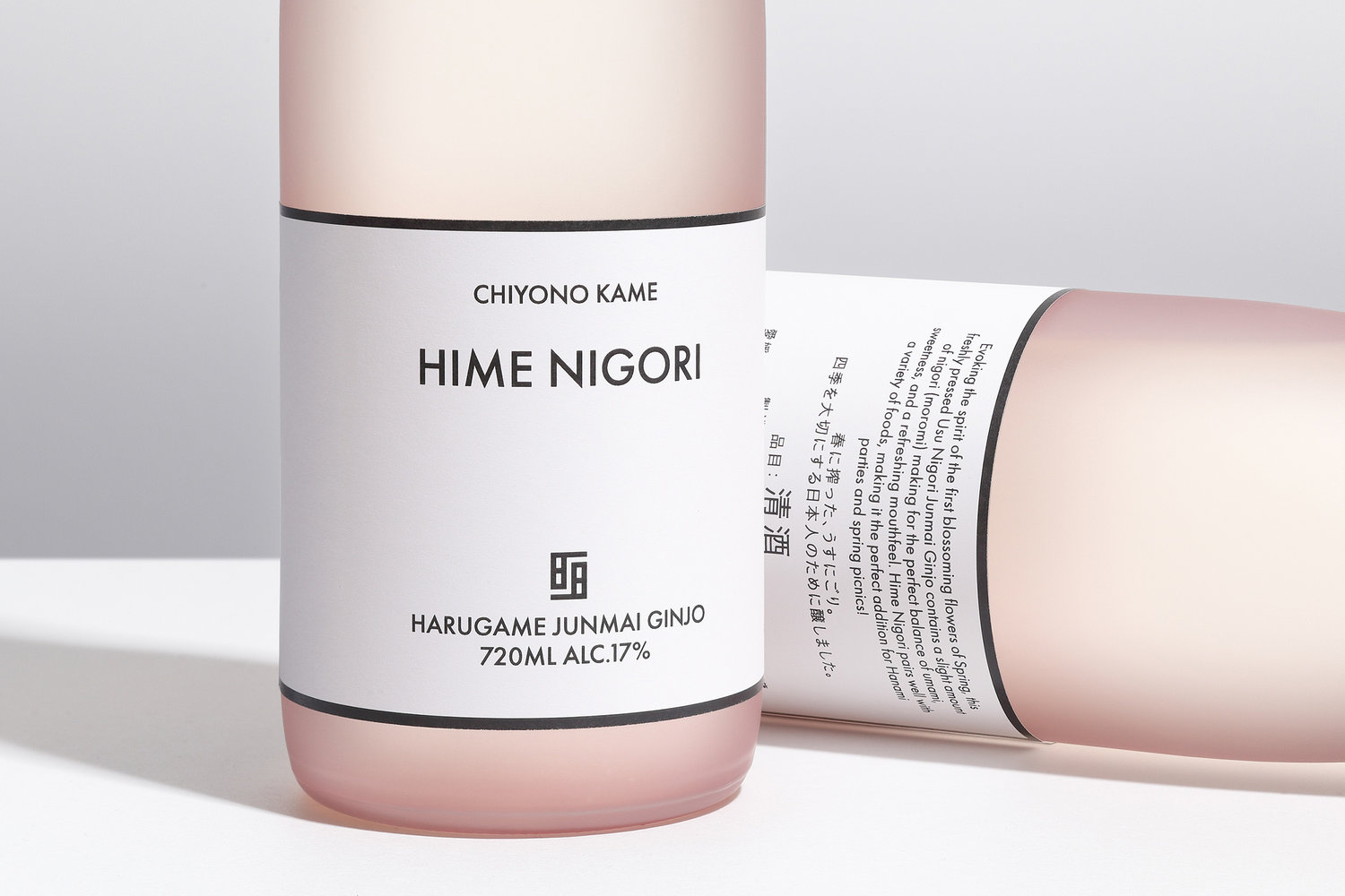
We have redesigned the seasonal sake “Hime Nigori” and “Hime Hanabi” from sake brewery Chiyonokame in Uchiko, Ehime. Established in 1716, Chiyonokame is a brewery with over 300 years of history. While we pay respectful tribute to the rich history of Japanese sake culture, we have also created a new Japanese sake design to match the modern scene. Our symbol is inspired by a turtle facing us, grains of rice and a rice paddy. The white label is reminiscent of rice grains, and we created a simple typography that matches the blank space no matter what scenery is paired with it. The pink glass represents blooming sakura, and the blue glass is symbolic of the sky and sea during the summer; the frosted glass bottle evokes the imagery of a fine Japanese sake.



CREDIT
- Agency/Creative: Yuta Takahashi
- Article Title: Modern and Minimal Sake Design for Chiyonokame
- Organisation/Entity: Agency, Published Commercial Design
- Project Type: Packaging
- Agency/Creative Country: Japan
- Market Region: Asia
- Format: Bottle
- Substrate: Glass, Pulp Paper


