
Season of Victory – Modern Vitamin Supplements
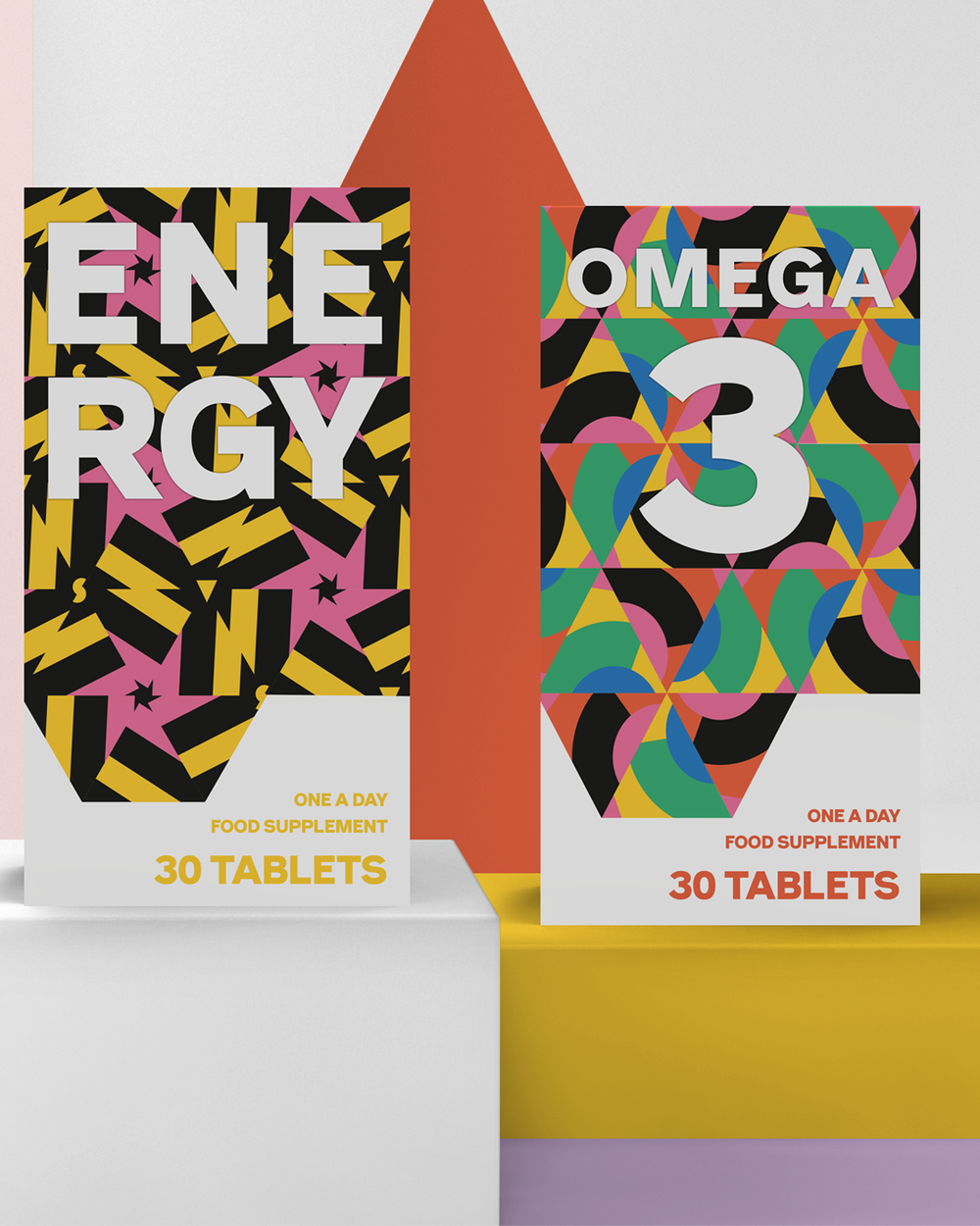
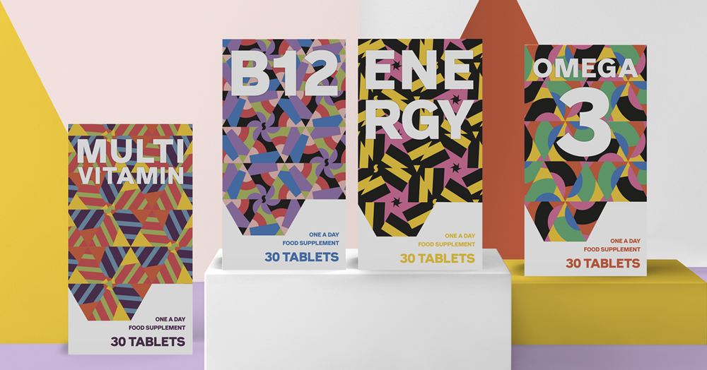
Vitamin packaging has long been generic or old-fashioned. The tendency is toward too much text and information. Most consumers are informed, and have researched deeply by the time they are at the point or purchase.
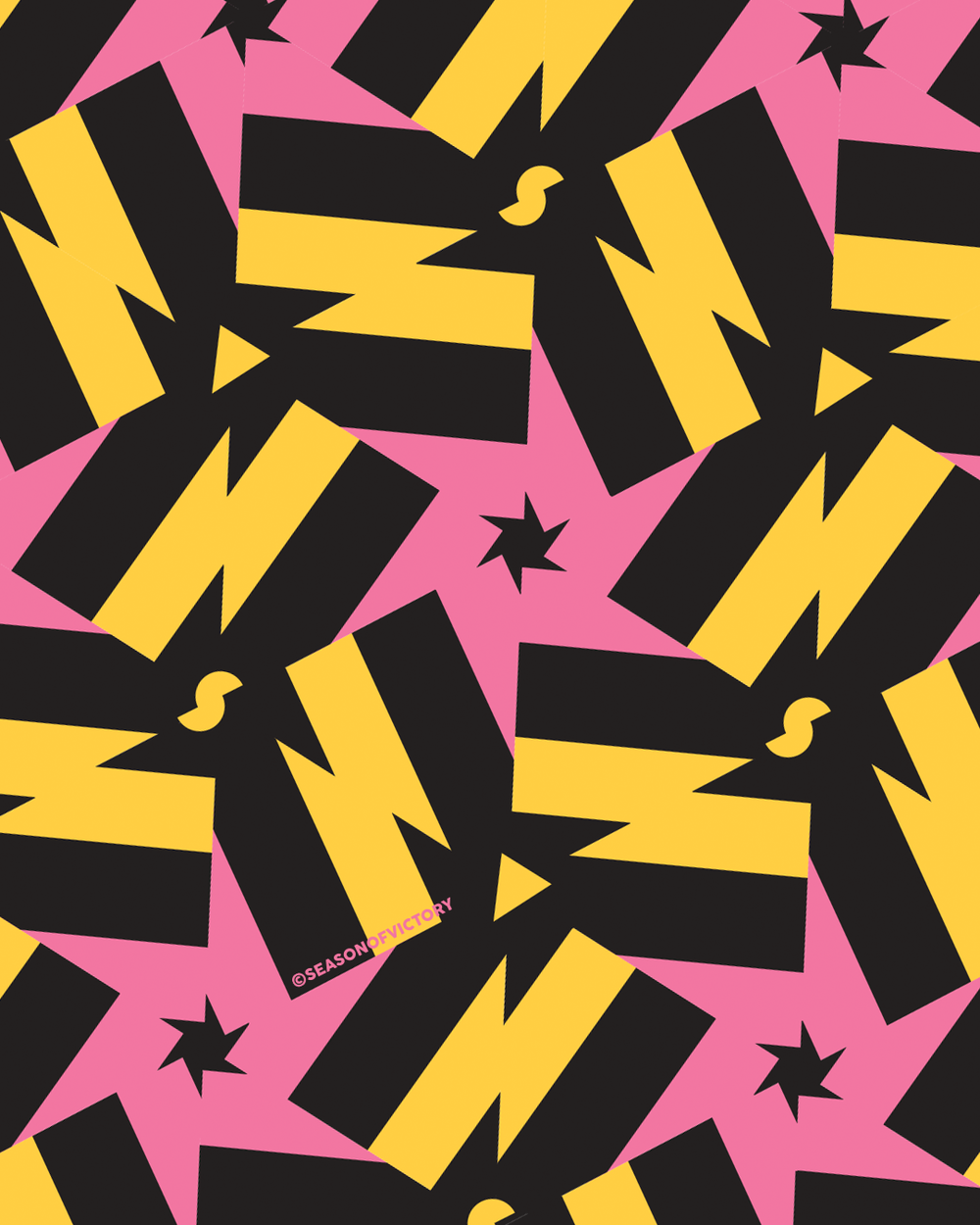
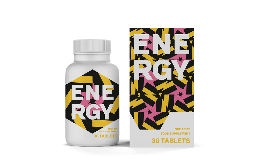
Focussing on pattern, colour and type, this packing design concept was created to add vitality to this part of the market. It adds playful design to the medicine shelf of the consumer, allowing it to sit closely with the premium beauty packaging they purchase.


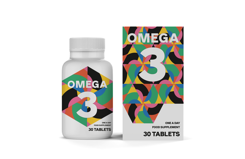
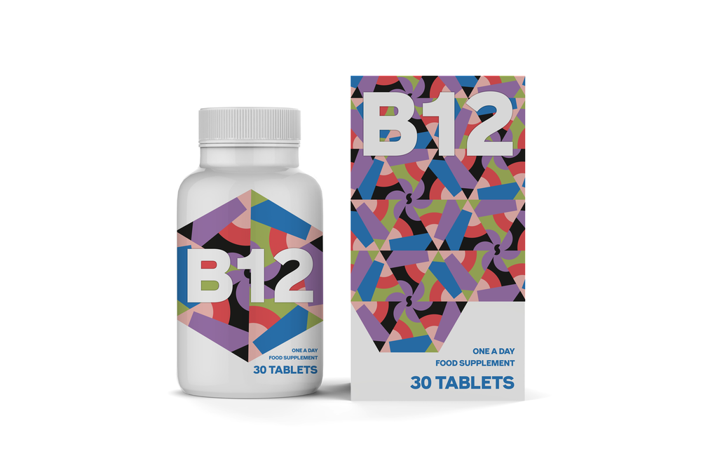
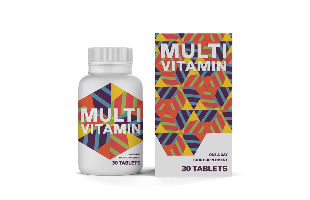
CREDIT
- Agency/Creative: Season of Victory
- Article Title: Modern and Colourful Vitamin Supplements Brand and Packaging Design Concept
- Project Type: Packaging
- Agency/Creative Country: United Kingdom
- Market Region: Global
- Format: Bottle, Box
- Substrate: Plastic, Pulp Carton
FEEDBACK
Relevance: Solution/idea in relation to brand, product or service
Implementation: Attention, detailing and finishing of final solution
Presentation: Text, visualisation and quality of the presentation


