


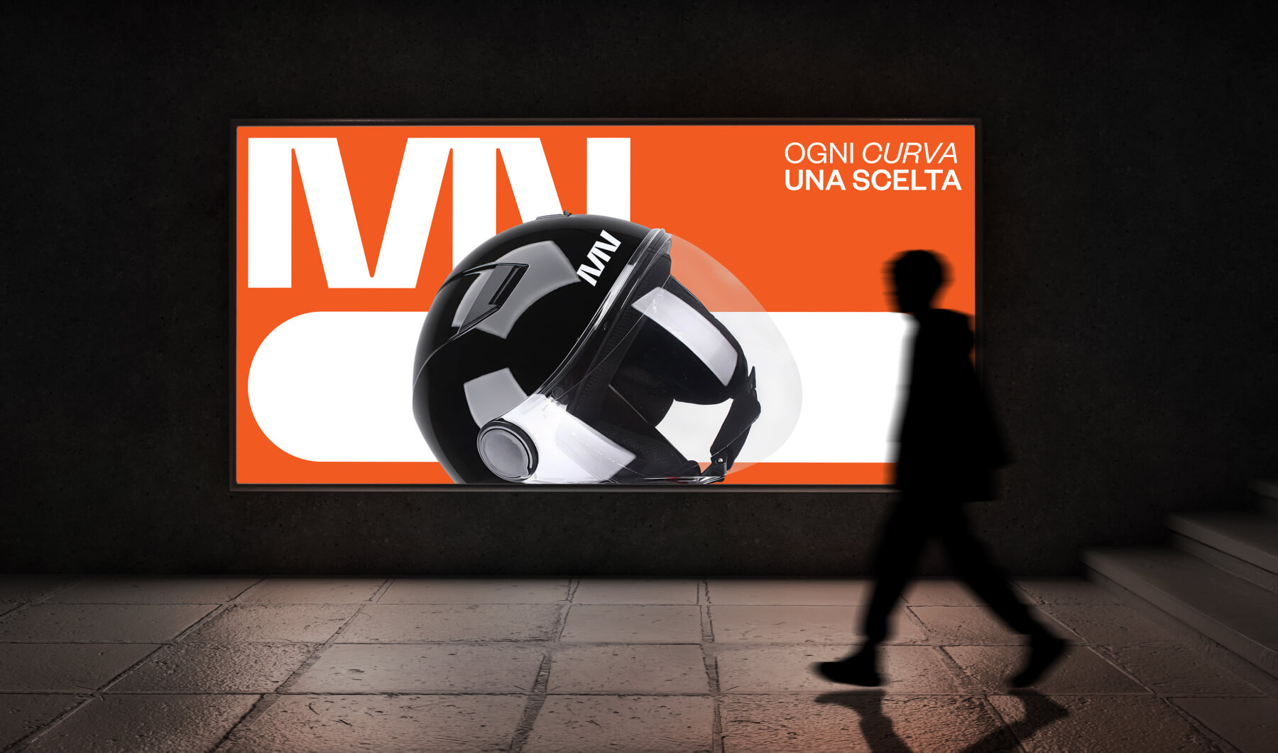
The MN Helmets brand identity was designed to redefine the visual language of the motorcycle helmet industry through clarity, structure and contemporary aesthetics. Our objective was to create a system that could communicate technical reliability while embracing a bold, unmistakable graphic presence. The result is a visual identity that balances engineered precision with a strong sense of personality.
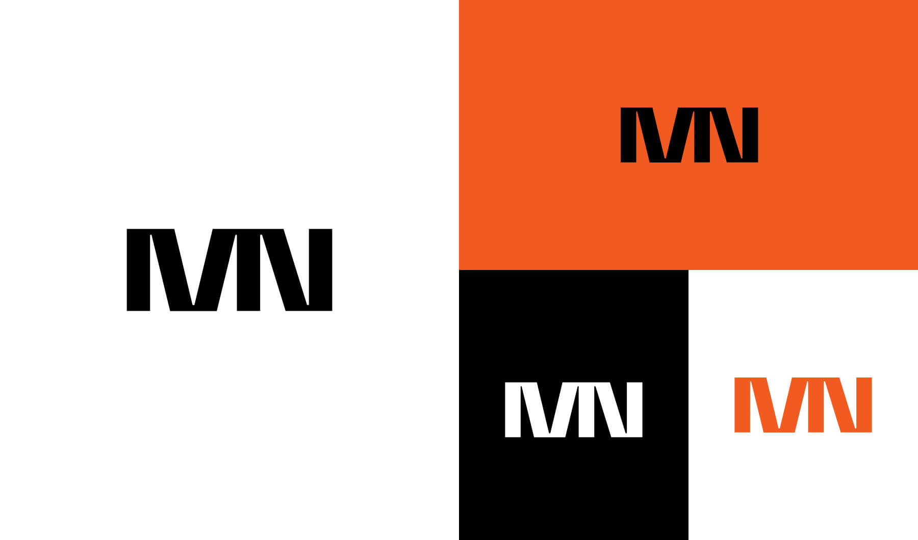
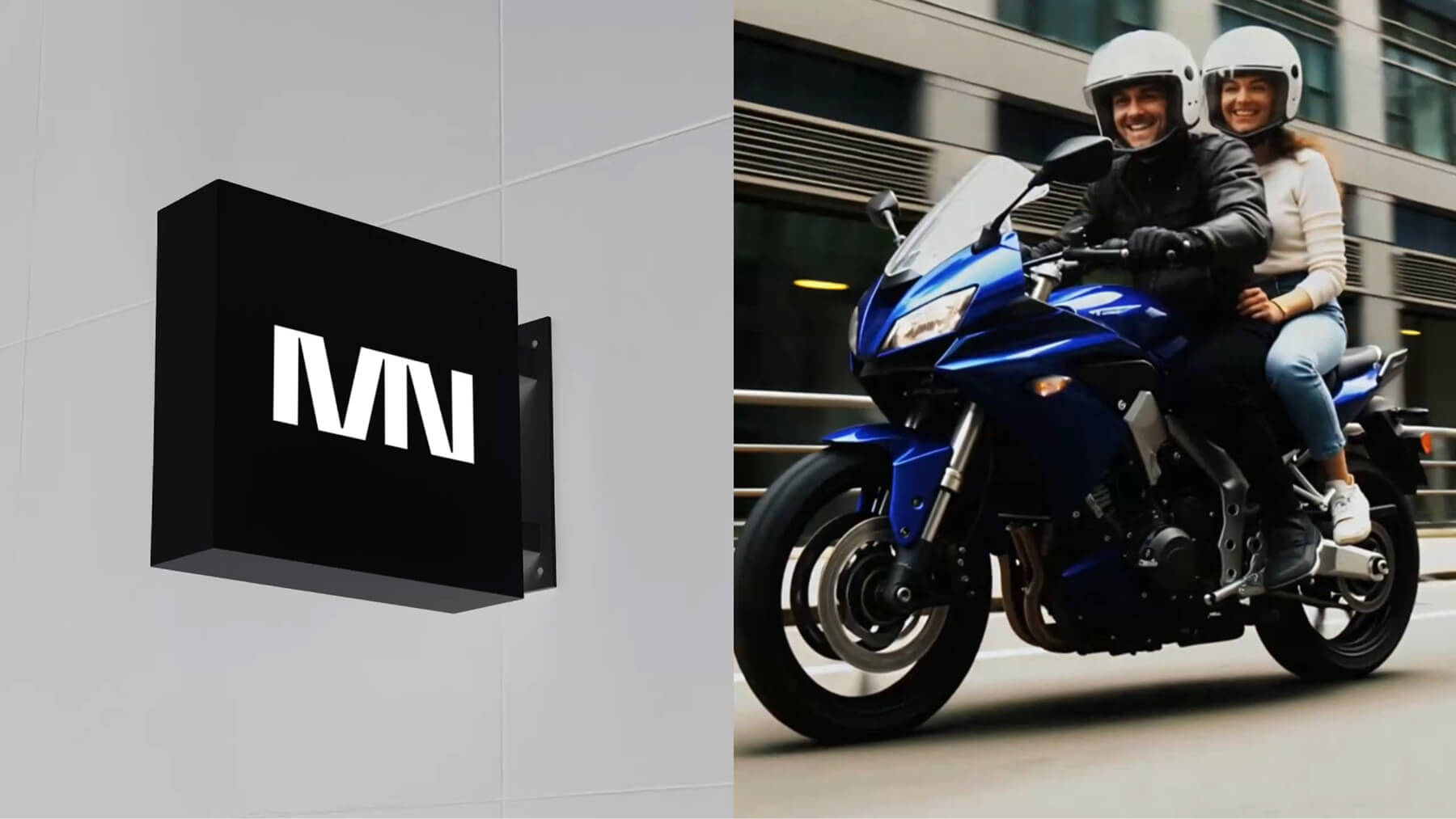
At the heart of the project lies the monogram: a sharply constructed “MN” designed to work both as a logotype and as an emblem. Its geometry is intentionally minimal and directional, ensuring high legibility across curved surfaces and allowing the brand to remain instantly recognisable in every context, from product applications to large-scale campaign assets. The typographic system reinforces this clarity, employing clean, powerful letterforms that echo the structure of the monogram.
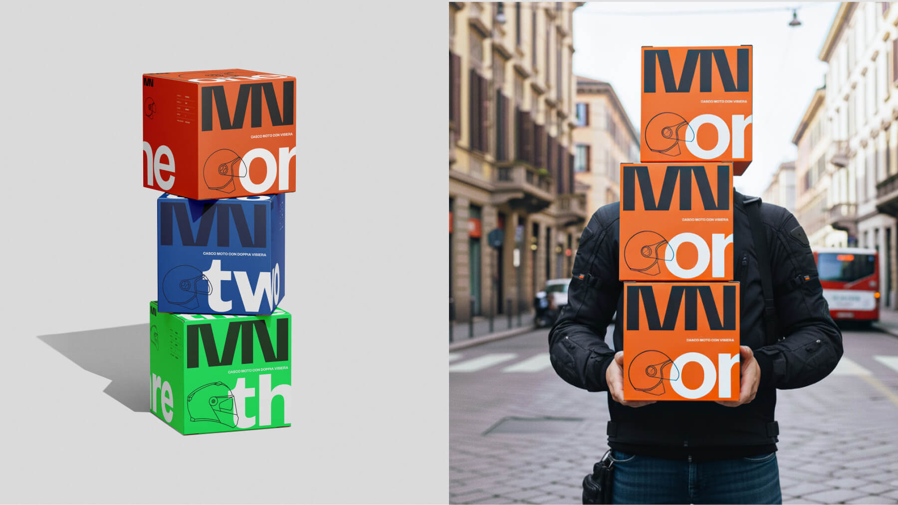
Color plays a strategic role in defining each helmet model within the product family. The warm red–orange represents the core brand hue and introduces the first model, ONE. TWO adopts a deep, technical blue, while THREE introduces an acid green that expands the brand into a more expressive register. This chromatic differentiation creates a packaging system that is unified yet distinctly modular, giving every product its own graphic identity without breaking the coherence of the brand.
The packaging itself acts as an extension of the visual system. Oversized typography, essential line illustrations and expansive color fields transform each box into a sculptural object. The design prioritises immediate impact and shelf visibility, while maintaining a refined, editorial balance in composition. The result is a packaging experience that reflects the brand’s values: confidence, modernity and engineered simplicity.
MN Helmets is a brand built on visual discipline, a system where minimal elements are used with precision to create maximum presence. The identity, photography and packaging work together to deliver a cohesive brand world defined by clarity, direction and contemporary design culture.


CREDIT
- Agency/Creative: Studio K95
- Article Title: MN – Branding for a Motorcycle Helmet Company by Studio K95
- Organisation/Entity: Agency
- Project Type: Identity
- Project Status: Published
- Agency/Creative Country: Italy
- Agency/Creative City: Catania
- Market Region: Europe
- Project Deliverables: Art Direction, Brand Design, Brand Identity, Graphic Design, Packaging Design
- Industry: Manufacturing
- Keywords: logo design, graphic design, packaging, visual identity, helmet, motorcycle
-
Credits:
Grapgic designer & Creative Director: Danilo De Marco
Graphic designer: Dario Leonardi


