The Vision
The idea that we started our project with was that we were going to make a brand that specializes in making perfect combinations of nut snack bars, that can suit everyone’s individual taste. The market competition was primarily cliche, all in one nut bars with everything and anything in them, so we decided to be special.
Solution
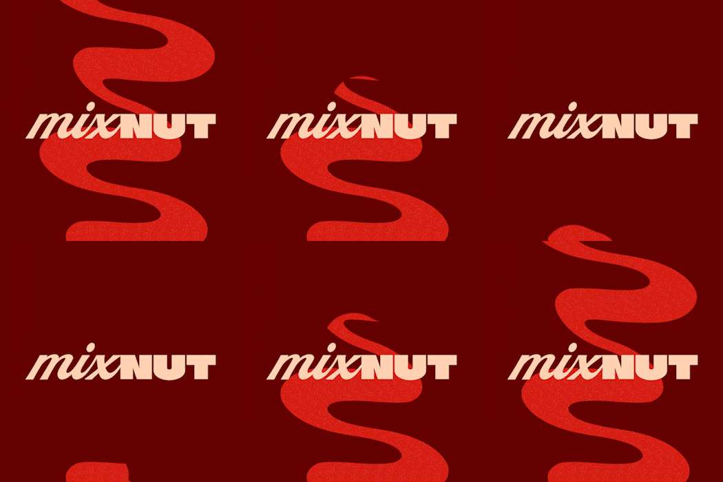
After a lot of debate, we decided on the direction of our project. We wanted to base the company name on the attention that it places on its MIX quality, and we wanted to make it clear that NUTS are the only ingredient in the product. The name we came up with was ‘mixNUT’, and we further reinforced the idea of ‘mix’ and ‘NUTS’ with the following design. The aim was to appeal to customers who would like to try something new and healthy that also stands out even when surrounded by competition.
Logo explained
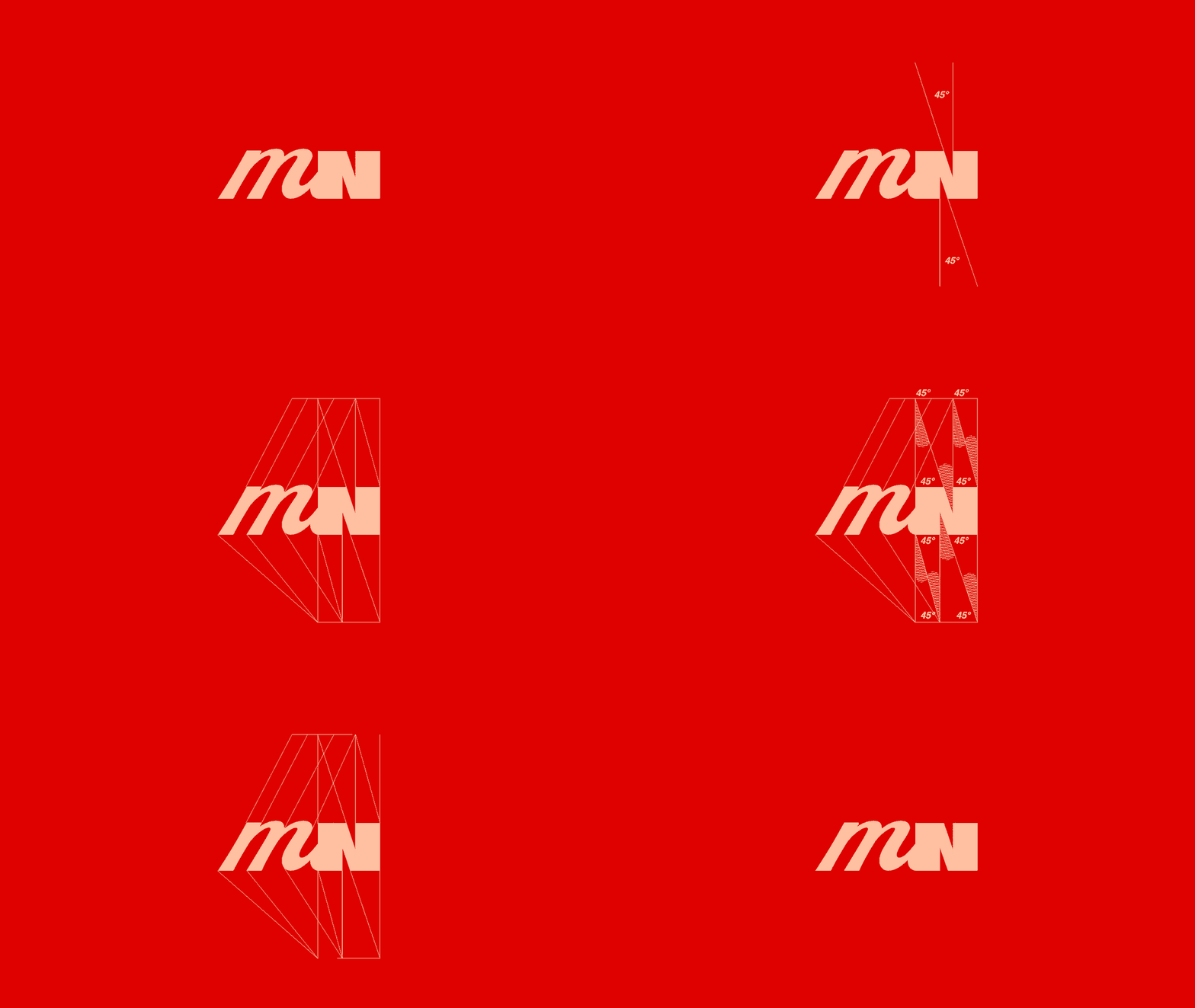
The logo consists of two words ‘mix’ & ‘NUT’. The first part of the logo is a script font and its made in such a way that it symbolises a mixing motion and contrasts really well against the second part, which is a fully bold. The second part of the logo is a bold display font that represents the toughness and sturdiness of a nut. Together they communicate the 2 main focuses of our client.
Typography
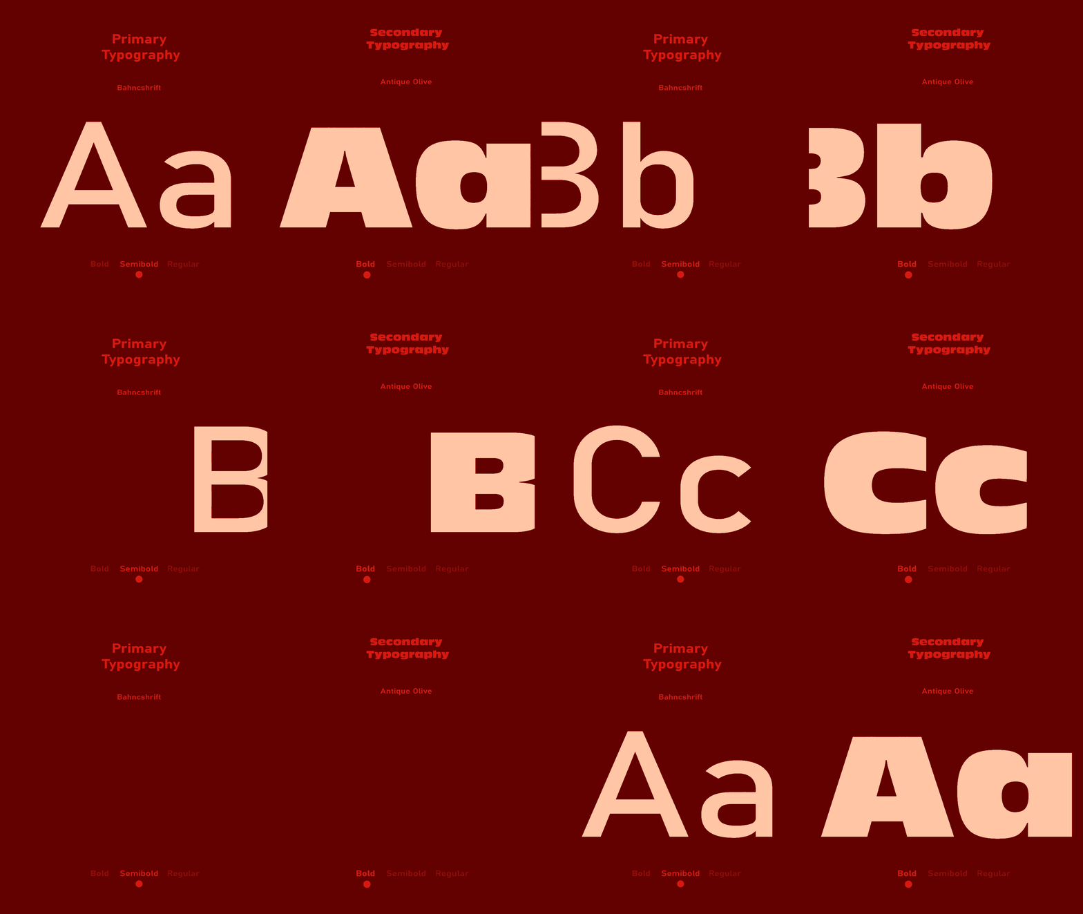
The fonts we used on this project are Bahncshrift and Antique Olive.
Bahncshrift is a font we chose to display information and fluid text, while Antique Olive was used on titles and words that require extra attention from the potential customer. Both fonts are very flexible and have their own variations, especially Bahncshrift, which has as many as 15 variations.
Colours
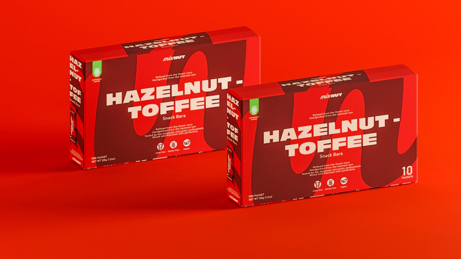
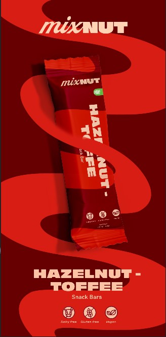
The chosen colors work well with each other, with a base light brownish colour that we called ‘Peanut Brown’. Each colour represents their own respective taste that is hidden inside the packaging, which helps the customer identify the taste potentially without looking on or inside the package.
Finalisation
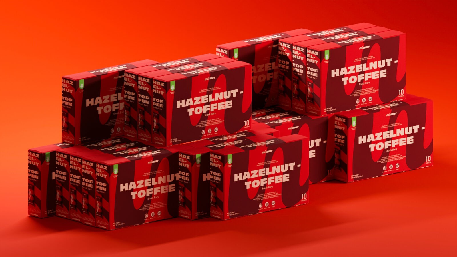
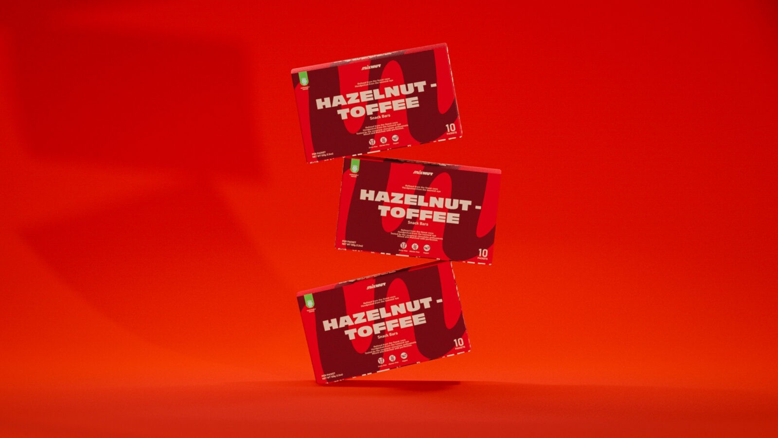
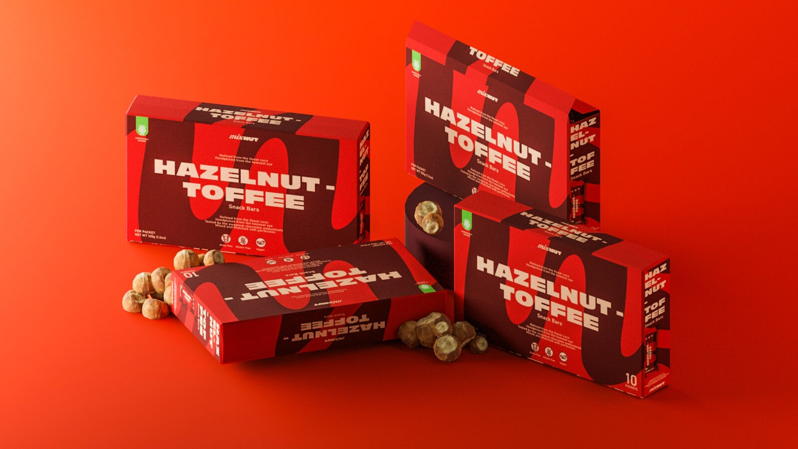
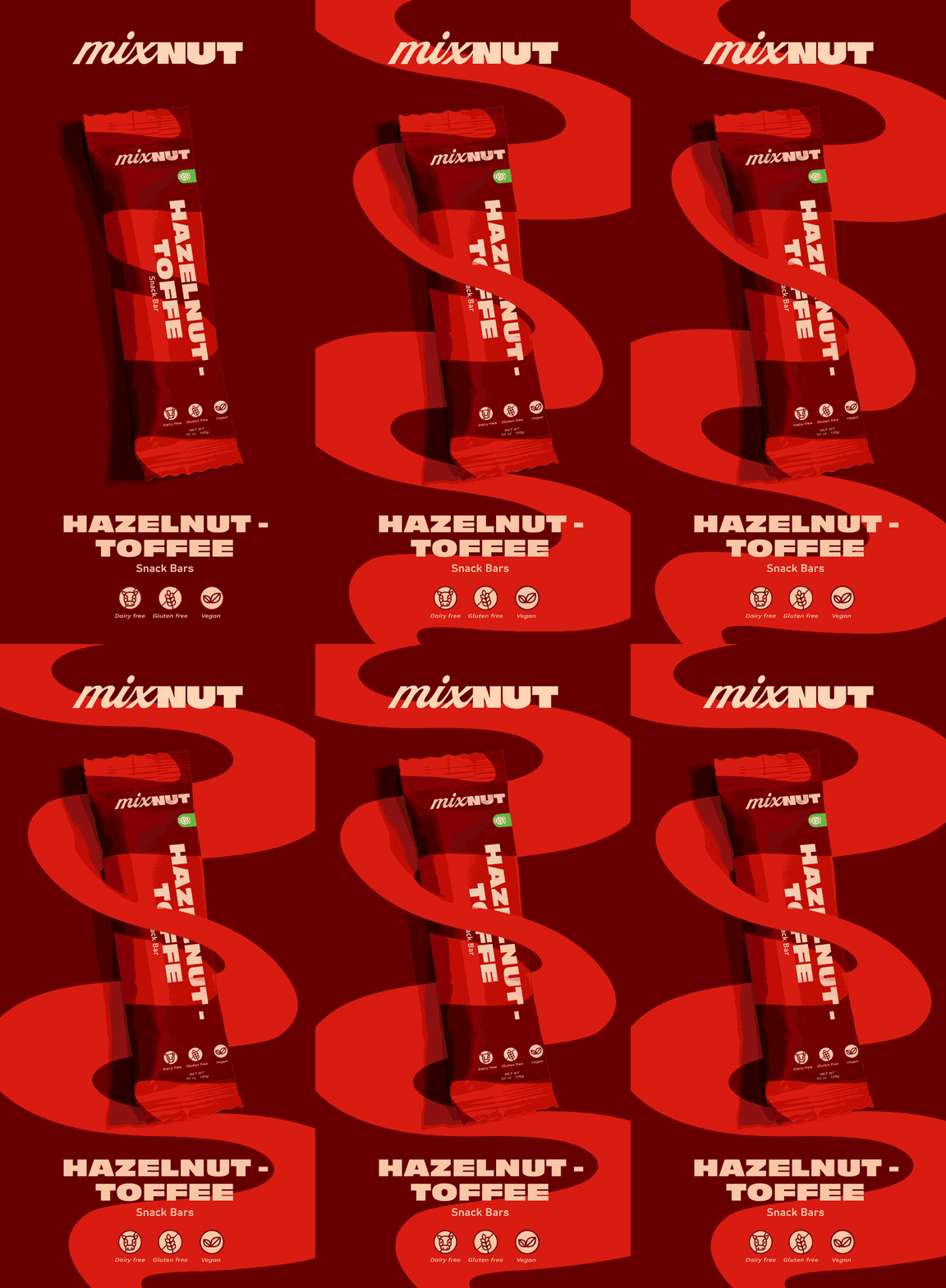
The final result we achieved after incorporating all of the principles and ideas above is an eye-catching and interesting brand whose type of design and graphic elements haven’t been seen on the shelves before. The dimensions of the boxes and the bars are standard, and the bars can easily fit inside someone’s pocket. We didn’t want to divide from today’s standards too much, but we did just so we could create a bit of shock and interest in the industry and the aisle so that the brand may attract more attention from potential customers.





CREDIT
- Agency/Creative: Vlado Bjelis
- Article Title: Mixnut Visual Identity and Packaging by Vlado Bjelis
- Organisation/Entity: Student
- Project Status: Non Published
- Agency/Creative Country: Australia
- Agency/Creative City: Sydney
- Keywords: WBDS Student Design Awards 2024/25
- Keywords: WBDS Student Design Awards 2024/25
-
Credits:
Creative Director: Vlado Bjelis
Educational Institution: University of technology Sydney - Bachelor of Design in Visual Communication
Educator's Name: Micke Lindenbergh


