Background:
Grimbergen is a Belgian monastic beer brand, named for the Norbertine monastery founded in 1128 from which the beers originated. Now owned by Carlsberg Group, Grimbergen beer is predominantly made in commercial breweries across Europe and is the 4th largest beer in France, their primary market, by number of consumers.
However, in 2019, Grimbergen opened a brand-new microbrewery inside the walls of the Abbey, bringing brewing capabilities back to the monastery after more than 200 years. These ‘brewed in the Abbey’ beers enter a highly congested category, competing both with Belgian beers and craft beers, so they needed to stand out. Yet in 2022, three years after launch, demand was only just over 10% of the maximum brewing capacity – something needed to be done.
Brief:
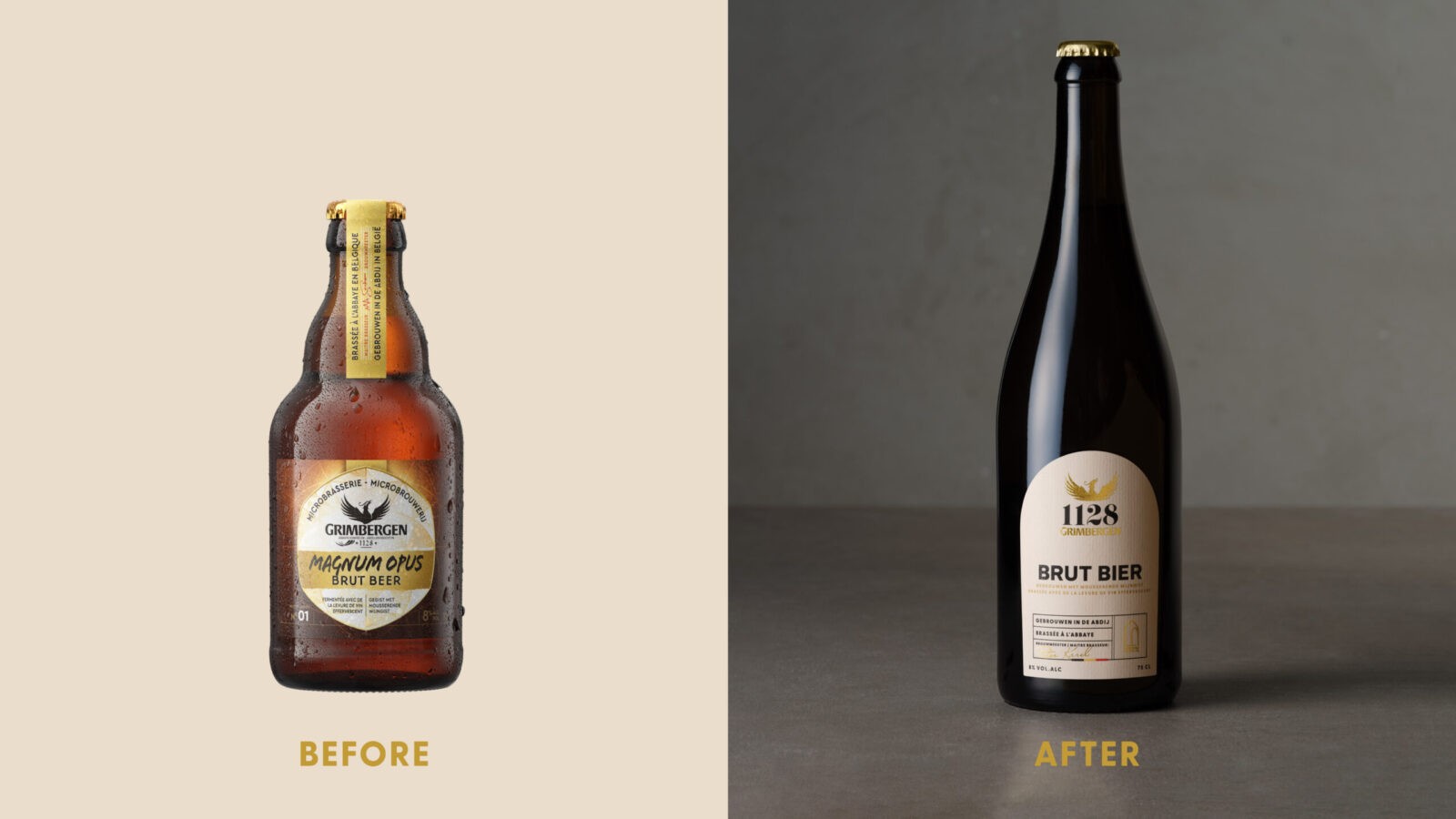
Our task was to totally overhaul the design of the ‘Abbey Brews’. While this microbrewery range was intended to be a premium offer, the initial pack design did not clearly differentiate it from the mass-produced commercial range.
While Grimbergen is well liked in France and Belgium, the brand is not seen as a premium offer. As such, there was a challenge for the positioning of this high-end range. It needed to strike a delicate balance for consumers, hitting the sweet spot between two key questions – ‘what brand is this’, and ‘why pay more’? Effectively, be both recognisably Grimbergen, yet sufficiently premium and modern to encourage consumers to trade up. The overall goal of the project is for the microbrewery range to cast a halo effect on the commercial range and build brand equity for Grimbergen.
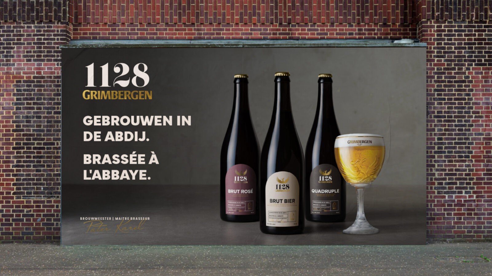
As a true monastic beer crafted by the Norbertine monks who live at Grimbergen Abbey, these beers deserved a new identity. From a new brand name to logo to bottle, plus a full suite of BTL assets, we developed all elements of this product redesign.
Strategy:
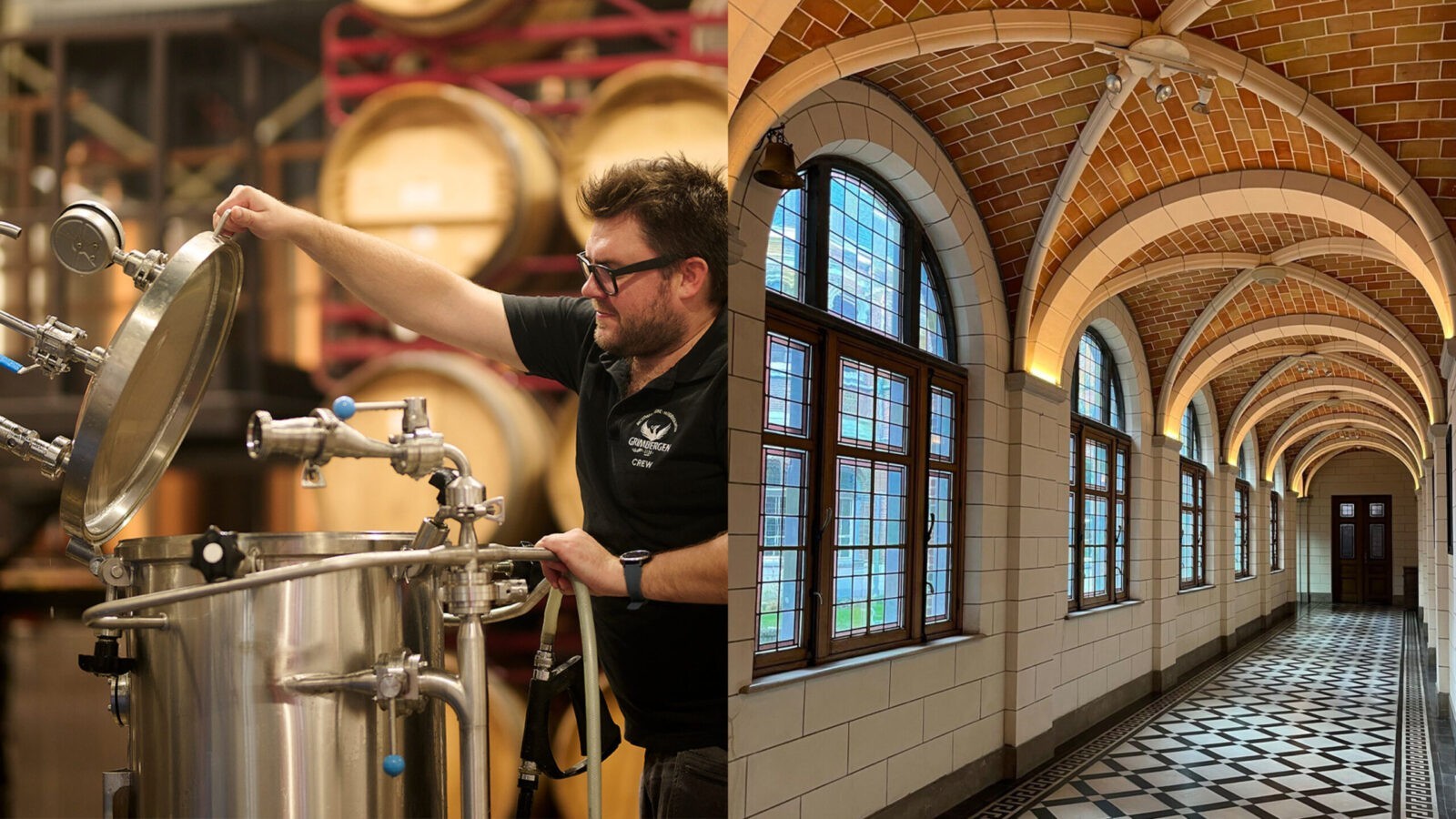
To answer our positioning question, we needed to have a deep understanding of the category and competitive landscape. Our immersion began with visits to the Abbey in Belgium, learning about the storied history of the Abbey and the brewing process from the monks themselves (and very happily tasting a few brews). We followed this with a thorough audit of the market and categories.
These ‘Abbey Brews’ sit in an unusual niche in the beer market, being both Belgian monastic beers and craft beers. Both categories are well understood by consumers individually but there is little precedent for a beer bridging the gap – this was the key tension we needed to address.
By using too many monastic beer design cues, a typically lower-priced beer, consumers would not understand the justification for the increased price point. However, leaning too far into craft beer semiotics would disconnect these premium beers from the main Grimbergen brand and commercial range, losing the intended halo effect.
Our winning creative territory connected the key three elements: the brand’s heritage and provenance, the consumer desire to indulge and reward, and the product’s genuine Norbertine-brewed origins. We named it ‘Legacy of Brewing’, connecting this new product to 896 years of brewing history in the abbey. Championing historic craftsmanship with limited production and stories that echo through time, we catered to the evolving and increasingly discerning beer enthusiast.
Design Process:
Building a premium brand requires refined design. To execute our Legacy of Brewing platform, we balanced the semiotics of three design levers: the Belgian beer category, craft beer category and Grimbergen brand.
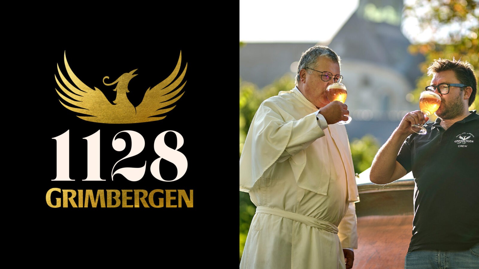
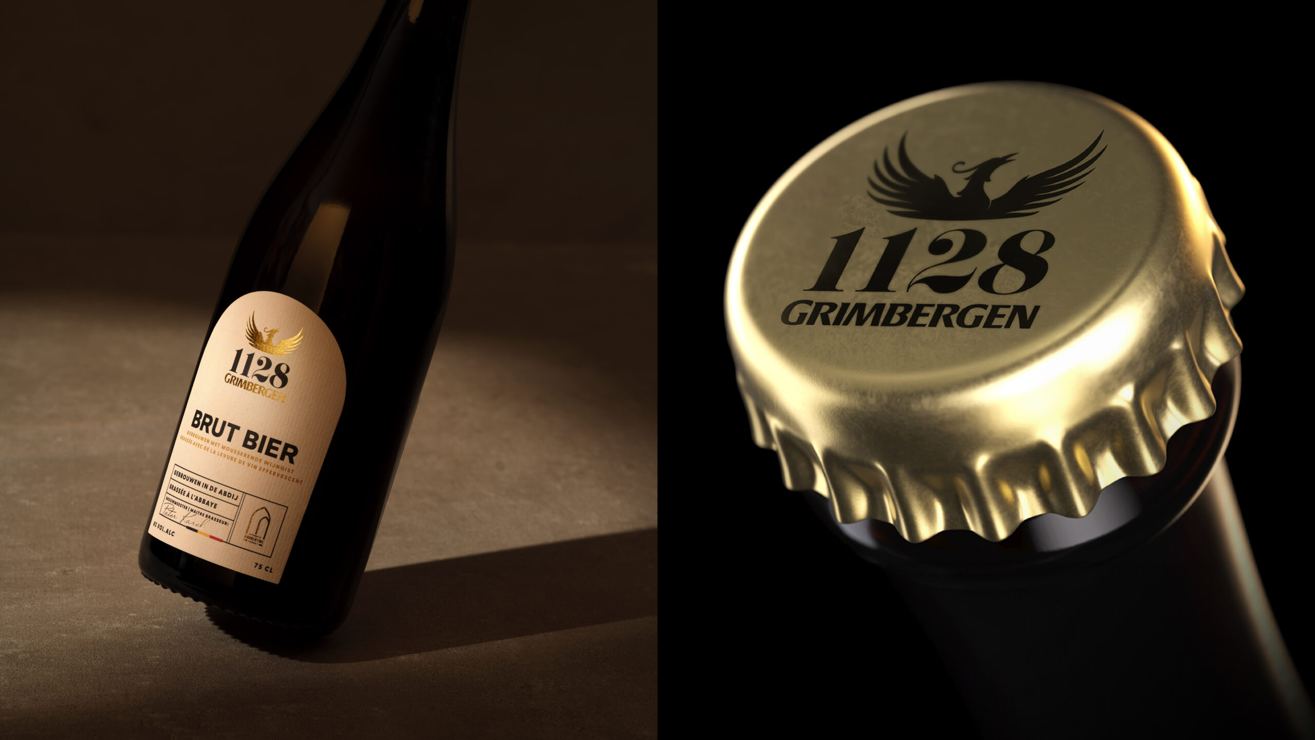
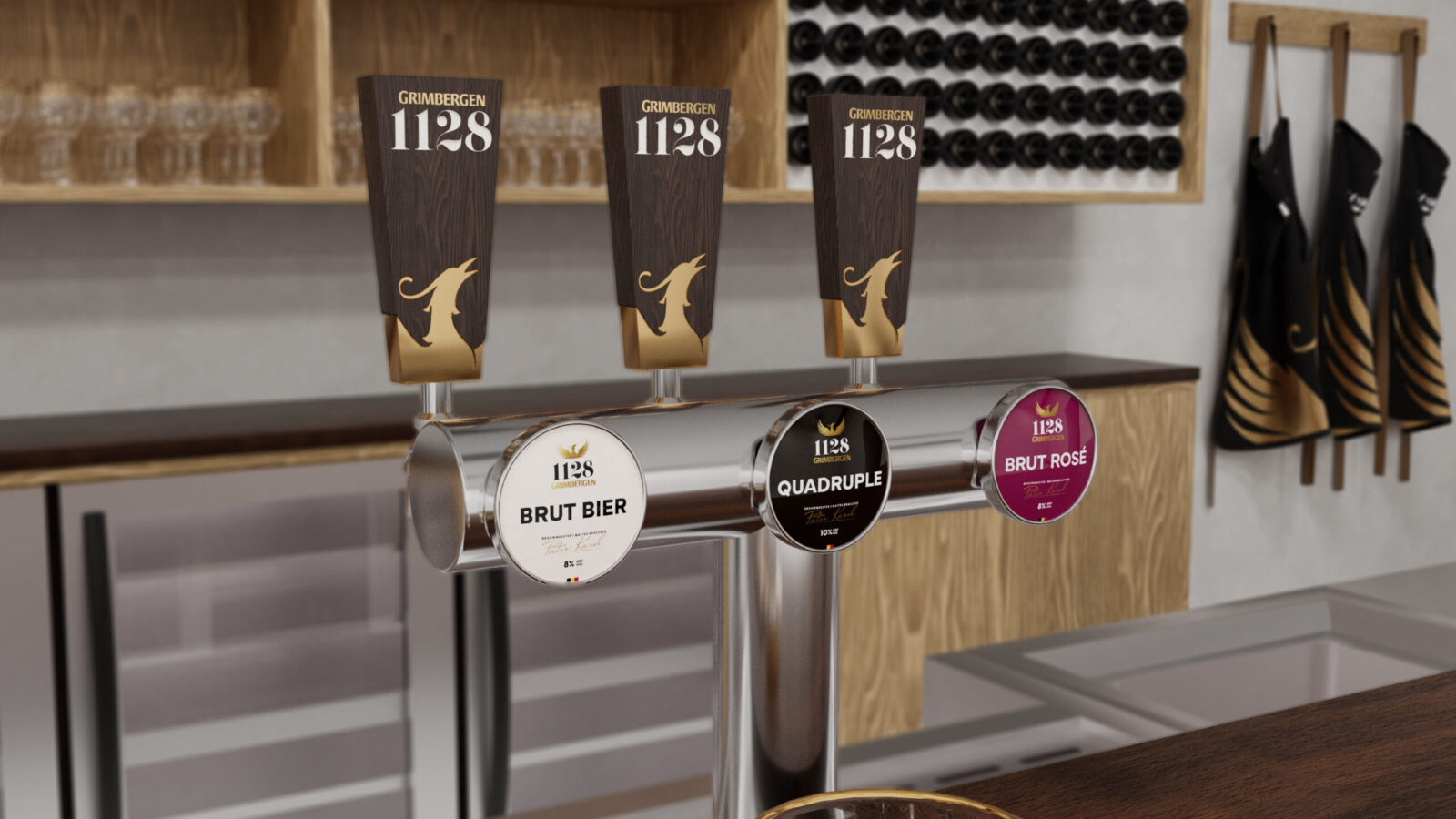
Taking Grimbergen Abbey’s founding year, 1128, as the new range name is simple yet impactful. Inspired by the numerous instances of dated stonework in the Abbey we observed on our visits, this name is modern yet alludes to history and provenance.
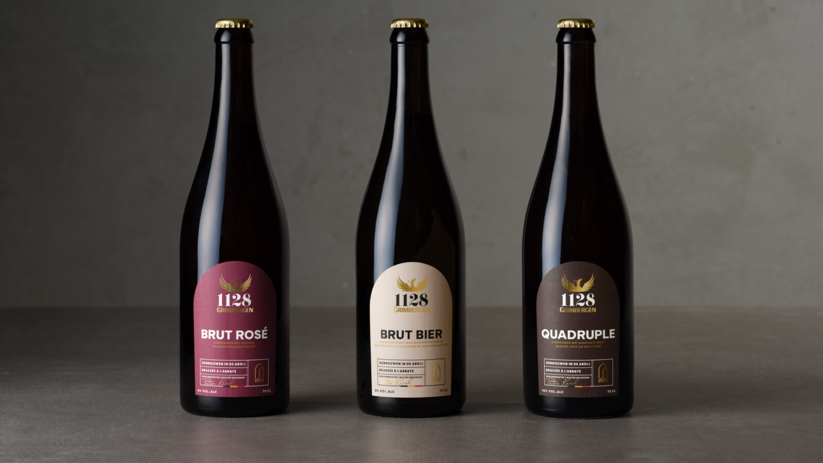
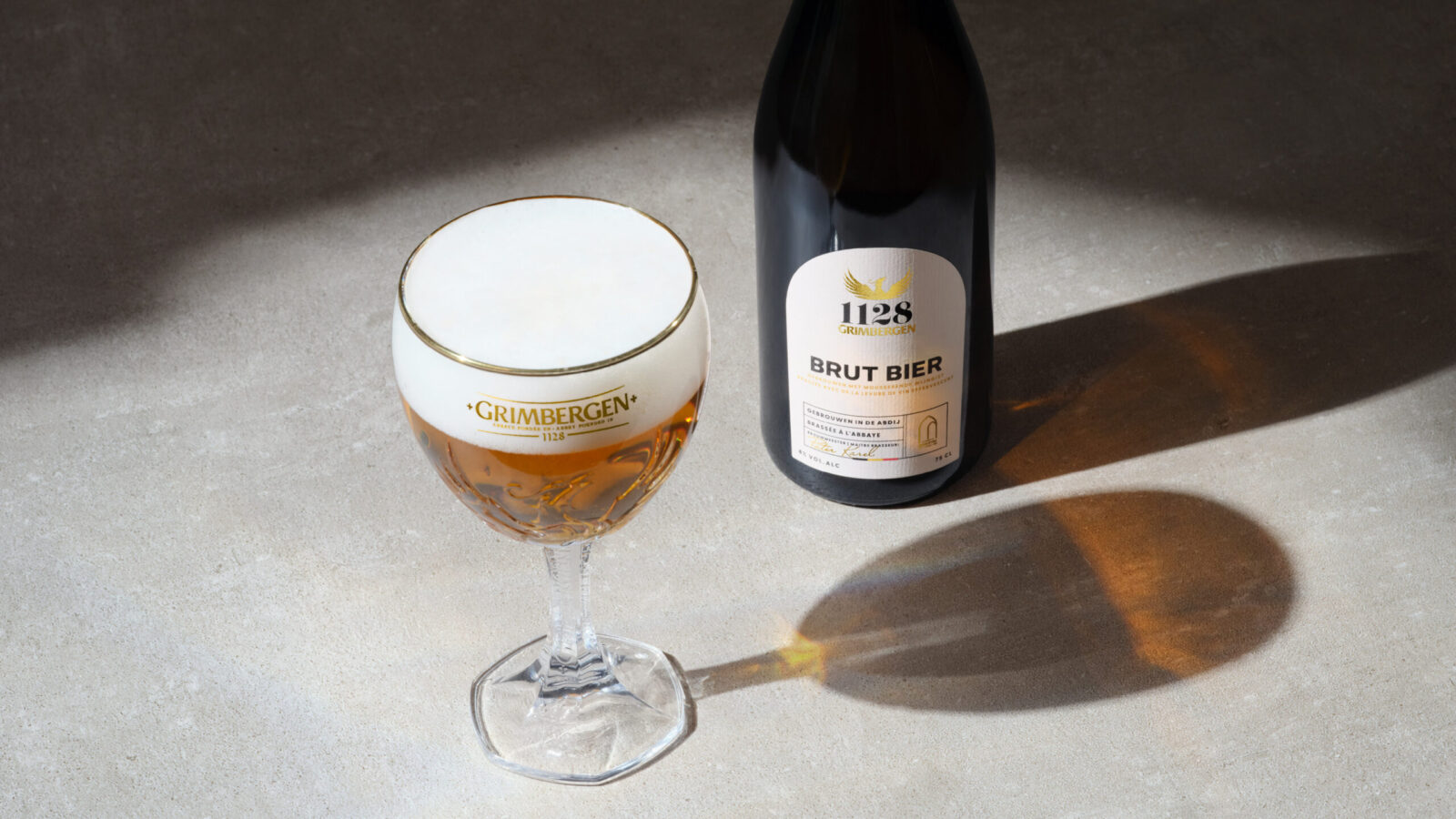
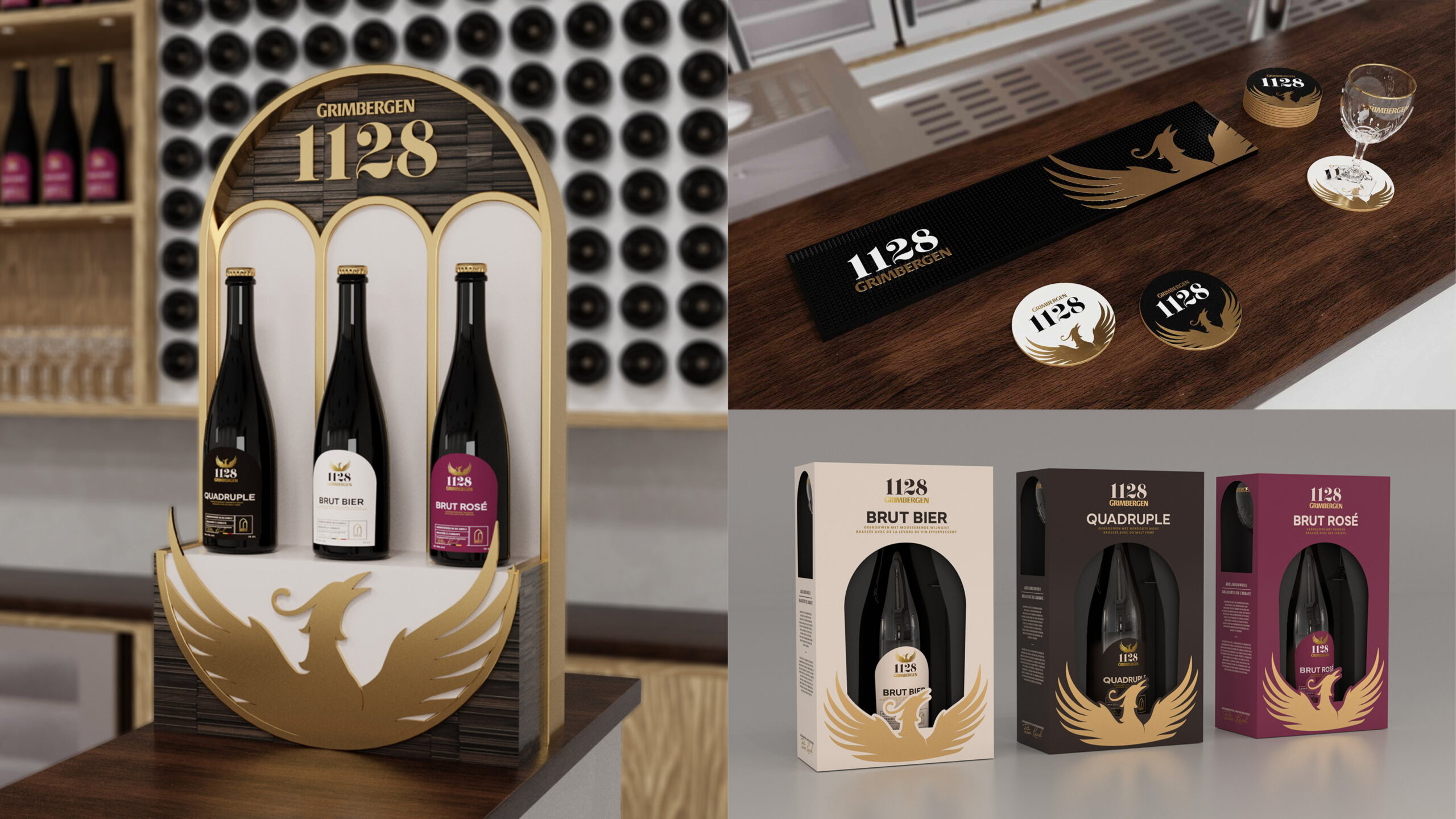
The updated bottle shape is rooted in the semiotics of the wine category. We found that our target consumers were increasingly moving from wine to beer in sharing moments, so our bottle takes advantage of this trend and guides consumers through this transition.
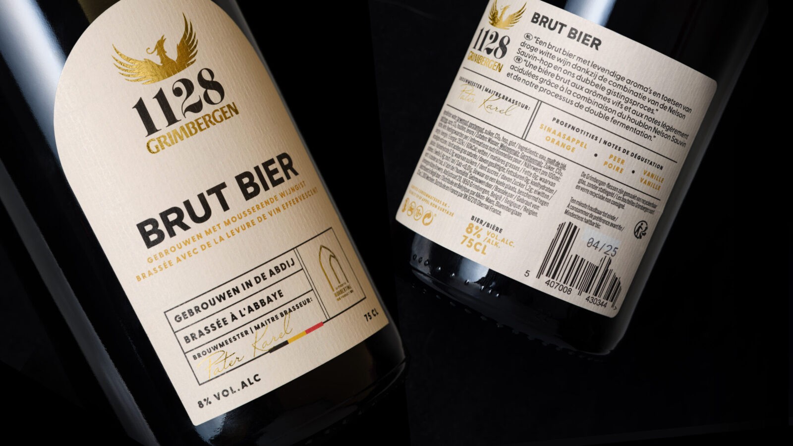
Label design maintains the premium feel, from the paper stock to the gold foil details. The textured parchment paper cues the legacy and history of the brand, and the elegant arched shape is reminiscent of the cloisters and corridors of the Grimbergen Abbey itself. Every bottle is detailed with the signature of the Master Brewer, imbuing the product with a sense of small-batch quality and care.
Our updated phoenix logo is a more refined version of the standard Grimbergen phoenix logo, casting a golden glow on the overall brand.
Results:
1128 by Grimbergen was launched in late Q2 2024. While we must wait to gather tangible results, we are confident this new beer brand will quickly gather a loyal congregation.
CREDIT
- Agency/Creative: Missouri Creative
- Article Title: Missouri Creative’s Design for 1128 by Grimbergen Brings Belgian Monastic Heritage to Life
- Organisation/Entity: In-House
- Project Status: Non Published
- Agency/Creative Country: United Kingdom
- Agency/Creative City: London
- Project Deliverables: Packaging Design
- Industry: Food/Beverage
- Keywords: WBDS Agency Design Awards 2024/25
- Keywords: WBDS Agency Design Awards 2024/25


