


Tea Leaves Branding and Packaging
Kounter is a tea brand positioned between everyday and premium. The challenge was not to create something overtly aspirational or trend-driven, but to build packaging that feels quietly confident. It needed to feel familiar without slipping into generic territory, and refined without losing the warmth and approachability associated with everyday tea rituals.
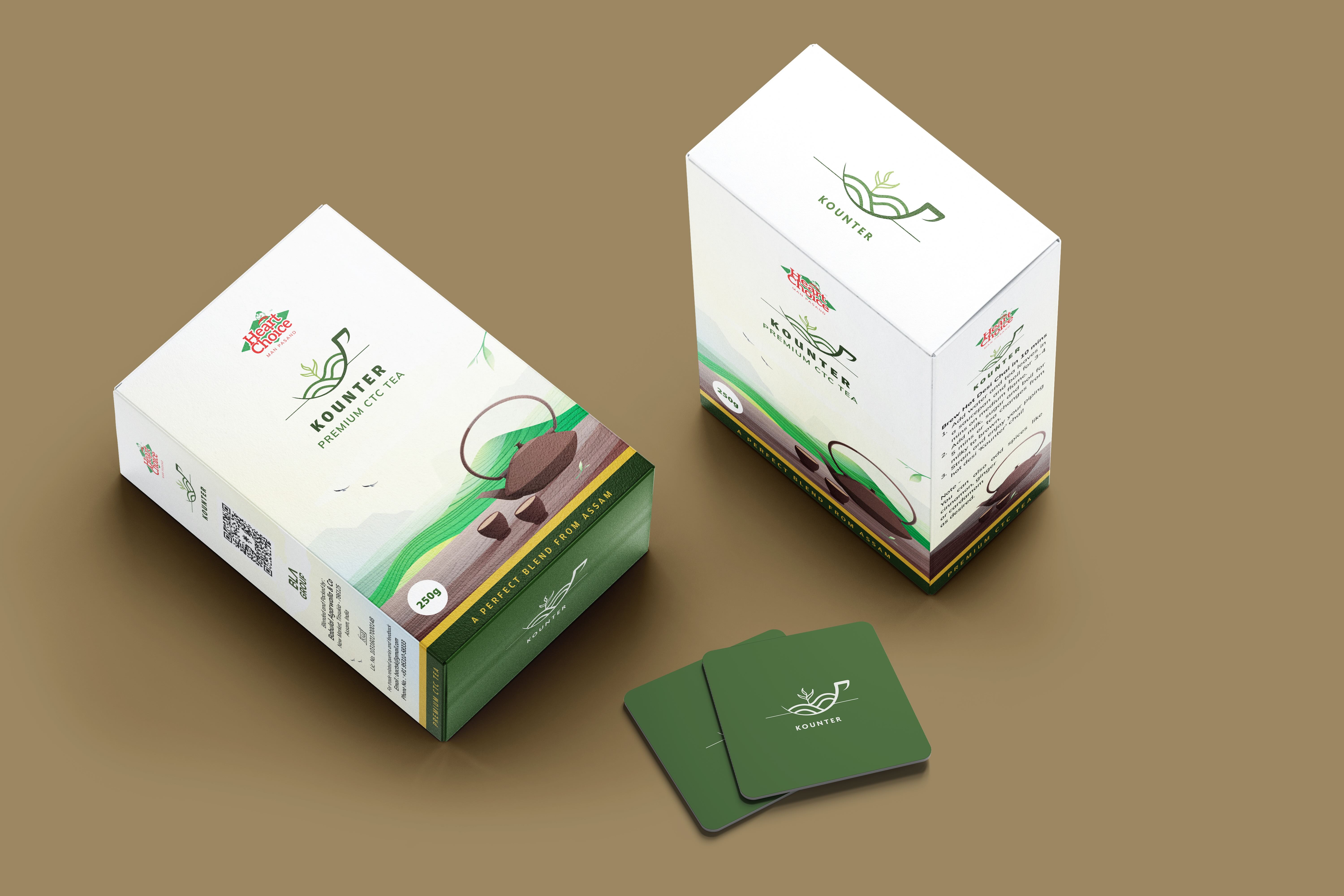
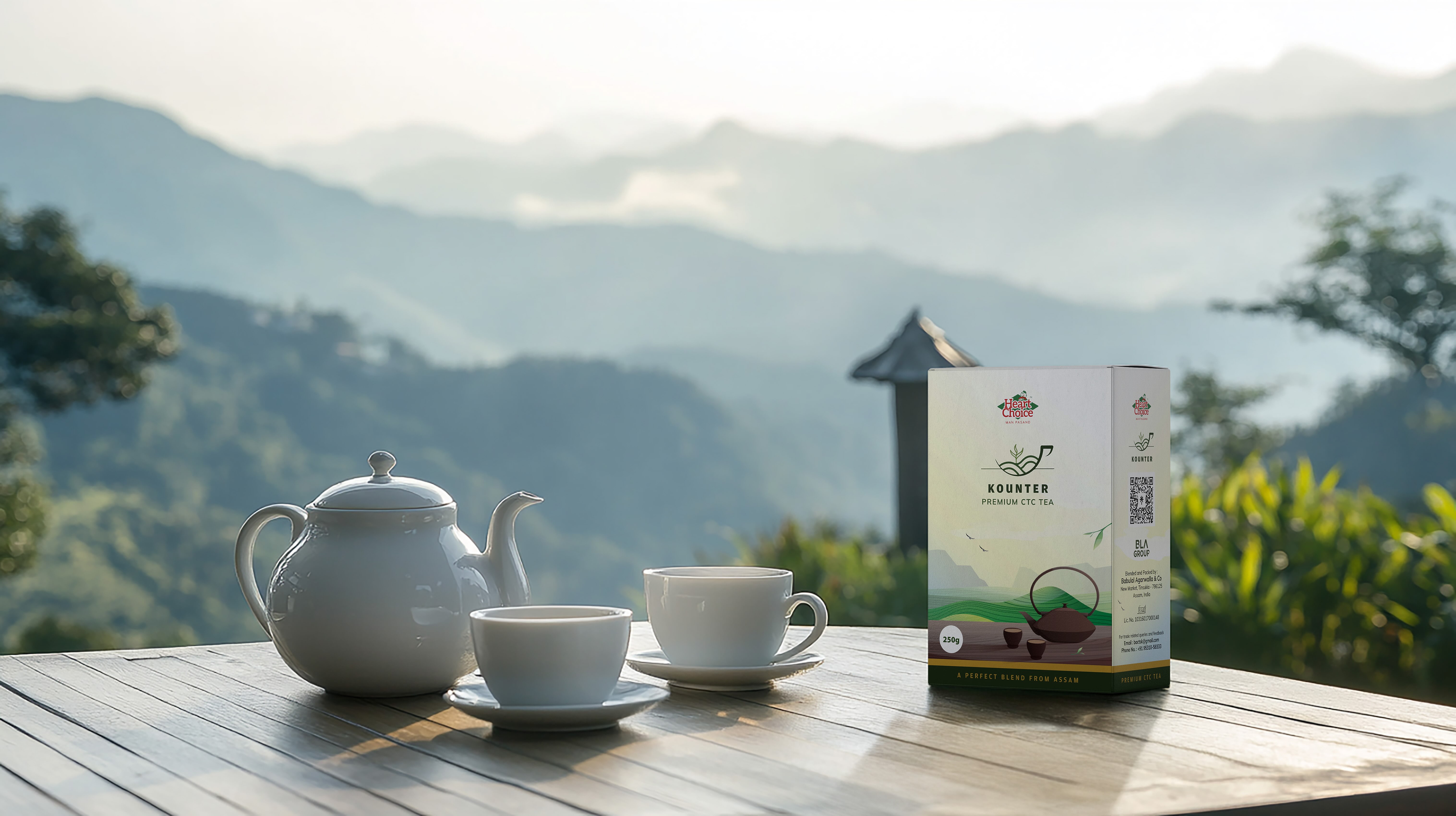
The visual identity is deeply rooted in the landscapes of Assam, where the tea is grown. The rolling contours of the hills, layered plantations, and the soft transitions of light across fields informed the overall visual language. These references are abstracted rather than literal, allowing the packaging to feel timeless instead of illustrative or decorative. Calm gradients and layered forms create a steady rhythm, reflecting the slow, deliberate nature of tea cultivation and consumption. Every element on the pack is intentional. There are no unnecessary embellishments or visual noise.
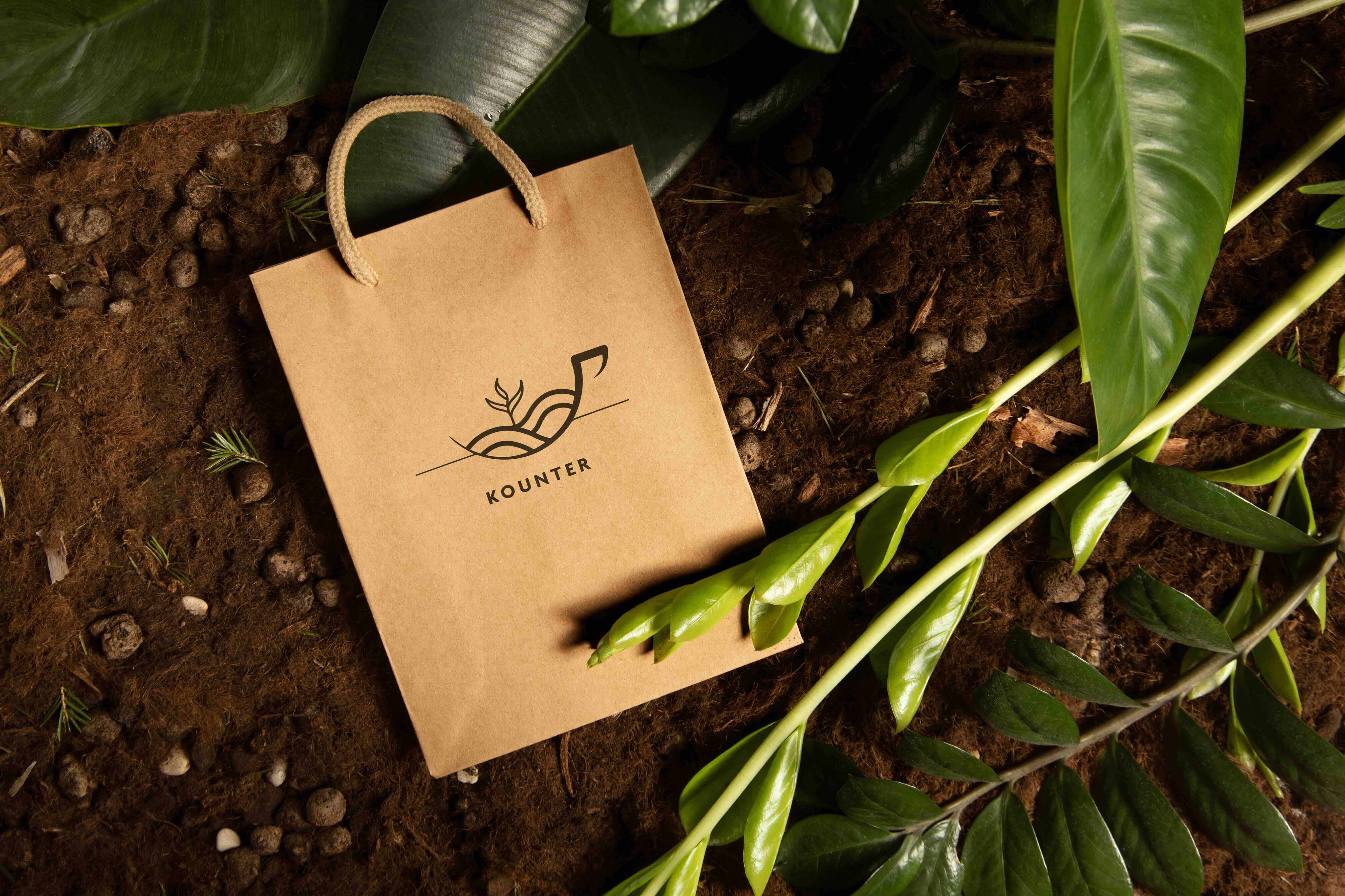
At the heart of the identity sits the logo, designed to hold multiple interpretations. It can be read as a cup of tea, a bowl of warmth, or a landscape in motion. This openness allows the brand to remain anchored in tea while offering flexibility for future food categories. The mark is recognisable yet adaptable, capable of scaling across different pack sizes, materials, and product extensions without losing meaning or coherence.
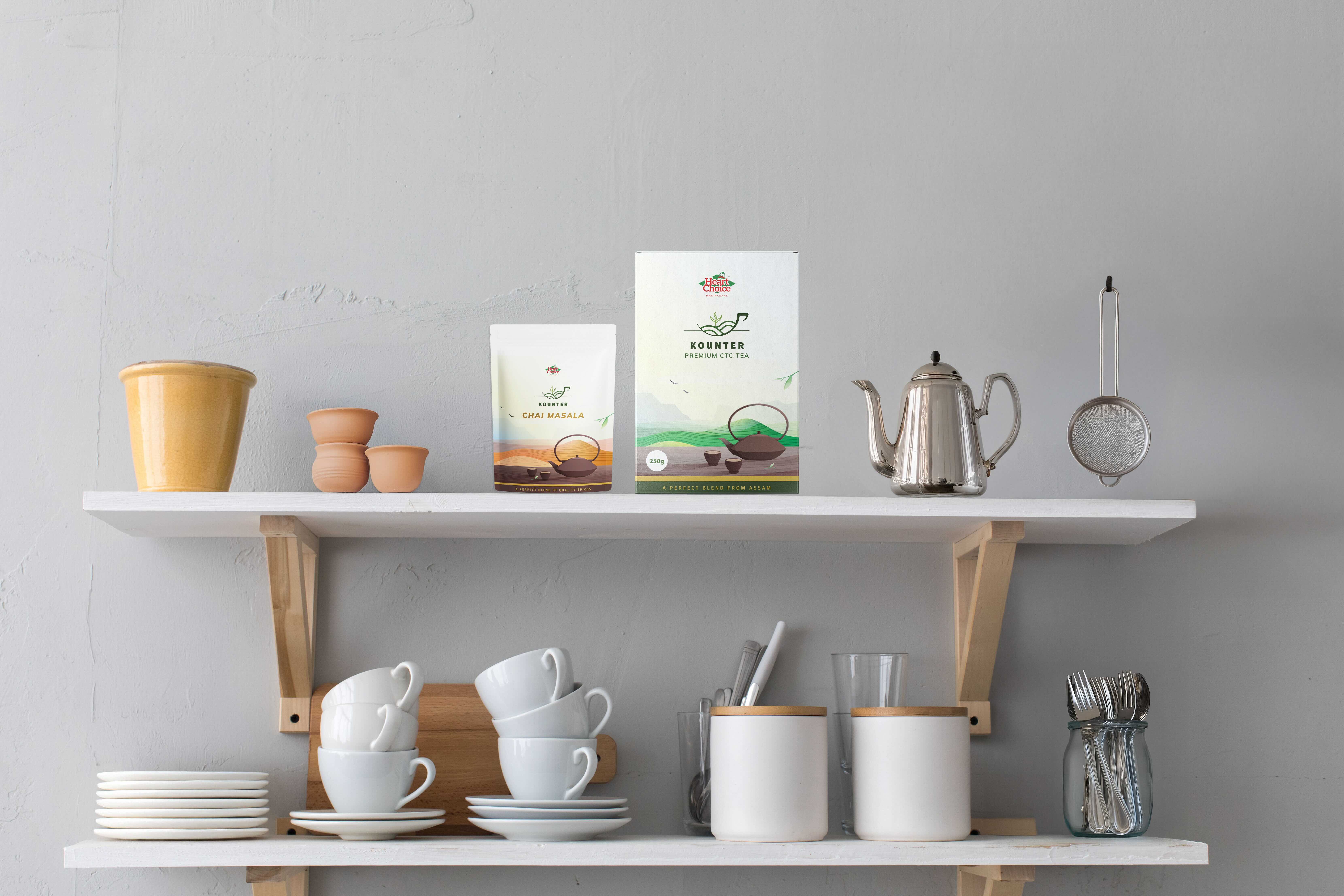
Premium CTC Tea and Chai Masala were developed within a single, unified packaging system. The structure, hierarchy, colour logic, and illustration style remain consistent, ensuring that the products are immediately recognisable as part of one family. Rather than treating each SKU as a standalone design, the system prioritises continuity and ease of navigation for the consumer, both on the shelf and at home.
The packaging is designed to work across contexts. On retail shelves, it stands out through restraint and clarity rather than loud graphics. In home environments, it feels natural and unobtrusive, becoming part of daily routines rather than a temporary visual statement. The materials, tones, and compositions were chosen to age well, reinforcing trust through repeated use.
The result is packaging that feels honest, grounded, and lived-in.
A quiet premium presence, achieved through system-led thinking, clarity of intent, and deep respect for origin.

CREDIT
- Agency/Creative: Mirakod Studio
- Article Title: Mirakod Studio Designs a Quietly Premium Identity for Kounter Tea Leaves
- Organisation/Entity: Agency
- Project Type: Packaging
- Project Status: Published
- Agency/Creative Country: India
- Agency/Creative City: Delhi
- Market Region: Asia
- Project Deliverables: Branding
- Format: Box, Pouch
- Industry: Food/Beverage
- Keywords: Packaging Design, Brand Identity, Tea Packaging, Food Packaging, Assam Tea, Landscape-Inspired Design, Rooted Branding, Scalable Packaging System, Minimal Packaging, Calm Visual Language, llustrative Packaging, FMCG Design, Shelf-Ready Design, Indian Brand Design, Modern Heritage, System-Led Packaging, Logo with Multiple Meanings, Restraint-Driven Design, Kitchen-First Packaging
-
Credits:
Founder: Anshika Agarwal


