


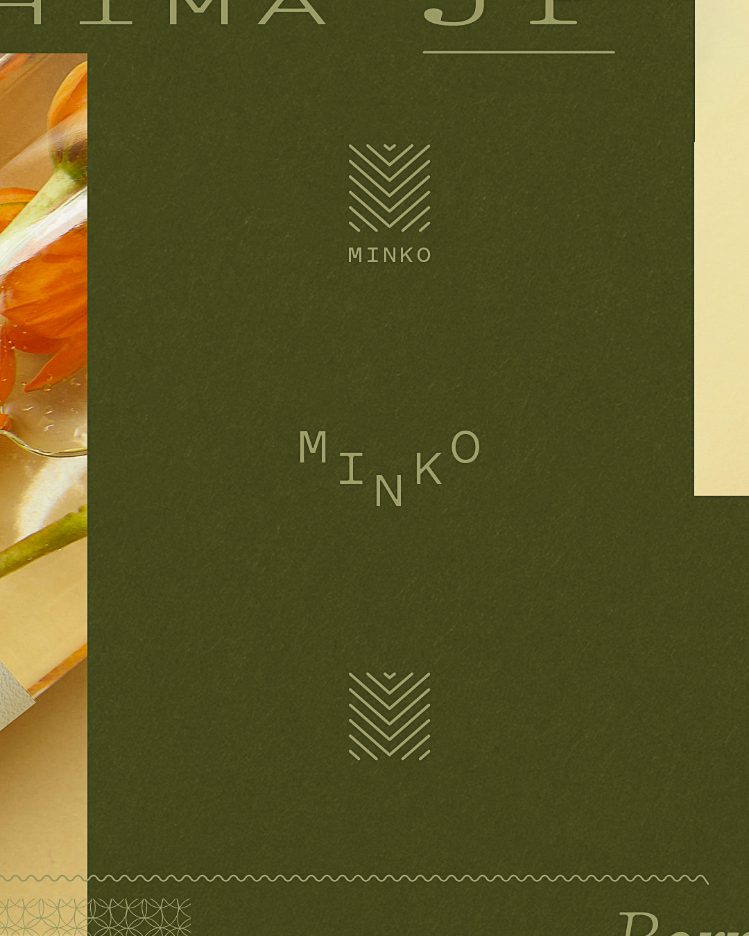
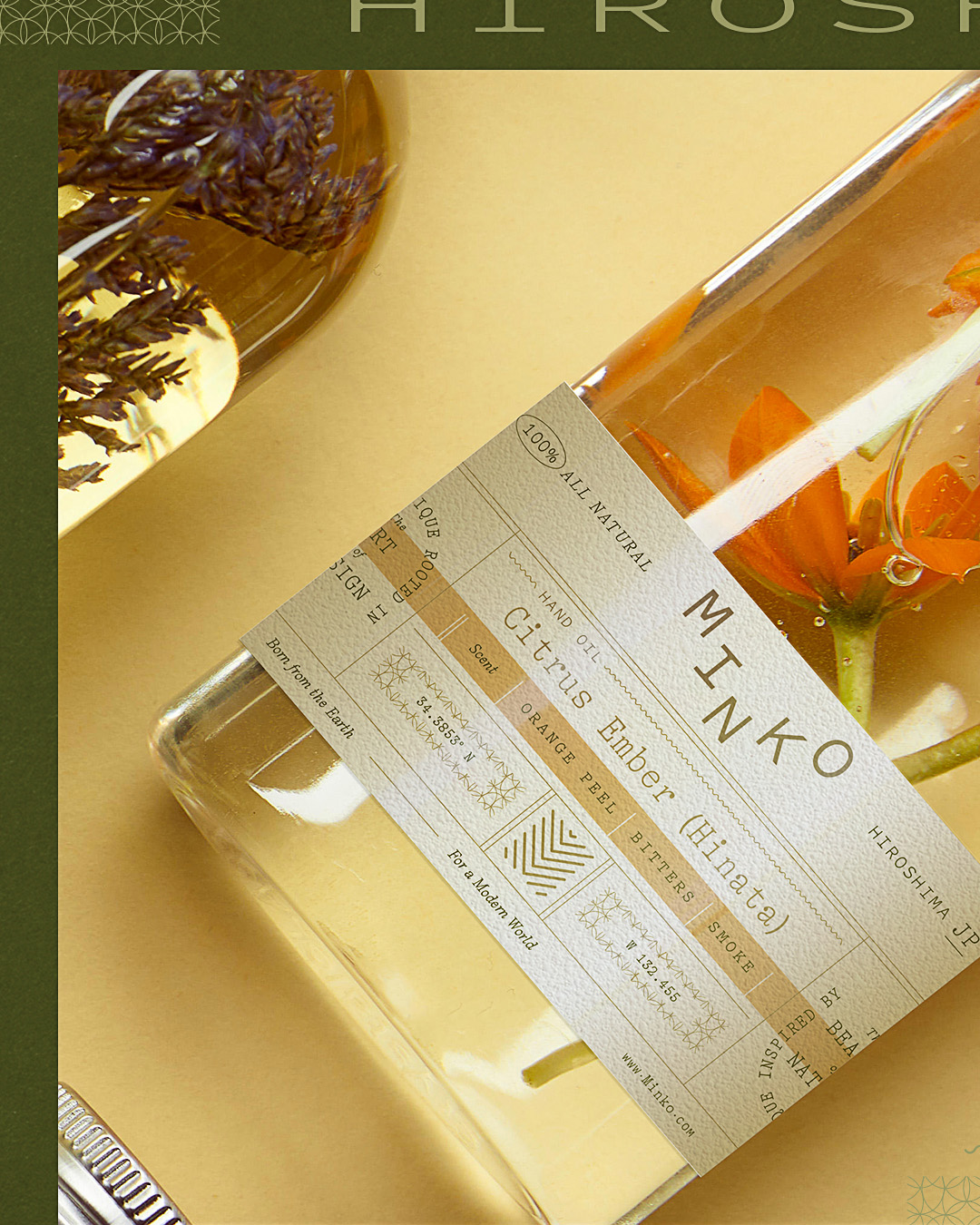
Logo and packaging for Minko are designed to reveal rather than obscure. Rooted in nature and crafted through considered design choices, the identity balances restraint with quiet confidence, allowing the product to feel honest, elevated, and unmistakably itself. A calm, deliberate typographic voice sets the tone, supported by a system that favors clarity over decoration and intention over excess. Every element is treated as part of a larger rhythm, from hierarchy and spacing to scale, material cues, and the way information is revealed in layers.
Rather than competing for attention, the packaging creates presence through simplicity and control. It gives the ingredients and the story behind them room to breathe, reinforcing a sense of trust, quality, and care. The brand mark is purposeful and composed, designed to feel familiar without becoming generic, and distinctive without relying on trend. It works as a quiet signature, anchoring the system while letting each product variation express itself through subtle shifts in tone, composition, and detail.
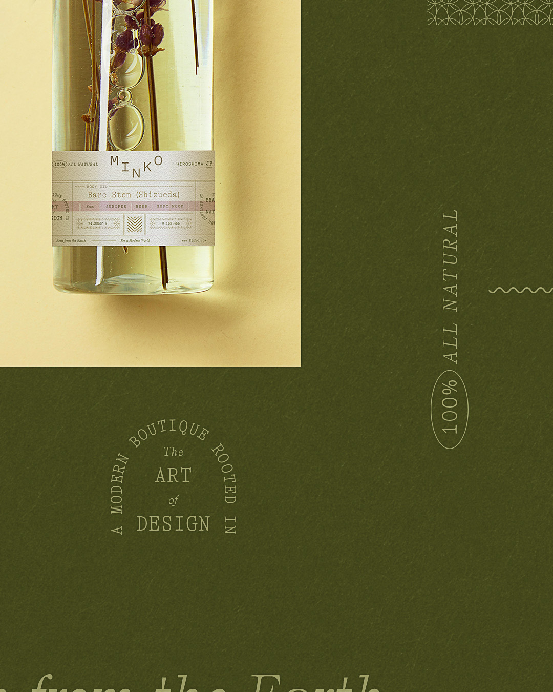
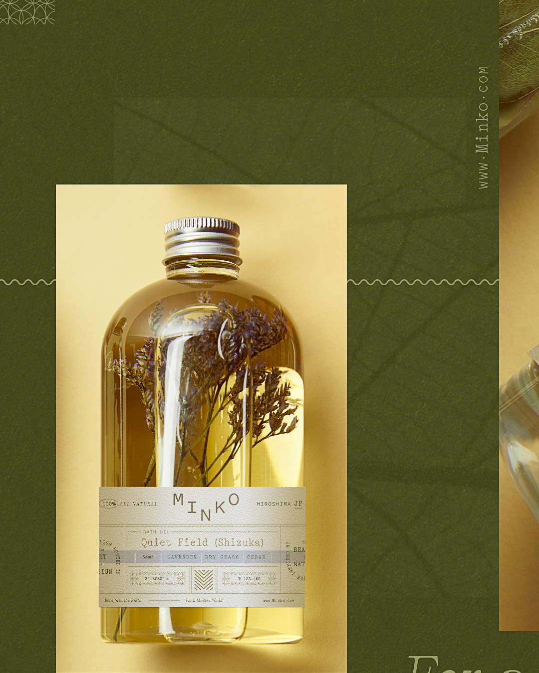
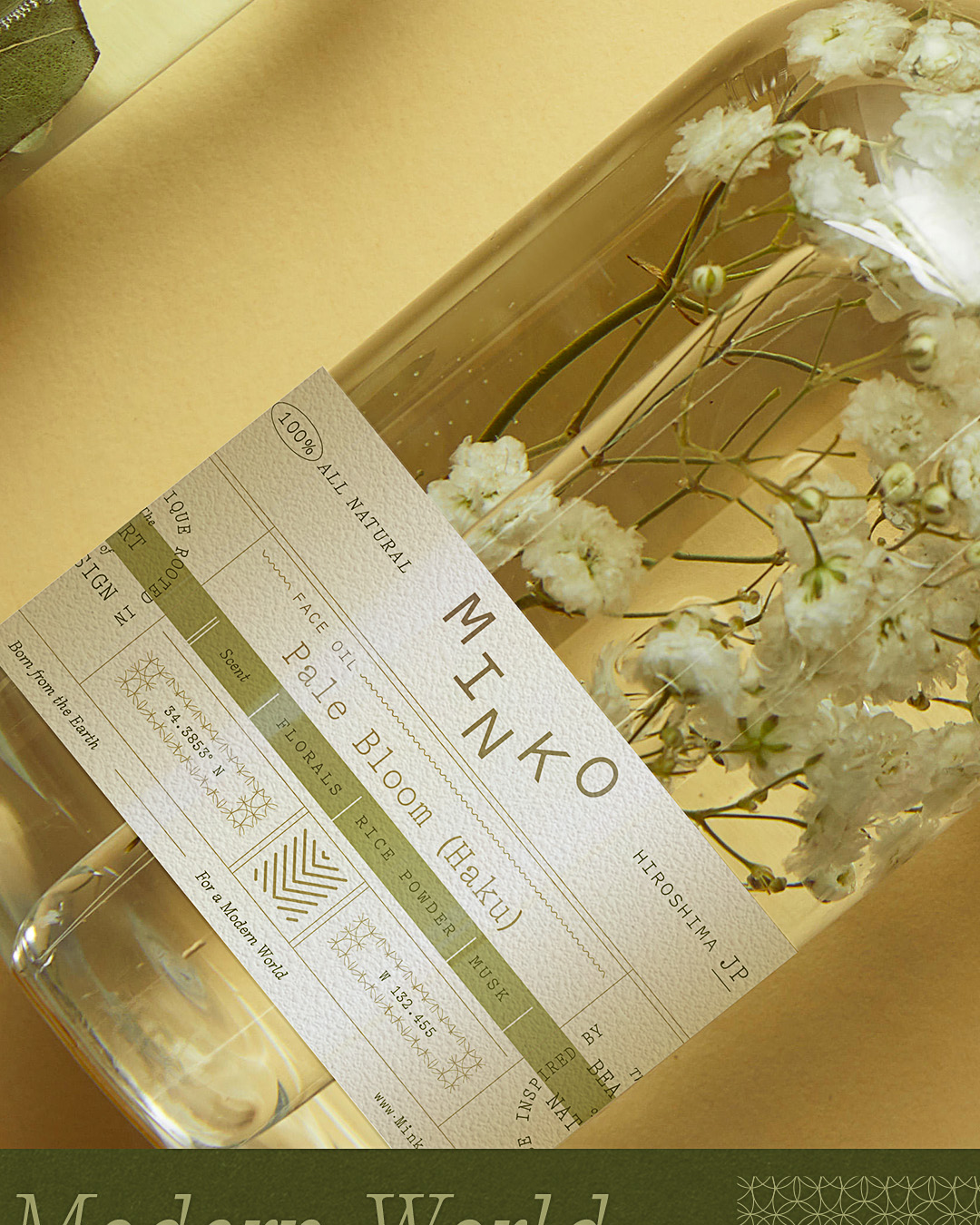
Color, typography, and layout are used as tools for clarity and atmosphere, not distraction. The palette draws from natural references, grounded, calm, and refined, while typography remains steady and measured, reinforcing the brand’s sense of restraint. Information is organized with an editorial mindset, prioritizing what matters most and giving each line the space to be read, understood, and trusted. The packaging feels tactile and intentional, with details that suggest craft and care without leaning on ornament. Materials and finishes are chosen to support the product, creating a quiet sense of quality that’s felt in the hand before it’s even read.
The result is a packaging system that feels modern, composed, and enduring, one that communicates value through discipline rather than embellishment. It invites a closer look, rewards attention, and creates a calm moment at shelf and in use. Minko’s identity doesn’t rely on noise to be noticed. It creates presence through precision, giving the product clarity, confidence, and room to speak for itself.
CREDIT
- Agency/Creative: Device Creative Collaborative
- Article Title: Minko Idenity and Packaging by Device Creative Collaborative
- Organisation/Entity: Agency
- Project Type: Packaging
- Project Status: Published
- Agency/Creative Country: United States
- Agency/Creative City: Winston-Salem
- Market Region: North America
- Project Deliverables: Packaging Design
- Format: Jar
- Industry: Beauty/Cosmetics
- Keywords: packaging design, brand design
-
Credits:
CD/Designer: Shane Cranford


