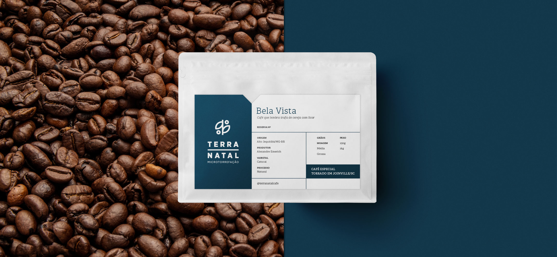
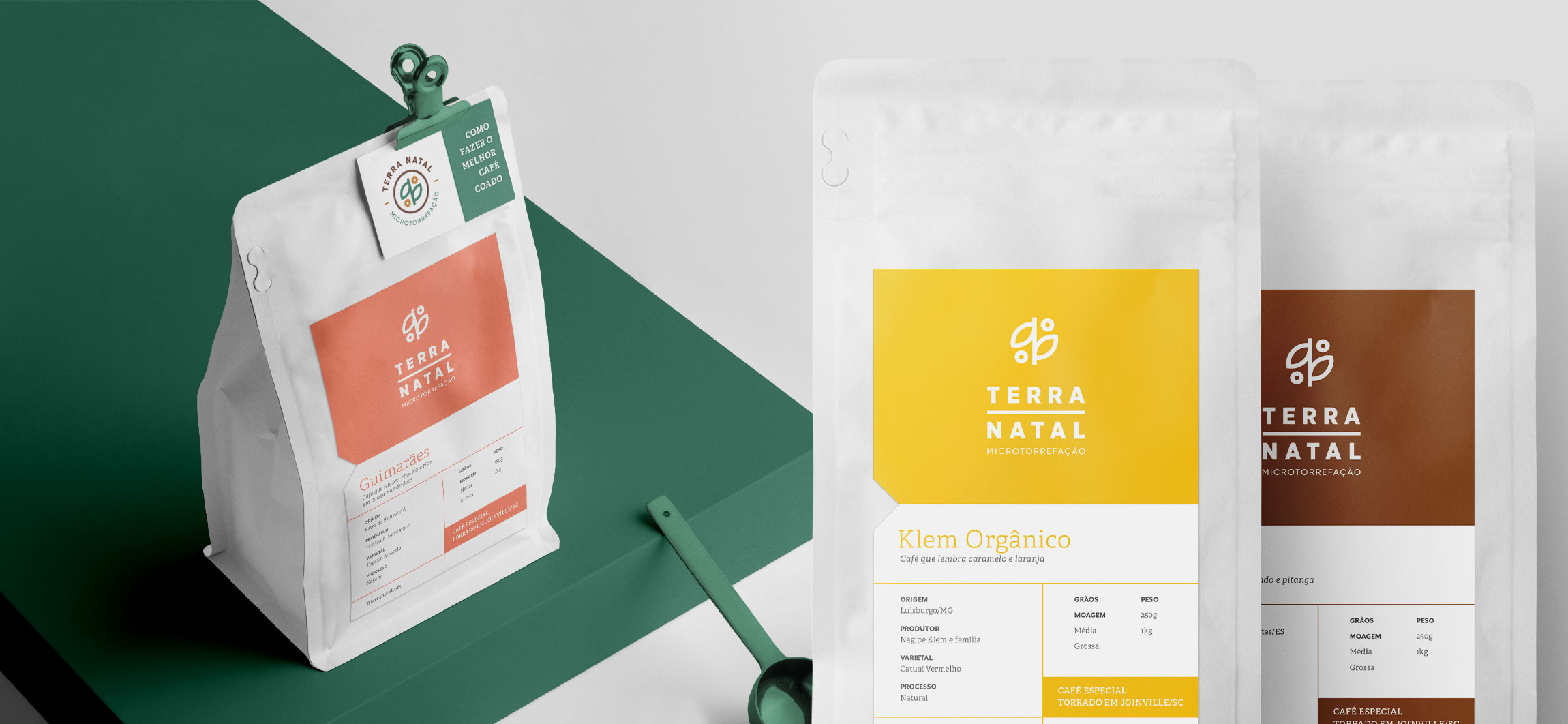
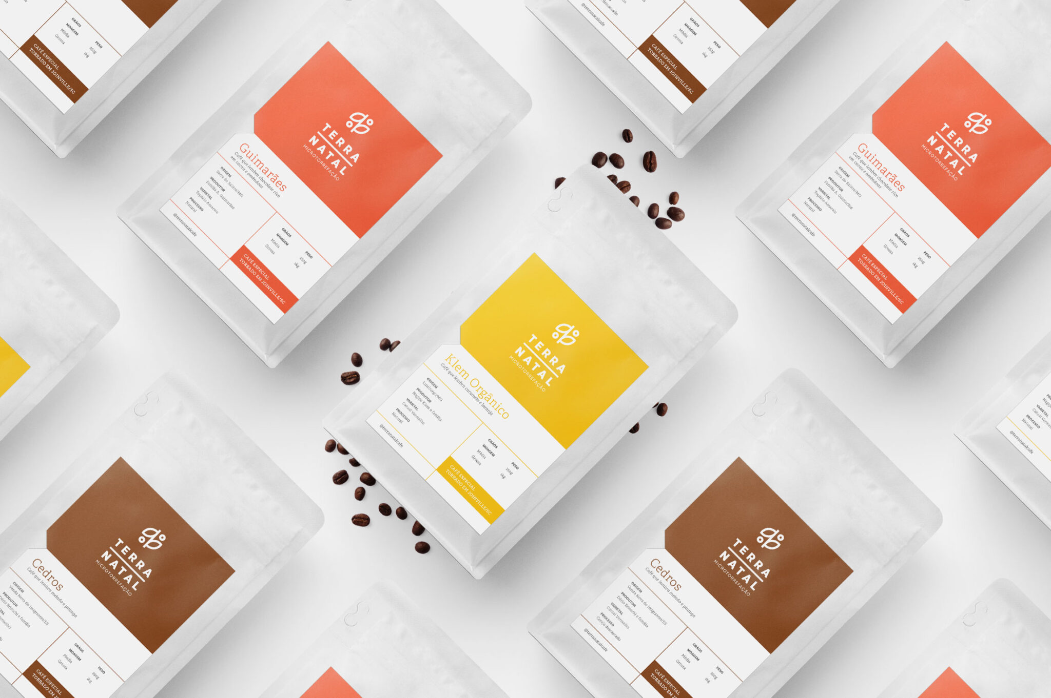
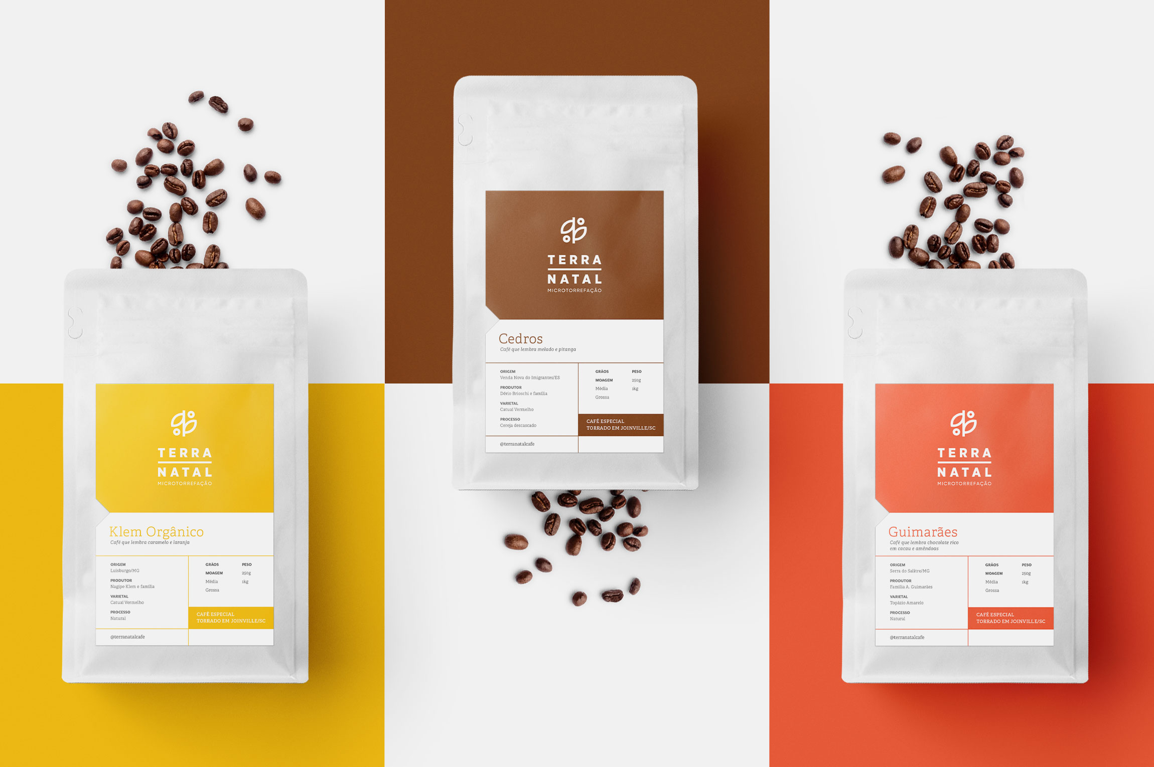
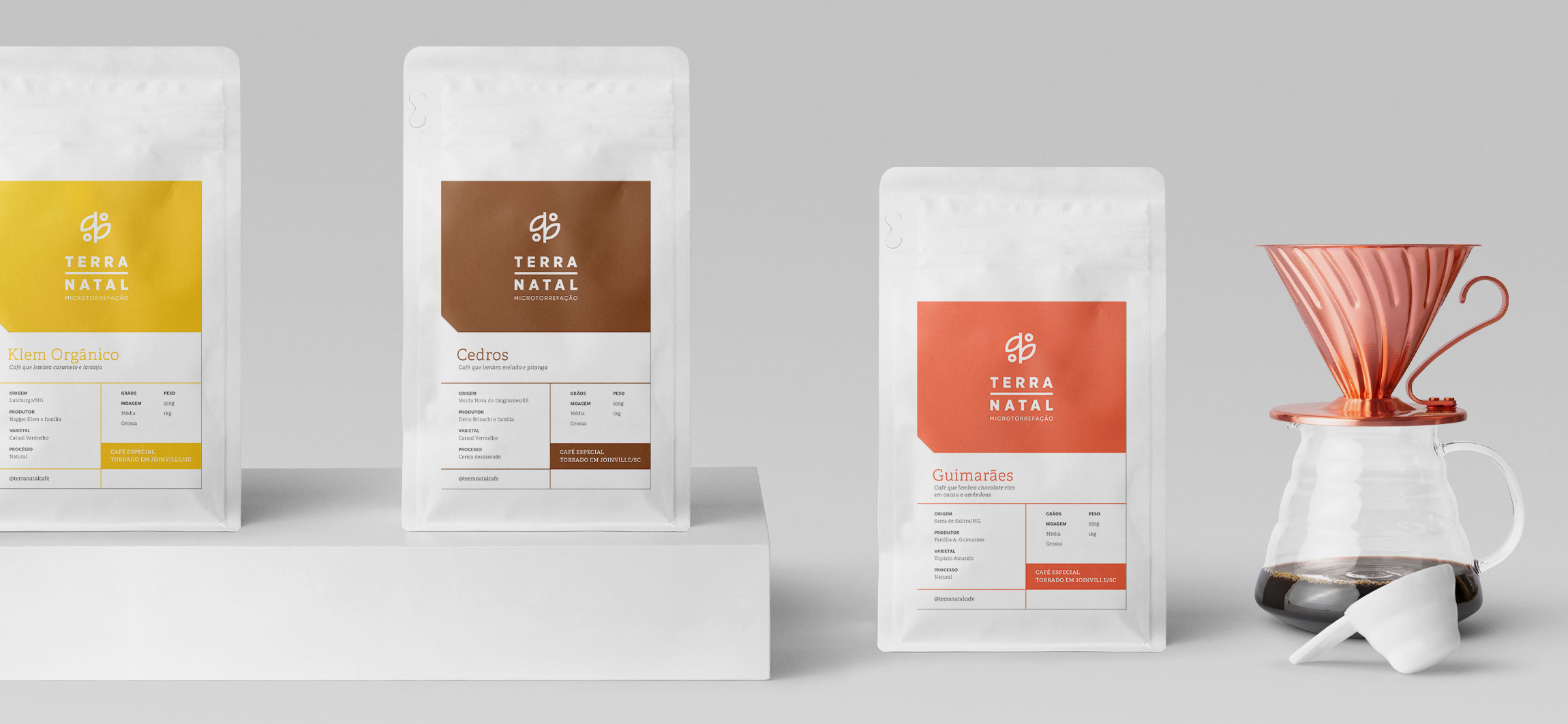
The packaging redesign project for special coffees of Terra Natal Coffee Roasters is focused on generating a more direct visual identification with the brand, categorizing product lines, informing sensory characteristics to the consumer and optimizing production processes.
As opposed to industrialized coffee that presents a standardized profile, specialty coffees offered by micro roaster like Terra Natal are subject to sensory variations according to the harvest, their processing and the roasting profile adopted. These are the characteristics that make the product unique, alive and constantly changing. The challenge of this project focused on communicating the descriptions of each coffee in an efficient way, placing greater emphasis on the role of micro roasting, creating hierarchies and different presentations for the product lines.
In addition to the visual change, the operational process was facilitated and optimized, reducing the steps for gluing the labels and allowing to define some information by hand, such as type of grinding and batch. The functional characteristics of the packaging were also preserved, protecting the product from light and moisture.
CREDIT
- Agency/Creative: Estudio Siamo
- Article Title: Minimalistic Packaging Design for Terra Natal Coffee Roasters
- Organisation/Entity: Agency
- Project Type: Packaging
- Project Status: Published
- Agency/Creative Country: Brazil
- Agency/Creative City: Joinville
- Market Region: South America
- Project Deliverables: Packaging Design
- Format: Bag
- Substrate: Plastic, Pulp Carton
- Industry: Food/Beverage
- Keywords: specialty coffee, packaging, minimalistic
-
Credits:
Designer: Rafael Buemeyer
Creative Director: Ana Megda
Client : Terra Natal Torrefação de Cafés


