


Blu Lab Design Lab – Cosecha Roja Coffee
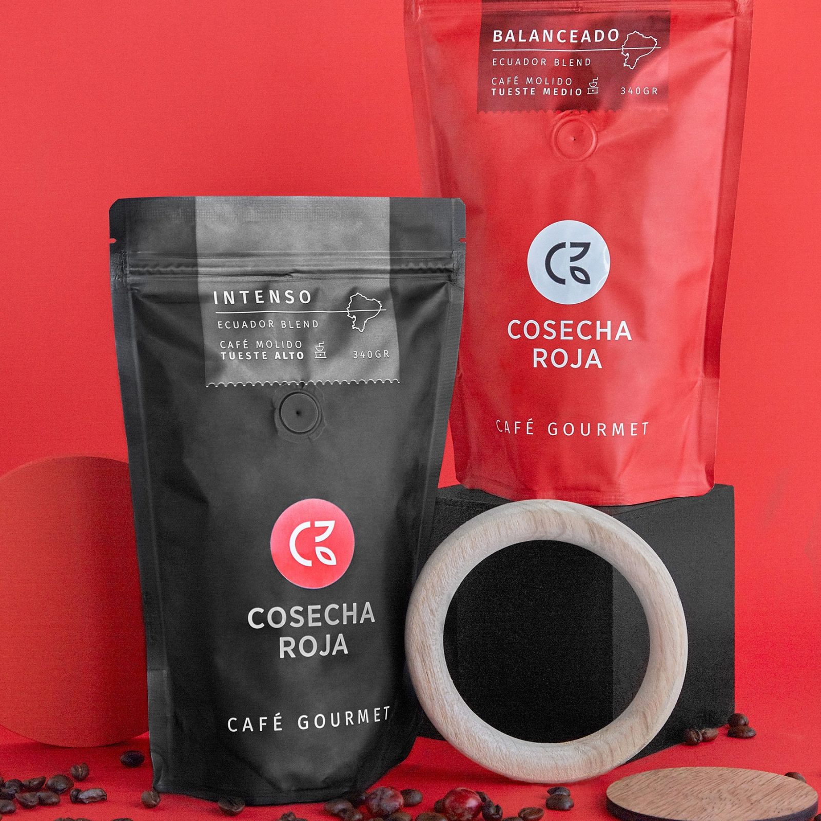
Cosecha Roja has been a family managed brand for over 40 years. Their name, literally translates to “red harvest”, because of the meticulous and handpicked selection of berries. These are harvested for their rich flavour, colour and size. This name helps distinguish the brand as a provider of a truly premium cup.
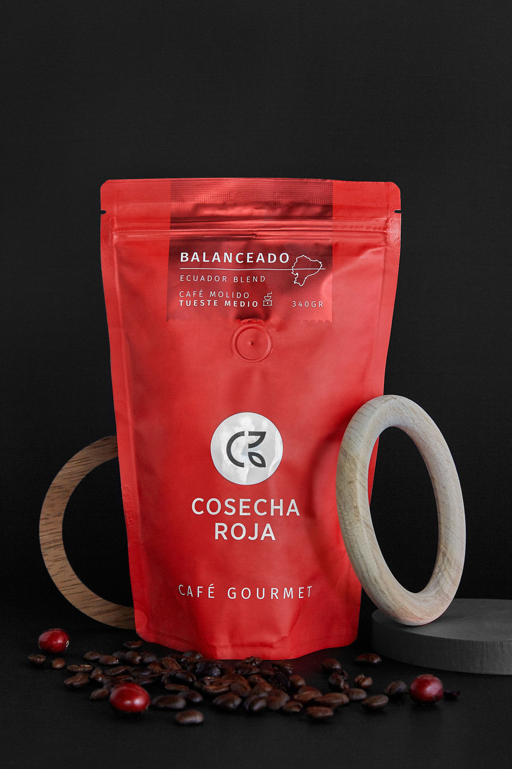
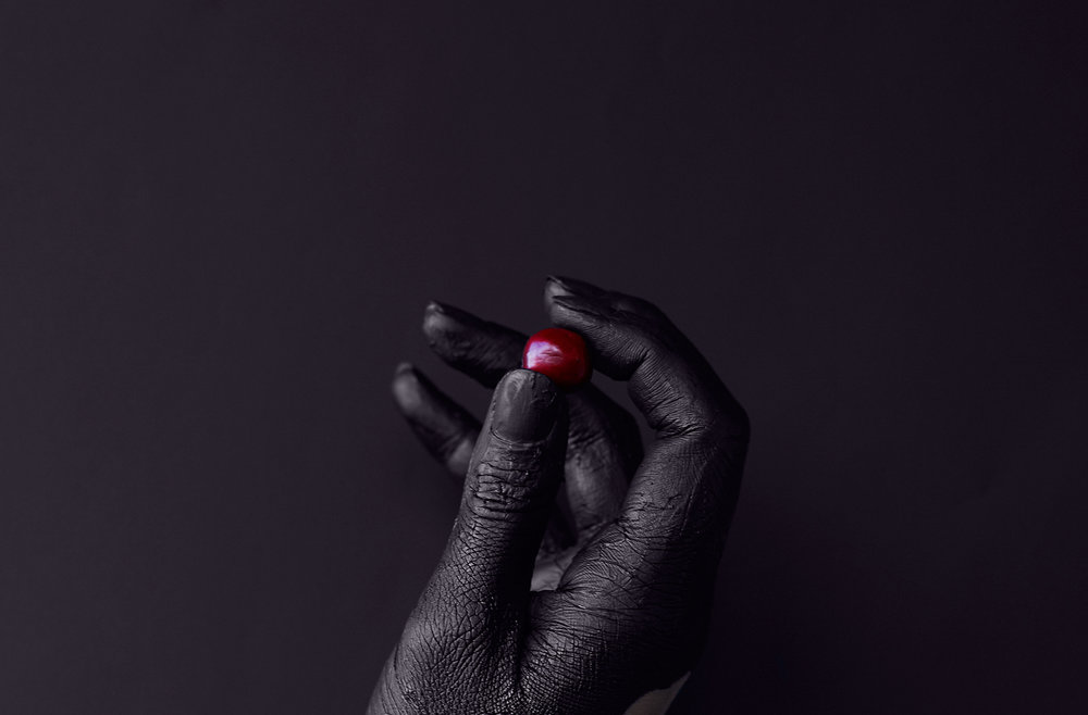
To reflect the authentic quality and the essence of the product, Blu!Lab Design Lab rebranded Cosecha Roja by transforming the packaging into a conceptually strong identity based on the high contrast between the two main colours; ruby red and graphite grey.
The concept behind re-branding this project was to take away all busyness that the previous packaging had and focus on a clean, minimalist design condensed into the red cherry berry. Explained in one sentence: Cosecha Roja is all about the berry.
Every detail, from the matte colouring of the bag, to the iconographic illustrations describing the coffee making process, have been chosen with special care to create an exceptional experience that goes beyond the coffee cup.


CREDIT
- Agency/Creative: Blu Lab Design Lab
- Article Title: Minimalist Packaging Design for High Altitude Origin Coffee from Ecuador
- Organisation/Entity: Agency Commercial, Published
- Project Type: Packaging
- Agency/Creative Country: Ecuador
- Market Region: South America
- Format: Bag


