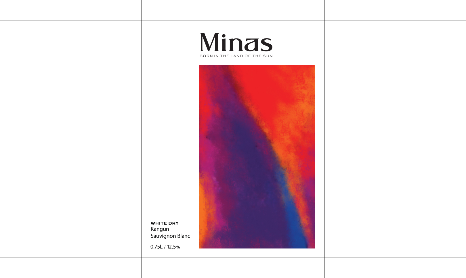
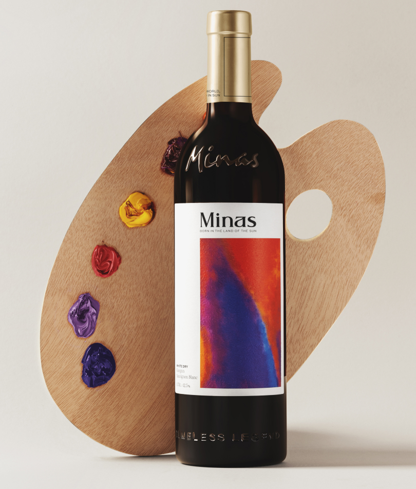
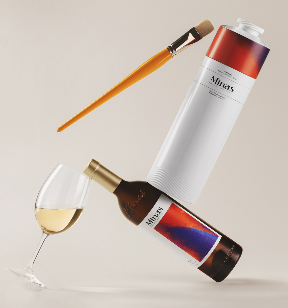
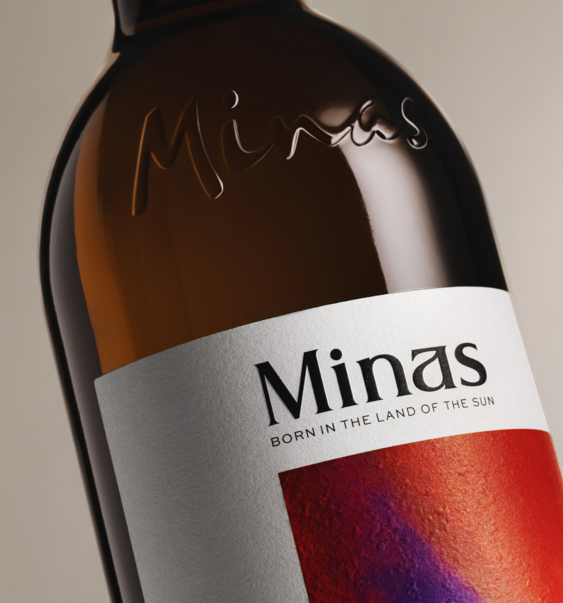
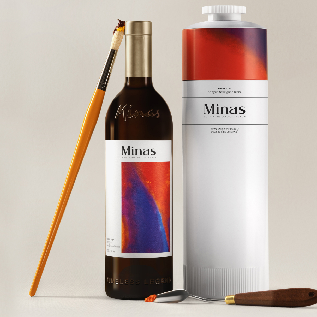
This work recreated his sense, without attaching it to any physical form. We show the “Master of Colour”, bringing the idea of color to the forefront. To enhance the sense of oil x canvas we printed the labels in 3d and added a textured paper. This added a more sensual touch to the customer experience.
His signature, fused on the bottle, puts it in the ethically right position to not mistaken our work with his original pieces.
The decision to forefront the idea of color is brilliant, as it is the very foundation upon which the “Master of Colour’s” legacy rests. By incorporating 3D printed labels and textured paper, you’ve elevated the sensory experience for customers, immersing them in the rich world of oil and canvas. This tactile approach adds a layer of intimacy, allowing consumers to not just see, but feel the artistry behind each bottle.
Moreover, the fusion of the artist’s signature onto the bottle is a testament to the ethical considerations at play. It ensures that while your work pays homage to the “Master of Colour”, it also respects his original pieces and the integrity of his brand.
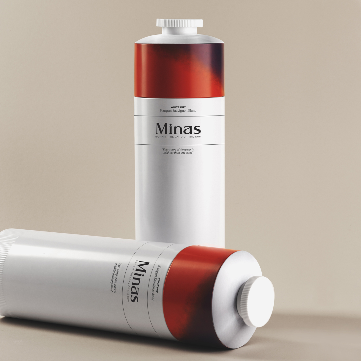
The playful use of an oil tube in the packaging design is ingenious, transforming a cliché into a sustainable solution that further reinforces the connection to the artist’s medium. It’s a subtle yet impactful nod to the very essence of his craft.
Expanding the branding campaign to include the renovation of the artist’s museum is a stroke of genius. It not only reinforces the brand’s commitment to preserving and celebrating artistic heritage but also serves as a socially and culturally engaged initiative that sets it apart from conventional branding efforts.
In essence, your approach to branding transcends mere marketing—it’s a holistic celebration of artistry, culture, and sustainability. It’s a masterclass in branding that not only captivates consumers but also leaves a lasting impression on the cultural landscape.
#minas #branding #brandingagency #indigobranding #rebranding #design #designidentity #packaging #marketing #smm #naming #strategy


CREDIT
- Agency/Creative: Indigo Branding Agency
- Article Title: Minas Signature Wine Design by Indigo Branding Agency
- Organisation/Entity: Agency
- Project Type: Packaging
- Project Status: Published
- Agency/Creative Country: Armenia
- Agency/Creative City: Yerevan
- Market Region: Asia
- Project Deliverables: Branding, Packaging Design
- Format: Bottle
- Industry: Food/Beverage
- Keywords: #minas #branding #brandingagency #indigobranding #rebranding #design #designidentity #packaging #marketing #smm #naming #strategy
-
Credits:
Art Director: Aram Azarian: Indigo Branding Agency


