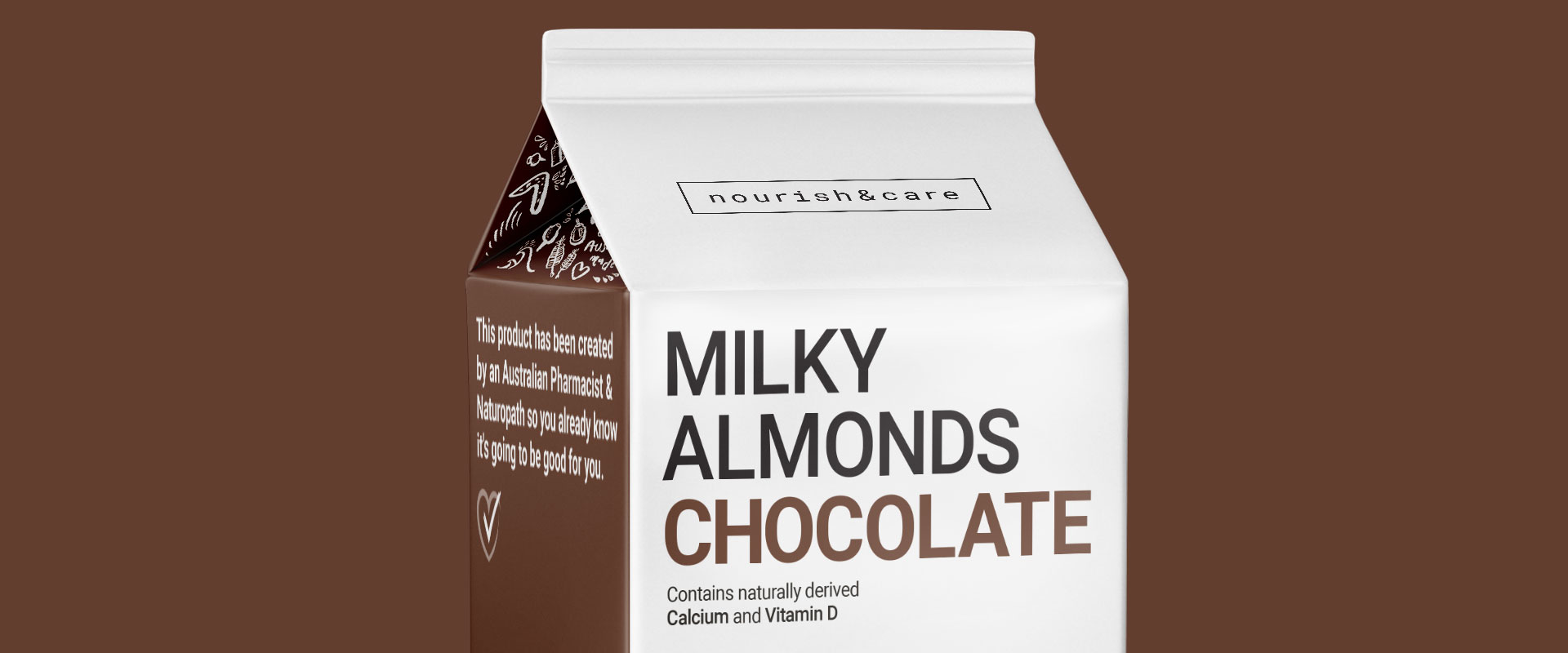
The packaging design need to showcase trust, innovation and a health angle, whilst still being fresh and eye catching enough to cut through a busy, shouty aisle environment.
With 8 individually wrapped sachets in the box – with each making up to 1 litre of fresh almond milk – the simple convenience of the Nourish & Care product also needs to attract consumers.
Busy families, with a desire to be health conscious, and to source a new, easy alternative to their current milk solution, will be the target audience for this market leading product.
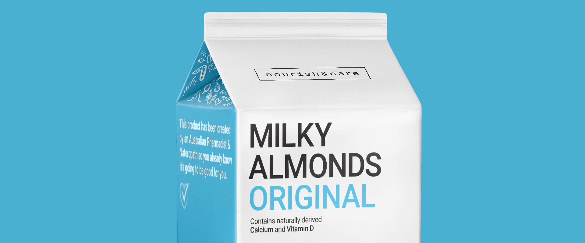
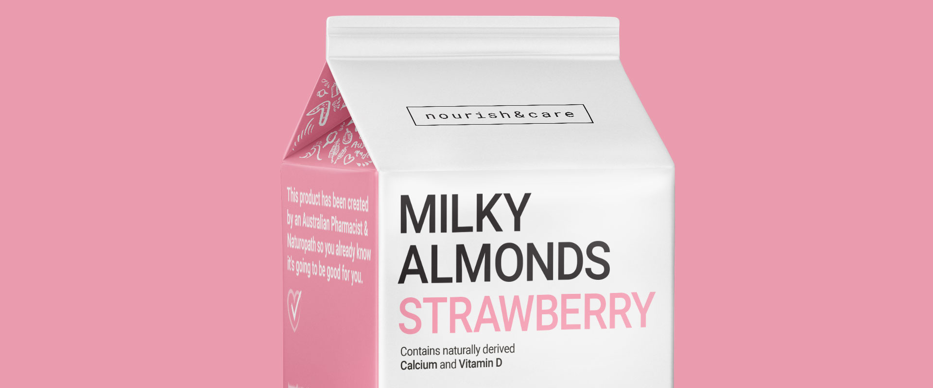
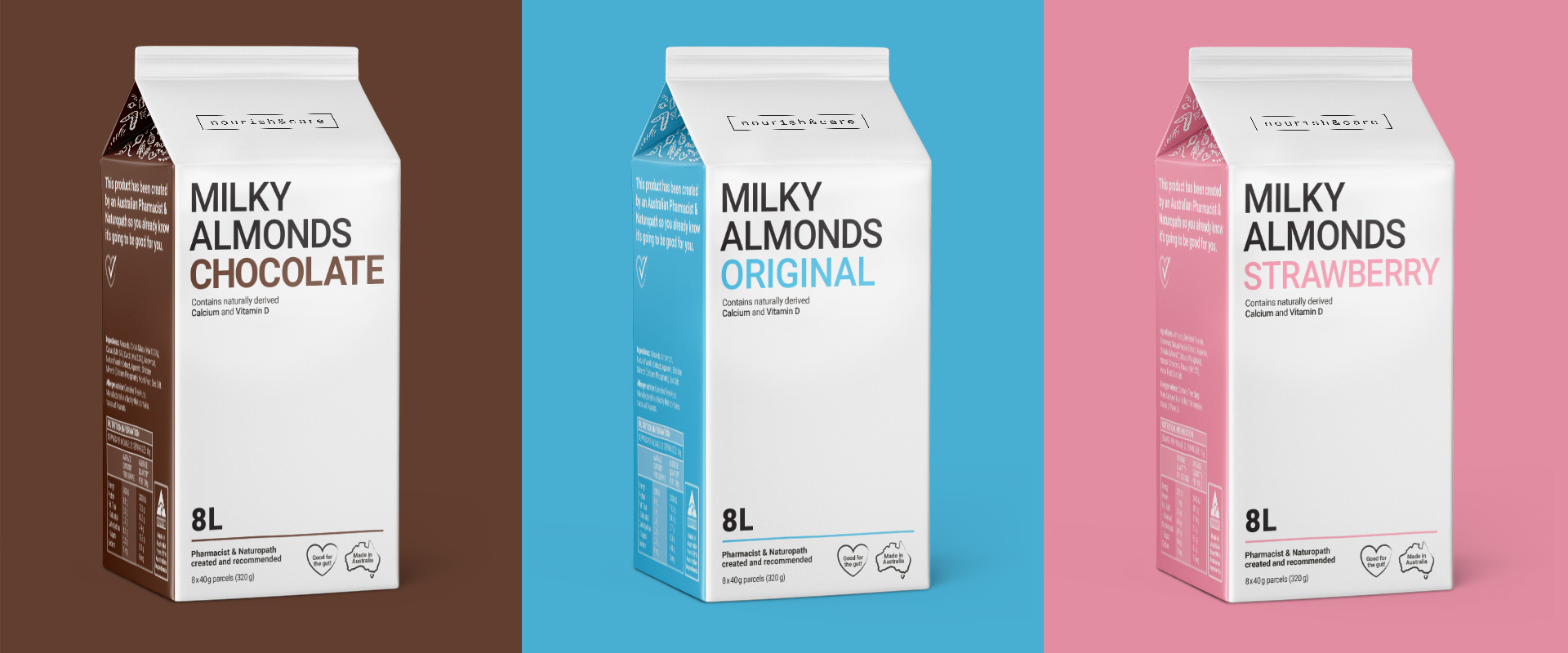
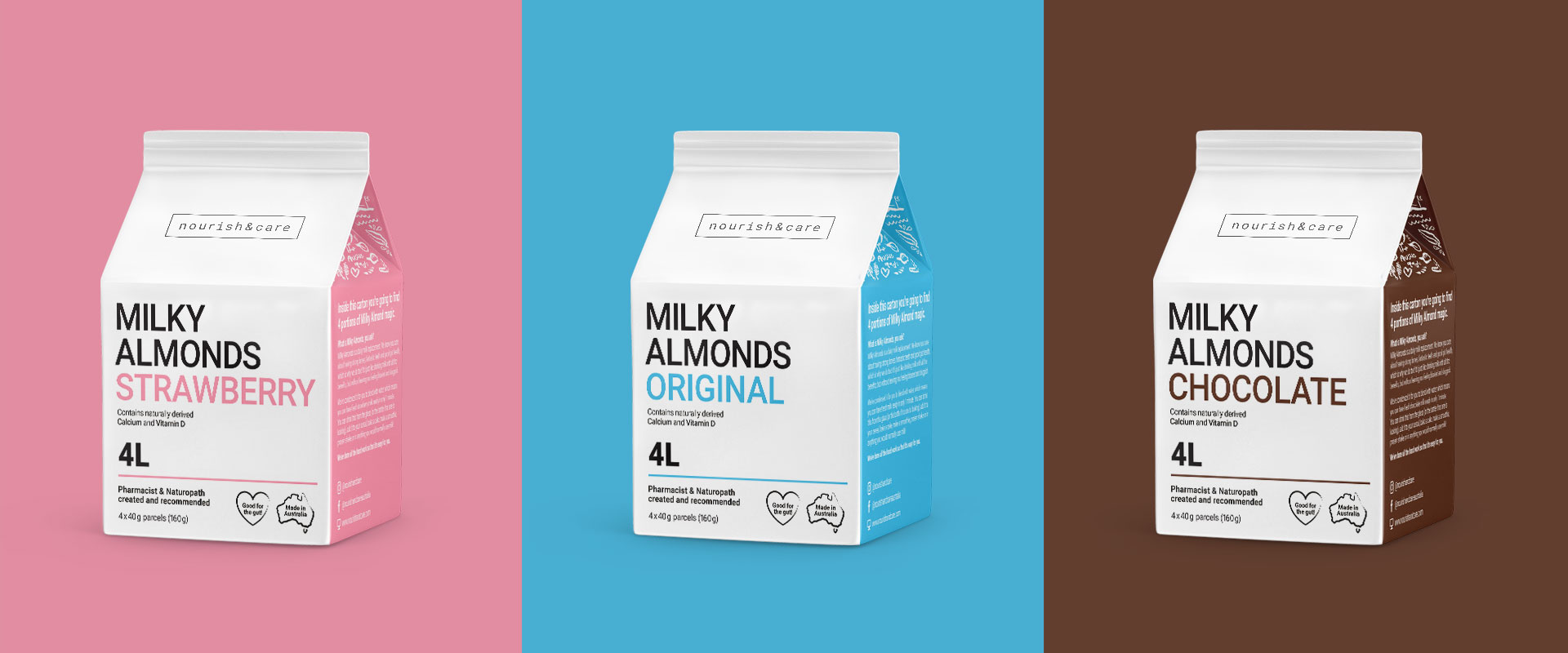
Percept created modern packaging design with a visually quiet and minimalist expression that really cut through the noise of the competitors. We figured the best way to stand out in a shouty environment was not to shout, but to be quiet, confident and stylish.
This is further supported by the milk carton shape of the containers, alluding to the point that although this is an alternative to mainstream milk, it is perfect for those seeking a substitute.
The packaging design also allowed for flexibility in terms of how flavour alternatives were displayed, making for easy range extensions in the future.
The result is a set of cartons featuring a modern packaging design style that is proud and confident of the product inside the container. It is clear in its communication, cutting through the noise with its simplicity.
CREDIT
- Agency/Creative: Percept Brand Design
- Article Title: Milky Almonds Packaging Design
- Organisation/Entity: Agency, Published Commercial Design
- Project Type: Packaging
- Agency/Creative Country: Australia
- Market Region: Global
- Project Deliverables: Brand Architecture, Brand Creation, Brand Guidelines, Brand Identity, Brand Strategy, Branding, Graphic Design, Identity System, Illustration, Packaging Design, Product Architecture, Research
- Format: Box, Sachet
- Substrate: Pulp Carton


