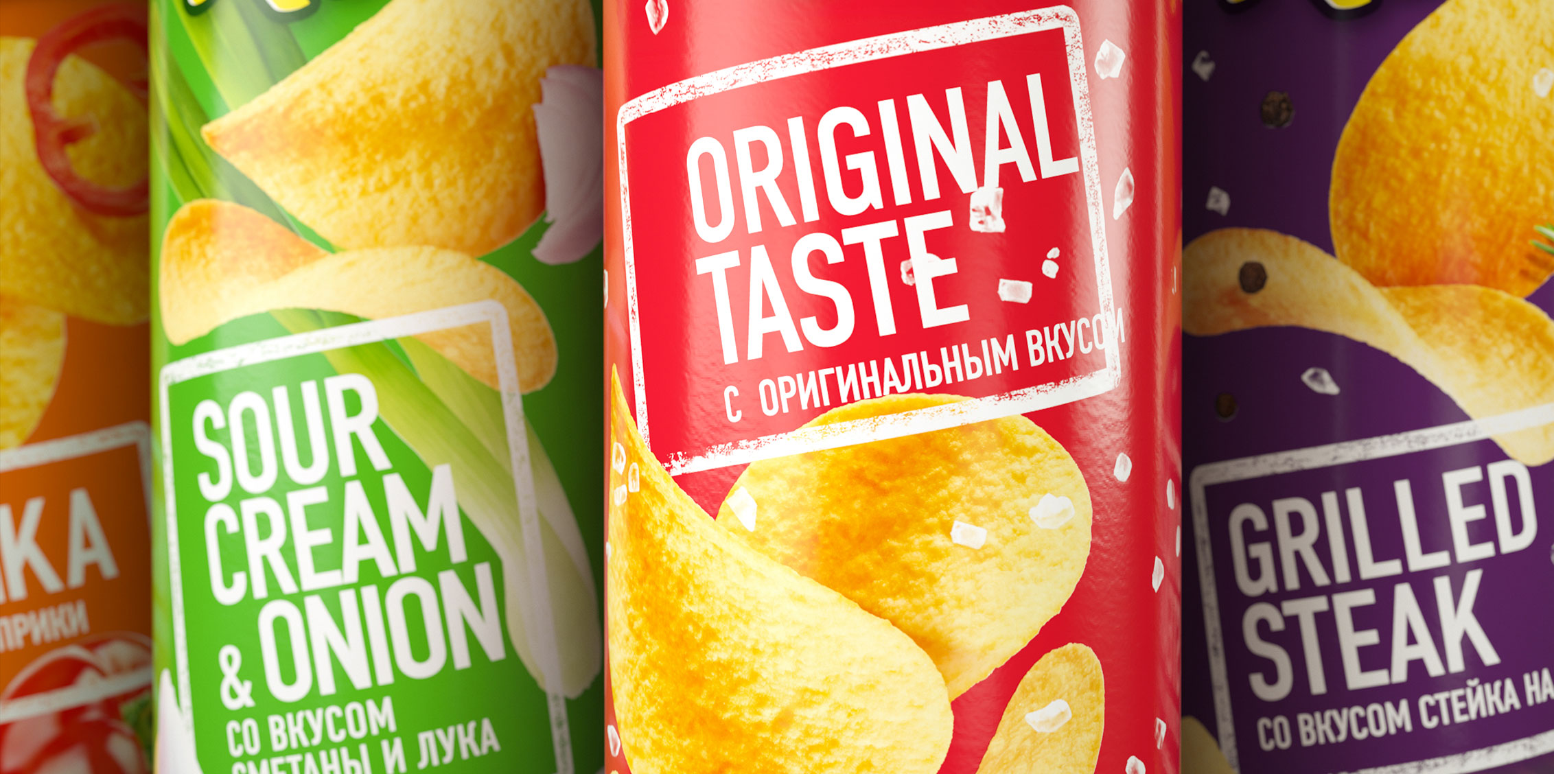
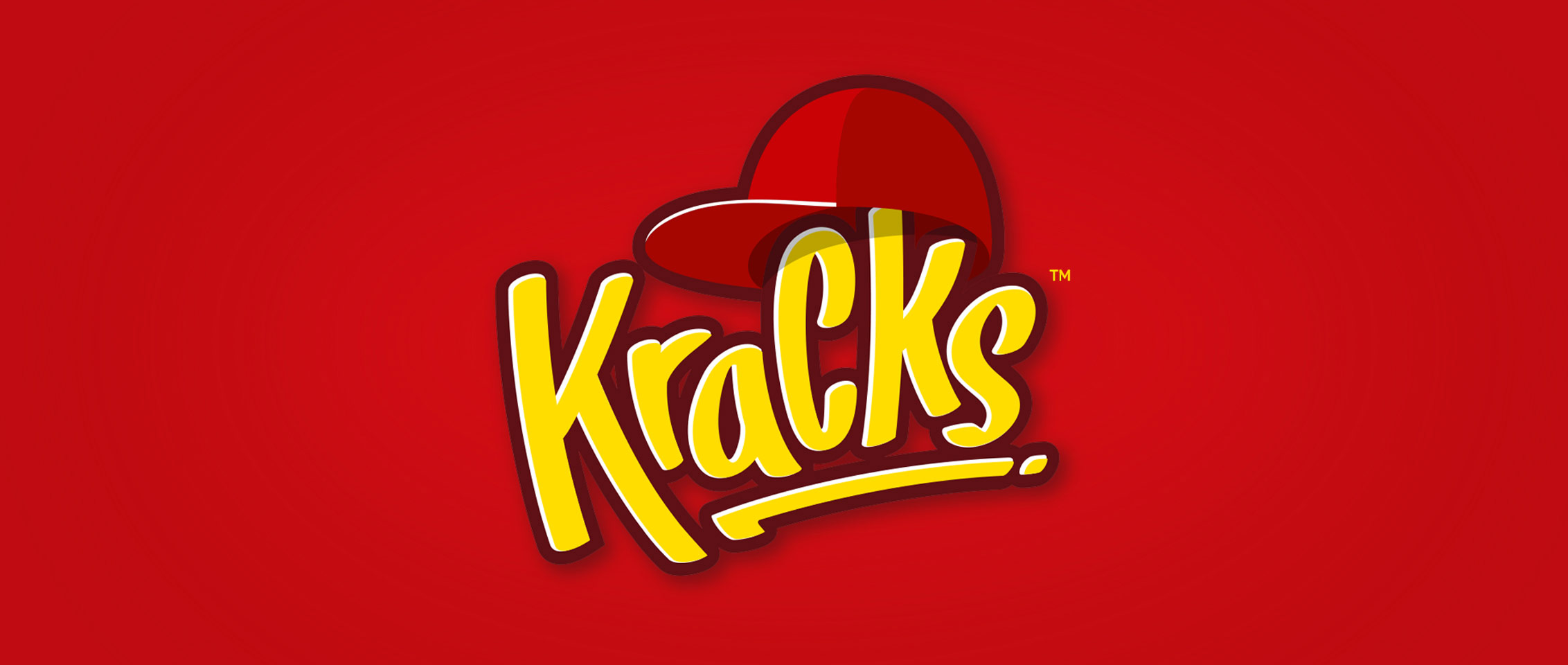
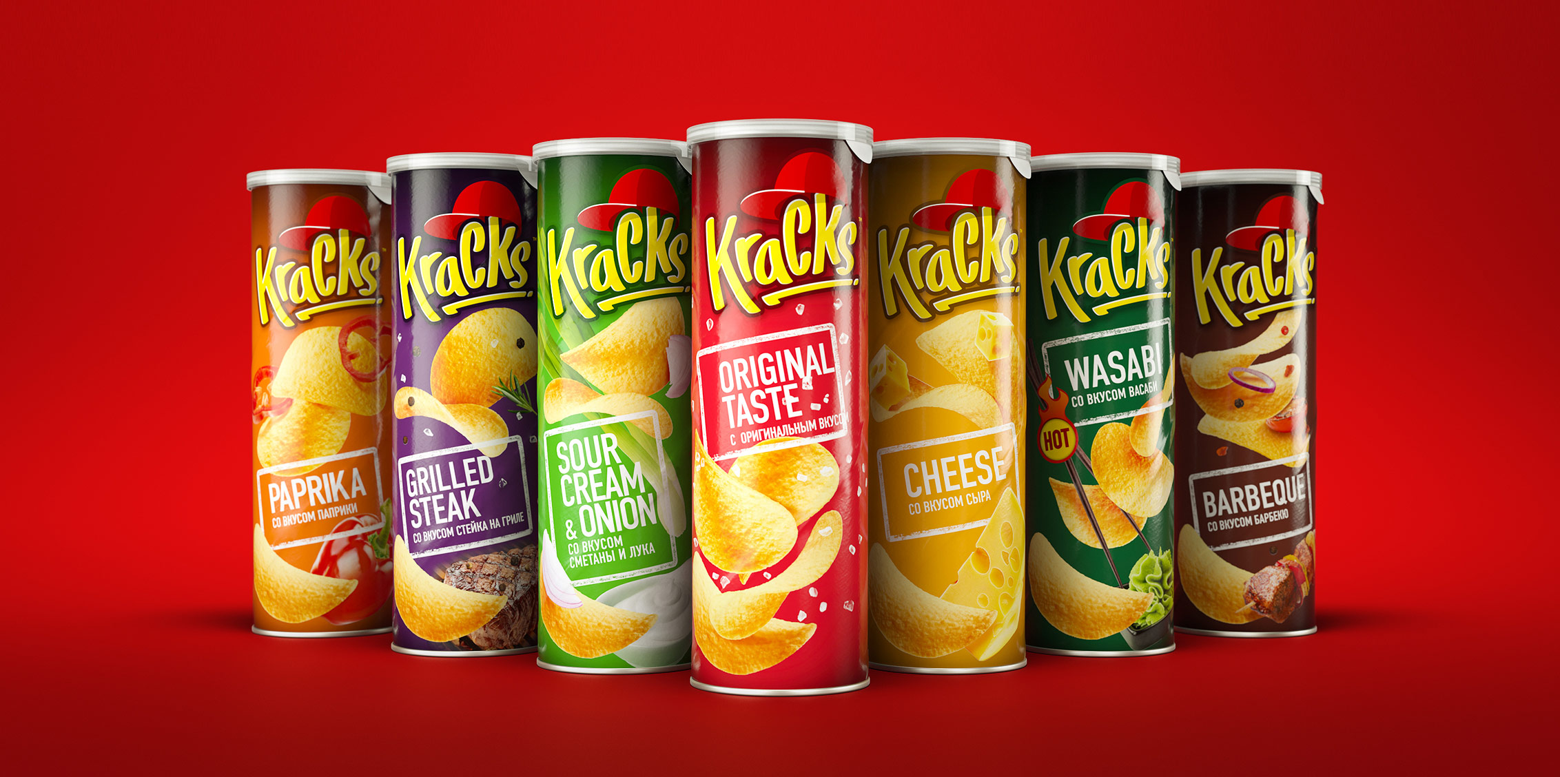
Kracks, a brand owned by Food Empire, has been presented in the Russian market since 2003. For a long time the brand demonstrated sustained growth, including thanks to offering competitive prices. In 2014 as prices began rising across the board serious changes occurred in the snacks segment, which necessitated updating the brand and putting more effort into communicating product quality to the market in order to attract more adult audiences with higher incomes. The company decided to redesigned the brand in order to give it a more modern appearance while ensuring that it remains recognisable.
The New City Kings concept that we’ve developed makes Kracks a positive brand icon for modern urbanites and moves the brand from teenager territory and into the urban style land that is more relevant for the new adult target audience.


CREDIT
- Agency/Creative: MILDBERRY
- Article Title: MILDBERRY Brand Consultancy Redesigned Kracks Chips
- Organisation/Entity: Agency, Published Commercial Design
- Project Type: Packaging
- Agency/Creative Country: Russia
- Market Region: Global
- Project Deliverables: Brand Identity, Identity System, Packaging Design, Rebranding, Tone of Voice
- Format: Tube
- Substrate: Pulp Carton


